Teammates: Student: submit responses: fix rubric questions overflowing the question box
v6.3.0
 damithc
All 10 comments
I could not reproduce using the updated code of github. Or is it to be reproduced some other way ?
 Shashwat-Garg
on 26 Feb 2018
Shashwat-Garg
on 26 Feb 2018
I could not reproduce using the updated code of github. Or is it to be reproduced some other way ?
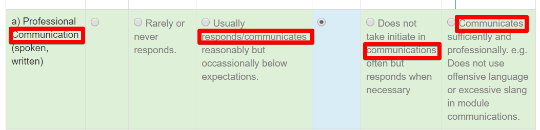
I guess it depends on the question contents. When contents have long words, they add up to push the content out of the box.
damithc
on 26 Feb 2018
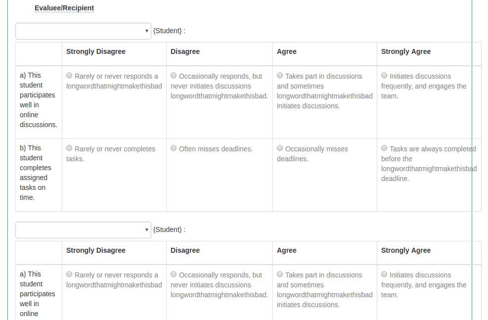
I used word-break: break-word; and it fixed in the following manner (it doesn't look good though :P )
Is there some more elegant way? Making it scrollable will make it look even worse imo
 tshradheya
on 26 Feb 2018
tshradheya
on 26 Feb 2018
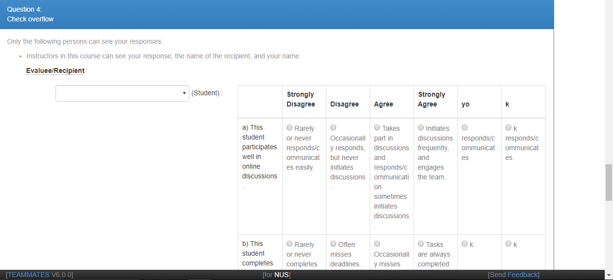
@damithc @tshradheya Though at first I thought about word-break only, but this can make reading the description very hard. why don't we use overflow: auto in this case? Something like this:
(Please ignore the description text :sweat_smile: )
 sukanta-27
on 26 Feb 2018
sukanta-27
on 26 Feb 2018
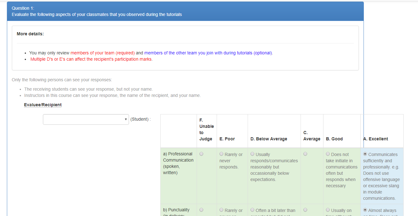
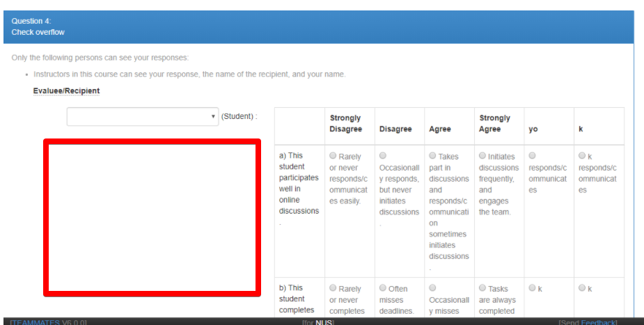
Rubric questions need to be given plenty of horizontal space. I wish there is a way to use some this empty space to show the question.
damithc
on 27 Feb 2018
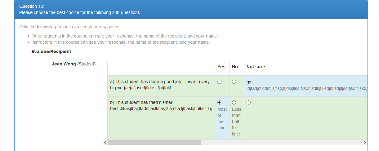
We could push the rubric down to a different row from the evaluee/recipient, like this:
(ignore the lack of word-wrap!)
But if we do this, then the style of rubric questions will be pretty different from other questions (e.g. the evaluee/recipient header looks a bit out of place in the screenshot above) so not sure if this is something we want to pursue. Thoughts/comments?
 craaaa
on 27 Feb 2018
craaaa
on 27 Feb 2018
@craaaa IMO using the space prof. @damithc suggested in https://github.com/TEAMMATES/teammates/issues/8542#issuecomment-368712030 will not solve the problem completely. As we can see in this above screenshot that the table still overflows the question box, not to mention if someone wants to add one more column the scenario will be same as before (with less appealing UI and a lot of refactoring for rubric question).
SO I think at some point we will have to add scrolling feature to stop the overflowing problem (https://github.com/TEAMMATES/teammates/issues/8542#issuecomment-368572530 ), which will be a lot simpler and consistent with the rest of the UI.
sukanta-27
on 27 Feb 2018
@sukanta-27 Yes, there's definitely a need for some form of wrapping or scrolling here to solve the primary problem. Was just thinking that making better use of the horizontal space would prevent the table from spilling over in more cases, so we would need either wrap/scroll in fewer cases. Both solutions work but are much less satisfying than having the entire table well-displayed :)
(FWIW I prefer the word-wrap; the horizontal scroll reduces visibility of some of the options which I think should be avoided if possible, particularly since respondents will have to scroll back and forth to compare between options)
craaaa
on 27 Feb 2018
We could push the rubric down to a different row from the evaluee/recipient, like this:
I think we should have _some_ indentation so that the question a bit more indented than the name.
And yes, we need some wrap/scroll solution as well.
damithc
on 27 Feb 2018
Fixed in V7
 wkurniawan07
on 16 Aug 2020
wkurniawan07
on 16 Aug 2020
Related issues
 keoren3
·
3Comments
keoren3
·
3Comments
 amarlearning
·
4Comments
craaaa
·
4Comments
amarlearning
·
4Comments
craaaa
·
4Comments
 rchliu
·
3Comments
rchliu
·
3Comments
 joanneong
·
4Comments
joanneong
·
4Comments
Most helpful comment
@sukanta-27 Yes, there's definitely a need for some form of wrapping or scrolling here to solve the primary problem. Was just thinking that making better use of the horizontal space would prevent the table from spilling over in more cases, so we would need either wrap/scroll in fewer cases. Both solutions work but are much less satisfying than having the entire table well-displayed :)
(FWIW I prefer the word-wrap; the horizontal scroll reduces visibility of some of the options which I think should be avoided if possible, particularly since respondents will have to scroll back and forth to compare between options)