Improvement
Open Sans is a beautiful and balanced (visually) typography, but it doesn't have a wide support of Unicode characters, reflected in issues like #1791 and #1527, In addition to the new Telegram translation platform, the number of supported languages will increase and therefore a font with a broad language support will be necessary.
I believe that Google Noto (sans) is the best option (SIL Open Font License) and as a second alternative Roboto fonts.
Unlike what is raised in the issue #90, I believe that the font of the interface should be uniform as well as the emojis to maintain the same user experience (in the case of size it is an exception because it is an accessibility option).
Steps to reproduce
X
Expected behaviour
Open Sans fonts is changed by a new typeface
Actual behaviour
Opens Sans is a beautiful typeface, but it has not been updated lately and doesn't have a wide support of Unicode characters
Configuration
Operating system:
fedora Workstation 27 (GNOME)
Version of Telegram Desktop:
1.1.23
 diazbastian
All 54 comments
@diazbastian I'm afraid that full Unicode supported font can't be bound to the distribution of the app because it has huge size, like tens, if not hundreds, MB of uncompressable data, see those Noto or Roboto CJK font files.
 john-preston
on 18 Nov 2017
john-preston
on 18 Nov 2017
@john-preston I think Telegram Desktop can afford users to set any installed fonts in Settings dialog.
 xvitaly
on 18 Nov 2017
xvitaly
on 18 Nov 2017
@john-preston I agree, but even the basic set of characters provided by Noto is broader and of better quality than Open Sans. On the other hand, it is the operating system that usually provides CJK-compatible fonts that draw the characters when the typography currently in use doesn't have them (in some systems they are moving to Noto anyway). But whether they are CJK or other fonts, it will be freely available and free to be installed in the system by the user while maintaining aesthetics of the app.
diazbastian
on 18 Nov 2017
Noto has a Display version and another called "UI" especially for interfaces with several weights. With a suitable combination it would look great on Telegram Desktop.
The interface is very Material Design style, so it would not be a bad idea to be inspired by typographic styles guide. Personally I would have recommended IBM Plex, but its stable release is planned for next year.
 charlesjt
on 18 Nov 2017
charlesjt
on 18 Nov 2017
Related read:
https://stackoverflow.com/questions/34732718/why-isnt-there-a-font-that-contains-all-unicode-glyphs
The latest version contains a repertoire of 136,755 characters.
 Aokromes
on 30 Nov 2017
Aokromes
on 30 Nov 2017
I think on Windows and macOS tdesktop should switch to the system defaults (like Segoe UI and San Francisco), I hope this will resolve unicode support problems as well.
john-preston
on 30 Nov 2017
Technically Unifont contains a very large number of glyphs, but the problem with it is that it looks plainly horrible and CJK glyphs are completely unreadable when rendered with it. Unluckily, the binary version of Telegram Desktop prefers that as its font when it's installed.
 musover
on 30 Nov 2017
musover
on 30 Nov 2017
@john-preston
When Noto or default system font will be used? Current Sans is very ugly.
 f242
on 22 Jan 2018
f242
on 22 Jan 2018
3363
Aokromes
on 1 Jun 2018
maybe telegram can suggest to download noto font based on country? For example, telegram desktop's default font cannot show amharic script at all, while arial can.
ሀ ሁ ሂ ሃ ሄ ህ ሆ
Aokromes
on 1 Oct 2018
Let us to change font and find best font for viewing
 omoridi
on 11 Nov 2018
omoridi
on 11 Nov 2018
is there any update on this front? I'm using tdesktop on debian and the hebrew font looks... bad. the letters are super thin, while being monospaced, with spaces being half-width. this makes seeing word boundaries really hard, and any word that contains narrow letters looks awful.
 reuvenpo
on 21 Jul 2019
reuvenpo
on 21 Jul 2019
I also would like to change default font because it looks ugly.
 sterid
on 20 Aug 2019
sterid
on 20 Aug 2019
Amharic Font is very tiny and weird

 serak
on 24 Aug 2019
serak
on 24 Aug 2019
@Aokromes i know its there but its so tiny and unreadable.
serak
on 28 Aug 2019
I don't think it's been mentioned here yet: the current font choice is a security problem, as its ambiguous characters help scammers spoof their identities, and even if their targets look closely at their usernames, they won't spot the difference.
As it is, folks accused me of attempting to scam them when a scammer copied my avatars and made their username mine, but replaced a lower case L with a capital I.
Even copying and pasting the scammer's username into the group chat maintained the fraudster's illusion.
Some fonts are simply irresponsible. It should be a basic requirement that characters are unambiguously identifiable by humans.
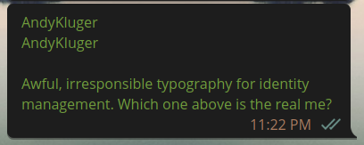
EDIT: And it's happening again, a very convincing impersonator is taking advantage of Telegram's pro-scammer fonts to ask people for money in my name.
 AndydeCleyre
on 27 Sep 2019
AndydeCleyre
on 27 Sep 2019
EDIT: This hack is flawed, see @ilya-fedin's remarks below.
FWIW I've found a hacky way to compile Telegram to use fontconfig-specified fonts for its primary font, including fallbacks. With this, font selection can be changed without recompiling further.
- replace the fonts with empty files:
for ttf in Telegram/lib_ui/fonts/*.ttf; do
    rm $ttf
    touch $ttf
done
- make sure
cmakeis run with-DDESKTOP_APP_USE_PACKAGED_FONTS=OFF
I currently have a pkgbuild up on the AUR which compiles this way, in addition to hard-coding-at-compile-time the monospace font. I don't think this fixes the hard-coded emojis though. Here is the diff from the official pkgbuild:
--- telegram-desktop/PKGBUILD   2020-02-19 23:22:35.796308831 -0500
+++ PKGBUILD    2020-02-19 23:16:58.717003705 -0500
@@ -1,13 +1,14 @@
-# Maintainer: Sven-Hendrik Haase <[email protected]>
+# Maintainer: Andy Kluger <https://t.me/andykluger>
+# Contributor: Sven-Hendrik Haase <[email protected]>
 # Contributor: hexchain <[email protected]>

 # Thanks Nicholas Guriev <[email protected]> for the patches!
 # https://github.com/mymedia2/tdesktop

-pkgname=telegram-desktop
+pkgname=telegram-desktop-userfonts
 pkgver=1.9.14
 pkgrel=1
-pkgdesc='Official Telegram Desktop client'
+pkgdesc='Official Telegram Desktop client, with your fonts as set by fontconfig'
 arch=('x86_64')
 url="https://desktop.telegram.org/"
 license=('GPL3')
@@ -22,6 +23,18 @@
 sha512sums=('56efa64048d23b280782b51319c0071c6cef833cb7e2584e52c6e45488577755beb85185ec9187029c425cc8d4c9c1887142687c744697e7731a15abe2846056'
             '3c21c871e28bac365400f7bc439a16ad1a9a8d87590ad764ce262f1db968c10387caed372d4e064cb50f43da726cebaa9b24bcbcc7c6d5489515620f44dbf56b')

+prepare() {
+    cd tdesktop-$pkgver-full
+    mono=${TG_MONO:-$(fc-match monospace | sed -E 's/.*: "([^"]+).*"/\1/g')}
+    echo -- Using $mono for monospace font
+    echo -- To override, set TG_MONO and make from fresh sources
+    sed -i "s/\"Consolas\"/\"${mono}\"/g" Telegram/lib_ui/ui/style/style_core.cpp
+    for ttf in Telegram/lib_ui/fonts/*.ttf; do
+        rm $ttf
+        touch $ttf
+    done
+}
+
 build() {
     cd tdesktop-$pkgver-full

@@ -33,6 +46,7 @@
         -DTDESKTOP_API_TEST=ON \
         -DDESKTOP_APP_USE_GLIBC_WRAPS=OFF \
         -DDESKTOP_APP_USE_PACKAGED=ON \
+        -DDESKTOP_APP_USE_PACKAGED_FONTS=OFF \
         -DDESKTOP_APP_USE_PACKAGED_RLOTTIE=OFF \
         -DDESKTOP_APP_USE_PACKAGED_VARIANT=OFF \
         -DDESKTOP_APP_DISABLE_CRASH_REPORTS=ON \
With a user-level fontconfig like this, this is the before and after:
I'd like to share this with everyone subscribed to #90, but discussion in that space has been silenced without explanation.
AndydeCleyre
on 20 Feb 2020
FWIW I've found a hacky way to compile Telegram to use fontconfig-specified fonts for its primary font,
Or you can just remove QFont initialization with font name https://github.com/desktop-app/lib_ui/blob/master/ui/style/style_core_font.cpp#L223
But you should enable DESKTOP_APP_USE_PACKAGED_FONTS to use DemiBold (or bold text won't be bold)
Also, look at https://github.com/kotatogram/lib_ui/commit/0a6d083dd552e7a9abd6fa50812c5124f257ef0d
Btw, you can also override Open Sans with fontconfig and telegram will use any font that you want without any code modification (if it is compiled with DESKTOP_APP_USE_PACKAGED_FONTS)
 ilya-fedin
on 1 Mar 2020
ilya-fedin
on 1 Mar 2020
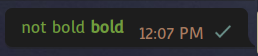
@ilya-fedin Thanks! Indeed the bold is not working with my hack, and I hadn't realized.
Can you explain more what you mean by "remove QFont initialization..."?
My user's fontconfig already sets a sans font, but this has no effect on telegram desktop as packaged by Arch, even though it is compiled with -DDESKTOP_APP_USE_PACKAGED=ON (and doesn't explicitly set -DDESKTOP_APP_USE_PACKAGED_FONTS). You mean specifically overriding "Open Sans" I gather, which would inappropriately affect much more than tdesktop . . .
If you know exactly how to get tdesktop to properly observe the user's preferred fonts from fontconfig, please post it here (as the actually appropriate issue for discussion remains censored by devs).
AndydeCleyre
on 1 Mar 2020
Can you explain more what you mean by "remove QFont initialization..."?
-: f(GetFontOverride(fontFamilies[family], flags))
-, m(f)
+: m(f)
This will initialize QFont with the default constructor (system font), but some additions are needed to make monospace work.
Also, you can delete these lines https://github.com/desktop-app/lib_ui/blob/master/ui/style/style_core.cpp#L46-L57
The most easy way is:
    <match>
        <test name="family"><string>Open Sans</string></test>
        <edit name="family" mode="assign" binding="strong">
        <string>Your Font</string>
        </edit>
    </match>
    <match>
        <test name="family"><string>Open Sans Semibold</string></test>
        <edit name="family" mode="assign" binding="strong">
        <string>Your Font:style=bold</string>
        </edit>
    </match>
Or even (this should fallback to the default system font):
        <selectfont>
            <rejectfont>
                <pattern>
                    <patelt name="family">
                        <string>Open Sans</string>
                    </patelt>
                </pattern>
                <pattern>
                    <patelt name="family">
                        <string>Open Sans Semibold</string>
                    </patelt>
                </pattern>
            </rejectfont>
        </selectfont>
(or use a fork with system font support :P)
ilya-fedin
on 1 Mar 2020
which would inappropriately affect much more than tdesktop
I don't see any using of open sans except tdesktop in my system, I think it has no affect, since Open Sans is not used in document writing/web-sites (even if you find that kind of site - 99% that open sans is loaded from google fonts or has a fallback)/etc
ilya-fedin
on 1 Mar 2020
@ilya-fedin
I don't see any using of open sans except tdesktop in my system, I think it has no affect
Yes, well we might want to actually use that font on our system for things, or generating PDF reports, or whatever. Murdering user's system fonts is no solution at all.
So I'm looking at the changes you linked, so I can patch my builds more properly. Looks like the lines you linked for fixing the mono fonts is closely tied to that fork, as UseSystemFont, possibleEmptyOverride, FontMonospace, and fontOverride are not present at all in this codebase.
Also, you can delete these lines
Do you mean, "it's ok to delete these now" or "alternatively, if you delete these lines, mono fonts will be fixed?"
Thank you very much for your help. For now I'll patch as you recommend for the sans font fix, which will work at runtime, and continue to hard code the mono font at build time until I can understand a better solution.
AndydeCleyre
on 9 Mar 2020
you linked for fixing the
monofonts is closely tied to that fork, asUseSystemFont,possibleEmptyOverride,FontMonospace, andfontOverrideare not present at all in this codebase.
You can leave only blocks that excepts UseSystemFont == true
possibleEmptyOverride, fontOverride, and FontMonospace is added by that commit, you can just transfer it to plain tdesktop
FontMonospace is required for correct setting of monospace font, since there are no other way to detect if font family setting is needed (i.e. it should ignore font famiily setting with general and semibold font)
Do you mean, "it's ok to delete these now" or "alternatively, if you delete these lines, mono fonts will be fixed?"
The last fallback is system monospace font, as you can see
ilya-fedin
on 9 Mar 2020
ilya-fedin
on 9 Mar 2020
added by that commit
Ah, since you linked a specific line range, I thought you were directing me to a specific line range. I'll have a look at the entire commit later.
Using just the diff you included at the top of this comment, the bold doesn't work either (the font I'm using doesn't include a bold weight, but bolding it does work in apps such as Calligra Words).
FontMonospace is required for correct setting of monospace font, since there are no other way to detect if font family setting is needed (i.e. it should ignore font famiily setting with general and semibold font)
I don't understand what this means yet (does "font family setting" refer to fontconfig, or to something internal to tdesktop?), but maybe I will when I read through that whole diff.
Thank you for your help.
AndydeCleyre
on 9 Mar 2020
oes "font family setting" refer to fontconfig, or to something internal to tdesktop?
f.setFamily
Font family is that you called as "font name"
ilya-fedin
on 9 Mar 2020
@ilya-fedin I'm sorry, the language isn't very clear to me yet, but I will keep experimenting. Do you have any thoughts on fixing the bold presentation, when the user's font doesn't have a dedicated bold weight?
Since you seem to have a good handle on this, would you consider making a feature branch from this repo for fixing user fonts (without unrelated changes)?
Thank you again for your help.
AndydeCleyre
on 17 Mar 2020
Do you have any thoughts on fixing the bold presentation, when the user's font doesn't have a dedicated bold weight?
That's why DemiBold is used when TDESKTOP_USE_PACKAGED_FONTS is true. This is a magic that make any font semibold.
Since you seem to have a good handle on this, would you consider making a feature branch from this repo for fixing user fonts (without unrelated changes)?
https://github.com/telegramdesktop/tdesktop/issues/4072#issuecomment-596697840
ilya-fedin
on 17 Mar 2020
@ilya-fedin Thank you! I've cherry picked that commit and made a patch and am currently compiling. But I already had TDESKTOP_USE_PACKAGED_FONTS, and the bold did not work. I'll see how it goes with this patch and the new release, though.
AndydeCleyre
on 17 Mar 2020
@ilya-fedin
Still no luck with bold, using Convergence from Google Fonts, and the following PKGBUILD and patch:
PKGBUILD:
# Maintainer: Andy Kluger <https://t.me/andykluger>
# Contributor: Sven-Hendrik Haase <[email protected]>
# Contributor: hexchain <[email protected]>

# Thanks Nicholas Guriev <[email protected]> for the patches!
# https://github.com/mymedia2/tdesktop

pkgname=telegram-desktop-userfonts
pkgver=1.9.21
pkgrel=2
conflicts=('telegram-desktop')
provides=('telegram-desktop')
pkgdesc='Official Telegram Desktop client, with your fonts as set by fontconfig'
arch=('x86_64')
url="https://desktop.telegram.org/"
license=('GPL3')
depends=('hunspell' 'ffmpeg' 'hicolor-icon-theme' 'lz4' 'minizip' 'openal'
         'qt5-imageformats' 'xxhash' 'libdbusmenu-qt5')
makedepends=('cmake' 'git' 'ninja' 'python' 'range-v3' 'tl-expected' 'microsoft-gsl')
optdepends=('ttf-opensans: default Open Sans font family')
source=("https://github.com/telegramdesktop/tdesktop/releases/download/v${pkgver}/tdesktop-${pkgver}-full.tar.gz"
        userfonts.patch)
sha512sums=('ea02fc69e88ed6244ed420516bb7a93827cb85efaa0a7e9af7562aa1bc29184c5a2102caca8693c976b25d374832e0deb2ccbf00144d5340b5ffacbdc9dcebf1'
            '9c6e8727e61a9e8227e8cee985851e23895978d7d3b8a75808e32168e9c1cb9542380ab10f496d193f59e89980994ec649f9400e53354726e73082037d9b0e3e')

prepare() {
    cd tdesktop-$pkgver-full
    patch -p1 < ../userfonts.patch
}

build() {
    cd tdesktop-$pkgver-full

    # export CXXFLAGS="$CXXFLAGS -ffile-prefix-map=$srcdir/tdesktop-$pkgver-full="
    cmake -B build -G Ninja . \
        -DCMAKE_INSTALL_PREFIX="/usr" \
        -DCMAKE_BUILD_TYPE=Release \
        -DTDESKTOP_API_TEST=ON \
        -DDESKTOP_APP_USE_PACKAGED_RLOTTIE=OFF \
        -DDESKTOP_APP_USE_PACKAGED_VARIANT=OFF \
        -DTDESKTOP_DISABLE_REGISTER_CUSTOM_SCHEME=ON \
        -DTDESKTOP_USE_PACKAGED_TGVOIP=OFF \
        -DDESKTOP_APP_SPECIAL_TARGET="" \
        -DTDESKTOP_LAUNCHER_BASENAME="telegramdesktop"
    ninja -C build
}

package() {
    cd tdesktop-$pkgver-full
    DESTDIR=$pkgdir ninja -C build install
}
userfonts.patch:
Submodule Telegram/lib_ui ccc12ce3d..eaee38e5d:
diff --git a/Telegram/lib_ui/ui/style/style_core.cpp b/Telegram/lib_ui/ui/style/style_core.cpp
index 18a5bbb..d42a153 100644
--- a/Telegram/lib_ui/ui/style/style_core.cpp
+++ b/Telegram/lib_ui/ui/style/style_core.cpp
@@ -42,25 +42,10 @@ void startModules(int scale) {
 }

 void ResolveMonospaceFont() {
-   auto family = QString();
-   const auto tryFont = [&](const QString &attempt) {
-       if (family.isEmpty()
-           && !QFontInfo(QFont(attempt)).family().trimmed().compare(
-               attempt,
-               Qt::CaseInsensitive)) {
-           family = attempt;
-       }
-   };
-   tryFont("Consolas");
-   tryFont("Liberation Mono");
-   tryFont("Menlo");
-   tryFont("Courier");
-   if (family.isEmpty()) {
-       const auto type = QFontDatabase::FixedFont;
-       family = QFontDatabase::systemFont(type).family();
-   }
+   const auto type = QFontDatabase::FixedFont;
+   const auto family = QFontDatabase::systemFont(type).family();
    const auto size = st::normalFont->f.pixelSize();
-   ResolvedMonospaceFont = style::font(size, 0, family);
+   ResolvedMonospaceFont = style::font(size, 0, family)->monospace();
 }

 } // namespace
diff --git a/Telegram/lib_ui/ui/style/style_core_font.cpp b/Telegram/lib_ui/ui/style/style_core_font.cpp
index a73e169..2eb6257 100644
--- a/Telegram/lib_ui/ui/style/style_core_font.cpp
+++ b/Telegram/lib_ui/ui/style/style_core_font.cpp
@@ -15,9 +15,6 @@
 #include <QtGui/QFontDatabase>

 void style_InitFontsResource() {
-#ifndef DESKTOP_APP_USE_PACKAGED_FONTS
-   Q_INIT_RESOURCE(fonts);
-#endif // !DESKTOP_APP_USE_PACKAGED_FONTS
 #ifdef Q_OS_WIN
    Q_INIT_RESOURCE(win);
 #elif defined Q_OS_MAC // Q_OS_WIN
@@ -36,7 +33,7 @@ QVector<QString> fontFamilies;
 QMap<uint32, FontData*> fontsMap;

 uint32 fontKey(int size, uint32 flags, int family) {
-   return (((uint32(family) << 10) | uint32(size)) << 4) | flags;
+   return (((uint32(family) << 12) | uint32(size)) << 6) | flags;
 }

 bool ValidateFont(const QString &familyName, int flags = 0) {
@@ -95,16 +92,6 @@ enum {

    FontTypesCount,
 };
-#ifndef DESKTOP_APP_USE_PACKAGED_FONTS
-QString FontTypeNames[FontTypesCount] = {
-   "DAOpenSansRegular",
-   "DAOpenSansRegularItalic",
-   "DAOpenSansBold",
-   "DAOpenSansBoldItalic",
-   "DAOpenSansSemibold",
-   "DAOpenSansSemiboldItalic",
-};
-#endif // !DESKTOP_APP_USE_PACKAGED_FONTS
 int32 FontTypeFlags[FontTypesCount] = {
    0,
    FontItalic,
@@ -113,16 +100,6 @@ int32 FontTypeFlags[FontTypesCount] = {
    0,
    FontItalic,
 };
-#ifdef Q_OS_WIN
-QString FontTypeWindowsFallback[FontTypesCount] = {
-   "Segoe UI",
-   "Segoe UI",
-   "Segoe UI",
-   "Segoe UI",
-   "Segoe UI Semibold",
-   "Segoe UI Semibold",
-};
-#endif // Q_OS_WIN

 bool Started = false;
 QString Overrides[FontTypesCount];
@@ -136,43 +113,6 @@ void StartFonts() {
    Started = true;

    style_InitFontsResource();
-
-#ifndef DESKTOP_APP_USE_PACKAGED_FONTS
-   bool areGood[FontTypesCount] = { false };
-   for (auto i = 0; i != FontTypesCount; ++i) {
-       const auto name = FontTypeNames[i];
-       const auto flags = FontTypeFlags[i];
-       areGood[i] = LoadCustomFont(":/gui/fonts/" + name + ".ttf", name, flags);
-       Overrides[i] = name;
-#ifdef Q_OS_WIN
-       // Attempt to workaround a strange font bug with Open Sans Semibold not loading.
-       // See https://github.com/telegramdesktop/tdesktop/issues/3276 for details.
-       // Crash happens on "options.maxh / _t->_st->font->height" with "division by zero".
-       // In that place "_t->_st->font" is "semiboldFont" is "font(13 "Open Sans Semibold").
-       const auto fallback = FontTypeWindowsFallback[i];
-       if (!areGood[i]) {
-           if (ValidateFont(fallback, flags)) {
-               Overrides[i] = fallback;
-               UI_LOG(("Fonts Info: Using '%1' instead of '%2'.").arg(fallback).arg(name));
-           }
-       }
-       // Disable default fallbacks to Segoe UI, see:
-       // https://github.com/telegramdesktop/tdesktop/issues/5368
-       //
-       //QFont::insertSubstitution(name, fallback);
-#endif // Q_OS_WIN
-   }
-#endif // !DESKTOP_APP_USE_PACKAGED_FONTS
-#ifdef Q_OS_MAC
-   auto list = QStringList();
-   list.append("STIXGeneral");
-   list.append(".SF NS Text");
-   list.append("Helvetica Neue");
-   list.append("Lucida Grande");
-   for (const auto &name : FontTypeNames) {
-       QFont::insertSubstitutions(name, list);
-   }
-#endif // Q_OS_MAC
 }

 QString GetPossibleEmptyOverride(const QString &familyName, int32 flags) {
@@ -220,11 +160,12 @@ int registerFontFamily(const QString &family) {
 }

 FontData::FontData(int size, uint32 flags, int family, Font *other)
-: f(GetFontOverride(fontFamilies[family], flags))
-, m(f)
+: m(f)
 , _size(size)
 , _flags(flags)
 , _family(family) {
+   const auto fontOverride = GetFontOverride(fontFamilies[family], flags);
+
    if (other) {
        memcpy(modified, other, sizeof(modified));
    } else {
@@ -232,13 +173,15 @@ FontData::FontData(int size, uint32 flags, int family, Font *other)
    }
    modified[_flags] = Font(this);

+   if (_flags & FontMonospace) {
+       f.setFamily(fontOverride);
+   }
+
    f.setPixelSize(size);
    if (_flags & FontBold) {
        f.setBold(true);
-#ifdef DESKTOP_APP_USE_PACKAGED_FONTS
    } else if (fontFamilies[family] == "Open Sans Semibold") {
        f.setWeight(QFont::DemiBold);
-#endif
    }
    f.setItalic(_flags & FontItalic);
    f.setUnderline(_flags & FontUnderline);
@@ -269,6 +212,10 @@ Font FontData::strikeout(bool set) const {
    return otherFlagsFont(FontStrikeOut, set);
 }

+Font FontData::monospace(bool set) const {
+   return otherFlagsFont(FontMonospace, set);
+}
+
 int FontData::size() const {
    return _size;
 }
diff --git a/Telegram/lib_ui/ui/style/style_core_font.h b/Telegram/lib_ui/ui/style/style_core_font.h
index 31b5962..c3b2f22 100644
--- a/Telegram/lib_ui/ui/style/style_core_font.h
+++ b/Telegram/lib_ui/ui/style/style_core_font.h
@@ -59,8 +59,9 @@ enum FontFlags {
    FontItalic = 0x02,
    FontUnderline = 0x04,
    FontStrikeOut = 0x08,
+   FontMonospace = 0x10,

-   FontDifferentFlags = 0x10,
+   FontDifferentFlags = 0x20,
 };

 class FontData {
@@ -83,6 +84,7 @@ public:
    Font italic(bool set = true) const;
    Font underline(bool set = true) const;
    Font strikeout(bool set = true) const;
+   Font monospace(bool set = true) const;

    int size() const;
    uint32 flags() const;
diff --git a/Telegram/lib_ui/ui/text/text.cpp b/Telegram/lib_ui/ui/text/text.cpp
index 90f9f8e..faa1dc4 100644
--- a/Telegram/lib_ui/ui/text/text.cpp
+++ b/Telegram/lib_ui/ui/text/text.cpp
@@ -2015,8 +2015,8 @@ private:
        auto result = f;
        if ((flags & TextBlockFPre) || (flags & TextBlockFCode)) {
            result = style::MonospaceFont();
-           if (result->size() != f->size() || result->flags() != f->flags()) {
-               result = style::font(f->size(), f->flags(), result->family());
+           if (result->size() != f->size()) {
+               result = style::font(f->size(), result->flags(), result->family());
            }
        } else {
            if (flags & TextBlockFBold) {
@@ -2027,9 +2027,13 @@ private:
                    result = style::font(f->size(), f->flags(), result->family());
                }
            }
-           if (flags & TextBlockFItalic) result = result->italic();
-           if (flags & TextBlockFUnderline) result = result->underline();
-           if (flags & TextBlockFStrikeOut) result = result->strikeout();
+       }
+
+       if (flags & TextBlockFItalic) result = result->italic();
+       if (flags & TextBlockFUnderline) result = result->underline();
+       if (flags & TextBlockFStrikeOut) result = result->strikeout();
+
+       if (flags & TextBlockFSemibold) {
            if (flags & TextBlockFTilde) { // tilde fix in OpenSans
                result = st::semiboldFont;
            }
diff --git a/Telegram/lib_ui/ui/text/text_block.cpp b/Telegram/lib_ui/ui/text/text_block.cpp
index ffa378f..da9a3cb 100644
--- a/Telegram/lib_ui/ui/text/text_block.cpp
+++ b/Telegram/lib_ui/ui/text/text_block.cpp
@@ -323,8 +323,8 @@ TextBlock::TextBlock(const style::font &font, const QString &str, QFixed minResi

        if ((flags & TextBlockFPre) || (flags & TextBlockFCode)) {
            blockFont = style::MonospaceFont();
-           if (blockFont->size() != font->size() || blockFont->flags() != font->flags()) {
-               blockFont = style::font(font->size(), font->flags(), blockFont->family());
+           if (blockFont->size() != font->size()) {
+               blockFont = style::font(font->size(), blockFont->flags(), blockFont->family());
            }
        } else {
            if (flags & TextBlockFBold) {
@@ -335,9 +335,13 @@ TextBlock::TextBlock(const style::font &font, const QString &str, QFixed minResi
                    blockFont = style::font(font->size(), font->flags(), blockFont->family());
                }
            }
-           if (flags & TextBlockFItalic) blockFont = blockFont->italic();
-           if (flags & TextBlockFUnderline) blockFont = blockFont->underline();
-           if (flags & TextBlockFStrikeOut) blockFont = blockFont->strikeout();
+       }
+
+       if (flags & TextBlockFItalic) blockFont = blockFont->italic();
+       if (flags & TextBlockFUnderline) blockFont = blockFont->underline();
+       if (flags & TextBlockFStrikeOut) blockFont = blockFont->strikeout();
+
+       if (flags & TextBlockFSemibold) {
            if (flags & TextBlockFTilde) { // tilde fix in OpenSans
                blockFont = st::semiboldFont;
            }
diff --git a/Telegram/lib_ui/ui/widgets/input_fields.cpp b/Telegram/lib_ui/ui/widgets/input_fields.cpp
index db17e0c..38b6797 100644
--- a/Telegram/lib_ui/ui/widgets/input_fields.cpp
+++ b/Telegram/lib_ui/ui/widgets/input_fields.cpp
@@ -654,9 +654,8 @@ void RemoveDocumentTags(
 style::font AdjustFont(
        const style::font &font,
        const style::font &original) {
-   return (font->size() != original->size()
-       || font->flags() != original->flags())
-       ? style::font(original->size(), original->flags(), font->family())
+   return (font->size() != original->size())
+       ? style::font(original->size(), font->flags(), font->family())
        : font;
 }
@ilya-fedin
This is a magic that make any font semibold.
I've updated the tdesktop version to 2.0.1 and recreated the patch to match it, but still there's no working bold behavior for the font Convergence. But it sounds like you do have bold for fonts like that. Can you test with Convergence? The build parameters and patch I'm using can be found at https://aur.archlinux.org/packages/telegram-desktop-userfonts/ .
AndydeCleyre
on 1 Apr 2020
But it sounds like you _do_ have bold for fonts like that.
Yes
Can you test with Convergence?
Ok, I tested, it doesn't work with your font ¯_(ツ)_/¯
But it works for me with Roboto, Noto Sans, Exo 2 and other fonts, that's enough for me.
ilya-fedin
on 3 Apr 2020
There are only Convergence-Regular.ttf in archive that I downloaded from Google Fonts, I think that's the case.
ilya-fedin
on 3 Apr 2020
@ilya-fedin Yes, it only has regular on its own. So I said
(the font I'm using doesn't include a bold weight, but bolding it does work in apps such as Calligra Words).
...
Do you have any thoughts on fixing the bold presentation, when the user's font doesn't have a dedicated bold weight?
And you said
That's why DemiBold is used when TDESKTOP_USE_PACKAGED_FONTS is true. This is a magic that make any font semibold.
So where's the magic? Why can't Telegram do whatever Calligra does?
AndydeCleyre
on 5 Apr 2020
Why can't Telegram do whatever Calligra does?
Because bold and semibold are different things
ilya-fedin
on 5 Apr 2020
Why can't Telegram do whatever Calligra does?
Because bold and semibold are different things
OK, so I've updated the patch to use Bold rather than DemiBold. I don't know what the advantage of Semi/Demi would be over Bold, other than being less bold (which seems a disadvantage personally, as it's harder to see the difference from Regular), and Bold seems much more widely applicable to arbitrary fonts.
I didn't bother changing any of the SemiBold references, since you said
DemiBold is used when TDESKTOP_USE_PACKAGED_FONTS is true
The result is good!
Thanks again for the help. The patch lives at the AUR. Hopefully it will be unnecessary one day.
AndydeCleyre
on 5 Apr 2020
    if (_flags & FontBold) {
        f.setBold(true);
-#ifdef DESKTOP_APP_USE_PACKAGED_FONTS
    } else if (fontFamilies[family] == "Open Sans Semibold") {
-       f.setWeight(QFont::DemiBold);
-#endif
+       f.setWeight(QFont::Bold);
    }
That would be more right:
    if (_flags & FontBold || fontFamilies[family] == "Open Sans Semibold") {
        f.setBold(true);
    }
That would be more right:
Will it behave any differently? While that may be "more right" for an upstream implementation, or a fork, my goal with the patch is to change the absolute minimum necessary to get proper behavior, so that maintenance throughout upstream changes is as fluid as can be.
Thank you for your help.
AndydeCleyre
on 5 Apr 2020
Will it _behave_ any differently?
Maybe :thinking:
my goal with the patch is to change the absolute minimum necessary to get proper behavior
You can at least use:
    if (_flags & FontBold) {
        f.setBold(true);
-#ifdef DESKTOP_APP_USE_PACKAGED_FONTS
    } else if (fontFamilies[family] == "Open Sans Semibold") {
-       f.setWeight(QFont::DemiBold);
-#endif
+       f.setBold(true);
    }
What doesn't have any difference in maintaining
ilya-fedin
on 5 Apr 2020
You can at least use:
OK, but can you tell me what the difference is? I appreciate your help, but it would be even better with some explanation.
AndydeCleyre
on 5 Apr 2020
OK, but can you tell me what the difference is?
I don't know, there are might be some difference on how Qt process these methods
ilya-fedin
on 5 Apr 2020
Just rebased to the latest version:
https://github.com/ilya-fedin/lib_ui-1/tree/system-font
ilya-fedin
on 5 Apr 2020
@ilya-fedin:
(or use a fork with system font support :P)
Do you know of any such forks available online? I'm on Windows.
 jocap
on 8 Apr 2020
jocap
on 8 Apr 2020
Do you know of any such forks available online?
Kotatogram
ilya-fedin
on 8 Apr 2020
@ilya-fedin, thank you for the tip.
jocap
on 8 Apr 2020
@ilya-fedin Any help with a new minimal patch to fix v2.1.0? My current attempt is here, but it only works for mono so far.
EDIT: Maybe I should just patch to fix the bold and mono, turn packaged fonts off, and re-implement the hack above (making the font files empty). If it still works, it'll be easier to maintain.
AndydeCleyre
on 26 Apr 2020
Any help with a new minimal patch to fix v2.1.0?
updated the branch
ilya-fedin
on 27 Apr 2020
Stop fighting over font choices and provide a font selection option
https://github.com/telegramdesktop/tdesktop/issues/7837
 oldherl
on 8 May 2020
oldherl
on 8 May 2020
For anyone interested, the patch I was using would break on every update and need to be re-made. But now that tdesktop seems to be using the mono font from fontconfig, "breaking" the build in the following way is a much more maintenance-friendly way to get fontconfig-defined fonts (for now...):
prepare() {
    cd tdesktop-$pkgver-full
    for ttf in Telegram/lib_ui/fonts/*.ttf; do
        rm $ttf
        touch $ttf
    done
    sed -i 's/DemiBold/Bold/g' Telegram/lib_ui/ui/style/style_core_font.cpp
}
And make sure to pass -DDESKTOP_APP_USE_PACKAGED_FONTS=OFF to cmake.
AndydeCleyre
on 10 May 2020
Hey there!
This issue will be automatically closed in 7 days if there would be no activity. We therefore assume that the user has lost interest or resolved the problem on their own.
Don't worry though; if this is an error, let us know with a comment and we'll be happy to reopen the issue.
Thanks!
![stale[bot] picture](https://avatars3.githubusercontent.com/in/1724?v=4&s=40) stale[bot]
on 23 Oct 2020
stale[bot]
on 23 Oct 2020
Not stale.
musover
on 25 Oct 2020
I'd like to mention that Noto Sans seems to be packaged differently nowadays than in the past. The normal 'Noto Sans Regular' file doesn't include nearly as many glyphs, making it comparable to Open Sans. It thus wouldn't necessarily be a huge pain to bundle, and it could even be set up so that users can download more languages (since different languages are added as different font files in Noto Sans).
That said, I've been looking at fonts to use for user interfaces for quite some time. I settled on Noto Sans for a while, but I've come to agree with what @charlesjt recommended early on in this discussion: IBM Plex Sans. To explain why, I'll give some information about what I look for in a UI font and why.
The main criteria I look for in a UI font are:
Directly includes Regular, Italic, Bold, and Bold Italic variants.
Automatically-generated bold and italic fonts can sometimes look weird.
Every glyph is distinguishable from every other glyph.
Starting a sentence with 'ill' should be easily distinguished from starting a sentence with 'III', and should also be easily distinguished from using the number 111 (one hundred eleven).
All number digits should be the same width at all times.
The main real benefit is that the 'Figure Space' Unicode character (U+2007) can be used to make textual tables more easily.
However, I admit that the main reason this is in my list of preferences, is because if the digits change width too much my clock widget changes width every second, constantly sliding all the icons in my system tray around by a few pixels.
This isn't relevant to Telegram though, so this shouldn't be something that'd cause a font to be a dealbreaker. However, it's worth noting that Open Sans and Noto Sans both follow this rule, as well as other common UI fonts like Roboto and DejaVu Sans.
Glyphs should be relatively large compared to the line height of the text.
Text at, for example 10pt, should be as large as a 10pt font can be without making each line taller than other fonts at 10pt.
Glyphs should be both legible, and as narrow as possible without compromising kerning or letter shapes.
This does not necessarily mean to make the actual shapes narrower, but rather to make the spacing between them narrower (except where that can cause ambiguity or legibility issues, such as 'rn' appearing the same as 'm'). It might also necessitate slightly slimmer glyph shapes, but not to the extent that it's noticeable.
At the default size (10pt for KDE Neon), glyph strokes should appear to be roughly 1px wide.
Doesn't have to be exact, really. Honestly, since KDE Neon also defaults to using Noto Sans (which is extremely similar to Open Sans), I just kinda make sure that fonts' apparent weights are roughly similar to that.
I think there's probably more things I've looked at overall, but I've already taken several breaks from typing this comment and I can't remember what else in that part I wanted to type. So, onward to a 'quick' overview of my comparison.
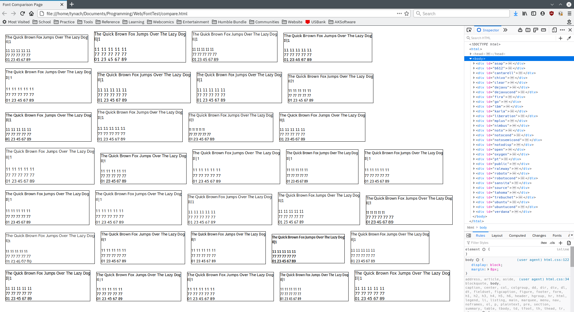
These are the fonts I evaluated:
- Asap
- B612
- Cantarell
- Chivo
- Clear Sans
- DejaVu Sans
- DejaVu Sans Condensed
- Fira Sans
- Go
- IBM Plex Sans
- Karla
- Liberation Sans
- M+ 2c
- Nimbus Sans L
- Noto Sans
- Noto Sans Semi Condensed
- Noto Sans Condensed
- Noto Sans Display
- Open Sans
- Oxygen-Sans
- PT Sans
- Public Sans
- Raleway
- Roboto
- Roboto Condensed
- Sansita
- Source Sans Pro
- Tahoma
- Trebuchet MS
- Ubuntu
- Ubuntu Condensed
- Verdana
And here is a screenshot comparing all of these, in order (I kept everything in alphabetical order to make things easier):
So, first of all, here are the fonts that are immediately disqualified for either not having italic variants, or not having something else that isn't captured in the screenshot:
B612
Font hinting is all over the place at medium sizes, and I mean all over the place. Each stem of the capital 'E' is a different width type of hinting issues, but not at the size I tested and not at larger sizes; just medium sizes.
Cantarell
No italics
M+ 2c (and all M+ variants, sadly)
While excellent fonts, they lack italics. The 'Migu 1C' and 'Migu 1P' forks deserve an honorable mention too, for adding serifs to the top/bottom of the capital 'i'.. Though they're only available in regular and bold, not even the other weights that the original M+ fonts have. And of course, still no italics.
Oxygen-Sans
The designer died before he could add proper italics... Otherwise this one looks like it might have ended up being my favorite.
Tahoma
Not only is it a Microsoft font and probably not legal to include anyway, but it also lacks italics. Otherwise not a bad font, so it's worth including in the comparison as a reference point.
Trebuchet MS
Lets face it, it's a pretty good font with italics and everything. But the licensing, man.. The licensing.
Verdana
Same as with Trebuchet MS, the licensing kills this one. Also, it's basically a version of Tahoma that has italics included and wider glyphs. Still, all these MS fonts that hide at the bottom of the alphabet are worthy of inclusion for comparison's sake.
Next, lets remove all the contenders that have ambiguity between uppercase 'i' and lowercase 'L' (and no, having a slight difference in height does not count... Usually they make the lowercase 'L' taller for some unfathomable reason, and my initial impression is always that the taller one is the capital letter, forcing me to think a bit. And I can only even catch that if they're right next to each other). Eliminating those leads to this list of finalists:
- Asap
- Chivo
- Clear Sans
- Fira Sans
- Go
- IBM Plex Sans
- Noto Sans
- Noto Sans Semi Condensed
- Noto Sans Condensed
- Noto Sans Display
- PT Sans
- Public Sans
- Raleway
- Sansita
- Source Sans Pro
- Ubuntu
One note about Open Sans is that it does have an alternate glyph for capital 'i' that includes the serifs. I don't actually know how to use it, but I can see it on this page by dragging the 'OpenSans-Regular.ttf' file to the top of the page, clicking 'OpenType Features', and enabling 'Stylistic Alternatives'. I'm assuming that it might not be easy to do this application-wide within Telegram, otherwise it would have been done already, so I'm not including it as a finalist.
Now, personally, the amount of text I can fit on a screen vertically is very important, especially when it comes to using Telegram. Telegram forces posts to be narrower than a desktop monitor could allow (something I think should be changed, but this is not the place for that discussion, so it's just being used as a given condition), and thus long posts take up more space vertically than on other instant messaging platforms.
I happen to know that my list of 'reference' bookmarks scrolls down the screen when I use either Noto Sans or Open Sans, so lets remove any fonts that have a bounding box on that test page I screenshotted before that has a height greater than or equal to the height of Open Sans' bounding box (116 px according to the inspection tools):
- Asap
- Chivo
- Fira Sans
- Go
- IBM Plex Sans
- PT Sans
- Public Sans
- Raleway
- Sansita
- Source Sans Pro
- Ubuntu
Next, lets eliminate any obviously too-bold fonts, or other fonts that are stylistically bad choices:
- Asap
- Fira Sans
- IBM Plex Sans
- PT Sans
- Public Sans
- Source Sans Pro
- Ubuntu
It might seem odd to eliminate Go but not Fira Sans; this is because Fira Sans has a font weight called 'Book' that makes it look just fine, while Go doesn't have such a weight.
PT Sans, on the other hand... Man, I'm torn. It's a very nice font, and I thought it was one of my favorites for the longest time, but it does have that slightly jarring disconnect on the Q, and other stylistic choices that might be seen as unwanted 'flair'. I'm keeping it for now, though.
Similarly, the Ubuntu family is rather.. Interestingly shaped. Stems on letters like 'n' and 'u' form a sharp corner instead of sticking out, and it's an interesting mixture of geometric shapes and humanist forms. I really like it, but I can see why that might not be to everyone's liking. I've left it in for now, though.
And now, based on variety of languages supported, I think I can narrow this down a biit further:
- Fira Sans
- IBM Plex Sans
- Source Sans Pro
- Ubuntu
The two fonts that seem the most promising to me are [Asap] (despite not making it to the final list) and IBM Plex Sans. Of the two, Asap saves the most vertical space, but IBM Plex has more variants/weights available, supports more languages, and distinguishes between capital 'i' and lowercase 'L' better by having both the serifs on the top/bottom of 'I' ('i'), and having a hook at the bottom of 'l' ('L'). Asap only has the latter (which, while sufficient for clearing up ambiguity, still leaves me looking twice when I see 'I' ('i') used by itself).
If it had been completed before Vernon Adams (the font's designer) died, Oxygen-Sans would have been one of my top contenders as well. As it is, it's without italic variants.
Source Sans Pro has smaller letters, so is a bit less legible to me than IBM Plex Sans. Since they have the same bounding box height of 110px, IBM Plex Sans wins me over between the two. Asap's much shorter box height (92, one of the shortest in the whole range of evaulated fonts) is all the more impressive though, given its glyphs are the same size as IBM Plex Sans' glyphs.
Then there's Fira Sans. It doesn't give equal widths to all the number digits, so it's out for my own personal use, but could still be a great choice for Telegram's UI. Out of all these finalists, it supports the largest variety of languages and has the best Unicode support. In that category, Source Sans Pro comes in at second place.
And finally, Ubuntu. It gets third place as far as Unicode support goes, but still definitely supports more glyphs than Open Sans still. But the question of whether its style is appropriate for Telegram is up for debate. Personally, I really like it - and it was (might still be?) the default UI font for the Ubuntu operating system for many years. It's legible, has a bounding box height on my test page of 98 (compared to IBM Plex Sans at 110, and Open Sans at 116), and has nicely sized glyphs. I also am a huge fan of the stylistic choices it makes, but this needs to be something everyone would be OK with, not just me, so I recognize those stylistic choices might be a con, not a pro.
All four of these fonts are at least on par with Open Sans, though IBM Plex Sans, admittedly, is borderline; I can't tell at a glance if it's sliightly better, sliightly worse, or exactly on par with Open Sans.
At any rate, I'd put the final 3 contenders as:
- Fira Sans
- IBM Plex Sans
- Ubuntu
Note: This is just my own personal preferences only. The developers might have different criteria they use for evaluating fonts, that make even this uh... Big rambling rant of a post completely irrelevant.
Really? I should probably edit this down and condense some stuff, maybe reorganize and add some headers in and...
... Aand it's almost 3 AM and I've literally been typing this all day long, off and on. Hm. I might be overthinking this, and also just be completely wrong about many of my decisions I've made. After all, one of the main fonts I was impressed with didn't even make the cut at the end (Asap), so obviously my preferences are at least slightly flawed.
Aanyway, I'm gonna just post what I've typed. Sorry if some of it is incoherent or contradicts itself.
 Tynach
on 1 Dec 2020
Tynach
on 1 Dec 2020
wow i was to say TL:DR but, hell read it xd
Aokromes
on 1 Dec 2020
Noto font isn't best for a normal desktop display. If anything this should be optional.
 ubone
on 14 Dec 2020
ubone
on 14 Dec 2020
Related issues
 Mindstormer619
·
3Comments
Mindstormer619
·
3Comments
 luisalvarado
·
3Comments
luisalvarado
·
3Comments
 JhonSane
·
3Comments
JhonSane
·
3Comments
 qwitriy
·
3Comments
qwitriy
·
3Comments
 Justinzobel
·
3Comments
Justinzobel
·
3Comments
Most helpful comment
@john-preston I think Telegram Desktop can afford users to set any installed fonts in Settings dialog.