Tdesktop: Make option to hide emoji panel more discoverable
Version 1.1 added a "feature" that shows a panel on the right that shows a list of emojis that can be inserted into a message.
While it can be disabled by clicking on the smiling face icon to the right of the text entry field, this behavior is not obvious. In fact, I had to refer to the closed GitHub issue #3398 to figure it out. A close button in the corner of the emoji panel, or even an option in application settings, would be much more discoverable.

 Maia-Everett
All 37 comments
@lucidfox You can click on the emoji icon to the right of the message input field.
 john-preston
on 15 May 2017
john-preston
on 15 May 2017
I know, but the behavior is so counterintuitive and non-discoverable that I had to browse closed issues on GitHub to find out about it. My suggestion is about providing a more obvious alternative, or at the very least making the connection between the icon and the panel more obvious in the UI.
Maia-Everett
on 15 May 2017
I'm pretty sure close button is necessary. Clicking on emoji icon is real unclear.
 farwayer
on 15 May 2017
farwayer
on 15 May 2017
I second lucidfox and farwayer's statements. I've had the emoji/sticker/gif pane open for over 4 hours before figuring out how to close it.
 AuditeMarlow
on 15 May 2017
AuditeMarlow
on 15 May 2017
You found it, I have to come here when I spent too many minutes to know how to hide it. I have already closed it, but please add an option.
I'd the panel open for many hours, until looked at issues.
Thank you very much,
 sgregori
on 15 May 2017
sgregori
on 15 May 2017
Another possible behavior would be to initially set emoji panel as closed.
This way user would discover the pane when first clicking on emoji icon, and so would reasonably expect that another click on the same icon would hide it.
 zclimber
on 15 May 2017
zclimber
on 15 May 2017
Thanks for this issue as i never found it myself...
Part to the fact that I'm primarly using it with my bot which has a custom keyboard. So no smiley icon to click on. First you have to close the keyboard and then you can disable the smileys...
 MWFIAE
on 15 May 2017
MWFIAE
on 15 May 2017
I actually had to search for it and ended up here to find out how to disable to emoji pane.
 LPenos
on 15 May 2017
LPenos
on 15 May 2017
Ended up here after hours of googling. Please, review this desicion, it is horrible.
 DeadMate
on 15 May 2017
DeadMate
on 15 May 2017
I went straight here after not being able to figure out how to close the panel in 2 minutes. I see two options on how to improve that. First one would be for the panel to be hidden by default for user to find out how to open/close it more easily as @zclimber suggested. Other option is what @lucidfox said. Just add an "x" button to the panel.
 pt300
on 15 May 2017
pt300
on 15 May 2017
The viber panel works exactly like this.

 diazbastian
on 15 May 2017
diazbastian
on 15 May 2017
An elegant solution to this could be just to highlight the emoji icon in the message bar.
It'd have the same highlight as the sections of the bar itself, so I reckon it'd work well.
Forgive the weird colouring:

 chessmango
on 16 May 2017
chessmango
on 16 May 2017
@chessmango highlighting would be a good idea, but not instead of a close x. When people want to close something, they click an x. There is no real reason to do it any differently here, IMO
 jaapz
on 16 May 2017
jaapz
on 16 May 2017
@jaapz Agreed. Both for best results. :stuck_out_tongue:
chessmango
on 17 May 2017
Support in the settings to add, I spent a long time unable to find the close button, was forced to switch to Mac version.
When I prepared to compile myself, I found the answer here.
:)
 kslr
on 17 May 2017
kslr
on 17 May 2017
In the latest version (1.1.2), a text popup appears above the emoji button that states you can close the pane by clicking on the emoji button again. In my opinion good enough so requesting to close this issue.
AuditeMarlow
on 18 May 2017
If you show help about bad UX it will not make it better. User can missed this 1s popup. He can forget about this behavior.
Adding all familiar X is very simple and right solution. It will prevent to show this unneeded non-expected toast.
farwayer
on 18 May 2017
@farwayer The X button there doesn't fit with the design :(
You see the emoji icon displayed active when the column is shown and inactive when it is not, it also gives you an understanding that they're related.
john-preston
on 18 May 2017
I found the popup kinda hilarious, because I clicked the popup itself because it said "Click here" and it didn't work. I feel the UI is even more unclear because of it now.
 TheLastProject
on 18 May 2017
TheLastProject
on 18 May 2017
@TheLastProject It is a tooltip with a special arrow in it ¯_(ツ)_/¯
john-preston
on 18 May 2017
If you show help about bad UX it will not make it better. User can missed this 1s popup. He can forget about this behavior.
I concur. The tooltip is a step in the right direction, but it's still easy to miss. The right answer to a counterintuitive UI decision is not to present a distracting tooltip that nonetheless goes away in a couple of seconds (so the user can miss it), but provide a standard solution.
The X button there doesn't fit with the design :(
I fail to see how an X button in the top right corner of a panel doesn't fit the design of an application that already uses buttons (including X buttons) in top right corners of panels:

Maia-Everett
on 18 May 2017
@lucidfox It doesn't fit specifically there because of the tabs with centered text in them, not because it is a button or because it is an X.
john-preston
on 18 May 2017
So reserve a little space on the right for the X button and make each tab use 1/3 of the remaining space, with centered text.
In fact, that's what I did on the picture in the original post - I edited it, shrinking each tab a little to make room for the button.
Maia-Everett
on 18 May 2017
To support the argument that at least the current set-up is bad UX with some anecdotal evidence. Me, plus three coworkers were all searching for a way to close the panel after the update, only discovering how it actually worked by finding this issue on github.
jaapz
on 18 May 2017
+1
I could not figure this out either, and i use telegram only in full screen so it was very annoying I could not close it.
Suggestion: maybe just disable it by default in the next version. If people want it, they can figure it out themselves, and well if they enable it by clicking that smiley icon, they will figure out they need to click that again to make it go away. I believe the problem was that it was enabled by default, also the explanation was a bit wrong saying that it "automatically" shows up, not mentioning you can close it.
Update:
The thing is after I disable it, the text is still showing up as if it still was enabled, but probably that's another bug.
 purplesrl
on 19 May 2017
purplesrl
on 19 May 2017
Shoot I would never think that I can disable sticker panel by clicking on emoji icon without reading this issue. There should definitely be a more obvious way to close the panel.
 restyler
on 8 Jun 2017
restyler
on 8 Jun 2017
Oh wow... I was looking for this button everywhere. I was about to make a new ticket. Thanks for showing me where it was!
 BoffinBrain
on 19 Jul 2017
BoffinBrain
on 19 Jul 2017
Maybe reuse the new channel / group / person info sidebar and merge it with emojis / gifs / pics?
https://i.imgur.com/5jjCHak.jpg
 Aokromes
on 12 Dec 2017
Aokromes
on 12 Dec 2017
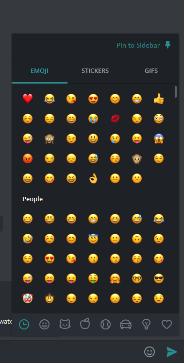
To be honest, I'd still prefer if the button didn't do anything on hover (to avoid accidentally opening it when moving the mouse over the corner of the window) and just opened the emoji popup on click. Once that popup is open, you can have a 'pin to sidebar' button with a pin icon in the corner. Please excuse the shoddy pin icon I drew in Paint! Also, I probably used the wrong theme color and it should be in gray, not green.
BoffinBrain
on 13 Dec 2017
3267 ?
Aokromes
on 6 Jan 2018
I had to come to this thread to find out how to close that window. Thank you!
 securitywyrm
on 19 Jan 2019
securitywyrm
on 19 Jan 2019
I had to come to this thread to find out how to close that window. Thank you!
Me too!
But my younger son (23 year old) found solution about 35 seconds. I think (maybe) put a legend on happy face "HIDE ME" but for every language is a bigger problem...
I want contribute to close this issue, please see this tweet for further details about this kind of problem:
https:/twitter.com/Karrenbacs/status/1190628095058960384
 ks7000
on 5 Nov 2019
ks7000
on 5 Nov 2019
It is 2020 and I ended up here googing on how to close this ANNOYING panel. Yea, I used it before, but I just forgot how to close it today. This is annoying. Probably I got he popup explaining me how to do things three years ago. Once.
I'm old and have ADHD. I don't bother to remeber such things.
 froh42
on 16 Apr 2020
froh42
on 16 Apr 2020
I came here to find out how to close the emoji panel.
 hkBattousai
on 30 May 2020
hkBattousai
on 30 May 2020
Couldn't figure out how to close the emoji panel -- ended up here (thanks to the search engine).
 foobargeez
on 2 Jun 2020
foobargeez
on 2 Jun 2020
Hey there!
This issue will be automatically closed in 7 days if there would be no activity. We therefore assume that the user has lost interest or resolved the problem on their own.
Don't worry though; if this is an error, let us know with a comment and we'll be happy to reopen the issue.
Thanks!
![stale[bot] picture](https://avatars3.githubusercontent.com/in/1724?v=4&s=40) stale[bot]
on 23 Oct 2020
stale[bot]
on 23 Oct 2020
this is very funny (stale bot) from the Telegram Desktop developers, but well its expected, we close the issue because the user lost interest, how is that? when you comment too much they say 'please stop commenting on this issue' (see Telegram Desktop encryption issue), now they added a bot to disable the idle issues, meaning that if nobody replies for some time the issue does not need to be fixed anymore, which is great! wish I could do the same at my workplace!
purplesrl
on 25 Oct 2020
Related issues
 whywhyy
·
3Comments
whywhyy
·
3Comments
 beppe9000
·
3Comments
beppe9000
·
3Comments
 JhonSane
·
3Comments
JhonSane
·
3Comments
 ArmeF97
·
3Comments
ArmeF97
·
3Comments
 LeonTheOriginal
·
3Comments
LeonTheOriginal
·
3Comments
Most helpful comment
I'm pretty sure close button is necessary. Clicking on emoji icon is real unclear.