Tcomb-form-native: How can I changing Piker in select
Hi. I want to changing select piker in tcomb-form-native for using piker filtering, for that I used react-native-modal-filter-picker and I created my template select like this:
import React from 'react';
import { View, Text, StyleSheet } from 'react-native'
import SelectFiltring from './SelectFiltring';

function select(locals) {
  if (locals.hidden) {
    return null;
  }

  var stylesheet = locals.stylesheet;
  var formGroupStyle = stylesheet.formGroup.normal;
  var controlLabelStyle = stylesheet.controlLabel.normal;
  var selectStyle = Object.assign({}, stylesheet.select.normal, stylesheet.pickerContainer.normal);
  var helpBlockStyle = stylesheet.helpBlock.normal;
  var errorBlockStyle = stylesheet.errorBlock;
  var bordercolor = '#cccccc';

  if (locals.hasError) {
    alert(locals.value)
    formGroupStyle = stylesheet.formGroup.error;
    controlLabelStyle = stylesheet.controlLabel.error;
    selectStyle = stylesheet.select.error;
    helpBlockStyle = stylesheet.helpBlock.error;
    bordercolor = '#a94442';
  }

  var label = locals.label ? <Text style={controlLabelStyle}>{locals.label}</Text> : null;
  var help = locals.help ? <Text style={helpBlockStyle}>{locals.help}</Text> : null;
  var error = locals.hasError && locals.error ? <Text accessibilityLiveRegion="polite" style={errorBlockStyle}>{locals.error}</Text> : null;

  var options = [];

  getOptions = () => {
    locals.options.map(({value, text}) => {
      //<Picker.Item key={value} value={value} label={text} />
      options.push({key: text, label: text});
    });
  }

  setSelectedValue = (value) => {
    if(value) {
      locals.value = value;
      locals.hasError = false;
      locals.error = null;
    }
  }

  return (
    getOptions(),
    <View style={formGroupStyle}>
      {label}
      <View style={[styles.container, { borderColor: bordercolor }]}>

        <SelectFiltring
          options={options}
          setSelectedValue={this.setSelectedValue.bind(this)}
          selectedValue={locals.value}
        />

      </View>

      {help}
      {error}
    </View>
  );
}

const styles = StyleSheet.create({
  container: {
    borderWidth: 1,
    height: 50,
    paddingLeft: 10,
    paddingRight: 10,
    borderRadius: 9,
    backgroundColor: 'white'
  }
})

module.exports = select;
Also the Piker component is like this:
import React, { Component } from 'react';
import { View, Text, Picker, TouchableOpacity, StyleSheet, Dimensions } from 'react-native'
import ModalFilterPicker from 'react-native-modal-filter-picker'
const { width, height } = Dimensions.get('window')
import Icon from 'react-native-vector-icons/FontAwesome';

export default class SelectFiltring extends Component {
    constructor(props, ctx) {
        super(props, ctx);

        this.state = {
            visible: false,
            picked: null,
        };
    }

    render() {
        const { visible, picked } = this.state;

        return (
            <View>

                <TouchableOpacity style={styles.buttonContainer} onPress={() => { this.onShow() }}>
                    <Text>{picked? picked: this.props.options[0].label}</Text>
                    <Icon name="angle-down" size={45} color="bordercolor" />
                </TouchableOpacity>

                <ModalFilterPicker
                    visible={visible}
                    onSelect={(selectedPiked) => { this.onSelect(selectedPiked) }}
                    onCancel={() => { this.onCancel() }}
                    options={this.props.options}
                />

            </View>
        );
    }

    onShow = () => {
        this.setState({ visible: true });
    }

    onSelect = (picked) => {
        this.setState({
            picked: picked,
            visible: false
        });
        this.props.selectedValue = picked;
        //alert(this.props.selectedValue);
        this.props.setSelectedValue(picked);
    }

    onCancel = () => {
        this.setState({
            visible: false
        });
    }
}

const optionStyle = {
    flex: 0,
    flexDirection: 'row',
    justifyContent: 'center',
    alignItems: 'center',
    paddingVertical: 10,
    paddingHorizontal: 10,
    borderBottomWidth: 1,
    borderBottomColor: '#eee'
}

const optionTextStyle = {
    flex: 1,
    textAlign: 'left',
    color: '#000',
    fontSize: 22
}

const styles = StyleSheet.create({
    container: {
        borderWidth: 1,
        height: 50,
        paddingLeft: 10,
        paddingRight: 10,
        borderRadius: 9,
        backgroundColor: 'white'
    },
    buttonContainer: {
        flexDirection: 'row',
        alignItems: 'center',
        justifyContent: 'space-between',
        marginTop: 0,
        paddingLeft: 2,
        //paddingRight: 2
    },
    overlay: {
        position: 'absolute',
        top: 0,
        left: 0,
        right: 0,
        bottom: 0,
        backgroundColor: 'rgba(0,0,0,0.85)',
        justifyContent: 'center',
        alignItems: 'center'
    },
    titleTextStyle: {
        flex: 0,
        color: '#fff',
        fontSize: 20,
        marginBottom: 15
    },
    listContainer: {
        flex: 1,
        width: width * 0.8,
        maxHeight: height * 0.7,
        backgroundColor: '#fff',
        borderRadius: 0,
        marginBottom: 15
    },
    cancelContainer: {
        flex: 0,
        flexDirection: 'row',
        justifyContent: 'center',
        alignItems: 'center'
    },
    cancelButton: {
        flex: 0,
        backgroundColor: '#999',
        paddingVertical: 10,
        paddingHorizontal: 20,
        borderRadius: 10
    },
    cancelButtonText: {
        textAlign: 'center',
        fontSize: 18
    },
    filterTextInputContainer: {
        borderBottomWidth: 1,
        borderBottomColor: '#999'
    },
    filterTextInput: {
        paddingVertical: 10,
        paddingHorizontal: 15,
        flex: 0,
        height: 50
    },
    categoryStyle: {
        ...optionStyle
    },
    categoryTextStyle: {
        ...optionTextStyle,
        color: '#999',
        fontStyle: 'italic',
        fontSize: 16
    },
    optionStyle: {
        ...optionStyle
    },
    optionStyleLastChild: {
        borderBottomWidth: 0
    },
    optionTextStyle: {
        ...optionTextStyle
    },
    selectedOptionStyle: {
        ...optionStyle
    },
    selectedOptionStyleLastChild: {
        borderBottomWidth: 0
    },
    selectedOptionTextStyle: {
        ...optionTextStyle,
        fontWeight: '700'
    },
    noResults: {
        flex: 0,
        justifyContent: 'center',
        alignItems: 'center',
        paddingVertical: 10,
        paddingHorizontal: 10
    },
    noResultsText: {
        flex: 1,
        textAlign: 'center',
        color: '#ccc',
        fontStyle: 'italic',
        fontSize: 22
    }
})
I used the following ligne for linking the template with the tcomb select:
template: require('./selectTemplate')
But I can't get the selected value and always locals.hasError = true.
Help me please.
 abdelghafourzguindou
All 4 comments
hi @zGuindouGit
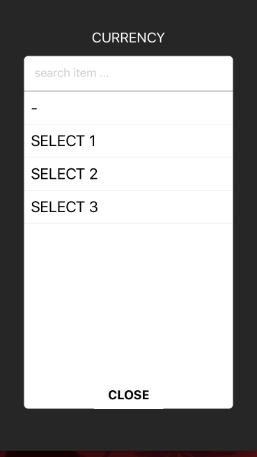

I edit the code from you and it runs fine
https://github.com/hiddentao/react-native-modal-filter-picker/issues/2
 herarya
on 25 Aug 2017
herarya
on 25 Aug 2017
Thanks++ @herarya
abdelghafourzguindou
on 25 Aug 2017
@zGuindouGit i think you forget locals.onChange(value)
full code https://gist.github.com/herarya/85a79b45415e13169b708e1a3be70e6c
herarya
on 28 Aug 2017
thanks @herarya , but how can i customise the picker in tomb-form component? any full example for it?
 Dannnyho
on 24 Apr 2018
Dannnyho
on 24 Apr 2018
Related issues
 timdoes
·
4Comments
timdoes
·
4Comments
 muthuraman007
·
4Comments
muthuraman007
·
4Comments
 pgmemk
·
4Comments
pgmemk
·
4Comments
 pocesar
·
4Comments
pocesar
·
4Comments
 newbreedofgeek
·
6Comments
newbreedofgeek
·
6Comments
Most helpful comment
@zGuindouGit i think you forget
locals.onChange(value)full code https://gist.github.com/herarya/85a79b45415e13169b708e1a3be70e6c