Tasks: Highlight selected task / mouse over highlighting (maybe use priority colours)
As the title says:
It would be great if one could see which task from the list is getting displayed in the detail view to the right. A light grey background or shading might do the trick.
Also, a mouse over triggering that shading might be interesting to have as well.
I am well aware, that this is just a visual thing, but especially the selected task being highlighted can improve the usability a lot. The priority colours could be used for that as well. I think a light shade of the priority colour could do wonders here as well.
 RuudschMaHinda
All 12 comments
The selected task as well as the task which is hovered by mouse are already highlighted. They get a light grey background compared to the white background of a normal task.
Do you propose to change this color?
 raimund-schluessler
on 30 Aug 2017
raimund-schluessler
on 30 Aug 2017
Oh!
I wish I could code well enough. No. This was more of a design suggestion. I wouldn't even know where to start. Let alone having to brush up on my CSS and JS. I am just an admin that gets several requests of an app like 'Tasks', and shown alternatives which "just look so easy to use" - but of course are hosted by a company that (rightfully so) wants to charge money for their servers and additional features ('todoist' gets dropped a lot). And I found that this would help with the visual feedback the users are getting.
RuudschMaHinda
on 30 Aug 2017
But this is already implemented. So what is your concern?
raimund-schluessler
on 30 Aug 2017
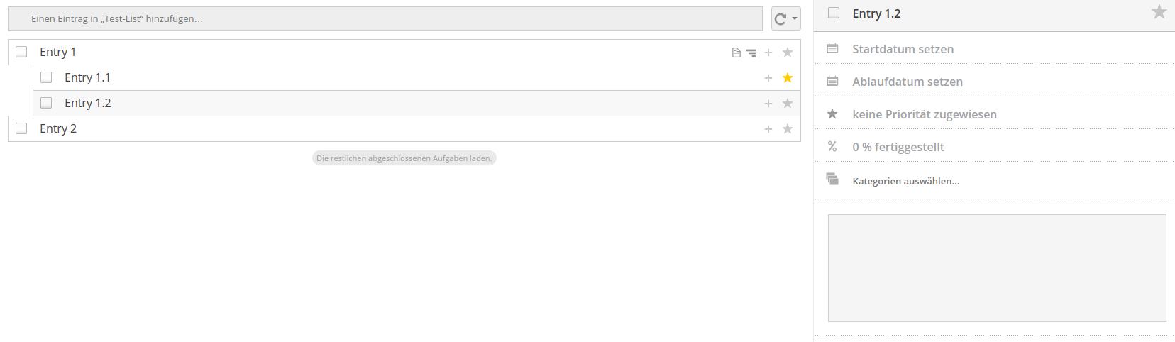
This is what it currently looks like when an Entry (Entry 1.2) is selected.
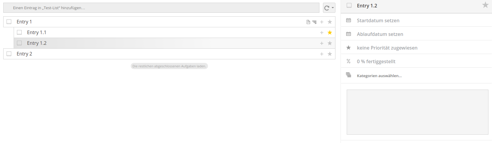
This is what I am suggesting it might look like when the same Entry is selected:
And here is my idea for the priority being shown for the selected Entry (Entry 1.1)
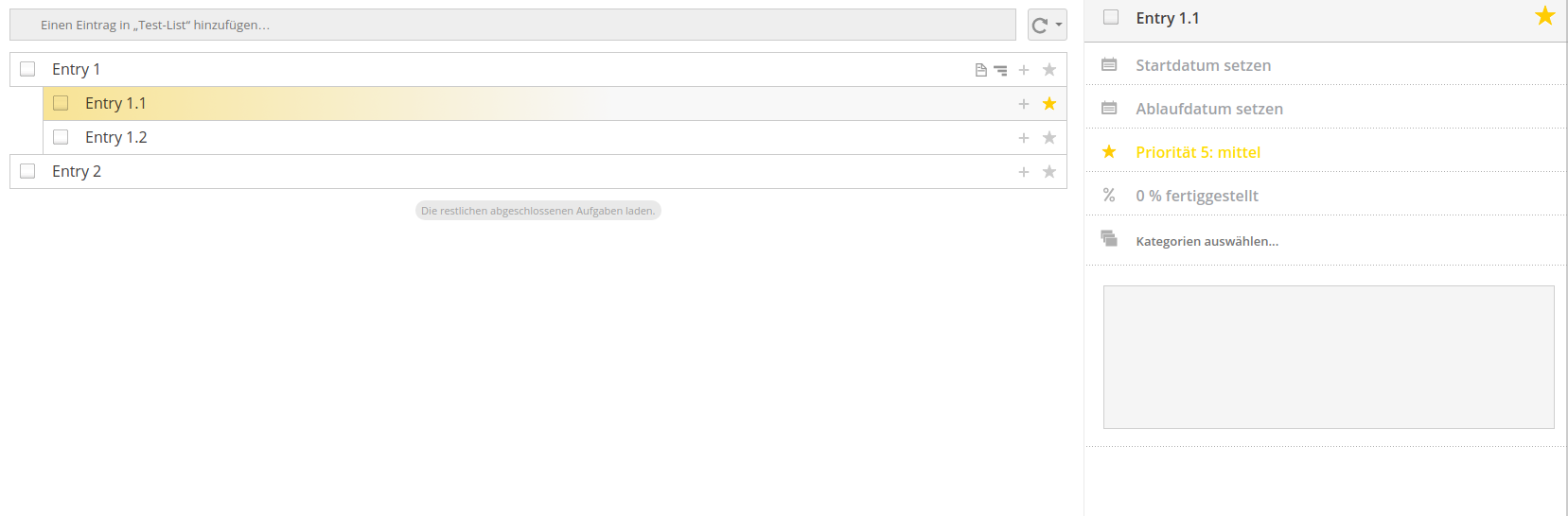
I just used a gradient of the star colour at an opacity of 40%. Done with the gimp, since I am no coder. Of course, the colour can only be a bleak grey. Just to indicate which task has been selected to be displayed on the right hand side of the screen.
If this is already implemented, I must be doing something wrong.
Latest version from the app store installed (0.9.5) on Nextcloud 12.0.2
RuudschMaHinda
on 30 Aug 2017
In your first image, you see that Entry 1.2 has a slightly darker background color than the other entries. Maybe it is hard to see on your screen.
So you suggest to make the background darker / change the color to make that more obvious, I guess?
raimund-schluessler
on 30 Aug 2017
Oh my!
That is really embarrassing! I am so sorry. Yeah, It really was my screen all along.
Well. I still like the gradient.
Anyways: Thank you for pointing out my monitor was set up all wrong, and apologies for taking up your time with this trivial matter.
RuudschMaHinda
on 30 Aug 2017
Don't worry, we could still change the color of the highlighting and make it darker to make that more obvious. You are probably not the only one with a suboptimal monitor configuration 😉
@nextcloud/designers What do you think, should we make the background color slightly darker? Is there probably a default color for such things?
raimund-schluessler
on 30 Aug 2017
Yes there is, look at the scss variables in core! :)
https://github.com/nextcloud/server/blob/master/core/css/variables.scss
 skjnldsv
on 30 Aug 2017
skjnldsv
on 30 Aug 2017
Thanks, I will have a look.
raimund-schluessler
on 30 Aug 2017
What do you think abouth highlighting the selected task similar to how we highlight a selected calendar/list with a box-shadow in the left side @nextcloud/designers :

I have implemented this in the Vue branch, but we can adjust it if necessary.
raimund-schluessler
on 21 Oct 2018
I must say, this small change would really increase the usability of Tasks. I am very much hoping this change will make it into the code.
I know quite a few of my users who will have a sigh of relief once they see that.
RuudschMaHinda
on 21 Oct 2018
PR is in #211
raimund-schluessler
on 22 Oct 2018
Related issues
 CordlessWool
·
8Comments
raimund-schluessler
·
8Comments
raimund-schluessler
·
7Comments
CordlessWool
·
8Comments
raimund-schluessler
·
8Comments
raimund-schluessler
·
7Comments
 gjgd
·
6Comments
gjgd
·
6Comments
 janvonde
·
8Comments
janvonde
·
8Comments
Most helpful comment
What do you think abouth highlighting the selected task similar to how we highlight a selected calendar/list with a box-shadow in the left side @nextcloud/designers :
I have implemented this in the Vue branch, but we can adjust it if necessary.