Talk-android: Design : enable a more compact display of the text messages
Hi !
when using NC talk (text messages) on Android (8.0, latest released version), I find that the display of chats is not taking advantage of the screen estate :
when the keyboard is visible NC talk displays only 7 lines of text (among 2 people's msg) while whatsapp displays 11, and signal 11 as well.
I findh that the font is too big and the spacing betwenn the bubbles is to large + the empty space within a bubble (between text and border) is too large as well.
Am I the only one to wish for a way more compact design ?
Thanks
 GLLM
GLLM
All 47 comments
Good point. Our text is not even bigger than in Signal.
We can put the time into the bubble, and next to it display a sent confirmation as mentioned in #219. And the padding of the bubble can be reduced.
 jancborchardt
on 27 Jun 2018
jancborchardt
on 27 Jun 2018
Time was initially in the bubble. Then we moved it out of the bubble. Are we really moving it OUT of the bubble again?
 mario
on 27 Jun 2018
mario
on 27 Jun 2018
cc @skjnldsv
mario
on 27 Jun 2018
@mario if that's a problem, focus on only the bubble padding first.
jancborchardt
on 27 Jun 2018
I'm not sure this is a trivial change at this point.
mario
on 27 Jun 2018
I would stack all the messages from the same user during a specific period of time. :)
 skjnldsv
on 27 Jun 2018
skjnldsv
on 27 Jun 2018
@skjnldsv that's planned and in a separate issue already - we agreed to do this already ;)
mario
on 27 Jun 2018
So lower the bubble padding and stack up should be enough?
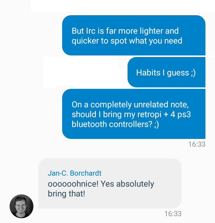
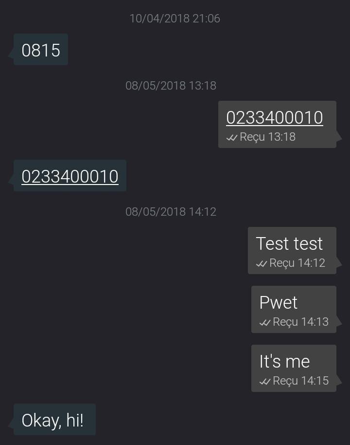
As a reference: my sms app which I really like
skjnldsv
on 27 Jun 2018
This is exactly what I'll do. Eventually.
mario
on 27 Jun 2018
You rocks!
@jancborchardt opinions? :)
skjnldsv
on 27 Jun 2018
Cool! I mean, to be clear, only reducing the bubble padding is fine. The rest of the style, like the big bubble border-radius is great.
jancborchardt
on 2 Jul 2018
The large radius is bit too large IMHO .... sooooo iphone3ish :-)
GLLM
on 2 Jul 2018
4dp
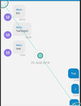
vs
8dp
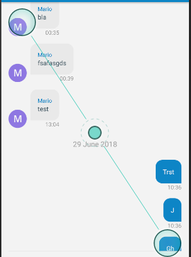
@jancborchardt @skjnldsv ?
mario
on 2 Jul 2018
Currently it's 8dp.
mario
on 2 Jul 2018
Could you try 2dp?
Also I kind of agree that the radius is too big @jancborchardt .
Could we lower it to something like we have on the server? 3px?
skjnldsv
on 3 Jul 2018
@skjnldsv can you clarify what radius are you referring to?
mario
on 3 Jul 2018
The radius of the bubbles, it feels too big compared to what we're using on the server: https://github.com/nextcloud/server/blob/master/core/css/variables.scss#L50
2dp was for the padding :)
skjnldsv
on 3 Jul 2018
@skjnldsv it is currently 15dp. And you want it 3dp?!
mario
on 3 Jul 2018
@mario I need to see before :p
I have no idea what 3dp looks like
skjnldsv
on 3 Jul 2018
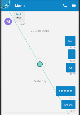
2dp padding between bubbles, 3dp border radius xD
mario
on 3 Jul 2018
Very ugly!
mario
on 3 Jul 2018
Aaah, far better :D
Not sure @jancborchardt agree though. What are your thought @mario ?
skjnldsv
on 3 Jul 2018
I think the padding between bubbles is fine, but the border radius is super super ugly.
Let me try 6dp.
mario
on 3 Jul 2018
I can live with 8dp.
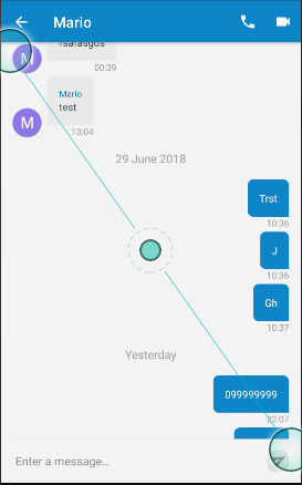
mario
on 3 Jul 2018
So ... 2dp, 8dp it is!
mario
on 3 Jul 2018
Not a big fan :)
Signal, textra, whatsapp, snapchat... all uses small radius. I guess 8dp is better that what we currently have though, but maybe an inbetween like 6 is better ;)
Also: your screenshots could benefit from more pixels :p
Hard to see on low res, especially on the radius anti aliasing
skjnldsv
on 3 Jul 2018
I can do 6 as a compromise.
mario
on 3 Jul 2018
@jancborchardt @skjnldsv final:
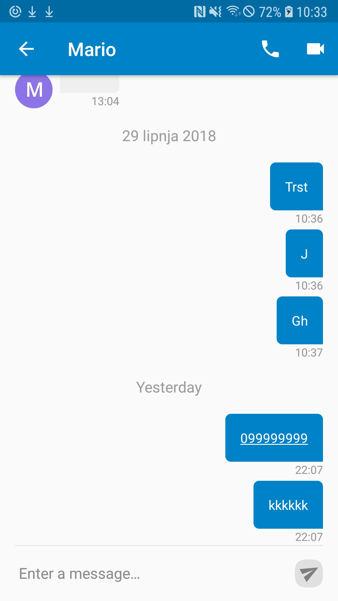
mario
on 3 Jul 2018
hey all !
just wondering : why are we keeping that large of a space/padding between teh text within a bubble and the border of the bubble ?
It just looks sooo big (to me, at least) :
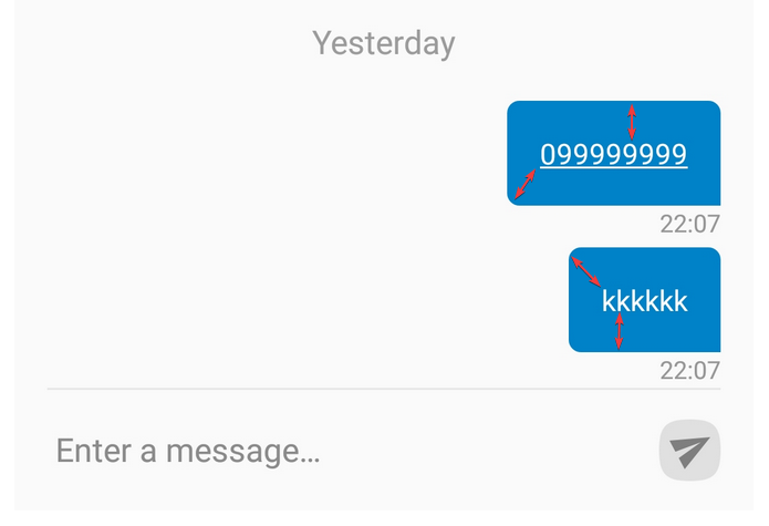
I would say, personally, that something between half and two-third of the current spacing would be a great improvement.
GLLM
on 3 Jul 2018
@skjnldsv and @jancborchardt to the rescue.
mario
on 3 Jul 2018
I kind of agree, @jancborchardt to the rescue then? :laughing:
skjnldsv
on 3 Jul 2018
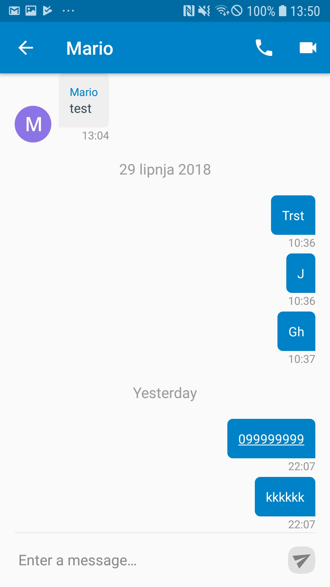
@GLLM @skjnldsv @jancborchardt
mario
on 3 Jul 2018
Better?
mario
on 3 Jul 2018
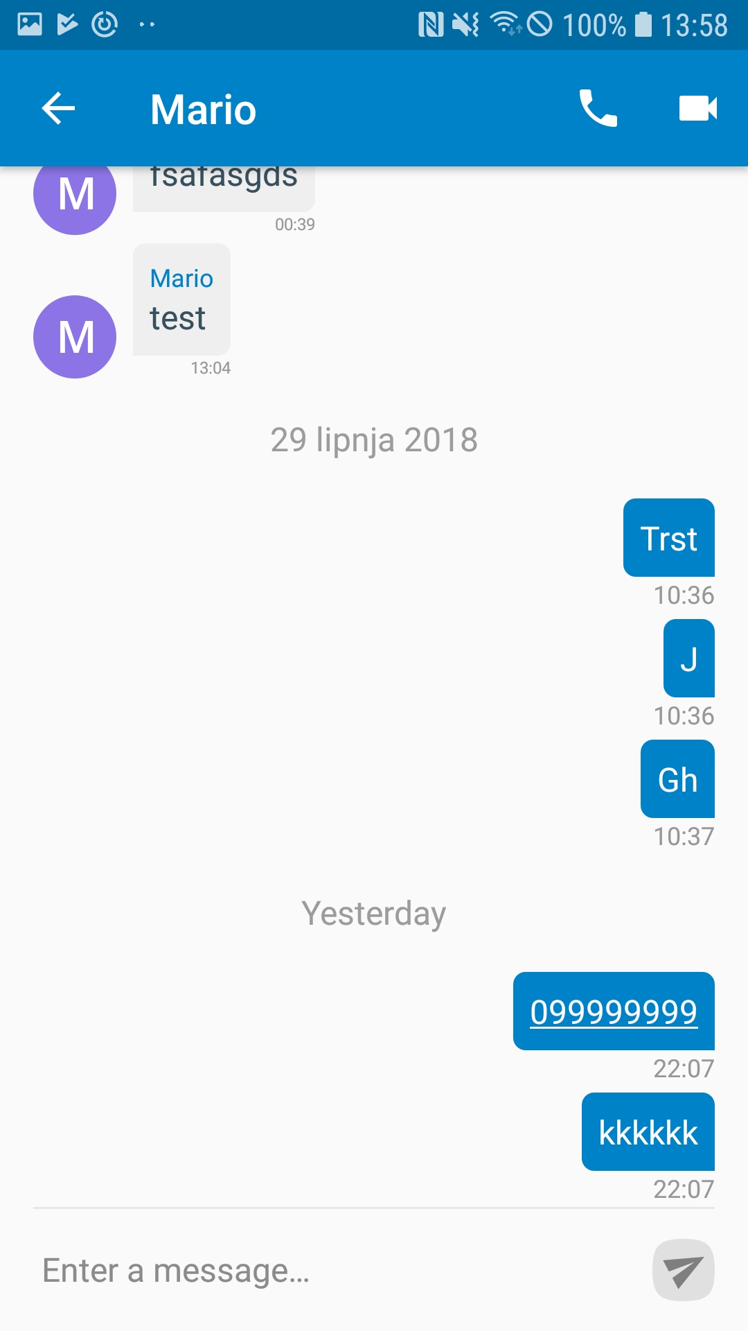
It still seems there is a lot of padding? As a baseline, could you simply use the _same_ measure as Signal uses?
Also, the text size is quite small. The date divider size is bigger than the text. Text size should be increased to be same size as date divider.
jancborchardt
on 3 Jul 2018
It's 8dp vs 16dp.
mario
on 3 Jul 2018
Sorry, 12dp vs 16dp. I'll set it to 8 and be done with it. Text increased from 16dp to 14dp.
mario
on 3 Jul 2018
mario
on 3 Jul 2018
Nice!
skjnldsv
on 3 Jul 2018
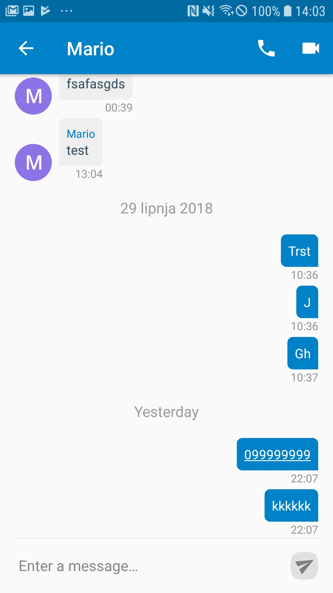
I dislike the big text size heavily. The padding is fine, but I have to reduce the text size.
mario
on 3 Jul 2018
Final design:
mario
on 3 Jul 2018
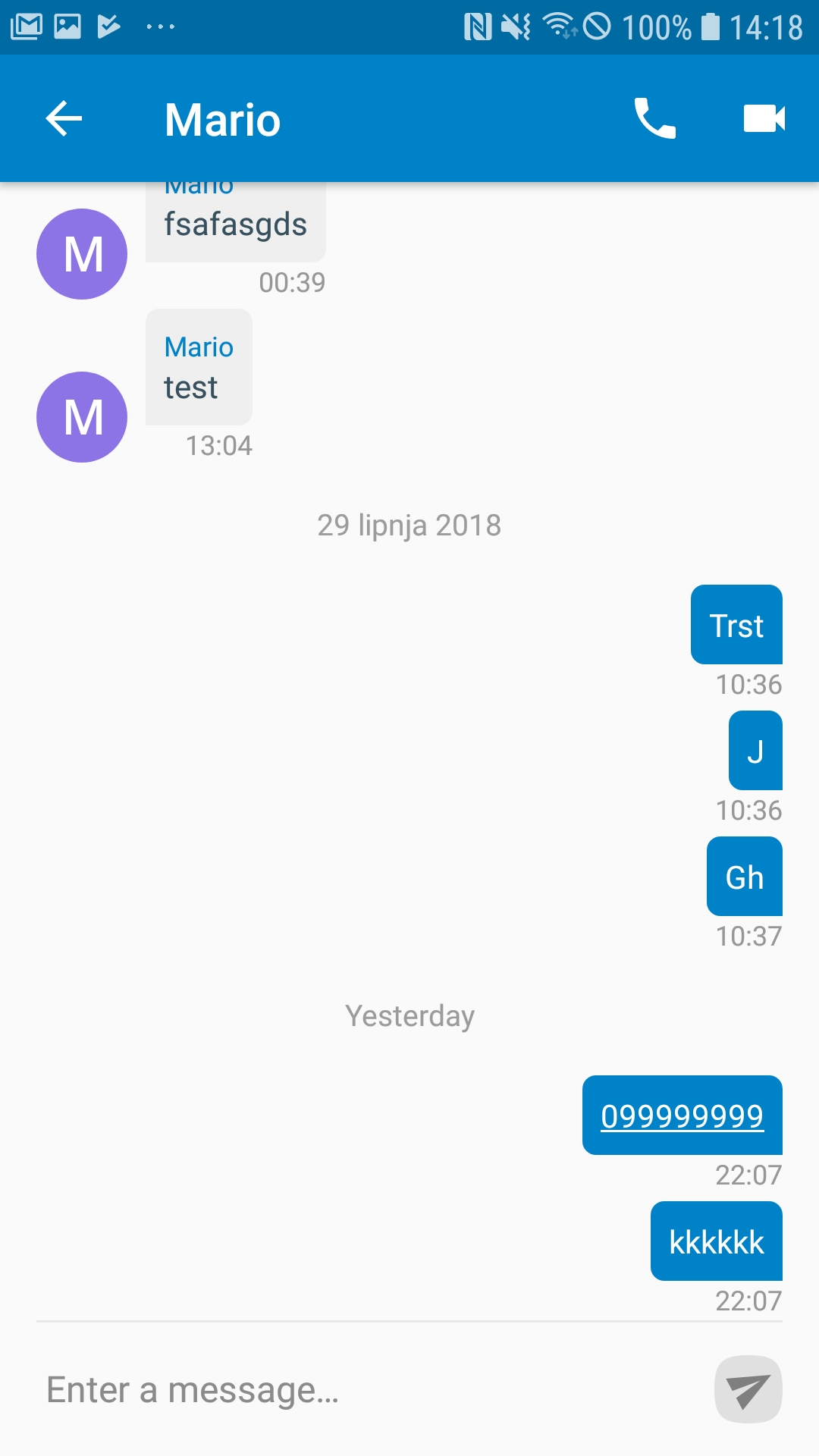
(Btw. date divider is bigger on purpose)
mario
on 3 Jul 2018
After thinking about it, made is smaller.
mario
on 3 Jul 2018
@mario : your last attempt looks really good :) I like it this way !
I wont bugger for more changes if padding / spacing remains like this !
Suggestion along with date separator, a very thin grey line ... like this ?
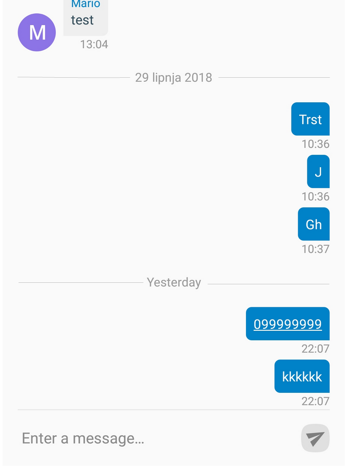
Unless you need anotehr Issue for this, b/c it is unrelatd with the spacing ! :)
GLLM
on 3 Jul 2018
I'd need another issue, but I'd close it right away, sorry :P
One wish at a time :D
mario
on 3 Jul 2018
No worries ... Be careful what you wish for :)
GLLM
on 3 Jul 2018
Sorry, this is not about liking or disliking but about readability on mobile. The text size is too small. The one in your earlier screenshot was perfect: https://github.com/nextcloud/talk-android/issues/218#issuecomment-402129987
jancborchardt
on 5 Jul 2018
@jancborchardt : not sure who your last message was meant for ! :-)
I kinda disagree ;-)
But then, let's have a setting for the font size, like every 2018-ear messaging app ....
On bigger screen smartphone (such as mine) , I feel like I'm visually deficient with such a big font ! (no offense meant to visually deficient people)
GLLM
GLLM
on 5 Jul 2018
Related issues
mario
·
6Comments
 jakobroehrl
·
4Comments
jakobroehrl
·
4Comments
 tobiasKaminsky
·
3Comments
tobiasKaminsky
·
3Comments
 jookk
·
6Comments
jookk
·
6Comments
 nickvergessen
·
3Comments
nickvergessen
·
3Comments
Most helpful comment