Tailwindcss: Placeholder color for input and textarea is off the default color palette
Tailwind's default color palette is great for creating quick and consistent designs. Having some of the colors assigned by default (eg border-color) also contributes to consistency a lot.
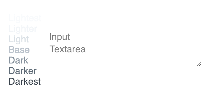
Currently placeholder in inputs and textareas has the default half-transparent black color which makes forms look a little off. Since inputs are present in almost every project (my guess), maybe matching placeholder's color to the Tailwind's palette by default could be a good idea?
 andgordio
All 4 comments
By default we actually set the placeholder to the same color as the text for the input, but with the opacity dropped to 50%. We did this because it seemed like a sane way to match the actual text color simply, for example if you have an error state on a form field and you make the text red, the placeholder will become a semi-transparent red:

Agree in a perfect world it would just be a proper color from the palette instead of using the opacity hack, but I think until we natively add support for styling placeholders with utilities (like placeholder-grey-light or something), what we have now is probably the best solution 😕
The tricky thing with providing native support for placeholder styles is it's hard to decide whether it should be a utility (like placeholder-red) or a variant (like placeholder:text-red). A variant probably makes the most sense and would be easy to add, so maybe we can get something like that in for the next release.
 adamwathan
on 7 Feb 2019
adamwathan
on 7 Feb 2019
Thanks for the detailed explanation! I was also delighted to learn from your latest journal post that people who rely on default styles are not a niche group of Tailwind users.
Having placeholder's opacity set to .5 makes sense, and having access to changing its style through a utility or a variant could be a great addition to the framework. Meanwhile, I have another suggestion on how to fit placeholder's look into palette, and I'm sorry if it gets too picky 😶
Do you think it makes sense to set the default style for placeholder to Tailwind's black instead of pure black (and keeping the opacity set to .5)? The change is not of the most pronounced ones, but it does remove false-red saturation that pure-black placeholder receives from all the blue-saturated greys around it:
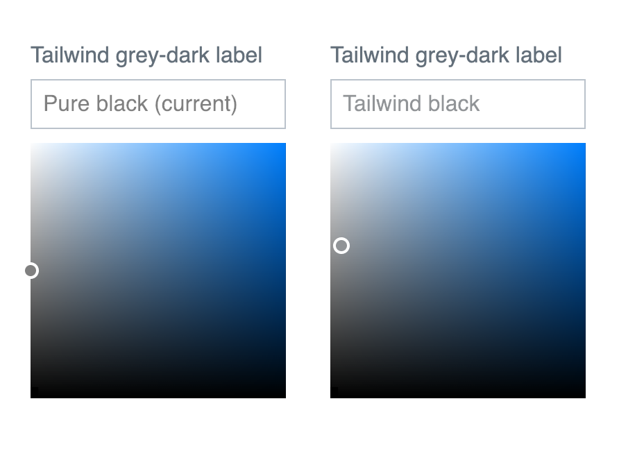
I realize this may lead to inconsistencies because the default text color is pure black, and that is done for a reason. But I still believe this minor fix could improve the default look of forms created with Tailwind without breaking Tailwind's design system. For example, iOS — a design system that I believe took saturated greys mainstream — uses purple greys almost everywhere, including placeholders, and pure black for text:

Anyway, thanks for your great work!
andgordio
on 7 Feb 2019
Do you think it makes sense to set the default style for placeholder to Tailwind's black instead of pure black (and keeping the opacity set to .5)?
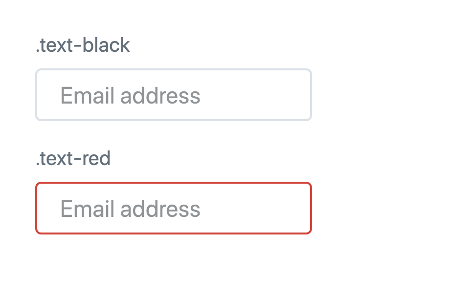
Because the placeholder color is inherited from the current color you can already do this by setting text-black on your input/textarea:
<input class="text-black">
Personally I add text-black (and a few other defaults) to the body tag so that it's used as the default for the entire site:
<body class="text-black leading-tight font-sans">
  <!-- ... -->
</body>
The problem with hardcoding a default for placeholders is that the placeholder color wouldn't update as the text color changes. Currently the placeholder is always based on the text color:
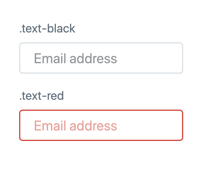
If we hardcoded a default placeholder color, the placeholder would be grey even in the red input:
So I think until we make it possible to customize the placeholder color with utilities, the current default is the most useful.
adamwathan
on 7 Feb 2019
Personally I add
text-black(and a few other defaults) to thebodytag so that it's used as the default for the entire site
This actually does the job of styling forms within the color palette, thanks!
Looking forward to a placeholder utility/variant in future releases 🤞
andgordio
on 7 Feb 2019
Related issues
 ouun
·
3Comments
ouun
·
3Comments
 nternetinspired
·
3Comments
nternetinspired
·
3Comments
 rgaufman
·
3Comments
rgaufman
·
3Comments
 AlexVipond
·
3Comments
AlexVipond
·
3Comments
 chintanbanugaria
·
3Comments
chintanbanugaria
·
3Comments
Most helpful comment
This actually does the job of styling forms within the color palette, thanks!
Looking forward to a placeholder utility/variant in future releases 🤞