Tailwindcss: @screen not working
Has anyone tried using the @screen directive? Doesn't seem to reflect in the compiled CSS. Here is what I'm trying to do:
.main-nav .nav-item {
  @apply .inline-block .uppercase .font-bold .mr-4 .pb-3 .border-b-4 .border-transparent;
  @screen sm {
    @apply .block;
  }
}
The first @apply rules work but the @screen directive does not reflect.
Thanks!
 chrisbjr
All 8 comments
Hey @chrisbjr ,
the @screen atRule works, but not as you expect it.
Try this one.
.main-nav .nav-item {
  @apply .inline-block .uppercase .font-bold .mr-4 .pb-3 .border-b-4 .border-transparent;
}

@screen sm {
  .main-nav .nav-item {
    @apply .block;
  }
}
This should work?
If you want to use your syntax you have to use one of Sass, Less, postcss-nested, or postcss-nesting in combination with tailwind.
The Docs seam to be misleading (https://tailwindcss.com/docs/functions-and-directives#apply) though.
 HellPat
on 4 Nov 2017
HellPat
on 4 Nov 2017
Hi @psren detaching the @screen from the rule worked. I'm already using Less though.
You're right, the docs is a little misleading (https://tailwindcss.com/docs/functions-and-directives#apply). It would be nice if that kind of syntax worked.
chrisbjr
on 4 Nov 2017
Hmm this works as expected for me using Less 2.7.2. Here's an example using lesstester.com:

Once the at-rule is extracted like that and Tailwind is run against it, it replaces screen with a media query and you're off to the races.
What version of Less are you using and what output are you getting both from just Less, and then from running Tailwind against the CSS Less is generating?
 adamwathan
on 4 Nov 2017
adamwathan
on 4 Nov 2017
@adamwathan Are you sure it works? According to your screenshot it extracts as:
@screen md { color: red; }
You get the media query, however, there is no selector in it. I would expect something like:
@screen md {
    .foo { color: red; }
}
 kfirba
on 4 Nov 2017
kfirba
on 4 Nov 2017
@kfirba Oh crap you're right! My mistake; that's a bummer.
It does work with Sass:
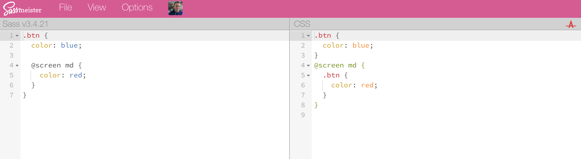
I guess I can't think of a way to make this work with Less unfortunately, but if you wanted to just use regular CSS, you can add this PostCSS plugin to your chain to add support for nesting (with a slightly different syntax in some cases, but for this use case it's the same):
https://github.com/postcss/postcss-nested
If you add that plugin after Tailwind, it'll extract the nested media queries Tailwind generates.
I've updated the docs to remove that nesting example to prevent confusion, thanks all!
adamwathan
on 4 Nov 2017
Going to close this as resolved now that the docs are updated 👍
adamwathan
on 5 Nov 2017
Thanks @adamwathan!
chrisbjr
on 5 Nov 2017
Also, this syntax works using postcss-preset-env with nesting-rules feature enabled.
.example {
  @apply font-thin;

  @screen sm {
    @apply font-bold;
  }
}
It generates :
.example {
  font-weight: 200
}

@media (min-width: 640px) {
  .example {
    font-weight: 700
  }
}
Here is my postcss.config.js file :
module.exports = {
  plugins: [
    "tailwindcss",
    [
      "postcss-preset-env",
      {
        stage: 3,
        features: {
          "nesting-rules": true,
        },
      },
    ],
  ],
};
Hope it can help :)
 frouo
on 14 Sep 2020
frouo
on 14 Sep 2020
Related issues
 smbdelse
·
3Comments
smbdelse
·
3Comments
 spyric
·
3Comments
spyric
·
3Comments
 divdax
·
3Comments
divdax
·
3Comments
 chintanbanugaria
·
3Comments
chintanbanugaria
·
3Comments
 benface
·
3Comments
benface
·
3Comments
Most helpful comment
@kfirba Oh crap you're right! My mistake; that's a bummer.
It does work with Sass:
I guess I can't think of a way to make this work with Less unfortunately, but if you wanted to just use regular CSS, you can add this PostCSS plugin to your chain to add support for nesting (with a slightly different syntax in some cases, but for this use case it's the same):
https://github.com/postcss/postcss-nested
If you add that plugin after Tailwind, it'll extract the nested media queries Tailwind generates.
I've updated the docs to remove that nesting example to prevent confusion, thanks all!