Tag-security: logo representing cloud native security...
CNCF is working on making us a logo. We need input on visual imagery to represent Cloud Native Security
 ultrasaurus
All 25 comments
originally inspired when lock icon appeared on the repo:

which I felt was not aligned with many discussion within the group where security is a process that is really about risk management
I found this secret agent emoji...

but github has limited emoji set, and I thought we could have a logo.
At KubeCon EU dinner, we talked about the fact that most project have an animal... and someone suggested a racoon
ultrasaurus
on 19 Jun 2019
trash panda sounds good to me.
 TheFoxAtWork
on 19 Jun 2019
TheFoxAtWork
on 19 Jun 2019
So we have some rough ideas from our design team, attached.
At this point in time, we're looking for more direction than a final logo.
Thoughts?
 amye
on 19 Jun 2019
amye
on 19 Jun 2019
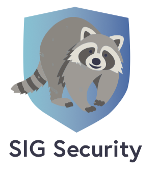
That looks friendly!
 mhausenblas
on 19 Jun 2019
mhausenblas
on 19 Jun 2019
if people enjoy the racoon we can do variations of the logo with it
On Wed, Jun 19, 2019 at 2:10 PM Michael Hausenblas notifications@github.com
wrote:
[image: image]
https://user-images.githubusercontent.com/52594/59789483-df0e9c00-92c5-11e9-8b57-975bf01e1189.pngThat looks friendly!
—
You are receiving this because you are subscribed to this thread.
Reply to this email directly, view it on GitHub
https://github.com/cncf/sig-security/issues/210?email_source=notifications&email_token=AAAPSIPL2GBDQUGDHVQXRKDP3JZBNA5CNFSM4HZLR5WKYY3PNVWWK3TUL52HS4DFVREXG43VMVBW63LNMVXHJKTDN5WW2ZLOORPWSZGODYCWNWQ#issuecomment-503670490,
or mute the thread
https://github.com/notifications/unsubscribe-auth/AAAPSIIRJHBRX2N74GVDDV3P3JZBNANCNFSM4HZLR5WA
.
--
Cheers,
Chris Aniszczyk
http://aniszczyk.org
+1 512 961 6719
 caniszczyk
on 20 Jun 2019
caniszczyk
on 20 Jun 2019
I like the idea of incorporating CNCF logo into it. Any chance we can have the friendly trash panda lounging in the CNCF logo box and drop the gradient shield?
TheFoxAtWork
on 20 Jun 2019
Sure! We can do another round of designs that includes that.
Any other logo ideas? I heard 'shield' as a design idea on the call and wasn't sure if there was strong movement towards that instead of friendly trash panda.
amye
on 20 Jun 2019
Other ideas from recent meeting:
- Sarah (me) - asked for imagery ideas as part of standup/intros, since Lock emoji didn’t resonate with me, I looked for other emoji and liked "secret agent," we brainstormed a bit at KubeCon EU dinner of a racoon (since many projects have an animal)
- Lutz - Shield and sword
- Ash - shield and sword
- Craig - Shield/Sword/Armor
- Jonathan - Shield/Sword
- Michael Ducy - Shield/sword/knight.
- Brandon - CNCF logo + shield imagery?
- Christian - Knight checking a passport ?
- Roger - Sword/Shield anything but lock.
- Emily - (anything OTHER than a lock!)
- Mark - Accountant wearing visor w/ CNCF logo sitting in a darkened data center
ultrasaurus
on 25 Jun 2019
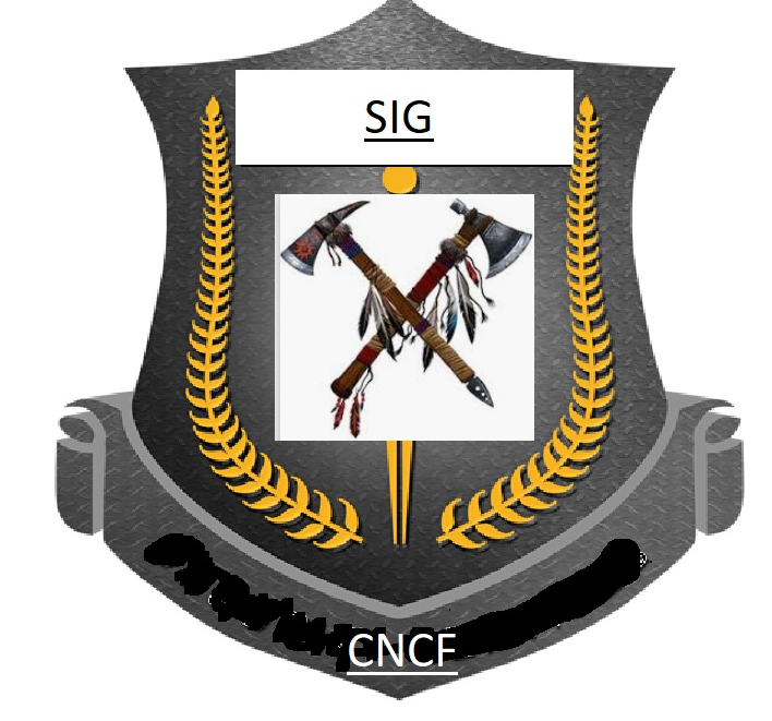
instead of a sword, 2 tomahawks
i will paste the example
 solrac901
on 29 Jun 2019
solrac901
on 29 Jun 2019
I like the idea of a coat of arms, can we do the trash panda on it wielding two tomahawks?
 quiqie
on 29 Jun 2019
quiqie
on 29 Jun 2019
I would discourage use of a tomahawk: https://en.wikipedia.org/wiki/Tomahawk_chop
 dankohn
on 29 Jun 2019
dankohn
on 29 Jun 2019
Any further comments here?
I'll be adding this as an agenda item for Wednesday's SIG meeting.
amye
on 2 Jul 2019
I think we have gathered a lot of ideas and it would be helpful to have some iterations before bringing it to the group again or a specific question that would allow for structured feedback / ideation.
I agree with @dankohn sage advise to avoid something that could be considered cultural misappropriation (though I am sure that was not intended).
Someone also mentioned in the meeting that we should consider striving for visual simplicity, which I've heard elsewhere in logo design. We could consider having an animal mascot separate from the logo, where we use the racoon imagery for fun, but have a logo that is more iconic.
ultrasaurus
on 2 Jul 2019
I like the visual simplicity and iconic feel of this one, with subtle tie in with CNCF visual representation (color schema + stripe)

ultrasaurus
on 3 Jul 2019
This one approaches what I would like to see in a logo, in terms of an iconic representation. I like that it is much more differentiated from other representations of security, yet still evokes the theme -- with the combo of bandit and chevron (which could represent an "official") or also a less commonly used, but still representational shield shape. I also find it to be cute and friendly, which still feeling serious.

ultrasaurus
on 3 Jul 2019
I like this one too (same as the first one reported by @ultrasaurus).
The only things that I'd probably change is the font of SIG Security but overall looks really elegant and communicative!
 leodido
on 3 Jul 2019
leodido
on 3 Jul 2019
I like this one:
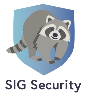
I like the sig to have a mascot that we can also use as icon with emojis like in twitter
Raccoons are cute, I'm voting for the cutest logo.
 fntlnz
on 3 Jul 2019
fntlnz
on 3 Jul 2019
I don't get the raccoon so I'll stick to a minimal shield with CNCF colours.
 danmx
on 3 Jul 2019
danmx
on 3 Jul 2019
This one approaches what I would like to see in a logo, in terms of an iconic representation. I like that it is much more differentiated from other representations of security, yet still evokes the theme -- with the combo of bandit and chevron (which could represent an "official") or also a less commonly used, but still representational shield shape. I also find it to be cute and friendly, which still feeling serious.
I like this logo and the idea of having a mascot. The contrast looks nice as well. Does this look a bit similar or can cause some confusion ?

 ashutosh-narkar
on 3 Jul 2019
ashutosh-narkar
on 3 Jul 2019
We have our next round of designs!
sig-security-v2.pdf
Poll is here: https://forms.gle/ZAd8fcFV7VRQ58k37
I'll leave this open through July 22nd, please choose your top two and we'll go from there.
amye
on 12 Jul 2019
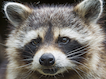
To explain raccoon relationship to security.... it's a bit of a visual riff on the idea that security work is a bit like detective work, security officers or secret agents are often depicted wearing dark glasses.... raccoons have distinctive facial markings that kind of look like sunglasses

ultrasaurus
on 17 Jul 2019
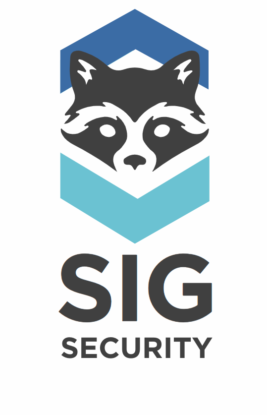
With 41.7% of the vote, this is our highest ranked logo.
amye
on 23 Jul 2019
Thanks @amye, can you work with Alex C. and get it put https://github.com/cncf/artwork and uploaded to this README :)?
caniszczyk
on 24 Jul 2019
https://github.com/cncf/sig-security/pull/243 is ready to roll
amye
on 26 Jul 2019
ultrasaurus
on 19 Nov 2019
Related issues
 MVrachev
·
6Comments
TheFoxAtWork
·
5Comments
MVrachev
·
6Comments
TheFoxAtWork
·
5Comments
 JustinCappos
·
11Comments
ultrasaurus
·
5Comments
JustinCappos
·
11Comments
ultrasaurus
·
5Comments
 lumjjb
·
9Comments
lumjjb
·
9Comments
Most helpful comment
I like the visual simplicity and iconic feel of this one, with subtle tie in with CNCF visual representation (color schema + stripe)