Tachiyomi: [Feature Request] Three dot to mark Download/Read/Unread chapters
Please return three dot menu to mark chapters Download/Read/Unread. It's really uncomfortable to make it with longtap
 Akazotik
All 11 comments
I believe it's the best it can be right now.
However, I think an added "Slide right to toggle read state" and "Slide left to download/delete" (alternatively bookmark) would be good for quick actions.
 Soitora
on 21 Apr 2020
Soitora
on 21 Apr 2020
So three dot like in j2k
Akazotik
on 21 Apr 2020
To mark all chapters or specific ones?
Soitora
on 21 Apr 2020
three dot on each chapter to mark it
Akazotik
on 21 Apr 2020
J2K is getting rid of that too, for reasons we agree with.
Soitora
on 21 Apr 2020
So. Anything but longtap to download chapters or mark them read/unread
Akazotik
on 26 Apr 2020
I believe it's the best it can be right now.
However, I think an added "Slide right to toggle read state" and "Slide left to download/delete" (alternatively bookmark) would be good for quick actions.
YES, this would be the best usability-wise since (as of now) there's nothing else one would want in a three-dot menu for an item in the chapter list.
 asdkant
on 4 May 2020
asdkant
on 4 May 2020
Sliding isn't going to work as long as keep a tabbed interface, but we'll see if we eventually remove that like J2K.
 arkon
on 4 May 2020
arkon
on 4 May 2020
Sliding isn't going to work as long as keep a tabbed interface, but we'll see if we eventually remove that like J2K.
Leave categories with left-right slide, and manga page make like in j2k with download marks and slide to read/unread
Akazotik
on 4 May 2020
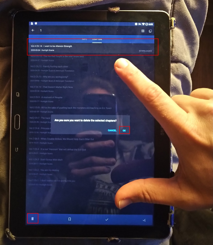
Not having the three-dot menu for items in the chapter list is a usability minus for large-screen devices. In my case I have a 10-inch tablet, in the image below you can see the distance I have to move for the three actions (select chapter, tap the delete icon, confirm), with my hand for reference.
asdkant
on 4 May 2020
I agree with that.
I find it especially tedious in the new releases screen.
Longtap, usually somewhere on the top of the screen, move finger all the way to bottom of the screen to do any action (it doesn't help that, since i usually balance my tablet against my stomach, the option menu is often covered with a shirt and it always takes me a moment to remember everything is down there now) and then move it all the way up to the top left to cancel out of the multitap function again
Then doing it all again for deleting the chapter after read.
The three dot menu as it was before was rather comfortable in that i barely had to move my right thumb for downloading.
 Clydefrosch22
on 8 May 2020
Clydefrosch22
on 8 May 2020
Related issues
 joseph619
·
3Comments
joseph619
·
3Comments
 j2ghz
·
3Comments
j2ghz
·
3Comments
 Pepsyy
·
4Comments
Pepsyy
·
4Comments
 MaryWeeb
·
4Comments
MaryWeeb
·
4Comments
 matthewdias
·
3Comments
matthewdias
·
3Comments
Most helpful comment
I believe it's the best it can be right now.
However, I think an added "Slide right to toggle read state" and "Slide left to download/delete" (alternatively bookmark) would be good for quick actions.