Tachiyomi: The App Icon doesn't look like it's following material design.
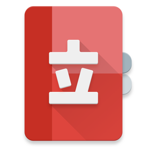
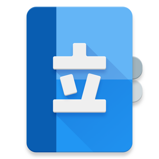
I've never been on this repo and I just found out that @EddJack made a circular icon but, it too isn't following the material design guidelines. Since I have experience on making icons for Android apps, I wanted to share my redesign. I made them in two colors, blue and red. Circular and traditional.


If the dev wants to implement this I'm fine with it. They're in a 512 x 512 format so that they can be downscaled into xhdpi xxhdpi, etc.
 Waynekosimoto
All 9 comments
I like the design though I would prefer if they were flat icons instead of the 3D pop effect.
Favourite one is the 2nd one!
 ghotinggoad
on 25 Aug 2017
ghotinggoad
on 25 Aug 2017
I like the ones with 3D effect more. The round one looks more symmetrical and balanced.
 444nonymous
on 25 Aug 2017
444nonymous
on 25 Aug 2017
I think the icon should be provided in below standard since adaptive is gonna be the new standard.
https://developer.android.com/guide/practices/ui_guidelines/icon_design_adaptive.html
 CarlosEsco
on 25 Aug 2017
CarlosEsco
on 25 Aug 2017
@CarlosEsco These are built with code and a grand majority of apps haven't moved to this new "standard". Free Form icons are still allowed (that's why the icon tab in the material design guidelines still have the free form style) but they will __eventually__ be treated as 2nd class citizens on Android.
Waynekosimoto
on 25 Aug 2017
@Waynekosimoto agreed they are built with code but they are 2 different drawables with different dimensions then the standard icons so my suggestion was to convert this to the new format. So they could be integrated in.
CarlosEsco
on 25 Aug 2017
@CarlosEsco I didn't ask what they are. I didn't realize that Android Oreo was pushing for this so quickly, I'll adapt them.
Waynekosimoto
on 27 Aug 2017
Uh, but what’s wrong with the current icon? I like it. The ones you made look blank compared to the current one.
 ghost
on 30 Aug 2017
ghost
on 30 Aug 2017
+1, but I'd choose the 2D over the 3D one.
 fighuass
on 14 Sep 2017
fighuass
on 14 Sep 2017
Sorry, no plans to update the icon for the current version. Maybe 1.x will have something different, but I will ask LinkCable when it's the time for that release.
 inorichi
on 1 Mar 2019
inorichi
on 1 Mar 2019
Related issues
 TheUnlocked
·
3Comments
TheUnlocked
·
3Comments
 as280093
·
3Comments
as280093
·
3Comments
 arkon
·
3Comments
arkon
·
3Comments
 squadz3
·
3Comments
squadz3
·
3Comments
 Pepsyy
·
4Comments
Pepsyy
·
4Comments