Syndesis: Regression in Basic Filter input field descriptions - they used to be more helpful
This is a...
[ ] Feature request
[ ] Regression (a behavior that used to work and stopped working in a new release)
[ ] Bug report
[X ] UI text issue or request
The problem
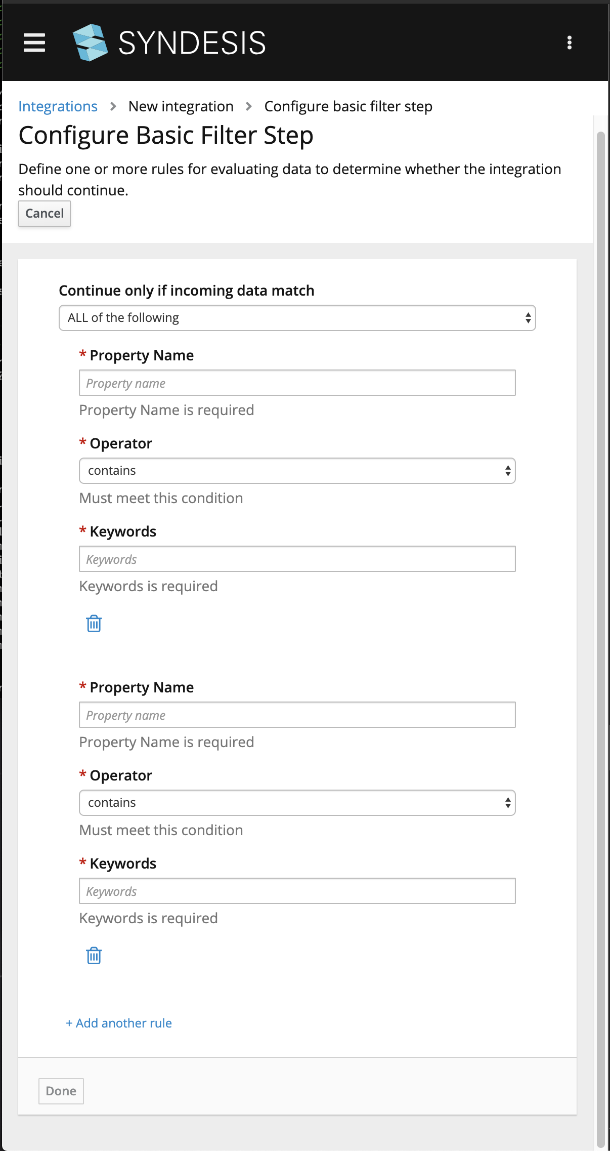
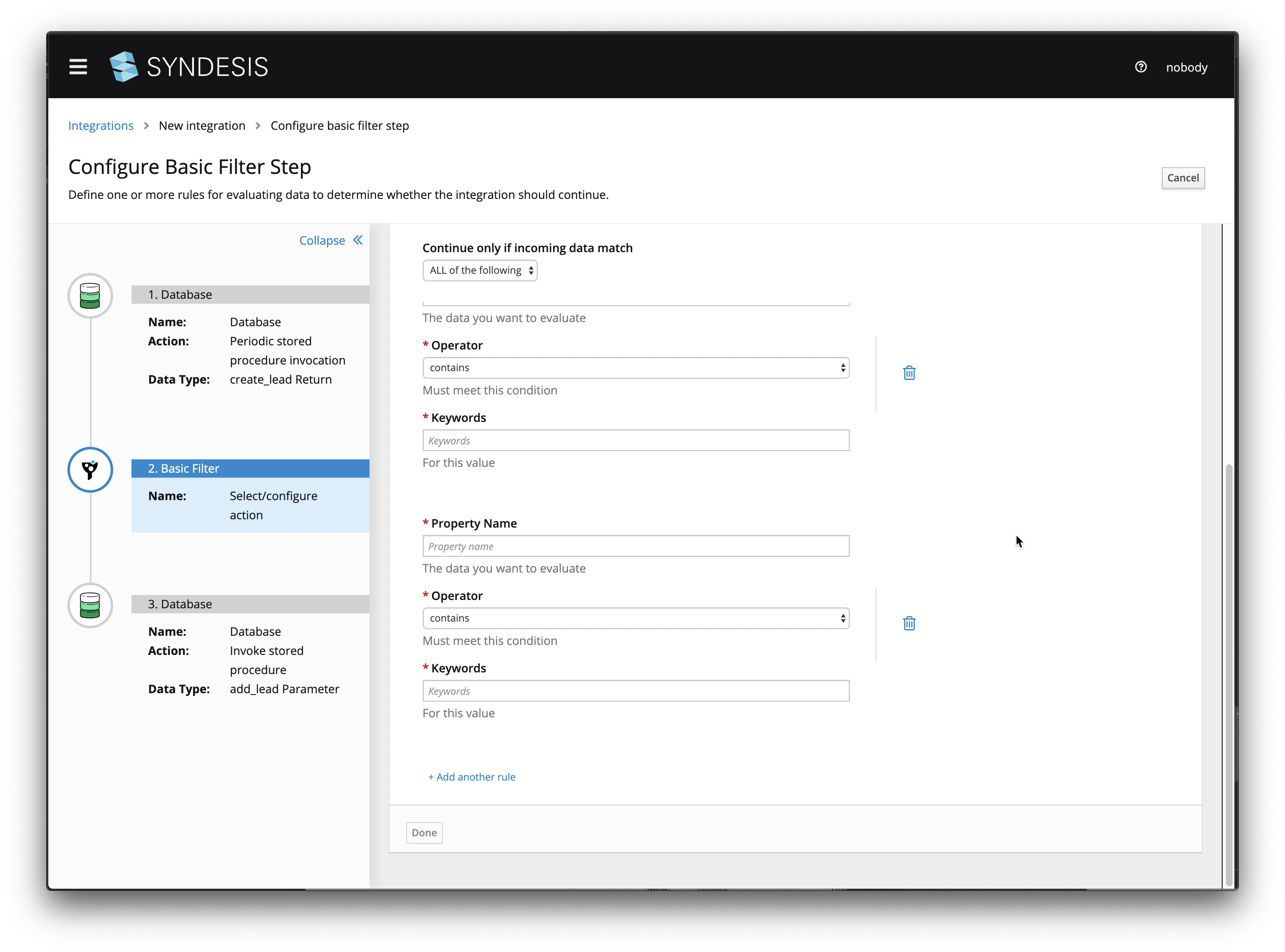
In the staging site, the UI for the basic filter looks like this:
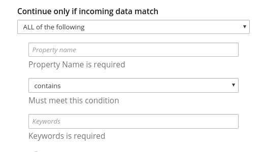
I think that the descriptions, "Property Name is required" and "Keywords is required" do not provide enough information for the business user to know what to insert. In previous releases, we had:
"The data you want to evaluate" in place of "Property Name is required"
"For this value" in place of "Keywords is required"
I see this as a regression because we changed what was there and made it more difficult to know what to do.
Expected behavior
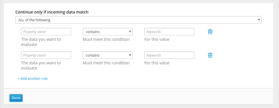
Please put it back the way it was. The three field descriptions form a sentence:
The data you want to evaluate must meet this condition for this value.
Replace "Property Name is required" with: "The data you want to evaluate".
Replace "Keywords is required" with "For this value".
And, can asterisks indicate the required fields?
Screenshot
 TovaCohen
All 34 comments
Hmm, that's validation kicking in but I guess the element structure doesn't
match the css that would make that text red. Still, that help text
shouldn't be getting overwritten until the field is clicked in and then
unfocused.
Also the asterisk unfortunately is part of the label normally for a
patternfly form, but this is a kinda customized thing which doesn't use
labels.
On Mon, Jul 22, 2019, 5:34 PM TovaCohen notifications@github.com wrote:
This is a...
[ ] Feature request
[ ] Regression (a behavior that used to work and stopped working in a new release)
[ ] Bug report
[X ] UI text issue or requestThe problem
In the staging site, the UI for the basic filter looks like this:
[image: image]
https://user-images.githubusercontent.com/25067106/61665335-b6057080-aca2-11e9-877c-c20296387325.pngI think that the descriptions, "Property Name is required" and "Keywords
is required" do not provide enough information for the business user to
know what to insert. In previous releases, we had:"The data you want to evaluate" in place of "Property Name is required"
"For this value" in place of "Keywords is required"I see this as a regression because we changed what was there and made it
more difficult to know what to do.
Expected behaviorPlease put it back the way it was. The three field descriptions form a
sentence:The data you want to evaluate must meet this condition for this value.
Replace "Property Name is required" with: "The data you want to evaluate".
Replace "Keywords is required" with "For this value".
And, can asterisks indicate the required fields?
Screenshot—
You are receiving this because you are subscribed to this thread.
Reply to this email directly, view it on GitHub
https://github.com/syndesisio/syndesis/issues/6222?email_source=notifications&email_token=AACV3LF7O3CKKIHT7UYSUFTQAYRWJA5CNFSM4IF5FP52YY3PNVWWK3TUL52HS4DFUVEXG43VMWVGG33NNVSW45C7NFSM4HAYGBSA,
or mute the thread
https://github.com/notifications/unsubscribe-auth/AACV3LCN5UD5QEKLWQISWX3QAYRWJANCNFSM4IF5FP5Q
.
 gashcrumb
on 22 Jul 2019
gashcrumb
on 22 Jul 2019
Oh, yes, when I click in a field, I get the right description.
But then when I add another rule, the fields have the Property Name and Keywords descriptions. So something is amiss.
TovaCohen
on 22 Jul 2019
Yep, looks like form validation kicks in as soon as you click "add another rule", I'll have to see if I can suppress that.
gashcrumb
on 23 Jul 2019
Hmm, so yes I can disable that validation, however the problem is that then, the overall form isn't validated, meaning you can click "add another rule" and not type anything in, then click "Done" because reasons, creating an invalid configuration.
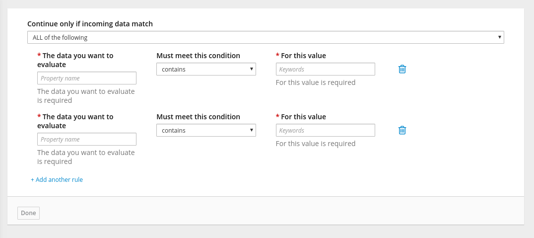
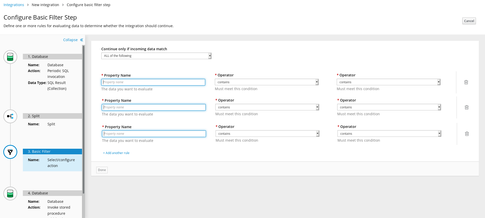
I wonder if it'd be better maybe to move these text prompts from the "help text" area underneath the form controls and instead have them be labels, leaving the help text available to prompt for required fields. So as a rough draft instead of:
Could be more like:
@syndesisio/uxd
gashcrumb
on 23 Jul 2019
Dunno, probably could stand to be less wordy too :smile:
gashcrumb
on 23 Jul 2019
I like your suggestion and I don't think it is too wordy. New users need these cues.
TovaCohen
on 23 Jul 2019
@TovaCohen @gashcrumb
I find it really hard to read and sort out. Problems I see:
- We should avoid wrapping labels if possible. Can you make the field wider to avoid that first field label wrapping?
- Repeating information in the label and then again under the field just seems like too much detail and adds clutter
- Can we simply use "Required" as help text under the required fields (to interpret the asterisk)?
@dongniwang @mcoker @lboehling Thoughts?
 amysueg
on 23 Jul 2019
amysueg
on 23 Jul 2019
That's why I said "rough draft" :smile_cat:
gashcrumb
on 23 Jul 2019
Can you make the field wider to avoid that first field label wrapping?
There is also some horizontal space to the right we could expand the fields into, so that the labels one be on one line, but these adjustments would only be the case for certain viewports. Eventually the labels will likely wrap if they're so long.
Looking at the existing layout, this also happens when you shrink the window
I wonder if we could use a list/table view where the list/table headers are the longer description, then each row has the fields as they display now?
Also the mobile view currently isn't bad -
I just mocked something up in the browser for how we could make that the default view, so that we aren't trying to fit so much information on the same row while still aiming to group the filter fields visually per condition
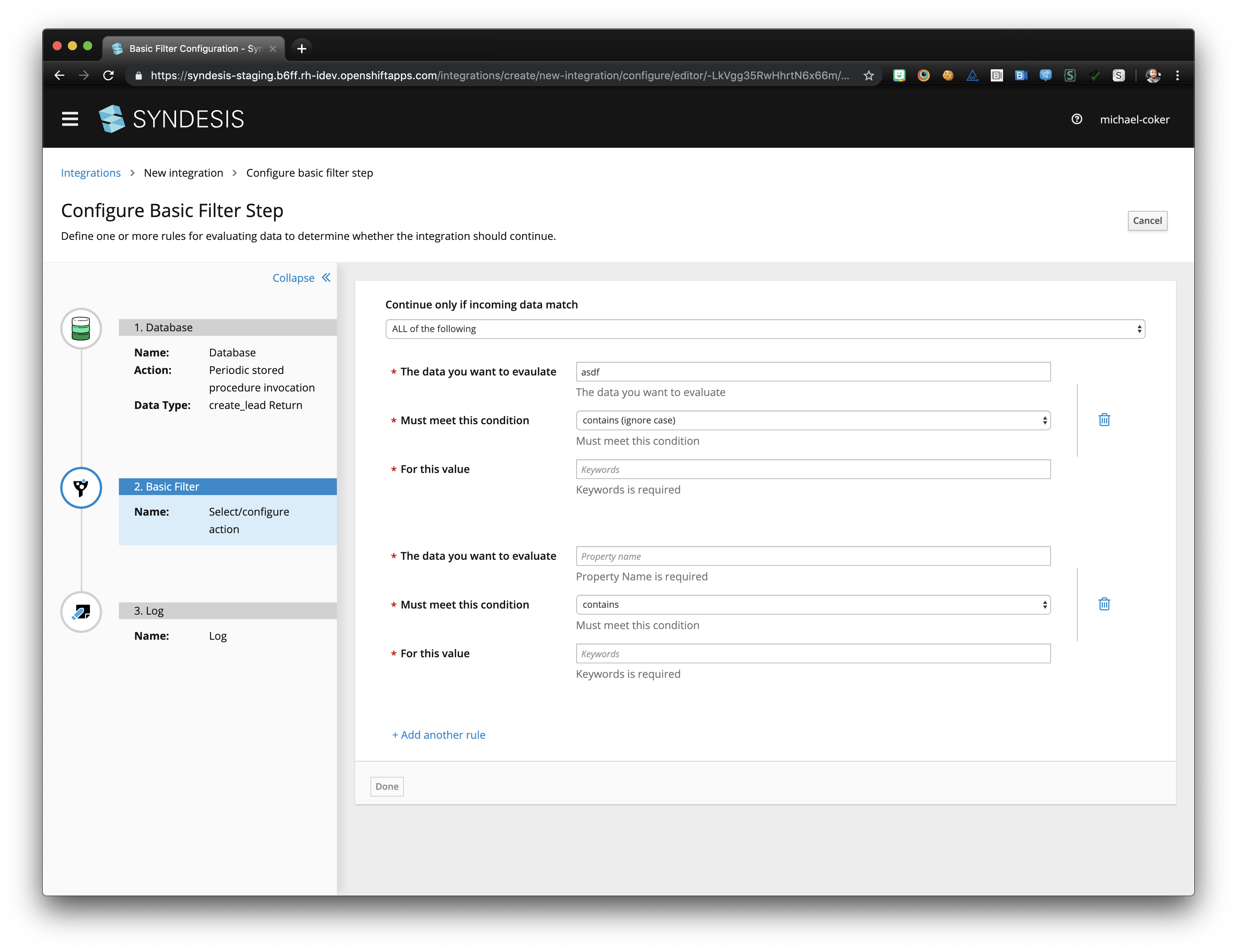
We could also provide the longer description we're using in the labels as helper text before the form, then just use short field level names
or
 mcoker
on 24 Jul 2019
mcoker
on 24 Jul 2019
I like the last two options you showed @mcoker!
 dongniwang
on 24 Jul 2019
dongniwang
on 24 Jul 2019
I like the last one for sure. Lemme know what you did or I can point you
in the right direction.
On Tue, Jul 23, 2019, 9:46 PM Dongni (Iris) Wang notifications@github.com
wrote:
I like the last two options you showed @mcoker https://github.com/mcoker
!—
You are receiving this because you were mentioned.
Reply to this email directly, view it on GitHub
https://github.com/syndesisio/syndesis/issues/6222?email_source=notifications&email_token=AACV3LGGTFG62OWRYCGSBADQA6X7BA5CNFSM4IF5FP52YY3PNVWWK3TUL52HS4DFVREXG43VMVBW63LNMVXHJKTDN5WW2ZLOORPWSZGOD2U5EPQ#issuecomment-514445886,
or mute the thread
https://github.com/notifications/unsubscribe-auth/AACV3LGSYW2BTLFCQXKOV5DQA6X7BANCNFSM4IF5FP5Q
.
gashcrumb
on 24 Jul 2019
Cool! I can go ahead and start on that option this afternoon and will let you know if I have questions @gashcrumb :D
Also, will we eventually be able to show the labels and hide the error messages (under the input fields) by default, then show the error messages when the user submits and something is invalid? If so, I can just work with the UI as it is now, like I did for the screenshots.
And @dongniwang should the condition blocks be indented at all on the left/right, or should they extend to fill the width of the content area, just like the "continue only if incoming data match" text + select at the top?
mcoker
on 24 Jul 2019
Great @mcoker thanks.
@TovaCohen I have trouble with "Keywords is required" I just do. Is there any way we can avoid it? Can we leave out "is"?
amysueg
on 24 Jul 2019
I definitely want "Keywords is required" removed.
I'm really sorry but I cannot give this the attention that I would like to until next week.
I'm still working on finishing the doc for 7.4.
Can you wait for me to review the design next week?
TovaCohen
on 24 Jul 2019
@mcoker - thanks! Extending the condition blocks to fill the width of the content area should be fine and I think the current indentation looks ok. I'll probably put the "Note: The data ..." sentence to be closer to the condition blocks.
dongniwang
on 24 Jul 2019
Also, will we eventually be able to show the labels and hide the error messages (under the input fields) by default, then show the error messages when the user submits and something is invalid?
One note the "blah is required" text shows up when validation occurs, it's not initially present until you leave/enter a field or modify the array of values by clicking on the add/remove controls there. Also this is all client-side validation, so no submitting is allowed until the form is happy.
gashcrumb
on 24 Jul 2019
Quick question @amysueg @dongniwang @gashcrumb @mcoker is it intended to have the filter form stretched the whole width of the page? I have three rules and have to scroll to see them all and scroll all the way up to see if it is ALL or ANY rules match.
I'd say this layout is good for smaller screens but to have it like this looks like a waste of screen space to me personally. I'd like to hear your opinion :)

 mmuzikar
on 7 Aug 2019
mmuzikar
on 7 Aug 2019
@gashcrumb @mcoker can you please sum up what should be verified by QE? Thank you
 mastepan
on 7 Aug 2019
mastepan
on 7 Aug 2019
Yep, so there's the layout change and also we've updated the validation on that page so it doesn't overwrite the help text.
gashcrumb
on 7 Aug 2019
Good point @mmuzikar ! I wonder if it's worth it to have a custom layout treatment based on the browser width, which means we display the normal horizontal layout for desktop sizes and this vertical layout for mobile screens.
WDYT, @mcoker ?
dongniwang
on 7 Aug 2019
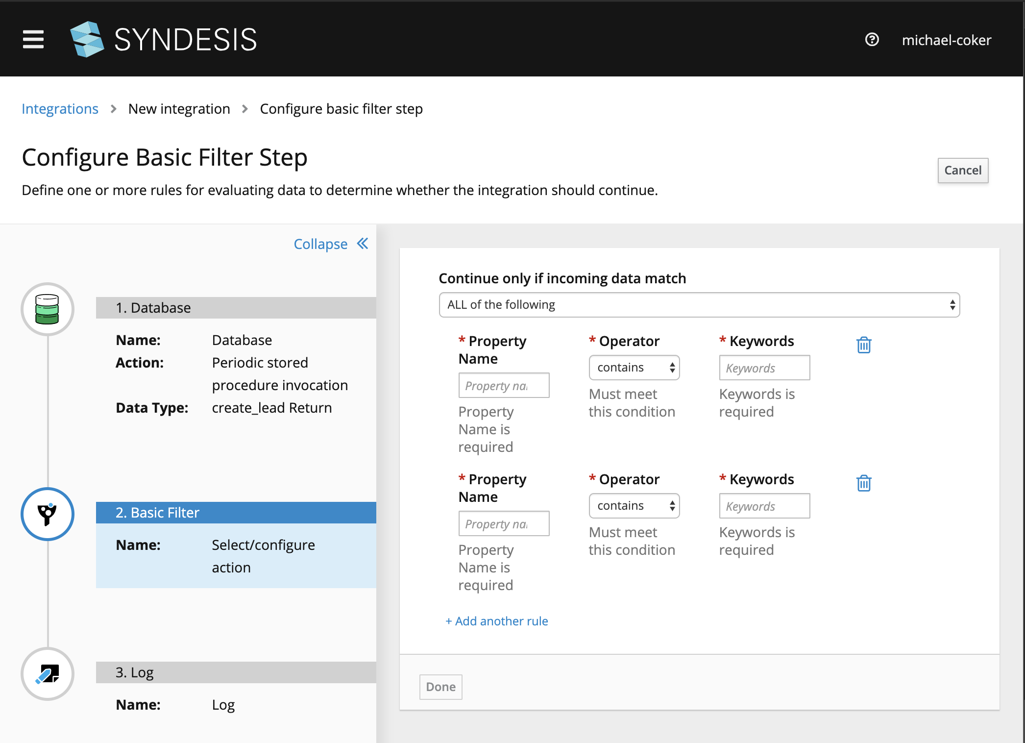
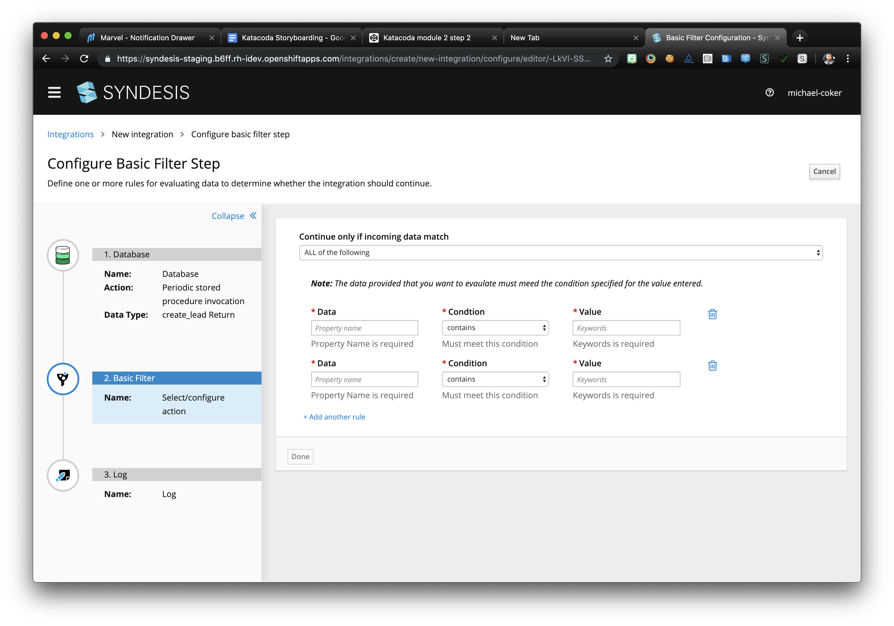
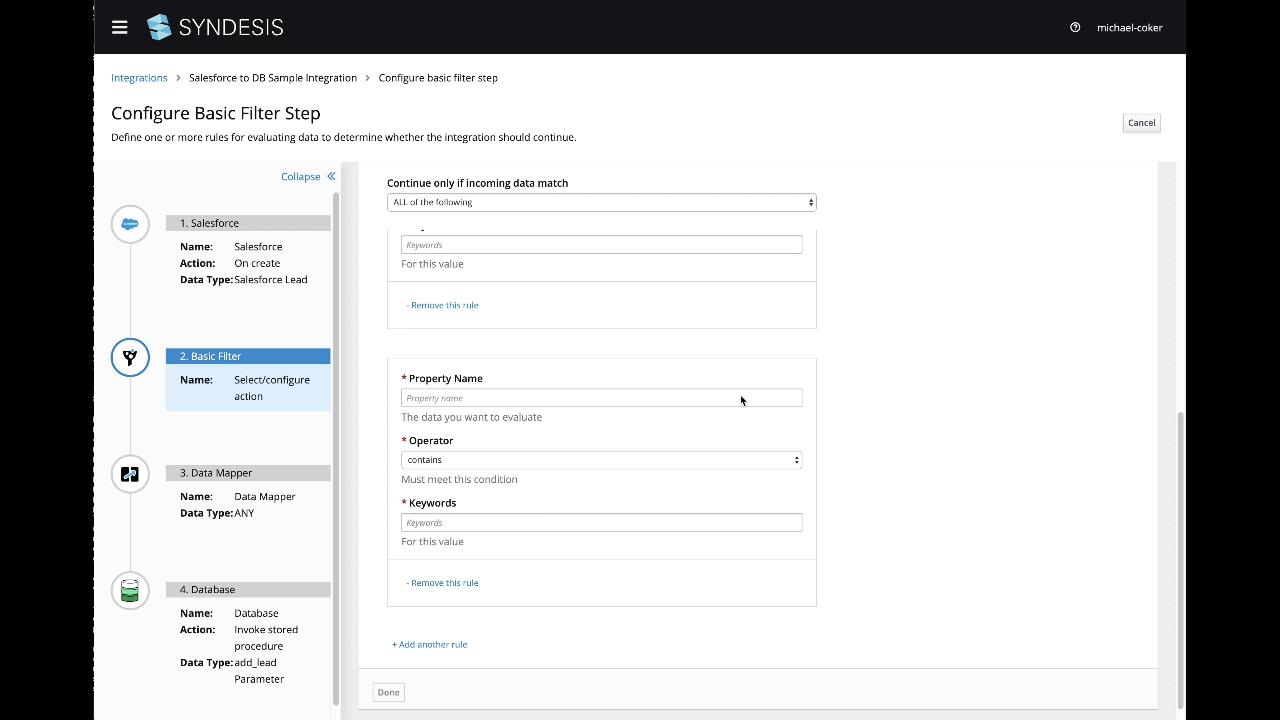
@gashcrumb @mmuzikar I worked with @dongniwang on the layout and am going to rework the UI to shorten the condition form fields (so they don't span the available width of the page), and keep the top "continue only if..." label and select row sticky to the top of the page as it scrolls. I filed an issue for that work - https://github.com/syndesisio/syndesis/issues/6336
Here is a preview:
Does that sound/look OK? Want me to make any other adjustments?
mcoker
on 7 Aug 2019
@mcoker The "Continue only if incoming data match" part is a great addition! Personally whenever I always have to think for a while if the filter step discards the exchanges that match or lets them continue, so that addition is great.
But I am just not a fan of the inputs being stacked as they are now, tell me if you'd personally wouldn't prefer it this way:
mmuzikar
on 8 Aug 2019
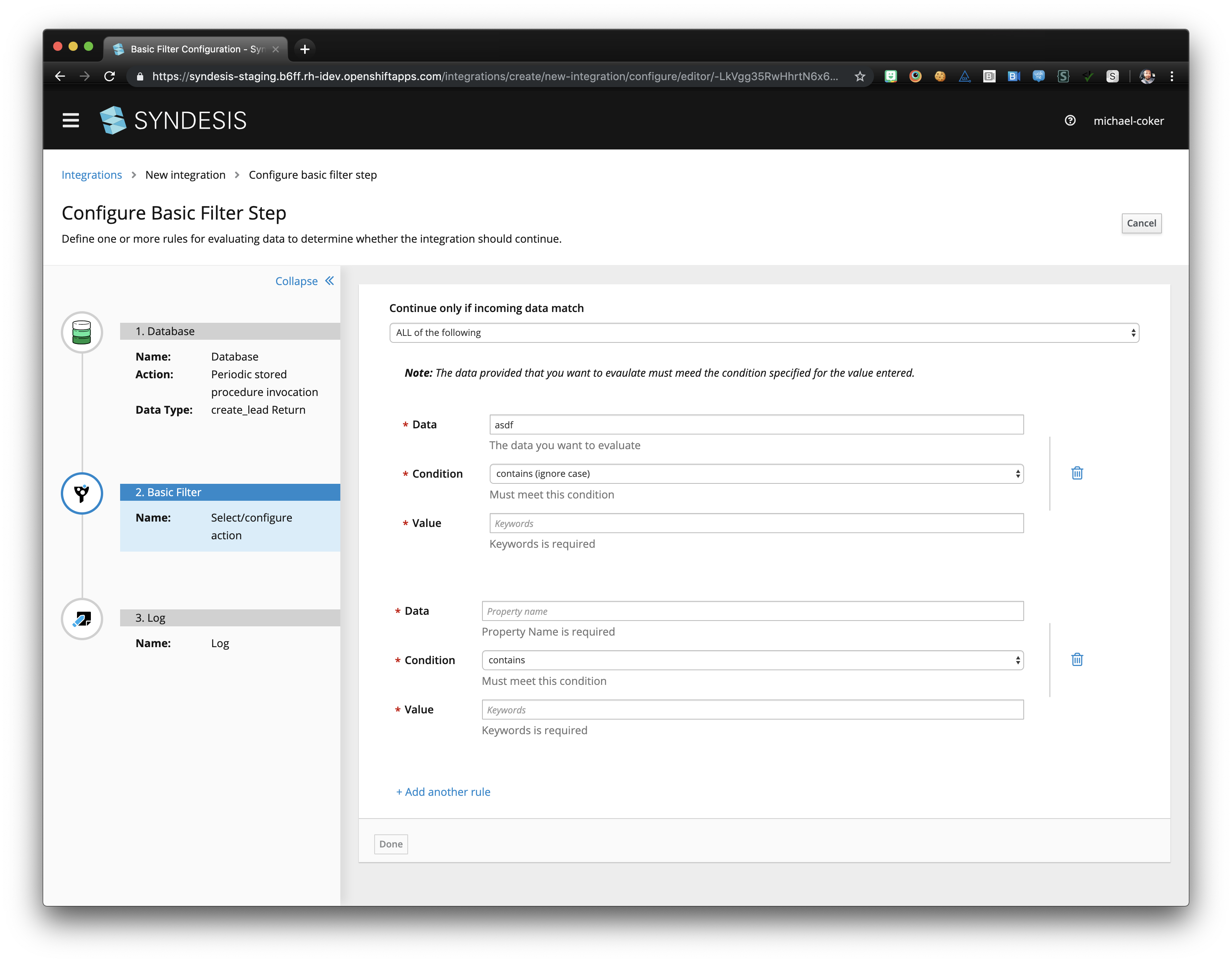
After meeting with the team, we discussed introducing this design proposal in PF4 for form sections (https://github.com/patternfly/patternfly-next/issues/1831) into the basic filter form.
The difference is putting each condition set in a section that has a distinct border, and removing the trash icon and replacing it with text as the last item in each section. I also left the "continue only if..." select form control full-width, as it was originally.
Here's a screengrab.
Thoughts? @dongniwang @seanforyou23 @gashcrumb @mmuzikar
mcoker
on 8 Aug 2019
I'm into it. We should coordinate a bit, today I started looking at
converting auto-form to use pf4 and got halfway through actually doing it.
I'll push a branch up tomorrow hopefully.
On Thu, Aug 8, 2019, 5:19 PM Michael Coker notifications@github.com wrote:
After meeting with the team, we discussed introducing this design proposal
in PF4 for form sections (patternfly/patternfly-next#1831
https://github.com/patternfly/patternfly-next/issues/1831) into the
basic filter form.The difference is putting each condition set in a section that has a
distinct border, and removing the trash icon and replacing it with text as
the last item in each section. I also left the "continue only if..." select
form control full-width, as it was originally.Here's a screengrab.
[image: Screen Shot 2019-08-08 at 4 16 30 PM]
https://user-images.githubusercontent.com/35148959/62738451-f5002980-b9f7-11e9-8149-b8607744edb5.pngThoughts? @dongniwang https://github.com/dongniwang @seanforyou23
https://github.com/seanforyou23 @gashcrumb
https://github.com/gashcrumb @mmuzikar https://github.com/mmuzikar—
You are receiving this because you were mentioned.
Reply to this email directly, view it on GitHub
https://github.com/syndesisio/syndesis/issues/6222?email_source=notifications&email_token=AACV3LHXIEDY2632YM45CZLQDSEVFA5CNFSM4IF5FP52YY3PNVWWK3TUL52HS4DFVREXG43VMVBW63LNMVXHJKTDN5WW2ZLOORPWSZGOD345ZHY#issuecomment-519691423,
or mute the thread
https://github.com/notifications/unsubscribe-auth/AACV3LE7RXJ4JH7SMNANUE3QDSEVFANCNFSM4IF5FP5Q
.
gashcrumb
on 9 Aug 2019
As I said I am more of a fan of the old way of displaying the conditions, but I like that the conditions are now properly separated from each other thanks to the border.
What would sell this new form layout for me is if those conditions could be folded, maybe unfold only the actively edited one and the rest display just [property name] [condition] [keywords].
SIDENOTE: Also while writing this what's the reason for the last input being keywords? I would instinctively think it would be value
mmuzikar
on 13 Aug 2019
The updated Basic Filter UI looks great and I updated the 7.5 doc to reflect it.
Where do the supported operators come from? Is there a web page that explains them that the doc can point to? For example, what's the difference between "contains" and "match"?
Also, how does the filter treat the content in the Keywords field? For example, can I use quotation marks to indicate that I am looking for exactly "Red Hat", those two words in that order, and not instances of "I like red." or "I have a hat." ?
(I realize these are questions I should have asked with the very first release, but better late than never, right? :-)
TovaCohen
on 27 Aug 2019
@TovaCohen - Those are great questions! I don't remember who worked on the basic filter feature... @gashcrumb Do you happen to remember? Are we using simple language here as well?
dongniwang
on 28 Aug 2019
I think yeah under the covers the step builds simple language expressions. @lburgazzoli or @zregvart can you confirm and also am not sure on Tovas questions beyond making educated guesses :-)
gashcrumb
on 28 Aug 2019
Yeah that should be Camel simple language, the list of operations is documented here.
 zregvart
on 29 Aug 2019
zregvart
on 29 Aug 2019
Thanks @zregvart. In Syndesis, in the Basic Filter page, one of the available operators is "matches". Does this correspond to the Simple Language "regex" expression? If not, what is the behavior of the "matches" operator?
TovaCohen
on 3 Sep 2019
@TovaCohen yes it's regex:
zregvart
on 3 Sep 2019
Thanks @zregvart.
In the user doc for the Advanced Filter step, we instruct the user to enter a Simple Language filter expression. How is that different from adding a Basic Filter step and specifying the operator as "matches"?
TovaCohen
on 3 Sep 2019
@TovaCohen with Advanced Filter step expressions can be more complex than the form based Simple Filter step allows. Hope that helps.
zregvart
on 3 Sep 2019
Sure. Thanks Zoran!
I updated the doc. And I think this issue can be closed.
I'll close it in the next day or so, unless I hear otherwise.
TovaCohen
on 3 Sep 2019
Related issues
 mcada
·
6Comments
mcada
·
6Comments
 honghuac
·
4Comments
honghuac
·
4Comments
 syndesis-bot
·
6Comments
syndesis-bot
·
6Comments
 gaughan
·
5Comments
gaughan
·
5Comments
 tplevko
·
4Comments
tplevko
·
4Comments
Most helpful comment
I definitely want "Keywords is required" removed.
I'm really sorry but I cannot give this the attention that I would like to until next week.
I'm still working on finishing the doc for 7.4.
Can you wait for me to review the design next week?