Syndesis: Data Mapper UI partially hidden when in API Provider integration
This is a...
[ ] Feature request
[x] Regression (a behavior that used to work and stopped working in a new release)
[ ] Bug report
[ ] Documentation issue or request
Description
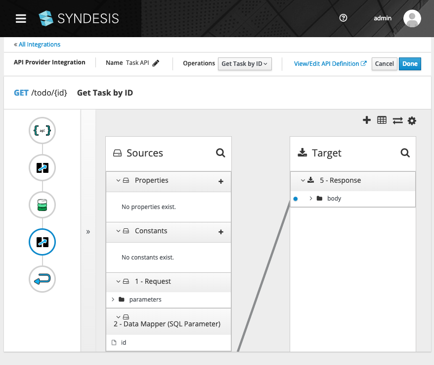
When editing a data mapping in an API Provder integration, the Data Mapper UI is partially hidden by the API Provider toolbar.
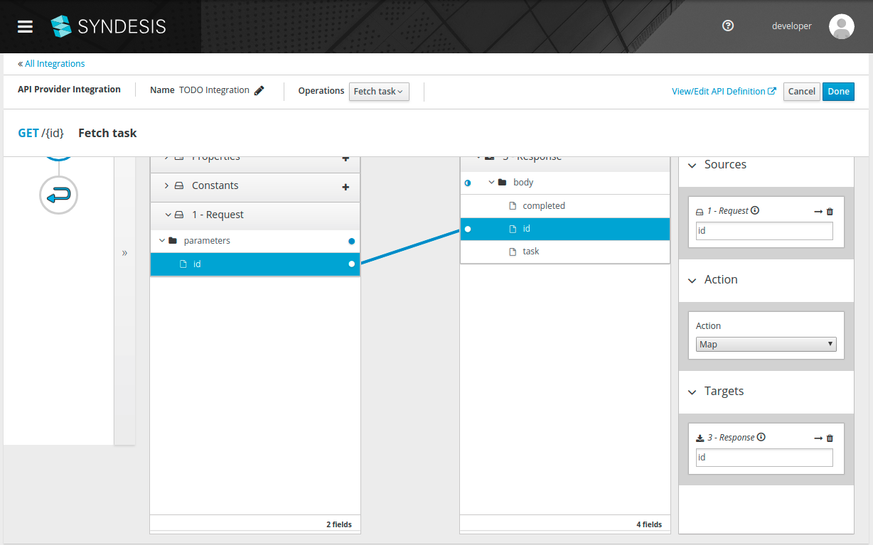
This breaks most of our automated tests, since they expect the buttons in the toolbar to be visible and clickable.
 asmigala
All 16 comments
@gashcrumb Can you look at this?
 heiko-braun
on 6 Mar 2019
heiko-braun
on 6 Mar 2019
I'm not seeing this behavior here on either Chrome or Firefox at least on master but let me try one more test with a freshly built UI image and update.
 gashcrumb
on 6 Mar 2019
gashcrumb
on 6 Mar 2019
Yeah, here I don't see this behavior on master, either when the code served out from the pod or in development mode. I've checked on Firefox and Chrome. Also tried making the window more narrow and also shorter but I can't get those toolbar buttons for the data mapper to do that.
gashcrumb
on 6 Mar 2019
@gashcrumb ok, did some more investigation and I think the main problem here is that in Chrome, this particular page is not scrollable. Our tests use scrollIntoView on the mapping field element, which causes just the .card-pf-body section to scroll under the header.
Here are the screenshot from Firefox and Chrome, notice the Firefox one has a scrollbar, Chrome has no scrollbar, plus a weird grey rectangle at the bottom.
(both of these screenshots were taken manually, not through the automated tests, also both are at commit fc2e36619deffa767408617147a2888092dc8e70)
asmigala
on 7 Mar 2019
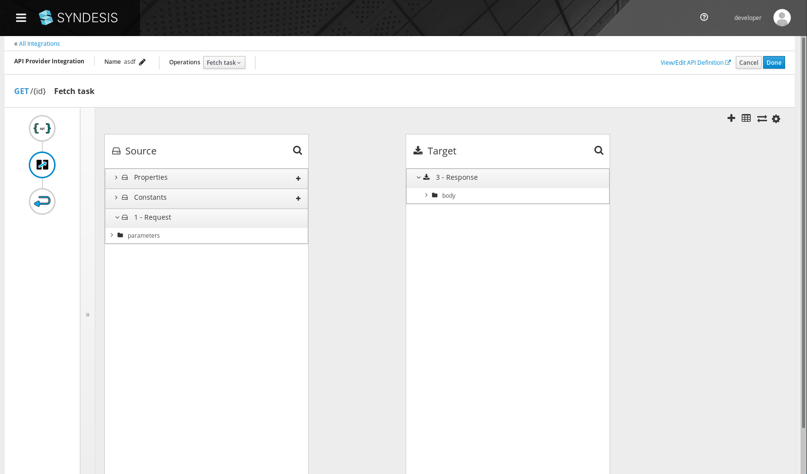
@gashcrumb also note that this is exclusive to the API Provider integration editor, when editing a regular integration, the scrollbar is visible in Chrome:
asmigala
on 7 Mar 2019
One last thing, I believe this is really a layout problem, there is no reason the scroll should be necessary, the only thing under the fold is the number of fields, which should be visible without scrolling.
asmigala
on 7 Mar 2019
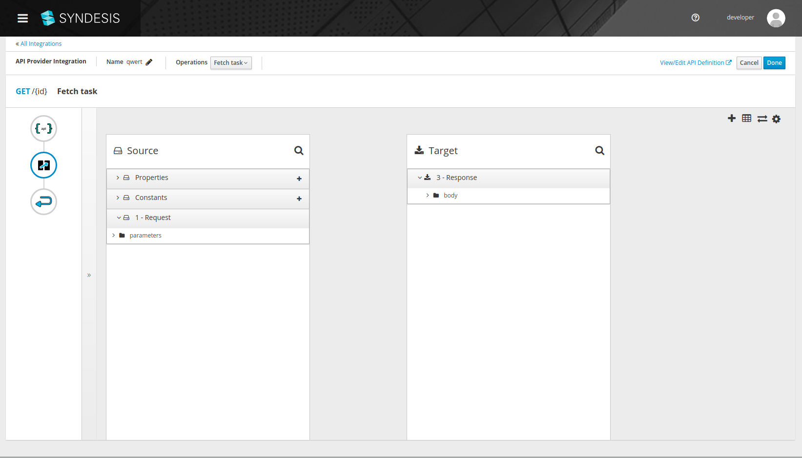
I can confirm that the page doesn't scroll (on Mac OS / Chrome):
heiko-braun
on 7 Mar 2019
@mcoker @seanforyou23 do either of you have a mac to verify this on?
Also on a side-node, do we want that thin padding on either side of the page and the bottom? Personally I find it bothers me but it's probably subjective.
gashcrumb
on 7 Mar 2019
@gashcrumb this is not exclusive to mac, my screenshots are from linux
asmigala
on 7 Mar 2019
I don't seem to be able to replicate the overlap as shown in the initial screenshot. However, I also can't seem to scroll and this should be possible when the content is too large to fit. Looks like it's coming from the styles applied to .pf-c-page__main .pf-c-page__main-section (overflow), which came from introducing the PF4 masthead. Should be a simple fix, will take a look. The padding @gashcrumb mentioned also seems to be coming from there so can fix both of these in the same go. Thx for bringing this to our attention!
 seanforyou23
on 7 Mar 2019
seanforyou23
on 7 Mar 2019
@seanforyou23 the overlap in the initial screenshot is actually due to the automated tests forcefully scrolling an element into view - I was also unable to do that manually.
However, I'd like to reiterate that I think there should not be no scrolling necessary on this page, unless the actual content is too tall - which it isn't in this case (my first comment), it's just the footer that's off-screen.
asmigala
on 7 Mar 2019
@seanforyou23 @gashcrumb is this being taken care of?
heiko-braun
on 8 Mar 2019
I'll take another look at this today.
@seanforyou23 ideally the data mapper area should just occupy the full height of the page without overflowing, as it has individual panels that can scroll.
There's a footer that's out of view in the above screenshots, seems like the height calcuation maybe doesn't take the extra space used by the api provider toolbar into account, perhaps that's what I missed when I first looked at this.
gashcrumb
on 8 Mar 2019
Aha, this todo says it all, doesn't it :-)
gashcrumb
on 8 Mar 2019
haha, good catch!
heiko-braun
on 8 Mar 2019
Verified with 1.6.1
asmigala
on 20 Mar 2019
Related issues
 mcoker
·
4Comments
mcoker
·
5Comments
mcoker
·
4Comments
mcoker
·
5Comments
 zregvart
·
3Comments
zregvart
·
3Comments
 tplevko
·
4Comments
tplevko
·
4Comments
 mcada
·
6Comments
mcada
·
6Comments
Most helpful comment
Aha, this todo says it all, doesn't it :-)