Syndesis: step-suggestion icon in integration editor IVP is misaligned
This is a...
[ ] Feature request
[ ] Regression (a behavior that used to work and stopped working in a new release)
[x] Bug report
[ ] Documentation issue or request
The problem
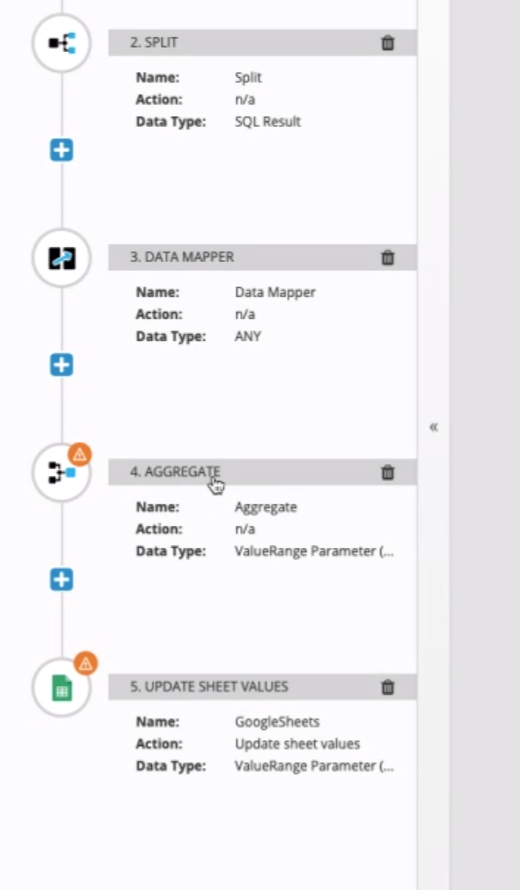
The blue step-suggestion icon is too far inside the step circle/icon.
Expected behavior
It should be placed like the orange data-mismatch icon.
Screenshot
Request and Response Data
API Endpoints and Schemas
Tasks involved / Steps to Reproduce
- Create integration
- Add split and steps that trigger step-suggestion and data-mismatch icons
3.
4.
cc @dongniwang @amysueg
 mcoker
All 5 comments
Also, the orange warning icons are not consistently placed on the edge of their circles -- shouldn't there be one standard location where all of these notification badges are situated? @mcoker
 amysueg
on 15 Feb 2019
amysueg
on 15 Feb 2019
@amysueg previously there was only one of these icons (data mismatch), so it was positioned in the top/right corner location. The new blue (step-suggestion) icon was added and copied the styles of the data-mismatch icon, but looks like there were some styles that were left off. So instead, I created a common class (step-badge) for any type of badge icon that's put in a step icon, so they'll be positioned consistently in the future.
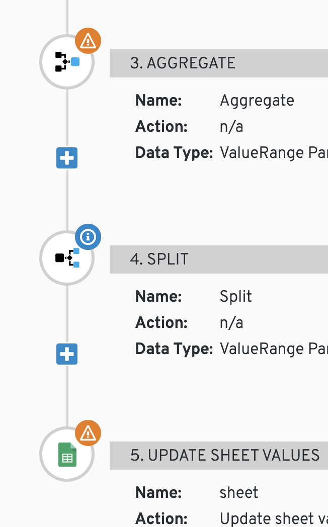
The misaligned orange icon by the aggregate step is another icon that should now use the common step-badge positioning, but I don't see the aggregate step on master (or staging), and made mention of that in the PR to fix this (https://github.com/syndesisio/syndesis/pull/4592). I'll either sort that one out if I've missed it in the app, or if it hasn't been added to master yet, I'll work with who's adding that feature to make sure they pull in the common badge styling for that icon.
mcoker
on 15 Feb 2019
Maybe @christophd could export that integration and attach it to this issue. I think the aggregate step is only available once the integration contains a split step.
 gashcrumb
on 15 Feb 2019
gashcrumb
on 15 Feb 2019
@gashcrumb @christophd great, I was able to replicate the aggregate step and looks like the PR fixed it. From master:
mcoker
on 15 Feb 2019
Looks great!
gashcrumb
on 15 Feb 2019
Related issues
mcoker
·
4Comments
 zregvart
·
3Comments
zregvart
·
3Comments
 mcada
·
6Comments
mcada
·
6Comments
 tplevko
·
5Comments
mcada
·
5Comments
tplevko
·
5Comments
mcada
·
5Comments
Most helpful comment
@amysueg previously there was only one of these icons (data mismatch), so it was positioned in the top/right corner location. The new blue (step-suggestion) icon was added and copied the styles of the data-mismatch icon, but looks like there were some styles that were left off. So instead, I created a common class (step-badge) for any type of badge icon that's put in a step icon, so they'll be positioned consistently in the future.
The misaligned orange icon by the aggregate step is another icon that should now use the common step-badge positioning, but I don't see the aggregate step on master (or staging), and made mention of that in the PR to fix this (https://github.com/syndesisio/syndesis/pull/4592). I'll either sort that one out if I've missed it in the app, or if it hasn't been added to master yet, I'll work with who's adding that feature to make sure they pull in the common badge styling for that icon.