Symplify: [Statie] it's own simple logo?
For better "marketing" purposes we can take an inspiration from https://github.com/sindresorhus and his packages, where a lot of them have their own logo, e.g.:
- https://github.com/sindresorhus/got
- https://github.com/sindresorhus/ky
- https://github.com/sindresorhus/alfy
- https://github.com/sindresorhus/ow
- ...
Something simple, of course. I found nice font that I can play with further:

If you agree, I can arrange that.
 crazko
All 9 comments
Good idea :+1:
If you have 3-4 style I could pick from, that wouldbe great.
This font looks a bit too "robotic".
These keywords pop in my mind when I think of Statie: "simple", "instant", "human".
"Statie" always reminded me a pokemon, like Pikachu or Toggepi, who is saying "Statieeee" with high-pitch voice :D
 TomasVotruba
on 16 Sep 2018
TomasVotruba
on 16 Sep 2018
oh right, pokemon-style sounds good 😆 don't know if I have time for that number of styles, but will see.
crazko
on 16 Sep 2018
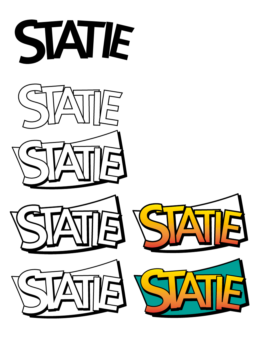
Probably need some more polishing, colors are just random, but see if the direction is right:
crazko
on 16 Sep 2018
Wow, cool :D You mad this all by yourself? Teach me!
Could you try 2-3 different background colors for the one in bottom right? Like puprle?
TomasVotruba
on 16 Sep 2018
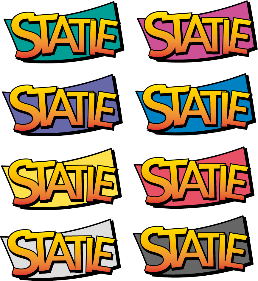
yeah, it's not that hard to work with vectors (at this level of quality 🤣) :) here are more color variations:
crazko
on 17 Sep 2018
I'm getting ready for Singapore so I reaply just now.
I think I like the green one :) :+1:
TomasVotruba
on 24 Sep 2018
Ok, I'll proceed further and update web accordingly. Are you ok also with adding the logo to the top of the Statie's repository readme? I think it's needed it to be part of it, let's say adding it into docs directory, which I think is the common standard.
crazko
on 26 Sep 2018
It's only 4kb big SVG (so small :))
crazko
on 26 Sep 2018
Yes yes :)
With allign to the center (I have no idea how to do it, but it looks solid and strong in others' README)
TomasVotruba
on 27 Sep 2018
Related issues
 boris-brtan
·
3Comments
boris-brtan
·
3Comments
 azdanov
·
8Comments
TomasVotruba
·
7Comments
azdanov
·
8Comments
TomasVotruba
·
7Comments
 OndraM
·
3Comments
OndraM
·
3Comments
 scion4581
·
5Comments
scion4581
·
5Comments