Swag-for-dev: Home Page Redesign
- [X] I've checked that this isn't a duplicate issue.
Hello,
I'm doing the #hacktoberfest and I'd like to propose a visual redesign for the home page.
In my opinion the website right now is a bit bland, I'd like to add more swag to the landing page, to give it a fresh and clean style. I'm planning to leave the html structure untouched as much as possible.
I'll fork the repo and work on the redesign, and it's up to you whether or not you merge my proposition 😃
 anhek
anhek
All 10 comments
Hi @anhek! It'll be great if you could post a sketch / mock of the redesign here to get feedback from the community. 😇
 swapagarwal
on 9 Oct 2019
swapagarwal
on 9 Oct 2019
Alright I'll do that :)
anhek
on 9 Oct 2019
Hello :)
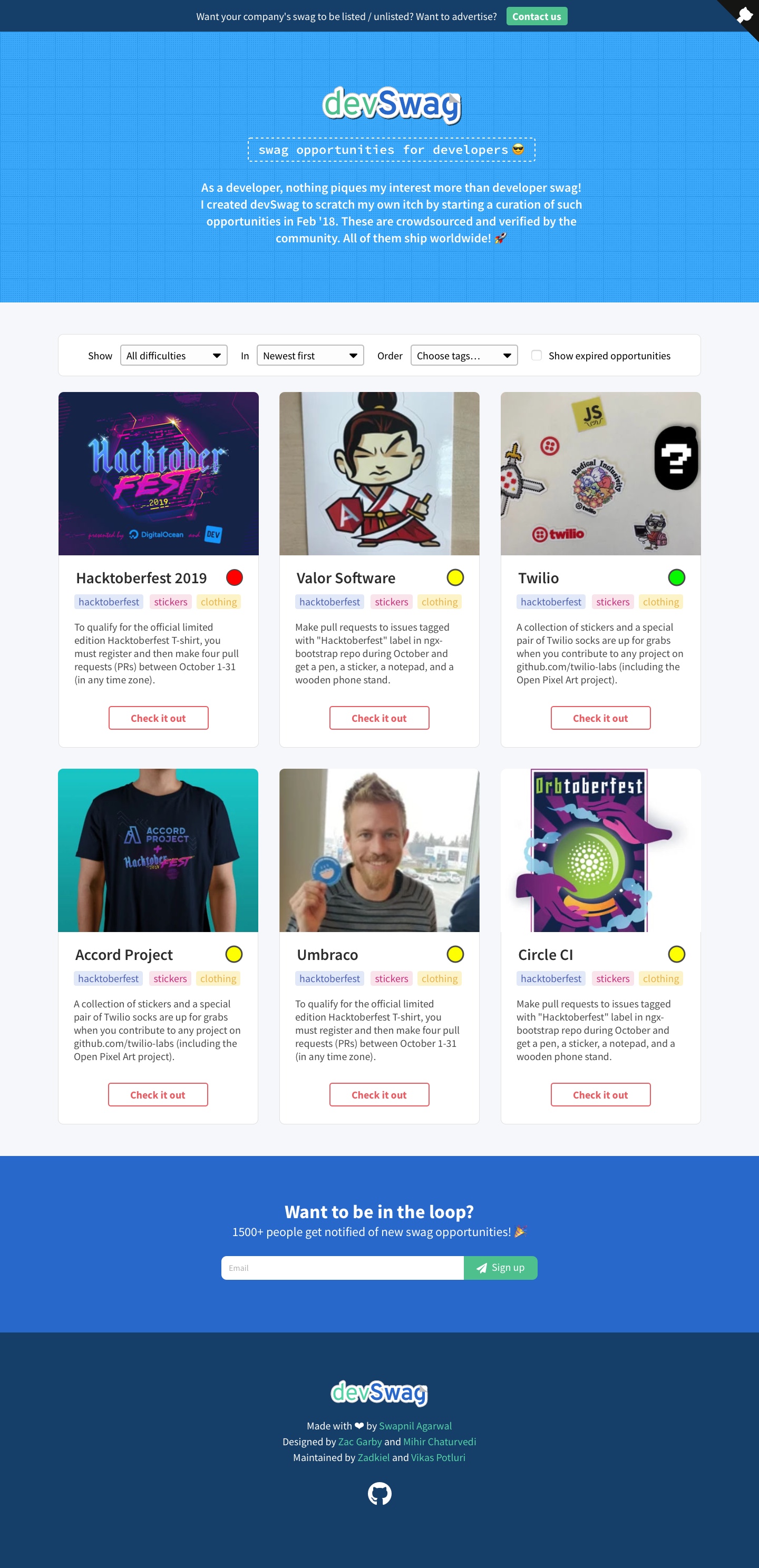
Here's the sketch as previously asked.
I restructured the layout to give it a better readability. My first intention was to create a logo but I've found out someone already worked on this part, so I imported the chosen one (from the poll that was made back in December).
I aimed to create a visual style that is playful and colorful (e.g for the background tags colors) as getting swag is something joyful 😄
I used a mix of Source Sans Pro and Source Code Pro for the fonts. I emphasized the newsletter block to make it more visible.
On the item structure, I put forward the image block before the title because I think the image catch the eye first rather than the title.
I think there's some work to do on the footer but I'll keep that for later.
By the way I don't think having a nav bar (for now) is necessary since there's nowhere to navigate. I'd like to know what you think about this point of view.
Now it's feedback time ! I hope you guys like it ^^
(The pic seems to be blurry I dunno what happens with Sketch 🤔
I'm trying to find the solution to make it crisp)
anhek
on 10 Oct 2019
This looks great! I've posted it in the Telegram group for feedback from the community. 😇
swapagarwal
on 12 Oct 2019
Looks amazing ! Good work 🔥
 Yash-Garg
on 12 Oct 2019
Yash-Garg
on 12 Oct 2019
351
 aslafy-z
on 14 Oct 2019
aslafy-z
on 14 Oct 2019
Some feedback from the community:
- Oh gosh the ui looks cleaner
- This is lit 🔥🔥
- Looks 🔥
- Cool
- UI looks amazing 🤩
@anhek Let's go ahead! 💯
swapagarwal
on 14 Oct 2019
Thank you for the feedbacks 🤓
My laptop just died today (need to bring it Wednesday for reparation), I’ll restart the integration work on another laptop and I’ll stay in touch with you guys 👌
anhek
on 14 Oct 2019
Dark mode draft https://github.com/swapagarwal/swag-for-dev/pull/214
aslafy-z
on 16 Oct 2019
Closed with #443 :100:
aslafy-z
on 3 May 2020
Related issues
 vmr1532
·
5Comments
vmr1532
·
5Comments
 butlerx
·
7Comments
aslafy-z
·
6Comments
aslafy-z
·
3Comments
aslafy-z
·
5Comments
butlerx
·
7Comments
aslafy-z
·
6Comments
aslafy-z
·
3Comments
aslafy-z
·
5Comments
Most helpful comment
Hello :)
Here's the sketch as previously asked.
I restructured the layout to give it a better readability. My first intention was to create a logo but I've found out someone already worked on this part, so I imported the chosen one (from the poll that was made back in December).
I aimed to create a visual style that is playful and colorful (e.g for the background tags colors) as getting swag is something joyful 😄
I used a mix of Source Sans Pro and Source Code Pro for the fonts. I emphasized the newsletter block to make it more visible.
On the item structure, I put forward the image block before the title because I think the image catch the eye first rather than the title.
I think there's some work to do on the footer but I'll keep that for later.
By the way I don't think having a nav bar (for now) is necessary since there's nowhere to navigate. I'd like to know what you think about this point of view.
Now it's feedback time ! I hope you guys like it ^^
(The pic seems to be blurry I dunno what happens with Sketch 🤔
I'm trying to find the solution to make it crisp)