Support: Please review my project and my profile
Items we can review on a live stream:
- GitHub profile: https://github.com/tusharnankani
- Open-source project: https://github.com/tusharnankani/ToDoList
PS: The project is not really advanced, but I received contributions lately, and I try to maintain all my projects the right way.
You can also join the discord community here
Feel free to check out other cool repositories of Eddie Jaoude Community here
 tusharnankani
All 6 comments
It's great having you contribute to this project
Feel free to raise an Issue! Welcome to the community :nerd_face:If you would like to continue contributing to open source and would like to do it with an awesome inclusive community, you should join our Discord chat and our GitHub Organisation - we help and encourage each other to contribute to open source little and often 🤓 . Any questions let us know.
![github-actions[bot] picture](https://avatars.githubusercontent.com/in/15368?v=4&s=40) github-actions[bot]
on 5 Dec 2020
github-actions[bot]
on 5 Dec 2020
Thank you for sharing 👍 . I will review in a video / live stream soon 🤓
 eddiejaoude
on 5 Dec 2020
eddiejaoude
on 5 Dec 2020
I reviewed your profile. It's good. Some minor suggestions:
This is your bottom section
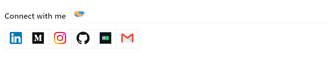
Remove the table, have the linked images in a div next to each other, and center that div. I think it will look better.I always recommend getting rid of the
profile viewstab. Those stats keep incrementing at every Refresh and can thus be manipulated. Hence not trustworthy.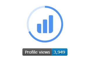
Thealt textfor this logo is Github readme stats, but there are no stats, neither does the image lead the user anywhere. Having it in the center is confusing as the visitor tends to click on it, hoping for more info. Consider removing it or placing it in a corner for less importance. Don't make it the center of attention.
 adityaraute
on 17 Jan 2021
adityaraute
on 17 Jan 2021
Also reviewed your project. Looks awesome. Some suggestions:
- Make the to-do cards more attractive. Simple rounded rectangles don't do it for me.
- When I delete a card, the screen momentarily shrinks with the scroll bar appearing, and then it's back to now. Try solving this issue.
- Add a link to the bottom corner to your repo or profile.
- Make sure to address the issues and PRs as they appear. I see some old stuff still hanging around.
adityaraute
on 17 Jan 2021
Reviewing with the community on a live stream https://youtu.be/oM8rBNyiwPY
The app looks great, here are some suggestions
CSSandJSshould probably be lowercase- Screenshot from the app high up in the README (consider having an animated gif)
- Add a quickstart guide
eddiejaoude
on 1 Feb 2021
Maybe add in a PR template too!
 Akshu-on-github
on 1 Feb 2021
Akshu-on-github
on 1 Feb 2021
Related issues
 stemount
·
4Comments
stemount
·
4Comments
 AllanRegush
·
4Comments
AllanRegush
·
4Comments
 ChoukseyKhushbu
·
4Comments
ChoukseyKhushbu
·
4Comments
 jai-dewani
·
4Comments
adityaraute
·
5Comments
jai-dewani
·
4Comments
adityaraute
·
5Comments
Most helpful comment
I reviewed your profile. It's good. Some minor suggestions:
This is your bottom section

Remove the table, have the linked images in a div next to each other, and center that div. I think it will look better.
I always recommend getting rid of the
profile viewstab. Those stats keep incrementing at every Refresh and can thus be manipulated. Hence not trustworthy.The
alt textfor this logo is Github readme stats, but there are no stats, neither does the image lead the user anywhere. Having it in the center is confusing as the visitor tends to click on it, hoping for more info. Consider removing it or placing it in a corner for less importance. Don't make it the center of attention.