Suitecrm: 7.10.4 Dusk theme optimization
Colors and spaces were better overall in 7.10 than in the later verions.
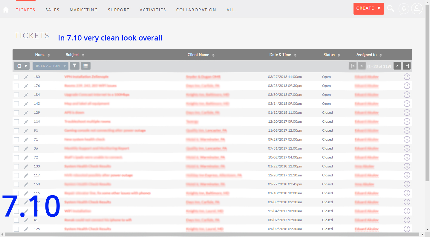
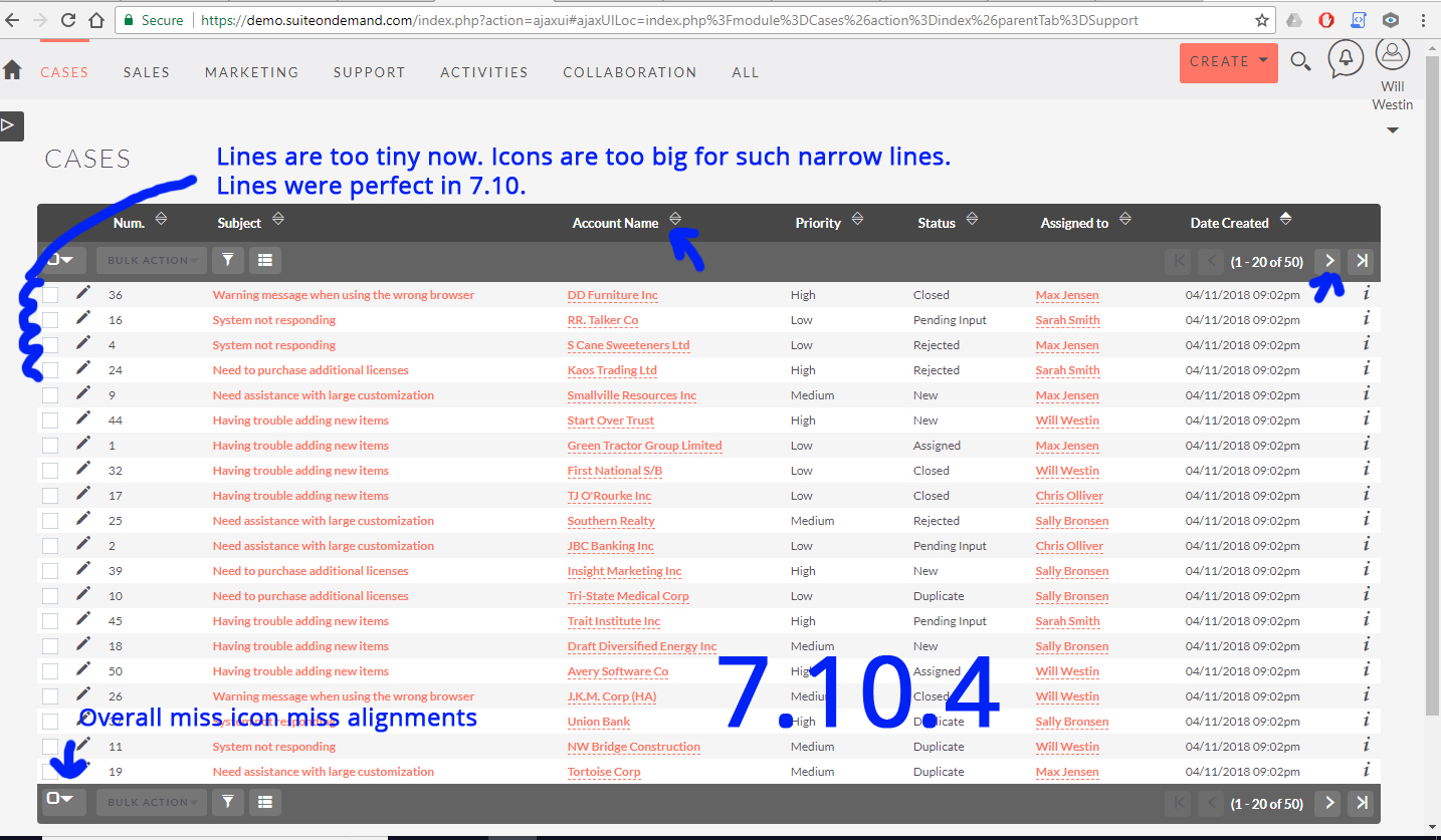
- Overall the theme became even more squeezed to point where the list view lines are too tiny. 7.10 was perfect!
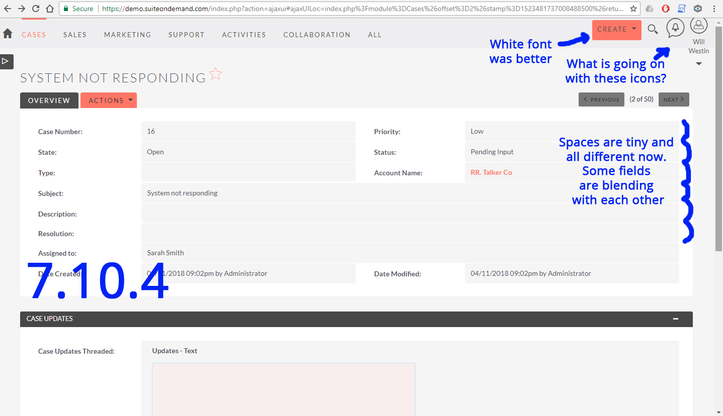
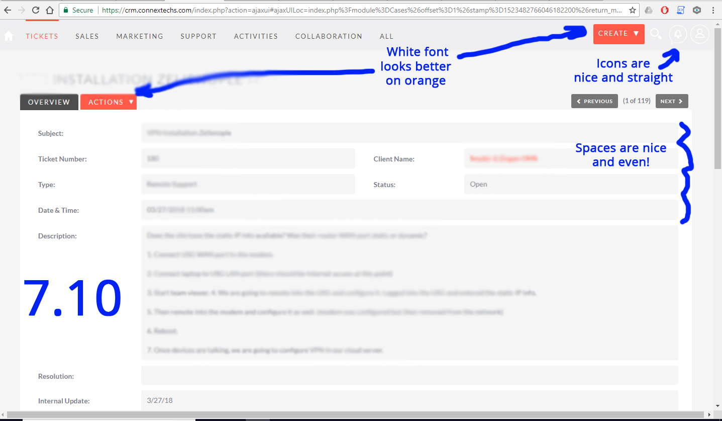
- Spaces between fields in modules became super tiny. Some fields started to blend with each other, some have tiny gaps, one different from another. Does not look professional. 7.10 was perfect!
- Top right corner icons - Create, Search, Notifications, Profile are now crazy off the alignment. Especially the profile icon is now far off because of the profile name that appeared under it after 7.10.1. I tried all my computers and even your demo site. The icons are very miss-aligned. 7.10 was perfect!
- Create button and all other buttons/menus that are orange color used to have white font, now it's black. White looked much much better in 7.10. Again 7.10 was perfect!
7.10.4
www.photobox.co.uk/my/photo/full?photo_id=500715710488
www.photobox.co.uk/my/photo/full?photo_id=500715709771
7.10
www.photobox.co.uk/my/photo/full?photo_id=500715709951
www.photobox.co.uk/my/photo/full?photo_id=500715709936
 acoolov
All 4 comments
Hi @acoolov - I mentioned the issue with the images on the forum post.
We can't see the screenshots but you are able to upload them via github rather than using photobox.
 samus-aran
on 12 Apr 2018
samus-aran
on 12 Apr 2018
Here are the pictures I tried to attach in my above post.
acoolov
on 12 Apr 2018
@acoolov some of the things you mention are issues that are already being looked at.
Namely a couple related to the new icon set:
- the small mis-alignments in the dropdowns #5703
- the top-right icons: #5634, but there's still #5675
About the rest:
- spacing in 7.10.0 was not perfect, it was just _perfect for you_. There were actually several protests from several people, leading to the spacing reduction.
- the same goes for the color changes in the menus: they are about adding the contrast that several people demanded (some of them due to visual impairments).
So I believe we just need to fix the first two issues, and slightly improve the other two, but without going back. So, at most, we could try:
- fine tune the smaller spaced theme so that the grey areas don't overlap
- check if the menu text color for the Dusk theme is really more contrasty this way, or like it was before.
Apart from this, I would advise you to customize your CSS to fit your needs and tastes. There's no pleasing every one. I also feel the Community could come forward and start producing theme variants to diversify what is available.
This is just my opinion, I'm open to hearing other people, of course.
 pgorod
on 13 Apr 2018
pgorod
on 13 Apr 2018
I got the same problem, the grey background overlap. It always happens when looking at the line items of the detailview of a quote or contract.
I posted this and more details in the forum: https://suitecrm.com/suitecrm/forum/developer-help/18807-show-borders-between-line-items-in-detailview
 MTet
on 3 May 2018
MTet
on 3 May 2018
Related issues
 Vhex
·
3Comments
Vhex
·
3Comments
 Mausino
·
3Comments
Mausino
·
3Comments
 daschenbrener
·
3Comments
pgorod
·
3Comments
daschenbrener
·
3Comments
pgorod
·
3Comments
 sasha2002
·
3Comments
sasha2002
·
3Comments
Most helpful comment
@acoolov some of the things you mention are issues that are already being looked at.
Namely a couple related to the new icon set:
About the rest:
So I believe we just need to fix the first two issues, and slightly improve the other two, but without going back. So, at most, we could try:
Apart from this, I would advise you to customize your CSS to fit your needs and tastes. There's no pleasing every one. I also feel the Community could come forward and start producing theme variants to diversify what is available.
This is just my opinion, I'm open to hearing other people, of course.