Styled-components-website: Better TypeScript setup for themes
I would like to suggest an improved TypeScript theming setup.
Currently, the docs suggest duplicating your theme: creating one in theme.ts with the values and another in a styled.d.ts declarations file. This has current setup has two limitations.
1) It isn't DRY - duplication over these two seperate files is annoying to type out.
2) Types are vague - You should not only get the name and type (e.g. string) in your autocomplete but also the value (e.g. hsl(200, 12%, 17%) ).
I've found a setup that works better for me, which you can find here on my personal website. This setup has less duplication, keeps all your theming in one file and gives you more informative autocomplete.
First, you type-cast your values so that you get more informative autocomplete:
const theme = {
  // blues
  b100: 'hsl(221,100%,11%)' as 'hsl(221,100%,11%)',
  b200: 'hsl(212,80%,20%)' as 'hsl(212,80%,20%)',
  b300: 'hsl(207,84%,24%)' as 'hsl(207,84%,24%)',
  b400: 'hsl(208,60%,35%)' as 'hsl(208,60%,35%)',
  b500: 'hsl(206,61%,40%)' as 'hsl(206,61%,40%)',
  b600: 'hsl(205,53%,48%)' as 'hsl(205,53%,48%)',
  b700: 'hsl(205,56%,57%)' as 'hsl(205,56%,57%)',
  b800: 'hsl(206,68%,71%)' as 'hsl(206,68%,71%)',
  b900: 'hsl(208,82%,85%)' as 'hsl(208,82%,85%)',
}
Second, you import this theme file and extend it, rather than typing out all your values again:
// import original module declarations
import 'styled-components'
// import your custom theme
import theme from '../utils/theme'

// extend the module declarations using custom theme type

type Theme = typeof theme

declare module 'styled-components' {
  export interface DefaultTheme extends Theme {}
}
That's it!
I think this is a much better way to type your theme and I'd be happy to go and make a PR for the docs if the team agrees.
My one question is about interface DefaultTheme extends Theme {}. This gives me a eslint error with my current setup that warns me about empty themes. However, I can't think of a better way to rename Theme to DefaultTheme so I'm sticking with it for now.
 mulholio
All 7 comments
Just wanted to say thanks for writing this up, it was immediately useful and does exactly what I need!
 andy-hook
on 21 May 2019
andy-hook
on 21 May 2019
How do we fix/hide that eslint error though?
EDIT: Ok I just created my theme object without annotating it already with DefaultTheme (like you do actually, I didn't notice earlier), so by writing const theme = {} and not const theme: DefaultTheme = {}
 eyerean
on 14 Aug 2019
eyerean
on 14 Aug 2019
We can remove the duplicate code:
const theme = {
  // blues
  b100: 'hsl(221,100%,11%)' as 'hsl(221,100%,11%)',
  b200: 'hsl(212,80%,20%)' as 'hsl(212,80%,20%)',
  b300: 'hsl(207,84%,24%)' as 'hsl(207,84%,24%)',
  b400: 'hsl(208,60%,35%)' as 'hsl(208,60%,35%)',
  b500: 'hsl(206,61%,40%)' as 'hsl(206,61%,40%)',
  b600: 'hsl(205,53%,48%)' as 'hsl(205,53%,48%)',
  b700: 'hsl(205,56%,57%)' as 'hsl(205,56%,57%)',
  b800: 'hsl(206,68%,71%)' as 'hsl(206,68%,71%)',
  b900: 'hsl(208,82%,85%)' as 'hsl(208,82%,85%)',
}
For a flat object, use a single enum:

For nested objects, use multiple enums inside the theme object.
For nested arrays, use as const:
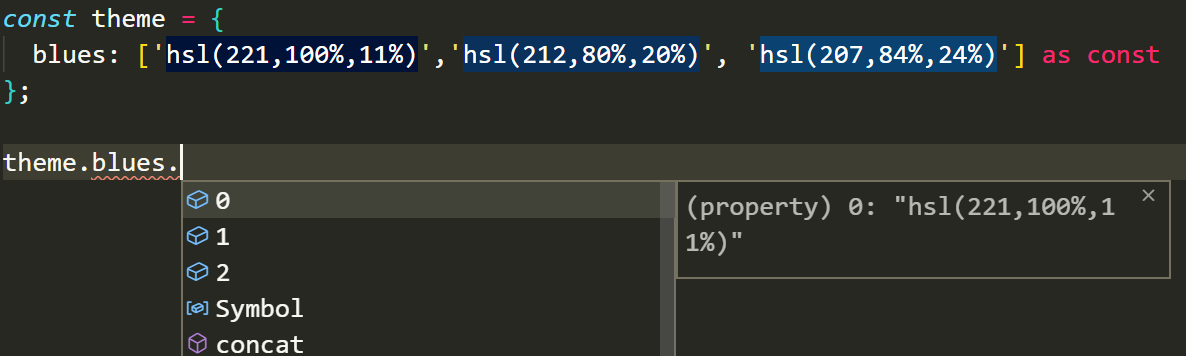
 zbeyens
on 22 Nov 2019
zbeyens
on 22 Nov 2019
To add on to @zbeyens comment, it is since typescript 3.4.x that you can write
const theme = {
  // blues
  b100: 'hsl(221,100%,11%)',
  b200: 'hsl(212,80%,20%)',
  b300: 'hsl(207,84%,24%)',
  b400: 'hsl(208,60%,35%)',
  b500: 'hsl(206,61%,40%)',
  b600: 'hsl(205,53%,48%)',
  b700: 'hsl(205,56%,57%)',
  b800: 'hsl(206,68%,71%)',
  b900: 'hsl(208,82%,85%)',
} as const;
instead, which works for all the literals in your theme. See https://www.typescriptlang.org/docs/handbook/release-notes/typescript-3-4.html#const-assertions
edit: I missed zbeyen's comment, which made the same point first. I have kept mine because it adds information on when this feature was supported in typescript.
 jhanschoo
on 18 Jul 2020
jhanschoo
on 18 Jul 2020
Wow thanks! I had a pretty similar setup but this works as you would expect!
 EddyVinck
on 20 Jul 2020
EddyVinck
on 20 Jul 2020
Are there any guidelines for nested themes in TypeScript? Take the following example:
interface Theme1 {
    hello: string;
}

interface Theme2 {
    world: string;
}

function App() {
    const theme1: Theme1 = {
        hello: "theme1",
    };
    const theme2: Theme2 = {
        world: "theme2",
    };
    return (
        <ThemeProvider theme={theme1}>
            <Test />
            <ThemeProvider theme={theme2}>
                <Test />
            </ThemeProvider>
        </ThemeProvider>
    );
}

function Test() {
    console.dir(useTheme());
    return <></>;
}
The outer test element will receive a theme object of type Theme1 whereas the inner one will receive an object of type Theme1 & Theme2.
 connelhooley
on 29 Jul 2020
connelhooley
on 29 Jul 2020
Are there any guidelines for nested themes in TypeScript? Take the following example:
You can extend DefaultTheme like so:
import defaultStyled, {
  css as defaultCss,
  DefaultTheme,
  ThemedStyledInterface,
  ThemedCssFunction,
} from 'styled-components';

interface DarkTheme extends DefaultTheme {/* */}
const styled = (defaultStyled as unknown) as ThemedStyledInterface<
  DarkTheme
>;
const css = defaultCss as ThemedCssFunction<DarkTheme>;
This is where the dark theme is extending the original but you could also adapt to override it instead.
mulholio
on 30 Jul 2020
Related issues
 MicheleBertoli
·
3Comments
MicheleBertoli
·
3Comments
 markatk
·
5Comments
markatk
·
5Comments
 mxstbr
·
3Comments
mxstbr
·
4Comments
mxstbr
·
5Comments
mxstbr
·
3Comments
mxstbr
·
4Comments
mxstbr
·
5Comments
Most helpful comment
Just wanted to say thanks for writing this up, it was immediately useful and does exactly what I need!