Streetcomplete: Indicate that categories contain other values
Use case
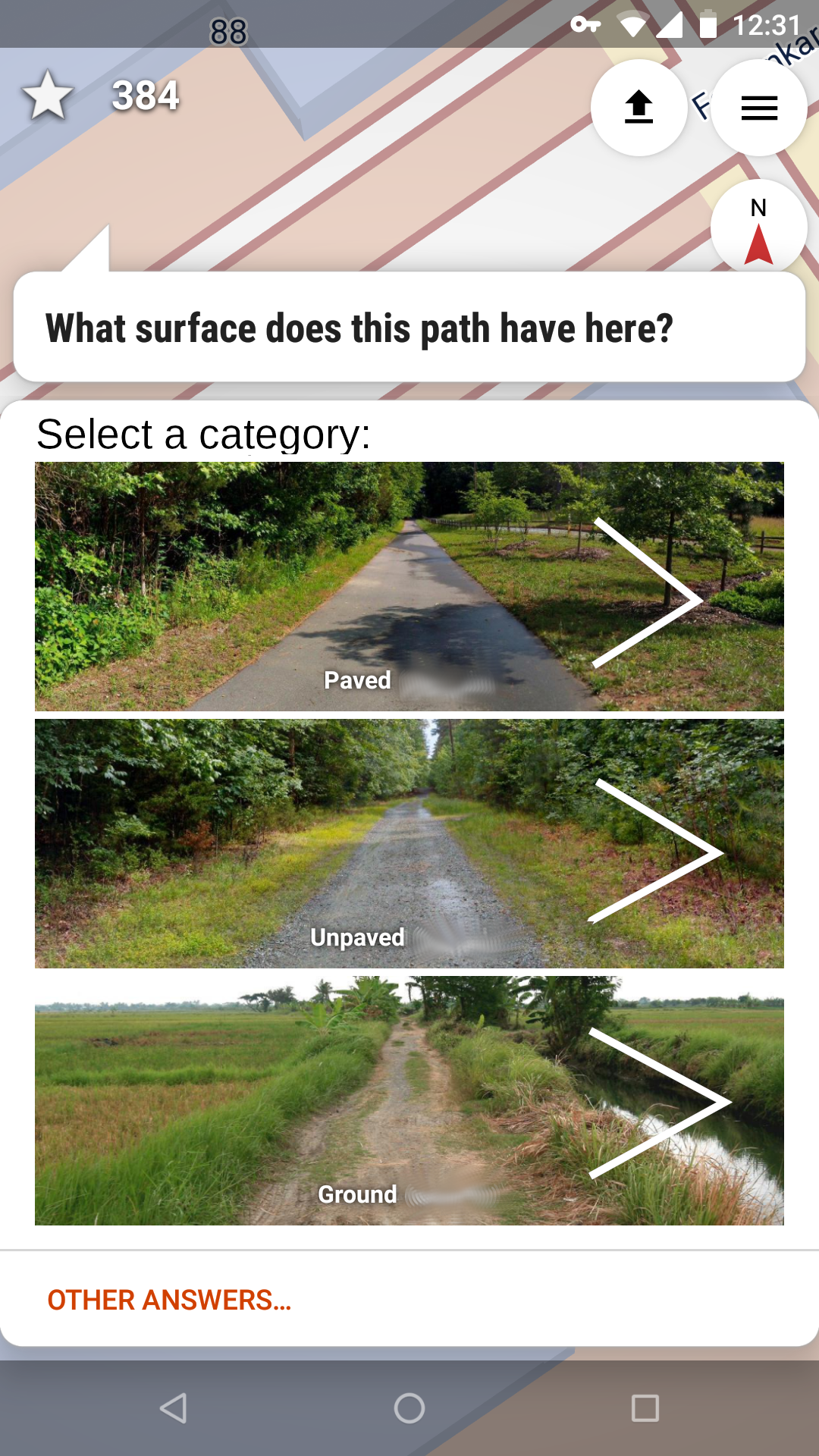
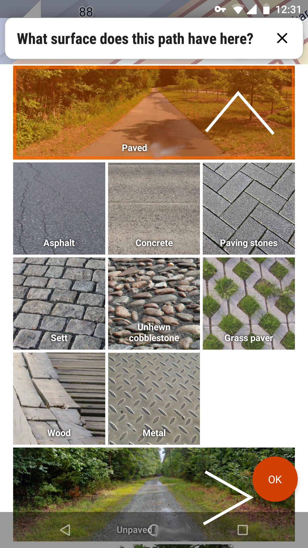
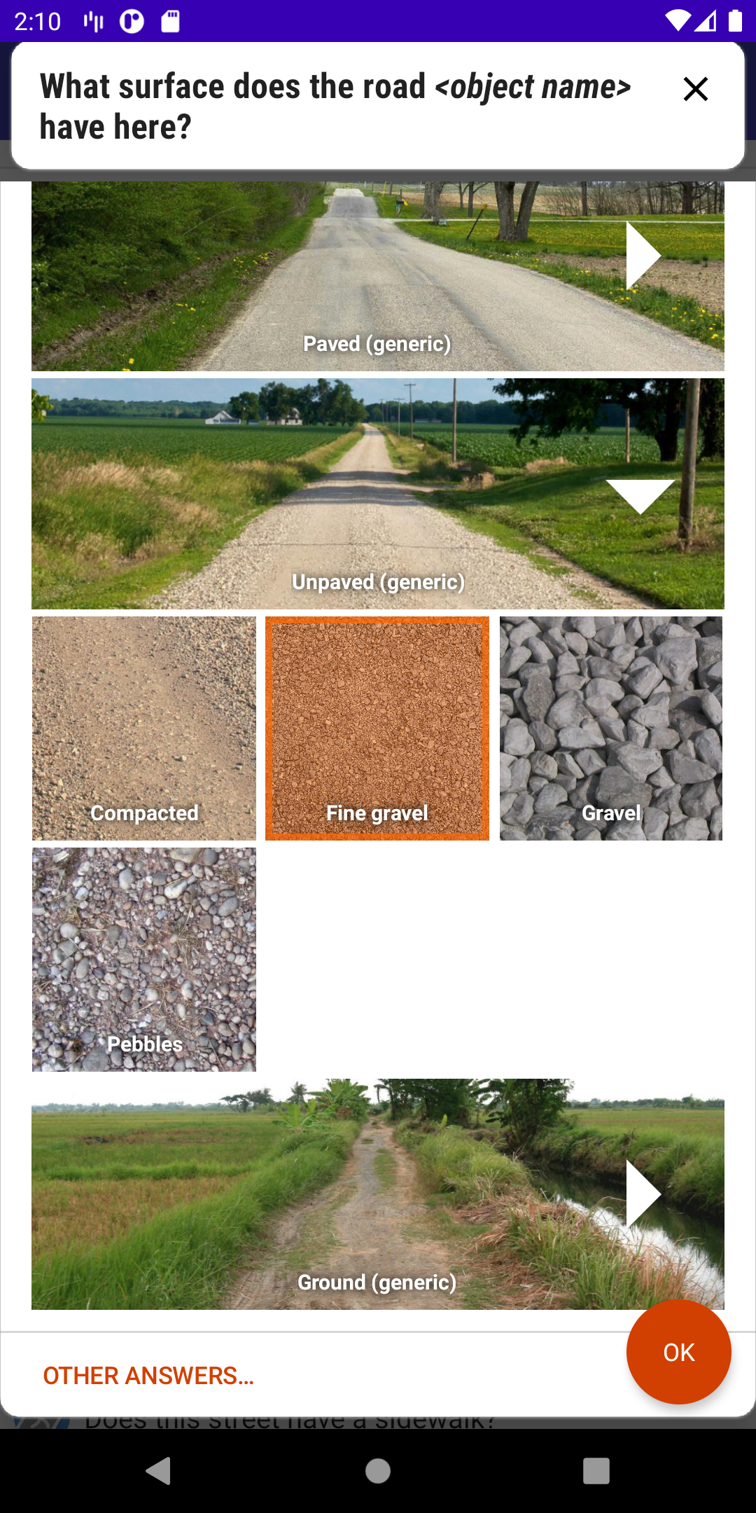
When I recently started using StreetComplete, I was looking for the "wood" and "metal" surface types (mostly for bridges and stairs), but could not find them in the app, instead leaving notes (and probably annoying my local OSM community). I did not realise how to find them until I went to report them missing as a bug and discovered #1863, which pointed out that the "generic" labels were actually categories, not final values.
Proposed Solution
I would suggest three changes to improve the discoverability:
- Change the wording of the heading to include the word "category" or similar, to indicate that the selection is not a final value.
- Remove the word "generic" from the category name. I am not describing a generic paved path, I am selecting a specific type of paving.
- Include a visual indication that more options will appear when an option is selected, e.g. an ellipsis (…), chevron right (>), or chevron down (∨), preferably changing to its opposite when the category is expanded (i.e. a chevron right on a closed category changes to a chevron left on an expanded one).
This should also be used for building types, and any other quests using a similar UI paradigm of first selecting a category and then an item in that category.
Examples:
 creideiki
All 15 comments
It seems like the main source of confusion is overloading the generic surface section as both a category and an option that can be selected. When I first started using SC I was actually confused in the other direction; I didn't initially realize that the generic options could be submitted (I think this was using an older interface without the obvious "you can submit now" cue of the floating action button appearing).
What if we made it so they're only categories that expand, and then "Generic" (perhaps with a different phrasing, like "Other" or "None of the above") could be an option under that at the end?
 smichel17
on 14 Jul 2020
smichel17
on 14 Jul 2020
The arrows are a good idea!
The wording is also good. It could start with "select a category" and once you selected an item, the text changes to the usual one.
 westnordost
on 14 Jul 2020
westnordost
on 14 Jul 2020
@smichel17 idea is also good.
westnordost
on 14 Jul 2020
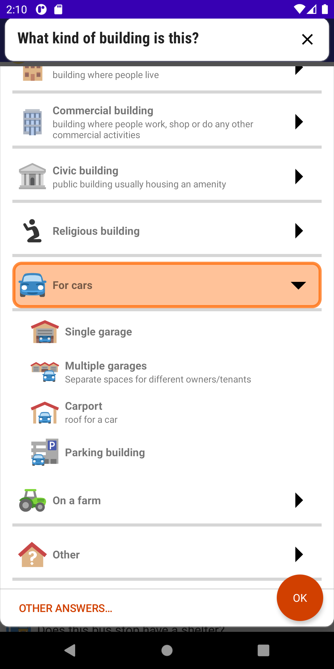
A similar problem seems to appear in the "What kind of building is this?" quest: #2138
Not realizing categories can be expanded seems to be a (surprisingly, to me) common issue (given that you only need to try and submit one of the more generic answers to see that it expands). And if several people posting here -- who are invested enough to open an issue -- have this problem, I'd guess it's more common in the general population of users.
I wonder if this type of interface should be avoided, or whether there is some improvement that would make the functionality more obvious.
The most confusing part to me is that you can select the categories. So I would advocate for not allowing that, and instead adding a "generic" option at the end of each section when expanded. And then we would need some additional visual cue that it can be expanded.
_Originally posted by @smichel17 in https://github.com/westnordost/StreetComplete/issues/2138#issuecomment-704235013_
I am reposting this here to prevent the discussion from getting lost in a closed issue.
 FloEdelmann
on 6 Oct 2020
FloEdelmann
on 6 Oct 2020
Ha, I guess I made the same suggestion twice :D
smichel17
on 7 Oct 2020
👋 I opened #2138. I was going to make a design suggestion over there, very similar to @creideiki's above, - using a carat to signify the list below the category title, but modifying the top-level category label to reenforce that options appear below. I 100% agree with their approach. Using a caret (an arrow) is very common to show this in a UI.
I've taken the liberty to expand on @creideiki's idea above, by making these wireframes:
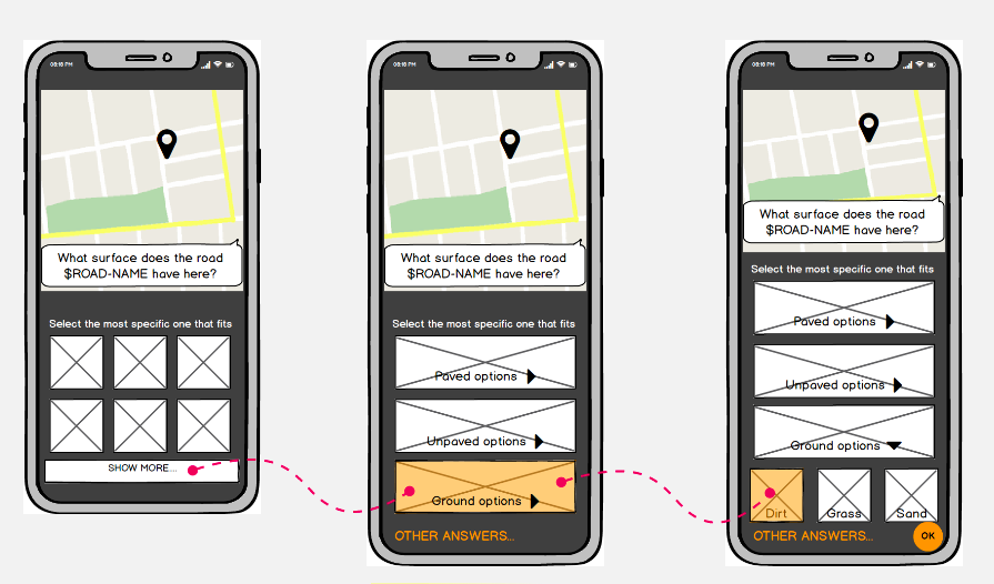
These are hosted here: https://miro.com/app/board/o9J_kitrI3E=/
You can comment on that board if you like.
 ei8fdb
on 12 Oct 2020
ei8fdb
on 12 Oct 2020
I also wanted to add - this UI pattern should apply to this category /sub-category picker throughout SC.
ei8fdb
on 12 Oct 2020
Well, I believe the current decision is to do away with the categories alltogether: Instead of these subcategories, the "generic" options should be shown at the very bottom of the list and when a user selects these, he will be asked for confirmation and a short comment as to why no other more specific surface fits. The PR is #2078 , by @matkoniecz , but he stalled working on it for some time now. Not sure what is the status.
westnordost
on 13 Oct 2020
However this ticket is still valid because there is one other place where the category select is used (building types)
westnordost
on 13 Oct 2020
but he stalled working on it for some time now. Not sure what is the status.
I will continue #2078 and kerb one tomorrow. Was planning today but it degenerated into debugging why my laptop falls into bootloop at start in GRUB menu (when screen is attached with HDMI).
 matkoniecz
on 13 Oct 2020
matkoniecz
on 13 Oct 2020
Oh no! You truly are unlucky!
westnordost
on 13 Oct 2020
Well, I believe the current decision is to do away with the categories alltogether
So the list of options to choose from gets longer? @matkoniecz any reason for doing away with the category/subcategory UI pattern?
The options paved/unpaved/ground are distinct enough for confusion to be minimum. In terms of selection, it'd be more efficient for the user to choose a category, then choose one of a small number of options.
ei8fdb
on 13 Oct 2020
However this ticket is still valid because there is one other place where the category select is used (building types)
The usability issue (based on the discussion in #2138 issue) is it is unclear to users that options exist below the generic category, due to no visual indication of being able to expand the list. This is common.
Providing some visual indication (closed/open caret) should be sufficient. If some text is desired, that would re-enforce the ability to expand.
ei8fdb
on 13 Oct 2020
So the list of options to choose from gets longer? @matkoniecz any reason for doing away with the category/subcategory UI pattern?
Yeah but not by that much, there are not that many options in each category anyway - unlike for the building types quest.
This has been discussed before, not sure where, maybe this ticket, maybe another. Here is a summary:
Using values such as paved, unpaved (and ground) is slightly discouraged because it is horribly imprecise. unhewn_cobblestone and asphalt are both paved, but worlds away from one another in terms of expected smoothness.
This is why @matkoniecz recently added a quest type that asks for roads whose surface is just tagged that generically to define them further. The consideration now is to merge the "define surface" and the "define surface more precisely" quest into one, i.e. ask to describe the reason why it can't be defined further directly in the "define surface" quest.
westnordost
on 13 Oct 2020
westnordost
on 13 Oct 2020
Related issues
 ecksun
·
3Comments
ecksun
·
3Comments
 escoand
·
4Comments
escoand
·
4Comments
 lzmartinico
·
4Comments
lzmartinico
·
4Comments
 RubenKelevra
·
4Comments
RubenKelevra
·
4Comments
 Helium314
·
3Comments
Helium314
·
3Comments
Most helpful comment
It seems like the main source of confusion is overloading the generic surface section as both a category and an option that can be selected. When I first started using SC I was actually confused in the other direction; I didn't initially realize that the generic options could be submitted (I think this was using an older interface without the obvious "you can submit now" cue of the floating action button appearing).
What if we made it so they're only categories that expand, and then "Generic" (perhaps with a different phrasing, like "Other" or "None of the above") could be an option under that at the end?