Streetcomplete: Use a different colour for the position marker
Hi,
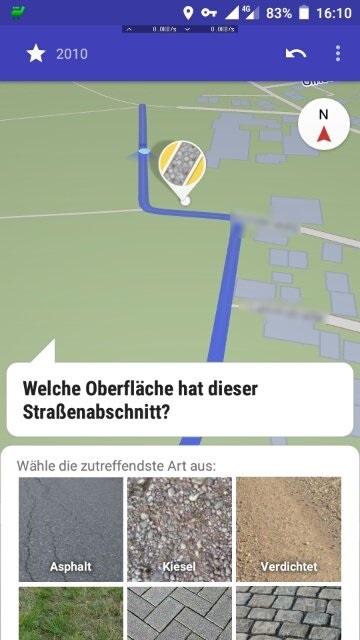
while answering a street surface quest, the position marker shown in the map in the upper half of the screen has almost the same colour as the marked part of the road. This makes it difficult to find it for 50+ people like me whose eyesight is more and more decreasing (presbyopia, problems with low contrasts and so on). See the following screenshot:

Suggestion: Simply use a different color for either the marked part of the road or the position marker. I'd suggest to use a strong red for the latter.
The cycling cat
 cyclingcat
All 9 comments
I used he accent color (orange) at the very beginning, but this color on the map looked like there was an error or something on the map. It was simply too prominent.
What is the use case for easily knowing where you are on the map while you opened a quest? Wouldn't you know where you are before you open the quest?
 westnordost
on 31 Mar 2020
westnordost
on 31 Mar 2020
In some situations you have to look very carefully where you currently are and which OSM way you are actually editing. For example some ways are very short (5-10 m) with changing road surfaces. Which one is the road you just turned in? Are you still on the marked section on the map (= the correct OSM way) or on the next one (possibly with a different surface)? And so on... the VERY low contrast between the position marker and the selected road snippet isn't helpful in these cases.
What about a different colour that doesn't look like "error"? Magenta? Cyan?
The cycling cat
cyclingcat
on 31 Mar 2020
Hmm okay, one needs to find a color that is visible both on dark and light mode so that it does not become necessary to use two different ones.
westnordost
on 31 Mar 2020
Cyan sounds not to bad. It could also just be a different shade of the blue, something visibly brighter for example. As its just a dot it should not be to harsh on the dark mode, i guess?
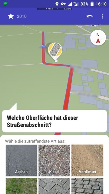
Edit: Bad example:
 natrius
on 6 May 2020
natrius
on 6 May 2020
An alternative is to solve this with shape rather than color. What about increasing the width of the white border?
 smichel17
on 6 May 2020
smichel17
on 6 May 2020
Why not use a 3D object, like a cylinder upside-down? From the top it's a circle with a border, from the side it looks like an arrow to the point where you stand.
This should make the position much more clearly when the map is tilted.
Instead of changing the color of the position marker, why not change the color of the selection?
 RubenKelevra
on 28 May 2020
RubenKelevra
on 28 May 2020
Cyan sounds not to bad. It could also just be a different shade of the blue, something visibly brighter for example. As its just a dot it should not be to harsh on the dark mode, i guess?
cyan looks fine to me, and I think about implementing it. If someone has an opinion based on mockup from https://github.com/westnordost/StreetComplete/issues/1769#issuecomment-624537803 then now would be the moment to comment about this.
 matkoniecz
on 5 Sep 2020
matkoniecz
on 5 Sep 2020
I think the accent color (dark orange) would make sense
westnordost
on 6 Sep 2020
implemented
westnordost
on 7 Sep 2020
Related issues
 rugk
·
3Comments
RubenKelevra
·
3Comments
rugk
·
3Comments
RubenKelevra
·
3Comments
 ecksun
·
3Comments
ecksun
·
3Comments
 MattWhilden
·
3Comments
MattWhilden
·
3Comments
 forteller
·
3Comments
forteller
·
3Comments
Most helpful comment
implemented