Streetcomplete: Create adaptive icon
As we recently had https://github.com/westnordost/StreetComplete/issues/1049 and https://github.com/westnordost/StreetComplete/issues/1069 I think we can actually really do something useful for the icon. Create an adaptive one!
https://developer.android.com/guide/practices/ui_guidelines/icon_design_adaptive
It may (or should?) not really be a (complete) re-design, but rather adapting the current icon to the new Android standard.
/cc @richardbmx, @Yasujizr
 rugk
rugk
All 13 comments
Hi,
If you really want, I'll start doing it. It would be better if you write your requests exactly.
Best regards.
 Yasujizr
on 18 May 2018
Yasujizr
on 18 May 2018
Indeed, taht's what @westnordost needs to do.
rugk
on 18 May 2018
Sure, making the current icon adaptive would be an improvement.
 westnordost
on 18 May 2018
westnordost
on 18 May 2018
We can change everything you want. I just did this as an example. It would be better if you told us what you wanted.
Yasujizr
on 22 May 2018
Well, I thought if making the _current icon_ adaptive. It seems you changed the colors there, at least.
But maybe @westnordost can define/explain it in a better way.
rugk
on 22 May 2018
Rugk, it's your ticket.
But anyway, I also understood that this ticket is about making the current icon adaptive. For what that needs to be done and how, you already linked the documentation, so it should be pretty clear.
On May 22, 2018 10:26:43 PM GMT+02:00, rugk notifications@github.com wrote:
Well, I thought if making the _current icon_ adaptive. It seems you
changed the colors there, at least.But maybe @westnordost can define/explain it in a better way.
westnordost
on 23 May 2018
Well… it's your project and you will have to like this new icon in the end. Could have been you say, "Hey yeah, great. Why not make that thing green at the top. Looks good." or so.
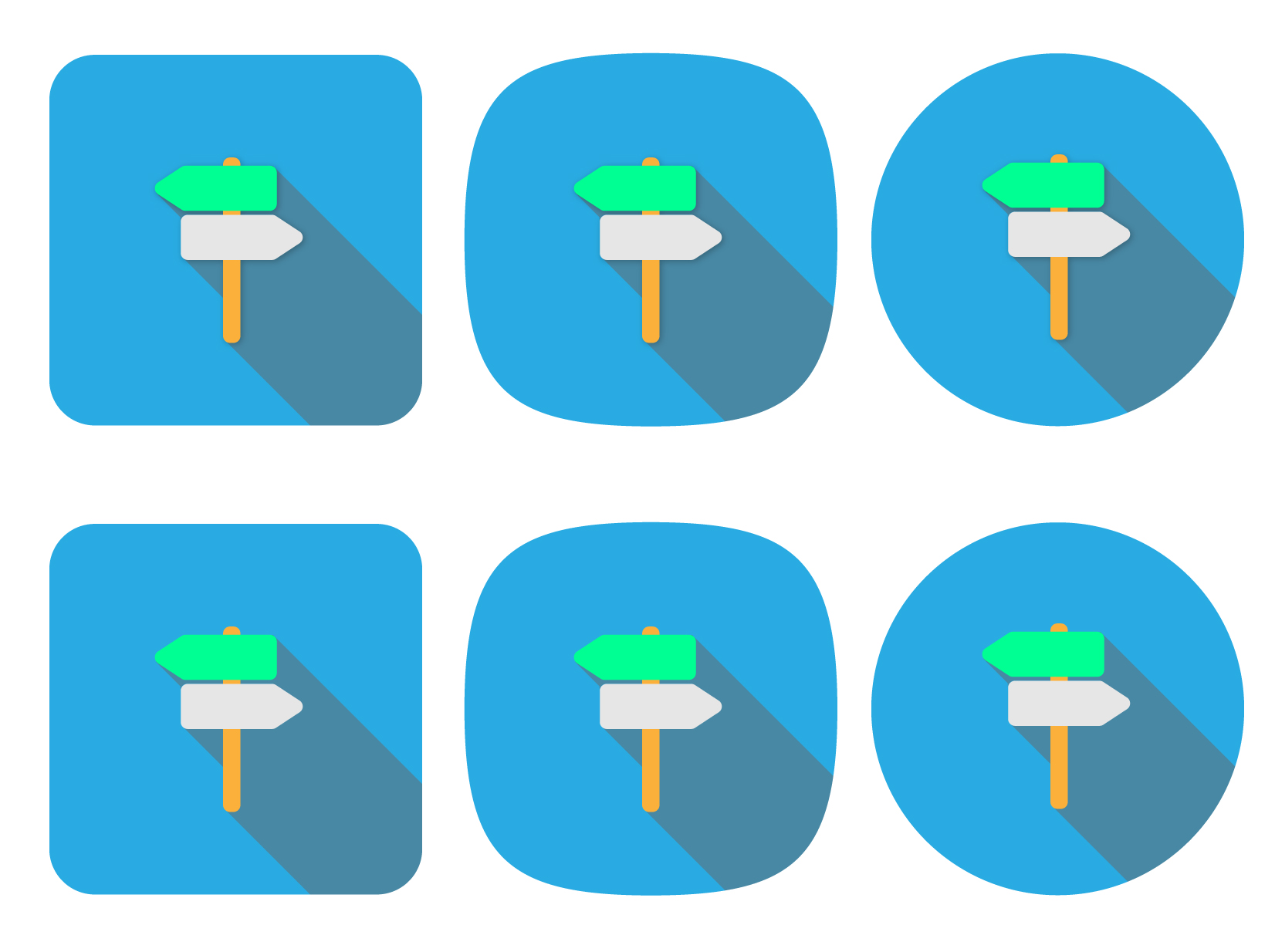
So, @Yasujizr, here is the current icon as an SVG:
https://github.com/westnordost/StreetComplete/blob/master/res/appicon_flat.svg
It should look the same way more or less, just make it adaptive. If the guide or so tells something, which conflicts with the current design, explain why and how you would change it.
rugk
on 23 May 2018
Adaptive very roughly just means that the foreground and background of the icon are separated.
On May 23, 2018 12:02:17 PM GMT+02:00, rugk notifications@github.com wrote:
Well… it's your project and you will have to like this new icon in the
end. Could have been you say, "Hey yeah, great. Why not make that thing
green at the top. Looks good." or so.So, @Yasujizr, here is the current icon as an SVG:
https://github.com/westnordost/StreetComplete/blob/master/res/appicon_flat.svgIt should look the same way more or less, just make it adaptive. If the
guide or so tells something, which conflicts with the current design,
explain why and how you would change it.
westnordost
on 23 May 2018
Sure, making the current icon adaptive would be an improvement.
Makes clear that changes to icon are not desired.
 matkoniecz
on 23 May 2018
matkoniecz
on 23 May 2018

@westnordost
@rugk
@matkoniecz
Yasujizr
on 26 May 2018
Perhaps there has been confusion, so I will clear this up now.
This ticket it about making the current icon adaptive, as defined in in the Android documentation . The icon itself stays exactly the same. I will accept a PR that does just that.
westnordost
on 27 May 2018
The comment before your's seems to do that. As far as I see it is exactly the same icon, just adaptive displayed in different ways Launchers may display it.
rugk
on 27 May 2018
So what's the status here? If the sources for this version here are provided by @Yasujizr and best implemented as a PR (in whichever way the app needs to be changed to make the icon adaptive); I'd consider this to be solved.
rugk
on 30 Jun 2018
Related issues
 RubenKelevra
·
3Comments
RubenKelevra
·
3Comments
 monikarora
·
3Comments
monikarora
·
3Comments
 nmxcgeo
·
3Comments
RubenKelevra
·
4Comments
rugk
·
3Comments
nmxcgeo
·
3Comments
RubenKelevra
·
4Comments
rugk
·
3Comments
Most helpful comment
Sure, making the current icon adaptive would be an improvement.