Hi @westnordost,
I have studied your work and I think a new design will make you more visible. I designed for you, I hope you like it and you want to use it. If you want to reach me, you can look at the my profile. I can give you all the formats of the design free. If you want a change please specify.
 Yasujizr
All 15 comments
will make you more visible
In what sense? Do you propose this to be the new app icon? To be honest, IMO the other icon is much more simpler and looks pretty good, so why do we need a new one?
 ENT8R
on 5 May 2018
ENT8R
on 5 May 2018
What is proposed in this issue?
 matkoniecz
on 5 May 2018
matkoniecz
on 5 May 2018
AFAIK a new (app) icon though I don't really know why we need a new one :smile:
ENT8R
on 5 May 2018
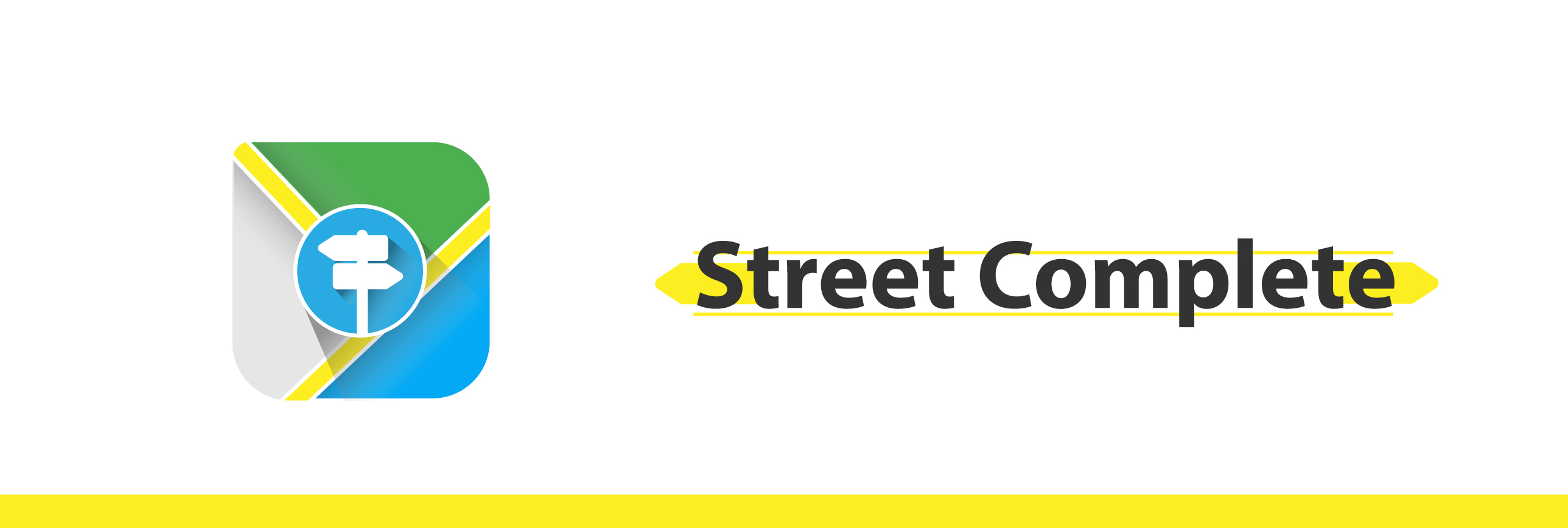
This issue suggests a new logo for you. I aimed to draw more attention among other applications. If you think you have not added anything to your previous logo, you can refuse.
Yasujizr
on 5 May 2018
Which other applications do you have in mind? AFAIK the icon StreetComplete uses is unique and not used by any other application...
ENT8R
on 5 May 2018
Apps in the same category as yours. If your logo is too simple, this program may show poor quality. Do not get it wrong, the program is very good but it is visually important in marketing.
Yasujizr
on 5 May 2018
Apps in the same category as yours.
For example?
If your logo is too simple, this program may show poor quality
Fortunately, SC is not suffering from this problem.
matkoniecz
on 5 May 2018
I see that as an outsider. If you like, you can do a survey so that the end user is a focused logo. I do not want to change your idea, it's just a suggestion. You can look at the applications in the same category as yours. You can even look at the results of "street complete".
Yasujizr
on 5 May 2018
You can even look at the results of "street complete".
Well, Google Play shows only some racing games besides this app 😄:
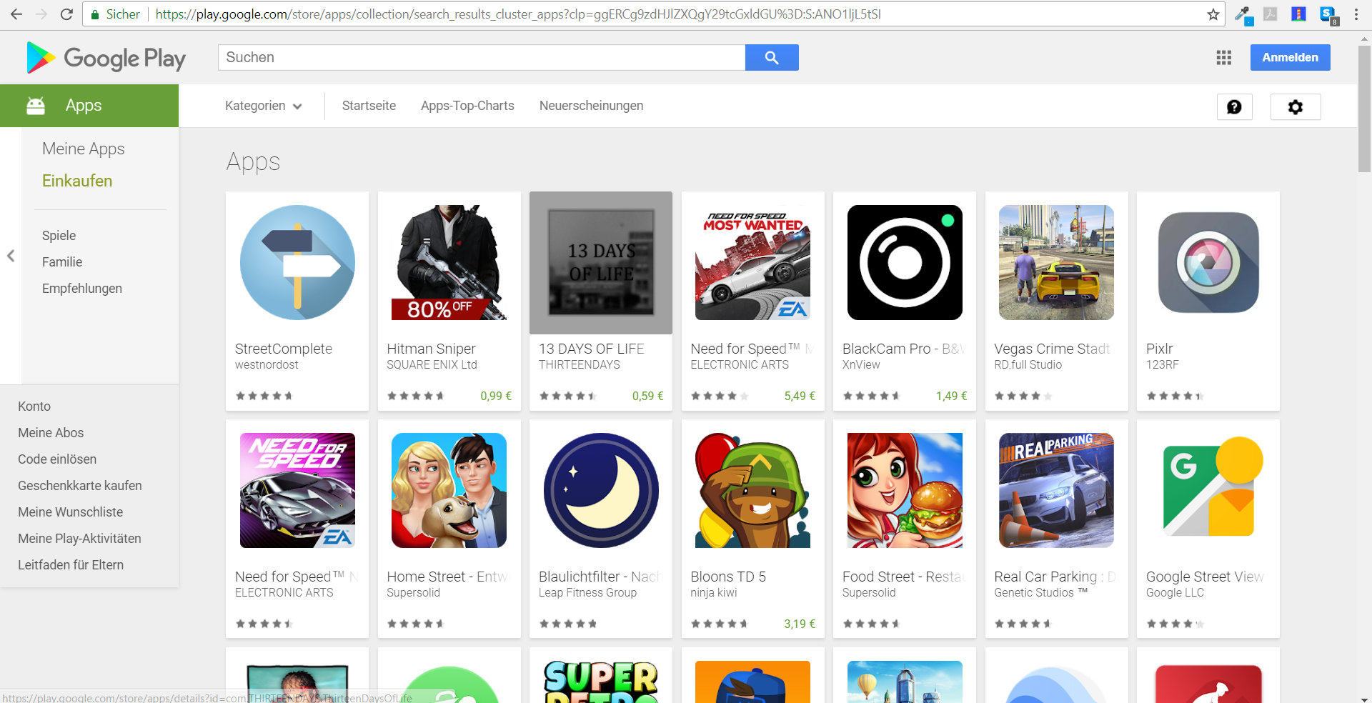
And searching for street complete on F-Droid results only in this app and OsmAnd...
Maybe we should just hear @westnordost's opinion on this?!
ENT8R
on 5 May 2018
I do not understand why you're so angry and prejudiced, it's just a suggestion.
Android Phone Search "Street Complete"
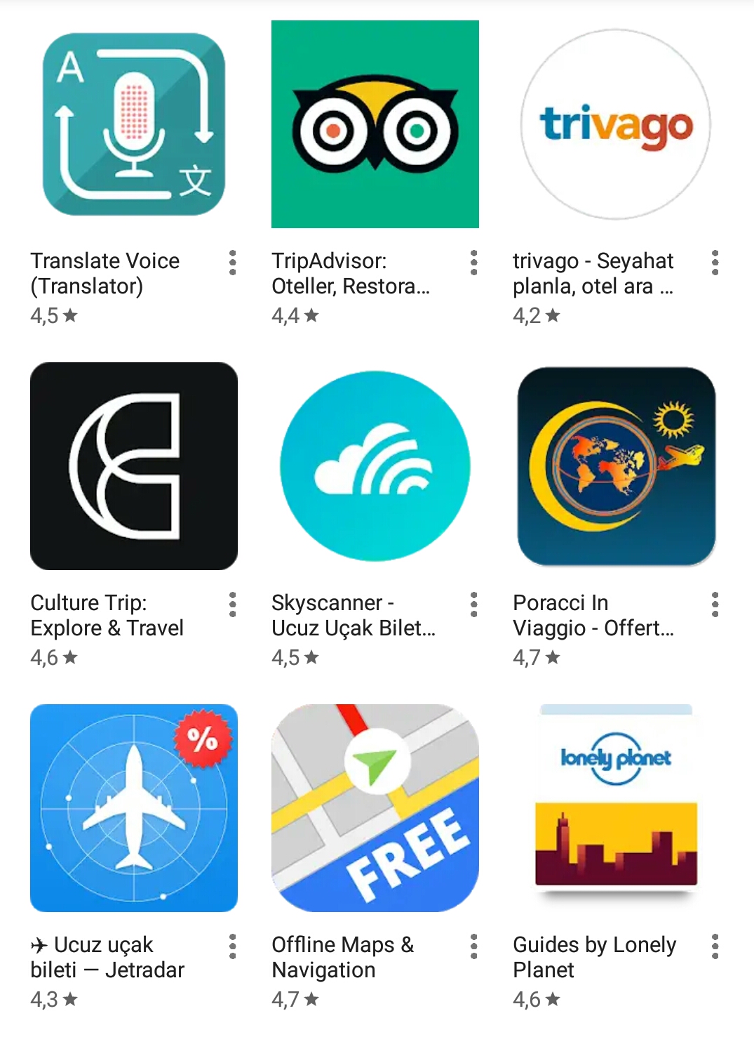
Category Search
Yasujizr
on 5 May 2018
While I'm a bit reluctant regarding the lettering with the yellow bar, I thing the logo looks really nice! However, I'm also not convinced that the current one needs to be replaced but that's for others to decide anyway. Just want to say thanks to @Yasujizr and compliment on the logo design.
But the actual reason I answer: Independent from this issue, maybe if @Yasujizr likes to support SC with his design skills, maybe it would be useful to have someone help out with all the icons needed for quests. IIRC the building type quest still needs a lot of well distinguishable icons for different building types. Just an idea..
 exploide
on 5 May 2018
exploide
on 5 May 2018
That's a Google Play search? If yo, it likely is just some strange personalisation of Google to not show you the results.
Or, likely, it filters by country. (E.g. DuckDuckGo only shows the – English – wiki site of StreetComplete as a top result.
Also with a new icon, you cannot influence how Google sorts/searches stuff. It likely also considers the user count in a given country.
IIRC the building type quest still needs a lot of well distinguishable icons for different building types
Yeah, good idea. See here for details: https://github.com/westnordost/StreetComplete/pull/774
 rugk
on 5 May 2018
rugk
on 5 May 2018
Thanks @Yasujizr for the design work done.
However i also dont understand why this icon is better than the actual one. Dont get me wrong - this is a good designed icon. But the current icon does "the job" well, and has fitting colors.
 axre
on 5 May 2018
axre
on 5 May 2018
Thank u all feedback, the previous logo was simple and I wanted to make improvements.
I will look at the details. You can close or delete this issue.
:)
Yasujizr
on 5 May 2018
Hi @Yasujizr, thank you for your design! I kind of like this icon, it looks fresh and it is inspiring.
But I prefer to keep the current icon, actually. Just in my personal not professional opinion, I think the icon is a bit much - an icon (street sign) within a circle within another icon.
I have long been planning of some visual redesigning of the app, when I come around to finally realize it, I might come back to you there.
In the meantime, if you are interested in creating icons and such in the same style as the already available ones (1, 2), you are invited to contribute there. I know at least for the building quest and the "what goes into this recycling container" quest, icons are needed.
(I should probably warn you though that I am very picky about icon design though :-/ )
 westnordost
on 5 May 2018
westnordost
on 5 May 2018
Related issues
 nmxcgeo
·
3Comments
nmxcgeo
·
3Comments
 cascafico
·
4Comments
cascafico
·
4Comments
 HolgerJeromin
·
3Comments
HolgerJeromin
·
3Comments
 escoand
·
4Comments
escoand
·
4Comments
 RubenKelevra
·
3Comments
RubenKelevra
·
3Comments
Most helpful comment
Hi @Yasujizr, thank you for your design! I kind of like this icon, it looks fresh and it is inspiring.
But I prefer to keep the current icon, actually. Just in my personal not professional opinion, I think the icon is a bit much - an icon (street sign) within a circle within another icon.
I have long been planning of some visual redesigning of the app, when I come around to finally realize it, I might come back to you there.
In the meantime, if you are interested in creating icons and such in the same style as the already available ones (1, 2), you are invited to contribute there. I know at least for the building quest and the "what goes into this recycling container" quest, icons are needed.
(I should probably warn you though that I am very picky about icon design though :-/ )