Streetcomplete: Use proper compass icon
Before the 2.0 release, could we still get a proper compass icon?
See https://github.com/westnordost/StreetComplete/pull/436#issuecomment-321512624
I could not resist to open a new issue for that, I still fear it may go undetected as it is not in the 2.0 milestone, which soon seems to be finished. Also your "TODO" list should be completely on GitHub issues as that is transparent coding as expected from FLOSS software.
 rugk
rugk
All 8 comments
"Proper"? It is proper!
(And also, to be precise, it is not an icon, but a 3D-model)
 westnordost
on 28 Aug 2017
westnordost
on 28 Aug 2017
Also your "TODO" list should be completely on GitHub issues as that is transparent coding as expected from FLOSS software.
Please, avoid making suggestions that sound like demands. It is really cool that @westnordost makes this great app, it would be a good idea to avoid discouraging him.
 matkoniecz
on 28 Aug 2017
matkoniecz
on 28 Aug 2017
Yeah, just giving tips.
As for "proper", I've elaborated on that, so to summarize there are different issues:
- "Could we also rotate the "N" – so make the N belong to the arrow?"
- The current icon is a red triangle with a letter. That's not a compass. Maybe use this one or a simple one I also saw in other applications showing the south triangle too. (this style, only colored)
And, to also include the issues @ENT8R discovered:
- The red triangle overlays the quest.
- "map [should] reset[…] to the default orientation if the north-indicator is clicked"
If anything is already done (particularly for the last one I am not sure), no problem, just comment. That's what we have an issue tracker for, to see what issues there are/were and when/if/how they are closed.
(I admit, I should have opened the issue instantly when finding the problems, commenting in an already-merged pull request was not a good idea.)
rugk
on 28 Aug 2017
By the way, in my definition, FOSS just means that it is free and open source, nothing more.
Everything else is additional. It is enabled by the software being free but it is not a necessary part of it.
Specifically, I do not react well to people that come to me with the expectation that I have to comply to some "FOSS guides", just because this software happens to be open source. It should be clear that these guides were written as tips _for_ the developers and not as rules of conduct to be brought up _against the_ developers.
I am usually a little frank but I think any good developer will prefer honest feedback over compliments (_"Nedd gmotzt isch globt gnuag"_). Also, I am not as transparent as some people might wish. If that scares away some people, that's unfortunate, but I am primarily a programmer, not a community manager. Making people feel welcome is to be honest really not my main objective. My passion is coding and living it is what ultimately drives this project.
That being said, I didn't take amiss your words, all fine, chill. I just felt that right now is a good moment to publicly state what is my stance on this, so everybody is in the clear.
westnordost
on 28 Aug 2017
"Could we also rotate the "N" – so make the N belong to the arrow?"
No, that was deliberate. I want the N always to be readable right-side-up.
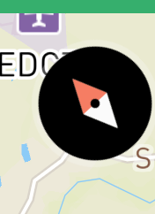
The current icon is a red triangle with a letter.
It is called a compass needle. The rest of the compass, including "South"-part of the needle is abstracted away. This should go well with the arrowhead metaphor for direction that many map and navigation apps use. In short, I will not change anything there.
- The red triangle overlays the quest.
This has long been fixed.
- "map [should] reset[…] to the default orientation if the north-indicator is clicked"
This has long been implemented already.
westnordost
on 28 Aug 2017
So let's have a look at other compasses. (all from the apps here)
Mapillary:
Maps.me:
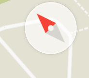
OsmAnd:

Now compare it with StreetComplete:

Don't you think, this looks strange? From the screenshot the "N" is also partially overlayed, and if the N is really fixed at it's position, then it also behaves strange compared to other "usual" compasses you know from other apps. (see above)
The "compass needle" also does not look like a needle, but rather than an arrow. If you compare the pictures above, I hope, you see what I mean. E.g. the one ending is carved in whereas a needle would not have this.
And IMHO the OsmAnd version is okay, but the others showing the south needle too are more familiar to me and look nicer.
That said, I have not tried out the app in practice yet as no version is released yet and I do not want to self-compile it. So you can leave this issue as it is and I will likely comment on it again when I get my hands on it in practice.
rugk
on 28 Aug 2017
Don't you think, this looks strange?
No, for me it was perfectly recognizable as symbol of a compass.
matkoniecz
on 29 Aug 2017
You can report that the arrow is shifted to the top if you experience it (and specify what android version you are using etc.) as a bug.
westnordost
on 29 Aug 2017
Related issues
 monikarora
·
3Comments
monikarora
·
3Comments
 RubenKelevra
·
4Comments
RubenKelevra
·
4Comments
 cascafico
·
4Comments
cascafico
·
4Comments
 Atrate
·
3Comments
Atrate
·
3Comments
 Helium314
·
3Comments
Helium314
·
3Comments
Most helpful comment
Please, avoid making suggestions that sound like demands. It is really cool that @westnordost makes this great app, it would be a good idea to avoid discouraging him.