Streetcomplete: Determine railway crossing barrier
Add quest to add the crossing:barrier for a railway crossing and perhaps crossing:bell and crossing:light as these are the most used / useful values.
Perhaps these values could be swiftly combined in one quest with some sort of enjoyable diorama / illustration.
 westnordost
All 57 comments
Today I've started working on it and about half of the work with code is done; I need to finish it and find some clear photos with barriers/lights/bells. As it will be my first PR with quest you'll have to check it carefully.
 Etua
on 17 Dec 2017
Etua
on 17 Dec 2017
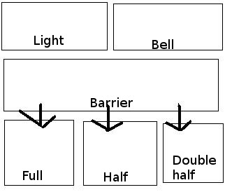
Should we ask only for yes/no condition for crossing:barrier or more precise value? I want to add all three values (barrier, light, bell) in the same quest and I don't know if asking whether barrier is full/half/double half would not make it too big as you have to add pictures for every case.
Edit: Maybe we should split it into two quests: one for barrier and the second one for the rest?
Etua
on 23 Dec 2017
Probably I'll drop for now asking for other values in crossing:barrier as it causes some UI problems. but at the same time could be asked many times (yes answer applies both to unspecified and other crossing types than full/half/double half) and probably has not wide range of use cases.
Etua
on 24 Dec 2017
@westnordost spoke of a "panorama". So I thought you add a big illustration there and the user can tap on the barrier to activate it and at a bell icon and at a crossing light.
The illustration just shows all these three as you would see it on real live. If one feature is not activated by the user it us greyed out.
So one can switch all these things on or off in one UI. You just have to make it obvious that the user can tap there.
 rugk
on 24 Dec 2017
rugk
on 24 Dec 2017
@rugk I thought about making it kinda like surface quest so you would have extensible barrier answer and simple yes/no for bell and light. However i found it too confusing for users that are used to panorama quest with only one possible choose, also difficult to add three clear images in a row for full/double/double half answers. Do you have some pictures that are self-explaining even when put in such small size?
Etua
on 24 Dec 2017
No, sorry. But I think something can more or less easily be made up as an svg.
rugk
on 24 Dec 2017
What do you think about such UI? Other _barrier_ answers under arrows would be visible after touching _barrier_ first, like in surface quest.
Etua
on 27 Dec 2017
The idea I tossed in at the beginning was only a very rough idea. I thought perhaps some UI like the cycleway quest would be possible where before you press, you have some kind of Wysiwyg view, a vector graphics illustration of the whole railway crossing.
https://github.com/westnordost/StreetComplete/issues/422#issuecomment-353752373 is fine and probably better anyway too as I didn't think through what kind of UI could be used to get to the mentioned "big picture".
westnordost
on 28 Dec 2017
I more or less thought of a generalized picture (SVG) of a railway with all features present (as you see them when you are in front of it):
As a sketch:
Tapping on the barrier would cycle through the three variants and switch the image there. The bell and light would be simple on/off switches, which grey out when deactivated and be colored when activated.
Thinking about it, one may of course also want to not specify a value (if it is not clear whether it has this feature or not). For that, next to each feature there could be an additional checkbox, or you just have an additional state for each one, where a question mark (?) is shown on top of a greyed out icon.
rugk
on 31 Dec 2017
That's not really wysiwyg though, but just a bunch of buttons. It is also not self-explanatory that you have to press the btns to cycle through the options.
Am 1. Januar 2018 02:09:35 GMT+07:00 schrieb rugk notifications@github.com:
I more or less thought of a generalized picture (SVG) of a railway with
all features present (as you see them when you are in front of it):As a sketch:
Tapping on the barrier would cycle through the three variants and
switch the image there. The bell and light would be simple on/off
switches, which grey out when deactivated and be colored when
activated.Thinking about it, one may of course also want to not specify a value
(if it is not clear whether it has this feature or not). For that, next
to each feature there could be an additional checkbox, or you just have
an additional state for each one, where a question mark (?) is shown
on top of a greyed out icon.--
You are receiving this because you were mentioned.
Reply to this email directly or view it on GitHub:
https://github.com/westnordost/StreetComplete/issues/422#issuecomment-354619577
--
Diese Nachricht wurde von meinem Android-Mobiltelefon mit K-9 Mail gesendet.
westnordost
on 1 Jan 2018
Well. of course with real images or cliparts. That was just a sketch(!) to show the position/method to select these. Mhh, don't know whether it is intuitive, that could indeed be difficult.
rugk
on 1 Jan 2018
I'm not sure if the second approach is within my skills.
Etua
on 22 Feb 2018
Some kind of image map (for Java/Android, however – in contrast to the known SVG one) would be required. Don't know whether such a thing exists.
However, as far as I see, there is no consent on how consensus on how the UI should look like, anyway.
rugk
on 24 Feb 2018
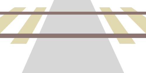
For the barrier type, how about this icons:
no | full | half | double-half
--- | --- | --- | ---
 |
|  |
|  |
| 
_(I don't know why they look so spongy on GitHub, actually they are sharper)_
Usually, there are no ties on the street but in an illustration rails wouldn't really look like rails without them ...
In this case, we have to keep in mind to mirror the images in countries with left-hand traffic, maybe such a metadata file already exists
 ServusWorld
on 27 Feb 2018
ServusWorld
on 27 Feb 2018
@ServusWorld I think the gap in _half_ icon should be broadened in order to be clearly visible on every screen size.
Etua
on 27 Feb 2018
in countries with left-hand traffic, maybe such a metadata file already exists
rugk
on 27 Feb 2018
I think the gap in half icon should be broadened in order to be clearly visible on every screen size.
True I will change this
It does.
Perfect!
ServusWorld
on 27 Feb 2018
Actually, the most important detail about these icons is the location and length of the red-white-striped line. But that line is not really prominent at all. There is really no reason why the icon would need to show the situation from the top (I can think of). Why not show the different configuration frontal, as the surveyor is also seeing these?
westnordost
on 27 Feb 2018
I.e. like this (the perspective)
westnordost
on 27 Feb 2018
@westnordost How would you include all possible barrier cases with such perspective?
Etua
on 28 Feb 2018
@Etua Is there anything in addition to cases listed in https://github.com/westnordost/StreetComplete/issues/422#issuecomment-368993631 ?
 matkoniecz
on 28 Feb 2018
matkoniecz
on 28 Feb 2018
Well... the original issue was also about bells and lights. Maybe we could later do that in different quests, if needed.
rugk
on 28 Feb 2018
How would you include all possible barrier cases with such perspective?
Yeah, double-half and half may be hard to differentiate in such a perspective...
rugk
on 28 Feb 2018
But I can try to make the icons "perspective" ...
ServusWorld
on 28 Feb 2018
I'd need more or less some serious 3d design, so you can see the barrier in a "flight/bird's perspective".
rugk
on 28 Feb 2018
@matkoniecz Not really, I'm not sure how clear _barrier_ UI can be achieved with such perspective as it's more difficult case than bell and light: you can't just change transparency of the icon depending on the user choice, but handle a few cases. How would this switch look like?
Etua
on 28 Feb 2018
The UI here may just be 4 pictures (as here), where the user chooses one. Don't make it too complicated...
The only issue I still see is how the pictures should look, exactly, but @ServusWorld seems to come up with some ones in a "perspective" way, so that sounds good.
rugk
on 28 Feb 2018
@rugk You can't have only 4 pictures and answer about bell, light and barrier at the same time.
Etua
on 28 Feb 2018
Yeah, and one should not try to put all that into the same quest. That's why I propose to add bell and light in separate quests. This issue here, may focus on the current approach with 4 pictures,
rugk
on 28 Feb 2018
@rugk Then I don't really see clear advantages of other perspective than the one presented by @ServusWorld These icons can be made more prominent so you can see the difference between them at a glance, but they will not take as much space as car-like perspective.
BTW: which quest would you consider more valuable in order to show it first?
Etua
on 28 Feb 2018
Barrier is the most important one, the others are "meh".
westnordost
on 1 Mar 2018
@westnordost Barrier importance 7 and bell + lights 8?
Etua
on 1 Mar 2018
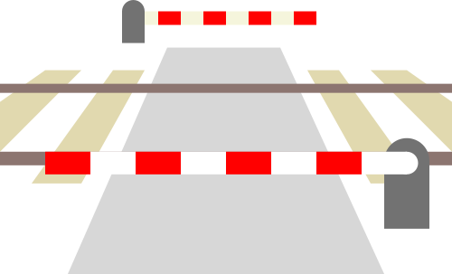
Something like this:
_(Others following ...)_
ServusWorld
on 2 Mar 2018
That looks good! BTW, SVGs would be preferable, but it seems you just exported this from an SVG.
rugk
on 2 Mar 2018
Yeah, you guessed it. I made it as SVG, but GitHub doesn't seem to support SVGs in issue comments.
I guess I should upload them somewhere else then ...?
Thanks, btw :)
ServusWorld
on 2 Mar 2018
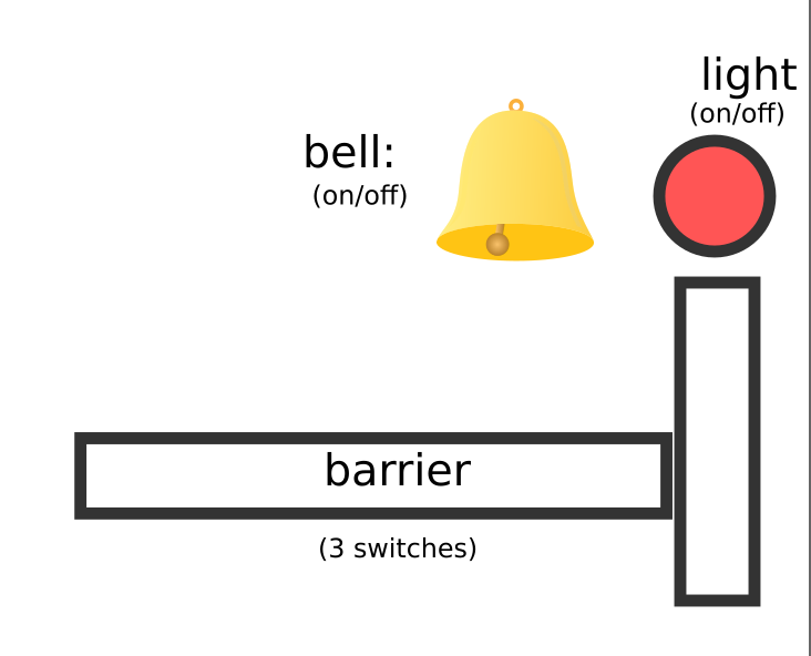
Apropos, I guess the easiest way to also cover light and bell would be to divide it into 3 quests:
Tag | Question | Type | Priority
--- | --- | --- | ---
crossing:barrier | "How is this railway crossing protected?" | Image quest | 7
crossing:bell | "Does this railway crossing have a bell?" | Yes/No quest | 8
crossing:light | "Does this railway crossing have lights?" | Yes/No quest | 8
ServusWorld
on 2 Mar 2018
Cool, the barriers are much better visible this way. I have a few more suggestions based on that it is an icon that should carry but one notion: The type of barrier there.
Necessary to show the barrier on the other side? Can it not assumed to be the same on the other side? If yes, the icon could be 3:1 and the four option could well fit into the form in a 2x2 grid.
The railway is not important, the street neither, only the barriers are. So, the barriers could be exaggerated/iconified while the rest should move to the background visually (in colors)
On 2 March 2018 17:23:38 CET, ServusWorld notifications@github.com wrote:
Something like this:
_(Others following ...)_
--
You are receiving this because you were mentioned.
Reply to this email directly or view it on GitHub:
https://github.com/westnordost/StreetComplete/issues/422#issuecomment-369971616
--
Diese Nachricht wurde von meinem Android-Mobiltelefon mit K-9 Mail gesendet.
westnordost
on 2 Mar 2018
Good point, I gonna try to highlight the barriers better.
I think showing both sides might be more logic, as it better complies with the user's real view.
ServusWorld
on 2 Mar 2018
So as for the other two quests, I've created separate issues in https://github.com/westnordost/StreetComplete/issues/935 and https://github.com/westnordost/StreetComplete/issues/936.
So here we can focus on the barrier one.
rugk
on 2 Mar 2018
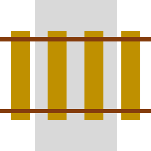
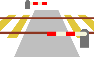
Okay ... all types with reduced colours for rails and street:
no | full | half | double-half
--- | --- | --- | ---
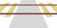 |
|  |
|  |
| 
ServusWorld
on 3 Mar 2018
Maybe also rails and sleepers can be gray (with rail in dark gray)?
matkoniecz
on 3 Mar 2018
@ServusWorld Are you interested in making code itself? If not I can make PR once you make SVG file available and select license for it (probably https://creativecommons.org/publicdomain/zero/1.0/ or https://creativecommons.org/licenses/by-sa/4.0/ would be the best).
matkoniecz
on 3 Mar 2018
The contrast of the white stripes of the barrier and the background is indeed a bit low… well… white on white. So maybe add a shadow or change the color or so.
rugk
on 3 Mar 2018
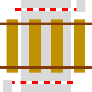
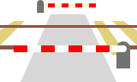
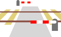
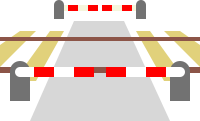
Sorry for the long interruption, now I created a version where the rails and the sleepers are in gray shades (the white stripes of the foreground barrier are better visible now).
no | full | half | double-half
--- | --- | --- | ---
 |
|  |
| 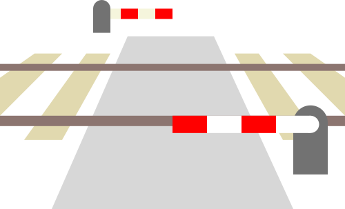 |
| 
If the graphics are okay now, where should I drop them and how do I declare them to be CC0?
ServusWorld
on 31 Aug 2018
how do I declare them to be CC0?
https://creativecommons.org/choose/zero/
(In the end you get a small text to include with your assets.)
Also, FYI, you can embed metadata in SVGs stating they are CC0. In Inkscape you can e.g. do that in the document properties.
where should I drop them?
I guess it does not matter, where. However, two ideas by me:
- As they look nice for a general use case, let's provide them in a general database. I'd suggest https://openclipart.org/. :smile: (they have CC0-licensed stuff there, so it aligns with the license you want to choose)
- Also, if you want to be nice, you may open a PR here to place them in some assets dir. But what the exact location should be, is what @westnordost has to decide.
And, BTW, they actually look really nice IMHO! :hugs:
rugk
on 31 Aug 2018
Hi @ServusWorld!
Cool, they look pretty nice now! You just have to say that you declare that, no formalities.
If you have no place to drop them, you could email them to me or create a PR here to put them into the res directory of this repo.
westnordost
on 1 Sep 2018
Okay, so, I was almost done with the implementation when it struck me to ask the simple question:
For what purpose do we want to record any information about the barrier used in a railway crossing beyond yes or no? Is there any purpose for it at all, for whom would this information be interesting? does it change anything for the road or rail traffic, or anyone else whether the crossing barrier that stretches the whole length, half the length or two barriers each stretching half of the length?
(3D representation does not count, because you can warrant recording every information with this, even brightness of lamp posts and color of garbage cans!)
westnordost
on 3 Sep 2018
of course that's a good question ... :thinking:
but one argument: if the user is already answering the question, it's not more effort to select the type (generally: if it's possible to be more precise I'd not just use yes)
and the second one: the icons have already been made :rofl:
that both doesn't really make tagging it more useful, but something where it can be used are e.g. navigation apps, which could warn the driver depending on how the railway crossing is secured
but some answer for the value yes should be available as alternative option, for being used if the user couldn't identify the exact type
ServusWorld
on 3 Sep 2018
By the way, I started thinking about that when I asked myself what to select in the case of a barrier like these
https://youtu.be/KUzE75mc1Fo?t=1318 (half-gate-on-wheels?)
https://youtu.be/1S8DyhItHAA?t=490 (full-swing-gate?)
https://youtu.be/1S8DyhItHAA?t=3029 (double-swing-gate?)
https://youtu.be/1S8DyhItHAA?t=3413 (half-gate-on wheels on one side, half-swing-gate on other)
I've also seen a mixture of all of these as well as a crossing that had all three different types. I.e. full-barrier + two half-barriers on one side, one half-gate on the other and stuff.
( Also, some ball magicians at play here: ;-) https://youtu.be/1S8DyhItHAA?t=4589 )
So, when thinking about it, I asked myself, why get lost into detail here again? It can get quite complicated, but what is the gain exactly.
westnordost
on 3 Sep 2018
I also opened a topic in the German forum: https://forum.openstreetmap.org/viewtopic.php?id=63605
westnordost
on 3 Sep 2018
Okay, so @Nakaner provided a good reason why these values make sense even outside the world of railway enthusiasts: railway crossings with half barriers can be assumed (e.g. by route planners) to block the road for a much shorter duration than the full and double_half barriers.
westnordost
on 4 Sep 2018
The problems with the icons is that they get really small when 4 of them are in one row. But if there are two rows, the last two are not fully visible and the user must scroll. I will see to modifying the icons to be less wide
westnordost
on 4 Sep 2018
@westnordost wrote:
By the way, I started thinking about that when I asked myself what to select in the case of a barrier like these
https://youtu.be/KUzE75mc1Fo?t=1318 (half-gate-on-wheels?)
IMHO half because it closes the half of the road.
https://youtu.be/1S8DyhItHAA?t=490 (full-swing-gate?)
IMHO gate if it prevents pedestrians and cattle to enter the tracks when the crossing is open to them. See this British level crossing which has "gates".
https://youtu.be/1S8DyhItHAA?t=3029 (double-swing-gate?)
They don't seem to prevent pedestrians and cattle to enter the tracks. IMHO double_half.
https://youtu.be/1S8DyhItHAA?t=3413 (half-gate-on wheels on one side, half-swing-gate on other)
IMHO half
I've also seen a mixture of all of these as well as a crossing that had all three different types. I.e. full-barrier + two half-barriers on one side, one half-gate on the other and stuff.
( Also, some ball magicians at play here: ;-) https://youtu.be/1S8DyhItHAA?t=4589 )
So, when thinking about it, I asked myself, why get lost into detail here again? It can get quite complicated, but what is the gain exactly.
There are yes, no, half, full, double_half to cover most. Everything else should go into sub-tags where local mappers know best what exists and how to model in tags.
I would like to ask to move tagging discussions to a suitable mailing list.
You can add a generic yes option as a "other than shown".
 Nakaner
on 4 Sep 2018
Nakaner
on 4 Sep 2018
I do want to avoid a generic yes for _"other than shown"_ because then it cannot be distinguished from _"it just hasn't been specified more precisely yet"_.
Where is the difference between gate and full/double_half?
westnordost
on 4 Sep 2018
It is better to just have the icons here because the icon can't be more clear and already says it all. It would be difficult to try to describe the barrier type in one word precisely and there would be the danger of possible misunderstandings in translation.
Only for no, I thought it's better to have a text because the question is asked in a way that almost assumes that there will be a protection of _some_ kind, making it almost necessary to dissent to the question (DE: "widersprechen").
Asking differently ("Is there a ... and if yes, what type is it?") would be unnecessary long.
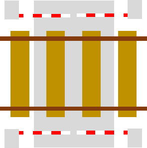
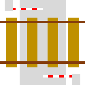
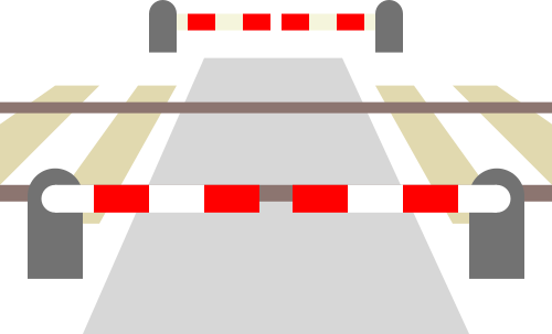
I also edited the icons a bit as announced to make the barrier more clear when the icon is really small and on white ground, made it less wide, made the barrier not overlap with the rail and removed the round portions from the box on the right because it doesn't always have to be a "Schranke" but could also be on wheels or in the style of a normal (swing) gate.
westnordost
on 5 Sep 2018
Looks good to me!
Is this a mockup or is it already "real"? :)
ServusWorld
on 5 Sep 2018
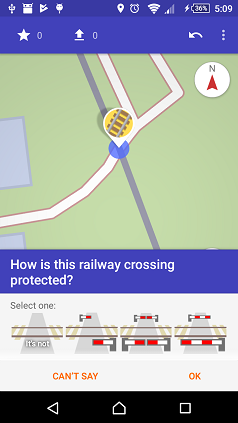
It's real, dude
westnordost
on 5 Sep 2018
Related issues
rugk
·
3Comments
 ecksun
·
3Comments
ecksun
·
3Comments
 JulienPalard
·
3Comments
JulienPalard
·
3Comments
 RubenKelevra
·
3Comments
RubenKelevra
·
3Comments
 lost-geographer
·
3Comments
lost-geographer
·
3Comments
Most helpful comment
It is better to just have the icons here because the icon can't be more clear and already says it all. It would be difficult to try to describe the barrier type in one word precisely and there would be the danger of possible misunderstandings in translation.
Only for
no, I thought it's better to have a text because the question is asked in a way that almost assumes that there will be a protection of _some_ kind, making it almost necessary to dissent to the question (DE: "widersprechen").Asking differently ("Is there a ... and if yes, what type is it?") would be unnecessary long.
I also edited the icons a bit as announced to make the barrier more clear when the icon is really small and on white ground, made it less wide, made the barrier not overlap with the rail and removed the round portions from the box on the right because it doesn't always have to be a "Schranke" but could also be on wheels or in the style of a normal (swing) gate.