Streetcomplete: Swipe/encouraging/information screens
Similar to openstreetmap.org's iD editor tutorial, but here it could just let the user answer some types of example quests, which will not be submitted to OpenStreetMap, of course…
This way users can get to know all (or the majority) of the quests types and see how (easy) it is to solve them as sometimes users may be in areas where there are literally only house (floor) quests they could be disappointed at first.
 rugk
rugk
All 71 comments
Then they will be disappointed after the tutorial when they realize there are only house level quests :-)
I think this is the wrong angle.
Don't forget this is an early version, there will be more different quests in the future, and also more important ones.
On 4 May 2017 09:14:15 CEST, rugk notifications@github.com wrote:
Similar to openstreetmap.org's iD editor tutorial, but here it could
just let the user answer some types of example quests, which will not
be submitted to OpenStreetMap, of course…
This way users can get to know all (or the majority) of the quests
types and see how (easy) it is to solve them as sometimes users may be
in areas where there are literally only house (floor) quests they could
be disappointed at first.--
You are receiving this because you are subscribed to this thread.
Reply to this email directly or view it on GitHub:
https://github.com/westnordost/StreetComplete/issues/178
--
Diese Nachricht wurde von meinem Android-Mobiltelefon mit K-9 Mail gesendet.
 westnordost
on 4 May 2017
westnordost
on 4 May 2017
Mhh, maybe, but at least they know there are other quests.
Anyway a tutorial could just be a general introduction for users.
rugk
on 4 May 2017
Right now the tasks itself are straight forward do not require explanation
Nevertheless, a short introduction might be beneficial and could introduce the most relevant aspects of the code of conduct. https://wiki.openstreetmap.org/wiki/Good_practice
Topics like: Map what's on the ground, Don't remove "tags/edit things" that you don't understand, if in doubt leave it out, ...
 callis
on 4 May 2017
callis
on 4 May 2017
You can't remove anything with this app. What do you suppose should be the content of the code of conduct as it may be presented here?
On 4 May 2017 16:38:44 CEST, callis notifications@github.com wrote:
Right now the tasks itself are straight forward do not require
explanationNevertheless, a short introduction might be beneficial and could
introduce the most relevant aspects of the code of conduct.
https://wiki.openstreetmap.org/wiki/Good_practiceTopics like: Map what's on the ground, Don't remove "tags/edit things"
that you don't understand, if in doubt leave it out, ...--
You are receiving this because you commented.
Reply to this email directly or view it on GitHub:
https://github.com/westnordost/StreetComplete/issues/178#issuecomment-299204799
--
Diese Nachricht wurde von meinem Android-Mobiltelefon mit K-9 Mail gesendet.
westnordost
on 4 May 2017
Good push! I was more or less copying from the wiki page …
What I imagine: Five pages to slide through at the first start of the APP
Goal: Welcome, Onboarding, good practice, login
Rough draft:
1) Thank You! With Your contribution You help to improve hundreds of services that relay on data from OpenStreetMap
2) All Your contributions are changing the OpenStreetMap immediately. That's great as you are having real impact
3) Please consider the Good practice of contributing to OpenStreetMap!
- When You are uncertain please leave the quest to someone who might know
- Change things You can see live in front of you. Go outside and take a walk to the next quest
- Take Your time while editing. 1 well considered edit helps more than 10 rushed edits
4) Stay safe!
- Don't map while driving
- Keep an eye on the road and traffic around You
- ??? You always need a third thing
5) Now, login or create your OpenStreetMap account and give it a go
If you consider implementing this, someone might want to help to improve the text to be more friendly, welcoming, positive, SHORTER and comprehensive
callis
on 4 May 2017
As for 4.: "No cats/XY were harmed during the creation of this app." :wink:
However I am a bit against 5. The current way of letting users do an edit first before logging in is better as login forms can easily scare users away (ala "No, not another service, where I have to register!"). So the login form should be the last thing to show to users, just as it currently is.
The user already made some edits before the form is shown, and then some users may think, now once they made the edit they also want to publish it.
Of course, that's a bit like an anti-pattern and psychological "manipulation", but hey… we're doing it for a good thing here. :smiley:
IANAP (I'm not a psychologist… :wink: )
rugk
on 4 May 2017
BTW my orioginal idea was really a tutorial, but such a simple slide-intro as you imagine is also a great idea and considering that the app is easy to use maybe the better idea.
rugk
on 4 May 2017
I agree on your concerns regarding my 5th step!
The new 5 could be something like ...
Tank You, have fund and keep up the great work!
callis
on 4 May 2017
…and let's start contributing/mapping/making the world a bit better/…!
rugk
on 4 May 2017
I am not sure is it the best idea - it is better to design app that tutorial is not necessary.
Nearly nobody reads introduction and several pages on the first start are really obnoxious and will cause many people to drop app.
Maybe something smarter like after 500 stars show subtle message (nothing like popup, maybe something in settings) "Do you know that you can use also other editors?".
 matkoniecz
on 7 May 2017
matkoniecz
on 7 May 2017
For example "Change things You can see live in front of you. Go outside and take a walk to the next quest" should not be handled by stern warning but by app not allowing to edit things far away from the user (what AFAIK is already planned).
matkoniecz
on 7 May 2017
"Don't map while driving Keep an eye on the road and traffic around You" - it is this kind of thing that stupid will ignore and irritates others. The only purpose of such warnings is usage as anti-lawsuit protection (that may or may not work, IANAL).
matkoniecz
on 7 May 2017
I generally with @matkoniecz, none of the proposed points from @callis is should be justified if the app is designed in a proper way. Except perhaps
All Your contributions are changing the OpenStreetMap immediately. That's great as you are having real impact
But this is something I would perhaps simply put in a dialog after first logging in.
westnordost
on 7 May 2017
All Your contributions are changing the OpenStreetMap immediately. That's great as you are having real impact
And this is duplicate of "Feedback for data upload #75"
matkoniecz
on 7 May 2017
So far in this issue:
in-app tutorial --> no, not necessary --> intro screens --> no, use other ways --> only encourage users
Generally I really appreciate all tutorials or introductory screens and I heavily disagree with the claim nobody would read them. If they are designed in a good way (three points per page) and are encouraging and helpful at the same time, many people likely read them.
If one can swipe there (as it is usual) or if they are even animated in a funny way (no, that's not necessarily needed for this project IMHO) users are actually also encouraged to use the app and get to know it a bit better…
Nobody would not use an app, because of 3 slides or so. The "expenditure" to download and install the app is larger than to swipe through three screens.
And: These slides may be good when you introduce new (major) features later, where also one slide can be shown after the update. This is how Maps.me e.g. does it.
So as I'd still advocate for the slides, maybe we should more talk about the content/goal of them. I agree that smart things as encouraging users with subtle messages (Although I'd frankly say that "Do you know that you can use also other editors?" is actually advertising if you link to iD or JOSM there… but well, that's @westnordost's decision, whether he wants to add it) is a good idea too, but we can maybe find some useful topics for an intro.
So we all seem to be agreeing about:
- encouraging user
What about:
- showing the impact and (shortly) present the overall project (OSM), so they know why they should/can do this
- explain what they can do?
- indicate what they might do (when there will be advanced mode or so…)?
But, hmm, … I am also not that convinced by my ideas. Maybe someone could come up with some other ideas. @callis?
rugk
on 7 May 2017
Some nicely designed "Get to know OSM" introduction screens that encourage dwelving deeper into OSM (i.e. JOSM, Vespucci) could be presented as "rewards" or "achievements" when hitting certain "star"-limits. I.e. on the 1000ths star, JOSM is introduced, on the 2000ths star, HOT & Maproulette is introduced etc..
Also, hitting certain star limits could unlock certain features of the app which only more involved and/or experienced users should be entrusted with. I.e. explorative quests like "mark all the traffic lights you find" etc. (brainstorming here).
These screens can be revisited in some kind of "rewards screen".
Prerequisite for all of this (that users "buy" that it reflects some kind of reward) must be that they also feel rewarding. (Have nice animations, perhaps even some interaction).
(This is all meant as brainstorming. It may be a nice feature, but this is faaar ahead in the future on "things I do next")
westnordost
on 7 May 2017
Wow, well… that's an awesome idea (also like how gamification is combined with preventing "low-skilled" users from making too drastic changes), but may we discuss this in another issue, as this one is clearly connected to beginners…
rugk
on 7 May 2017
My idea would be to use the same mechanic here for things that need to be said at the beginning, such as:
- on first change: Take care, your changes are applied right away!
- on 10th change: Already encountered quests you can't really answer? Leave a note!
- on 50th change that wasn't uploaded yet: Your contributions are safely stored on your smartphone, but you need to upload them to apply them
etc.
westnordost
on 7 May 2017
Galaxy Zoo also uses an incorporated compulsary tutorial. With this you can educate your users as not each type of quest is as simple.
 PanderMusubi
on 7 Jun 2017
PanderMusubi
on 7 Jun 2017
As for the slides (which I still consider to be a good idea), how about this:
(_colours look terrible at the moment :grimacing:_)
It shouldn't take lots of time to read. So simply:
- briefly introducing OSM on the 1st screen
- explaining what StreetComplete does on the 2nd screen
- maybe giving the ability to sign in/up and safety/copyright instructions on the 3rd screen
I think such an introduction is important, because StreetComplete is perfect for OSM newbies to contribute. But still I don't think it's attractive for "them", since hardly someone knows what OSM is and what it is good for.
 ServusWorld
on 18 Feb 2018
ServusWorld
on 18 Feb 2018
The way I see something like this could be incorporated would be:
- there is a new icon button somewhere, either always visible or only when something new is up, showing a number next to the icon, indicating how many new info-screens are available. Perhaps only visible in the menu.
- Only when clicking on it, those info screens are shown
- Info screens should always look very cool (mostly picture, very little text), interesting animation
- New info screens are added to the user's "inventory" on certain events, like "uploaded 100 changes" etc, like rewards. So, users can "collect" those screens, like badges. That means, that there will also need to be an overview screen that shows all the badges he collected.
- An initial tutorial of 3 screens would fit into this concept like that the user gets his first "badge" on first start of the app, but of course, not in the face, but only displayed when clicking on that icon.
- This concept also goes well together with introducing statistics about one's contributions in general (breaking down the star counter into counters for the individual quest types in an extra screen etc)
westnordost
on 18 Feb 2018
Info screens should always look very cool (mostly picture, very little text), interesting animation
Maybe you should have a look at https://github.com/IFTTT/SparkleMotion.
So this issue is about a greater concept here, with badges and so on. I like it, but still disagree with one small point:
but of course, not in the face, but only displayed when clicking on that icon.
At the very first start I think it is well acceptable that at least one or two slides are shown. I mean the user should be introduced into OSM, why one does so. Why one should map anyway, IMHO. What the purpose of OSM/this app is. Such things...
And BTW, I think we really need no general safety instructions. If there may be something interesting that other mappers have experienced then maybe mention that (but not at the beginning, but on a later slide), but otherwise it is kinda silly.
rugk
on 19 Feb 2018
What has not yet been considered here is one fact:
Currently: When I first start the app, the very first experience I get is a map that zooms to my place (that's good, so far) and then, I have to… wait… and wait… and wait… (until the first quests are downloaded).
As such, I think you could use the time the user is maybe looking through some information screens or onboarding process of whatever kind to also download the quests in the background already (and preferably, more than a few quest types, so more than usually triggered – but I know, that's a general issue to some extend), so that when they finished, their map is already populated and can be used/interacted with directly.
rugk
on 1 Sep 2018
wait… and wait… and wait…
Also known as #1172
matkoniecz
on 1 Sep 2018
Okay… :laughing: well… let's see how good the performance can be increased.
rugk
on 2 Sep 2018
@westnordost wrote
I generally with @matkoniecz, none of the proposed points from @callis is should be justified if the app is designed in a proper way. Except perhaps
All Your contributions are changing the OpenStreetMap immediately. That's great as you are having real impact
But this is something I would perhaps simply put in a dialog after first logging in.
Just like @callis, I'd show this very soon after installation, serving as a motivator _and_ making new users aware they are changing "real data" people rely on, not a game world. BTW: Noone forbids to use the same text after installation _and_ after first submission ;-)
@matkoniecz wrote
I am not sure is it the best idea - it is better to design app that tutorial is not necessary.
I agree that a tutorial seems not necessary - StreetComplete's usage patterns are still easy enough to be "discovered". But what app design do you suggest that new users learn about "intangible" good practices like in 3. point of @callis draft?
IMHO, the most important 2-4 good practices shall be shown at the beginning (as byproduct "hiding" initial download time as @rugk suggested) and maybe a reminder after solving the first quest, maye something like "_Great, that worked! Please tell us: Was that just a test or was it a real database edit compliant to these good practices?
@matkoniecz wrote
Maybe something smarter like after 500 stars show subtle message (nothing like popup, maybe something in settings) "Do you know that you can use also other editors?".
+1 as someone with so many edits will for sure have experienced that StreetComplete is _by design/purpose_ not feature rich enough for some tasks.
 georg-d
on 19 Dec 2018
georg-d
on 19 Dec 2018
I did some UX testing recently, including people who never contributed to OSM before and I must confirm
Currently: When I first start the app, the very first experience I get is a map that zooms to my place (that's good, so far) and then, I have to… wait… and wait… and wait… (until the first quests are downloaded).
as a real issue (it is made even worse by #871 as it is not obvious that zooming out may reveal some quests).
So some sort of tutorial would be useful to mask this waiting time.
matkoniecz
on 27 Jun 2019
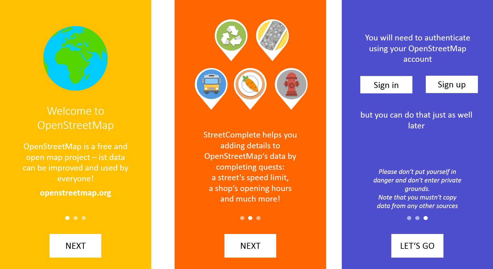
Proposing this as the final text. Heavily inspired by what @ServusWorld wrote:
Welcome to OpenStreetMap
_the free wiki world map_
With StreetComplete, you can easily contribute details to OpenStreetMap: bicycle lanes, opening hours, wheelchair accessibility and much more!
StreetComplete automatically looks for quests in your vicinity. Once they show, you can start solving them right away.
Later, login to publish your answers.
Finally, stay safe: Don't put yourself into danger and don't enter private property.
In those cases and whenever you are uncertain, you can always reply "Can't Say" and leave a note.Happy Mapping!
Only, leaving out the login button, because login itself (especially registration) is somewhat of a hurdle the new user shouldn't be confronted with right away. The app will remind the user to login by itself anyway.
Also, the app reminds the user that only data that has been collected on-site should be added when he tries to add something somewhere else, so it doesn't need to be mentioned in the intro.
I am a little unhappy with the wording "Later, login to publish your answers." to hint that the user must log in eventually to publish his answers, but he can do that later because his answers are persisted locally until he does.
westnordost
on 13 Mar 2020
I am a little unhappy with the wording "Later, login to publish your answers."
That seemed fine to me. My only concern was that people might be confused what exactly "quests" are. I have not found an alternative wording I am totally happy with, yet; so far I have:
StreetComplete automatically looks for missing details in your vicinity and shows them as quests for you to solve.
edit: Maybe something like this:
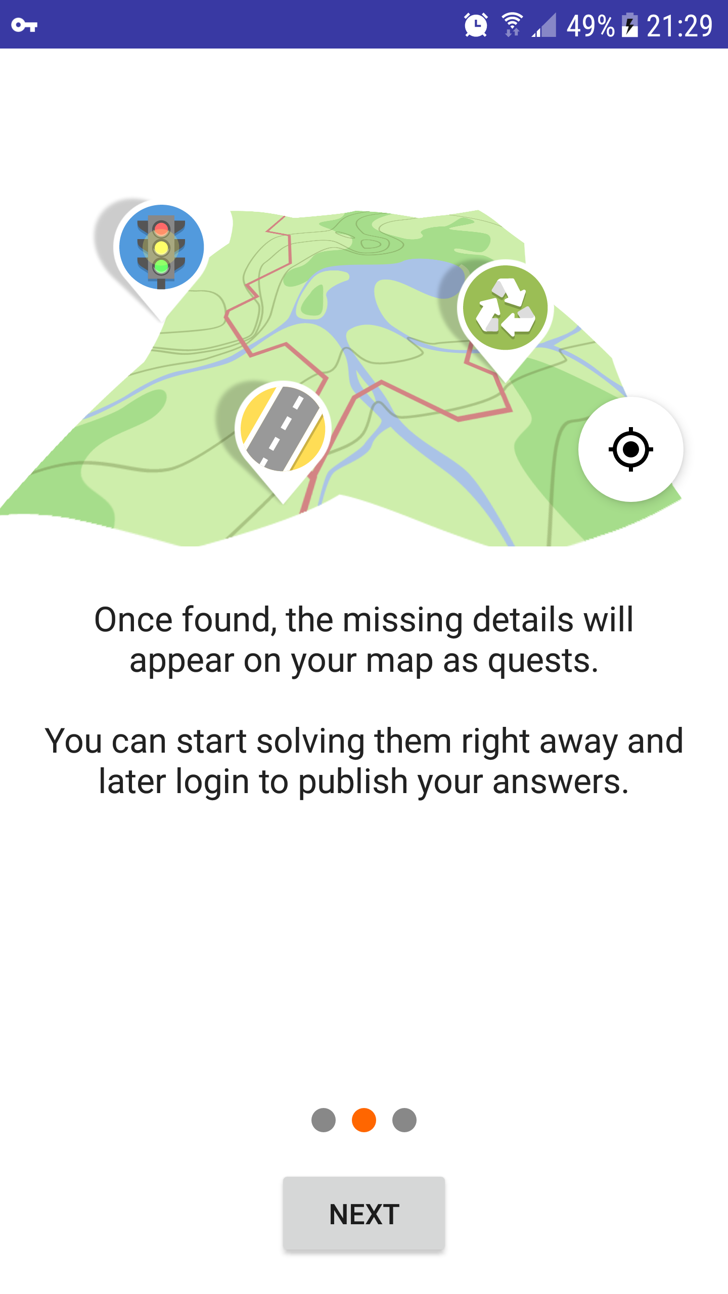
StreetComplete automatically looks for missing details in your vicinity. Once found, they will appear on your map as quests.
You can start solving quests as soon as they appear. Later, log in to publish your answers.
edit2: I really appreciate the advice about leaving notes, since I often forget to do that.
 smichel17
on 13 Mar 2020
smichel17
on 13 Mar 2020
I used edit2, thank you!
westnordost
on 13 Mar 2020
wheelchair accessibility
Given that it is disabled by default it may be either confusing for users that it is missing or encourage them to check settings.
matkoniecz
on 13 Mar 2020
It's not disabled by default, only one of those.
westnordost
on 14 Mar 2020
Oh right, that's just for dog park, hm
westnordost
on 14 Mar 2020
But for public transport it is enabled as well
westnordost
on 14 Mar 2020
https://www.westnordost.de/misc/tutorial.m4v
What do you think?
westnordost
on 14 Mar 2020
I am a little unhappy with the wording "Later, login to publish your answers."
That seemed fine to me.
+1
My only concern was that people might be confused what exactly "quests" are.
I fully agree: At least for me as a non-native-speaker, "quest" is a known yet very fuzzy word - I could not describe the concept represented by that word.
I have not found an alternative wording I am totally happy with, yet; so far I have:
StreetComplete automatically looks for missing details in your vicinity and shows them as quests for you to solve.
I like using "missing details" because it's a short yet understadable description of the main purpose. Maybe it helps understanding the idea of quests to make them more tangible like in "...shows them as quests you can solve in a question & answer style."?
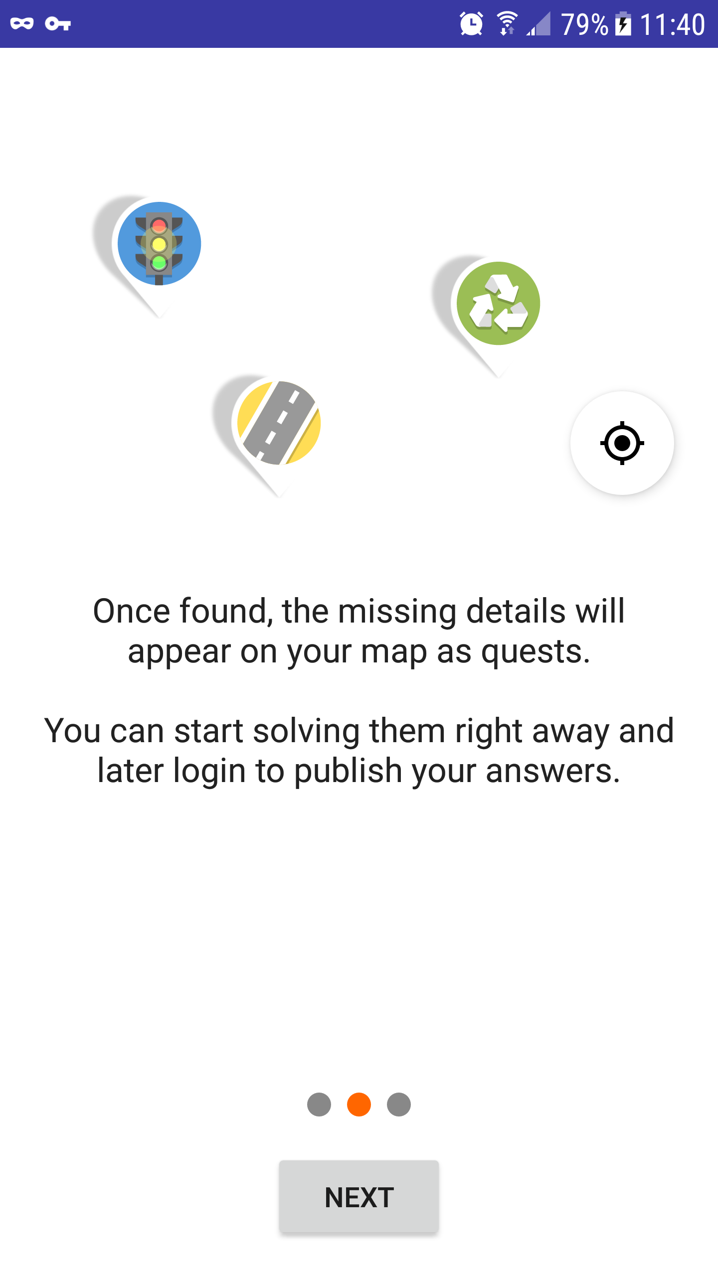
StreetComplete automatically looks for missing details in your vicinity. Once found, they will appear on your map as quests.
IMHO "once found" can easily be misunderstood by users that _they_ have to find the quests, like in geocaching. Hence, I'd prefer the 1st variant.
my 2 cents :)
georg-d
on 14 Mar 2020
https://www.westnordost.de/misc/tutorial.m4v
What do you think?
Nice :) Only I'd prefer the POI icons to not appear with the text "stay safe" but earlier with the text "missing details", because these details relate to POIs.
georg-d
on 14 Mar 2020
Don't put yourself into danger and
Is this part really needed? I don't like this "be careful little kid and watch the street" attitude of most navigation devices.
don't enter private property.
This is a good advice.
 HolgerJeromin
on 14 Mar 2020
HolgerJeromin
on 14 Mar 2020
Thanks for your support, georg!
Nice :) Only I'd prefer the POI icons to not appear with the text "stay safe" but earlier with the text "missing details", because these details relate to POIs.
Yes I had it like this at first, but I had no good idea what I could show in the third screen.
The initial idea was to visualize how they are solved and somehow visualize like one of them is not solved but a note left instead. My idea was to make the first and second pop out and fly away like they do when solved, the third turns into a note pin instead. I played around with animated check marks as well. But this illustration would actually introduce more confusion I think, because the user does neither know the app's UX yet, nor knows how notes look (spoiler: users can't see their own notes at all).
The reasons why I chose it this way now is:
- I put the "looking for location"-button in-between before the quests fall down to visualize that only after a location fix, the quests are downloaded. This resulted in that a lot was going on from slide 0 to slide 1 and the animation became really long
- the delay between slide 2 and slide 3 (because the user is reading the text) further emphasizes that it can take a while until quests are found. Maybe I should be even more explicit in the text even
- Since the pins fall down right after the user read the text that the quests will appear when ..., I think it is perhaps not too bad this way, it is still in context.
@HolgerJeromin Well, there are dangerous neighbourhoods and I once heard that you can be shot for trespassing in the US. If you don't look out for signs (for the latter) or your surroundings (for the former), inconvenient things may happen. The sentence is a reminder. It is just meant so that people keep that in mind, not suggesting that they are too stupid to know it.
Do you have a suggestion for an alternative wording? Something with "keep being aware of your surroundings" better maybe?
westnordost
on 14 Mar 2020
Thanks for your support, georg!
Thank _you_ for supporting OSM by creating & maintaining such an app! :)
BTW, the two paragraphs with "stay safe" and "leave a note" shall be switched, because the "note" parapgraph is content wise strongly related to solving quests so the previous screen, and a paragraph starting with "Finally" is supposed to be at the end ;)
Nice :) Only I'd prefer the POI icons to not appear with the text "stay safe" but earlier with the text "missing details", because these details relate to POIs.
Yes I had it like this at first, but I had no good idea what I could show in the third screen.
Your initial idea could indeed be "too much". How about a green checkmark (visualizes the user's quality improvements to OSM as well as stay safe) and/or a smily ("happy mapping")? .
The reasons why I chose it this way now is:
* I put the "looking for location"-button in-between before the quests fall down to visualize that only after a location fix, the quests are downloaded. This resulted in that a lot was going on from slide 0 to slide 1 and the animation became really long
* the delay between slide 2 and slide 3 (because the user is reading the text) further emphasizes that it can take a while until quests are found. Maybe I should be even more explicit in the text even
At least I did not get that intention; maybe others will. I guess I would get it if
- the "looking for location" icon would finally have a "GPS fix" or "position found" text attached or alternatively a stronger visualization than in that video, e.g. position icon turning green - but that shall then also be the case in the actual app
- the download had some visualisation, e.g. a rotating circle or having a globe at top from where the pure POI icons "rain" as tiny icons, become bigger and bigger, and finally get wrapped into "pins" on the map.
* Since the pins fall down right after the user read the text that the quests will appear when ..., I think it is perhaps not too bad this way, it is still in context.
As said, at least I do feel text & visualization to be out of sync.
@HolgerJeromin Well, there are dangerous neighbourhoods and I once heard that you can be shot for trespassing in the US. If you don't look out for signs (for the latter) or your surroundings (for the former), inconvenient things may happen. The sentence is a reminder. It is just meant so that people keep that in mind, not suggesting that they are too stupid to know it.
Then why not explicilty mentioning the reminding aspect? e.g. "Finally, keep in mind the usual behavioral rules while improving the map - so stay safe, be friendly and happy mapping!"
georg-d
on 15 Mar 2020
- I agree that the visuals, while very pretty, felt out of sync.
- I think the looking for location button is a good idea.
- I think the quest pins should fall down when the location button animation (flashing) ends.
- To help with the length, try making the location animation start as soon as the button appears, at the same time as the map is tilting.
- If that makes the pins appear too soon, you can play around with the delay between button appearance and animation (ie, how much the tilt and location animations overlap).
I have an additional idea for changing the phrasing around in a way that I think will work much better, but I don't have time to wordsmith right now since I am working on a lightning talk for Libreplanet tomorrow; I'll chime in later.
(Short version: move "search for missing details" to the first screen, "leave a note" to the second screen, and then rewrite everything so that makes sense.)
smichel17
on 15 Mar 2020
Libreplanet, sounds cool! Be sure to link your talk here when its done! Libreplanet is like FOSDEM, but online-only?
westnordost
on 15 Mar 2020
It is online-only this year due to COVID-19. Unfortunately I'm not going to be able to finish my talk in time unless I want to skip watching a few talks :\. Perhaps I will finish it and upload somewhere else after the conference.
smichel17
on 15 Mar 2020
Okay, here is a draft. I think it can be improved more but it is a starting point. It is a little more text but I think that is okay.
Welcome to OpenStreetMap
the free wiki world map
StreetComplete makes it easy to contribute to OpenStreetMap. It automatically looks for missing details in your vicinity: bicycle lanes, opening hours, wheelchair accessibility and much more…
Once found, they will appear on your map as quests. You can start solving them right away and log in to publish your answers.
Whenever you are uncertain, you can always reply "Can't Say" and leave a note.
Completing quests will earn stars and achievements, with information about how your contributions will be used.
Finally, stay safe: Don't put yourself into danger and don't enter private property.
Happy Mapping!
I think you can just use the "pop and fly away" animation on the 3rd screen, as long as you also include a little star count in the upper left corner. That way, it introduces the app's UX.
smichel17
on 15 Mar 2020
Overall, a very good draft!
Though, some things may be improved:
- current version it hints at that only [some] details can be contributed with SC, not everything. This is missing in the draft
- "Once found, they will appear on your map as quests." - "They" is now not really into context anymore because it's on the next page and also there is the list of example details in-between.
I'd like to keep the explanation of achievements etc. off the tutorial, because it is not necessary for the first steps in the app. It would just be a teaser, and basically on the first uploaded quest, you will already get a teaser for it. (The first edit achievement)
westnordost
on 15 Mar 2020
Ok, so what do you think of this?
Welcome to OpenStreetMap
_the free wiki world map_
StreetComplete makes it easy to contribute details to OpenStreetMap.
It automatically looks for missing details in your vicinity: bicycle lanes, opening hours, wheelchair accessibility and much more…
Once found, the missing details will appear on your map as quests. You can start solving them right away.
To publish your answers, you can later login.
Whenever you are uncertain, you can always reply "Can't Say" and leave a note.
Finally, remember to stay safe: Be aware of your surroundings and don't enter private property.
Happy Mapping!
The third screen could have a big animated check mark above the map view as @georg-d suggested. Should be easy to do and look good.
westnordost
on 15 Mar 2020
It'll also be a challenge for the translators to hit the right wording and not try a literal translation. For example, the previous _"With StreetComplete, you can easily contribute details to OpenStreetMap"_ is how I would word it in German.
westnordost
on 15 Mar 2020
The reason I omitted "details" from the first sentence was that I did not want to repeat the same word in the next sentence immediately after. I also realized I forgot one additional change, to the last two slides. Made that now:
Welcome to OpenStreetMap
_the free wiki world map_
StreetComplete makes it easy to contribute information to OpenStreetMap.
It automatically looks for missing details in your vicinity: bicycle lanes, opening hours, wheelchair accessibility and much more…
Once found, the missing details will appear on your map as quests.
Whenever you are uncertain, you can always reply "Can't Say" and leave a note.
You can start solving quests right away. To publish your answers, you can login later.
Remember to stay safe: Be aware of your surroundings and don't enter private property.
Happy Mapping!
I agree that translators will need to do a bit of extra work to translate the meaning instead of literally.
smichel17
on 15 Mar 2020
StreetComplete makes it easy to contribute information to OpenStreetMap by automatically looking for missing details in your vicinity: bicycle lanes, opening hours, wheelchair accessibility and much more…
I kind of want to do something like this, but it becomes quite a long, complicated sentence…
smichel17
on 15 Mar 2020
Ok, took your wording, except for the switch of details to information
westnordost
on 15 Mar 2020
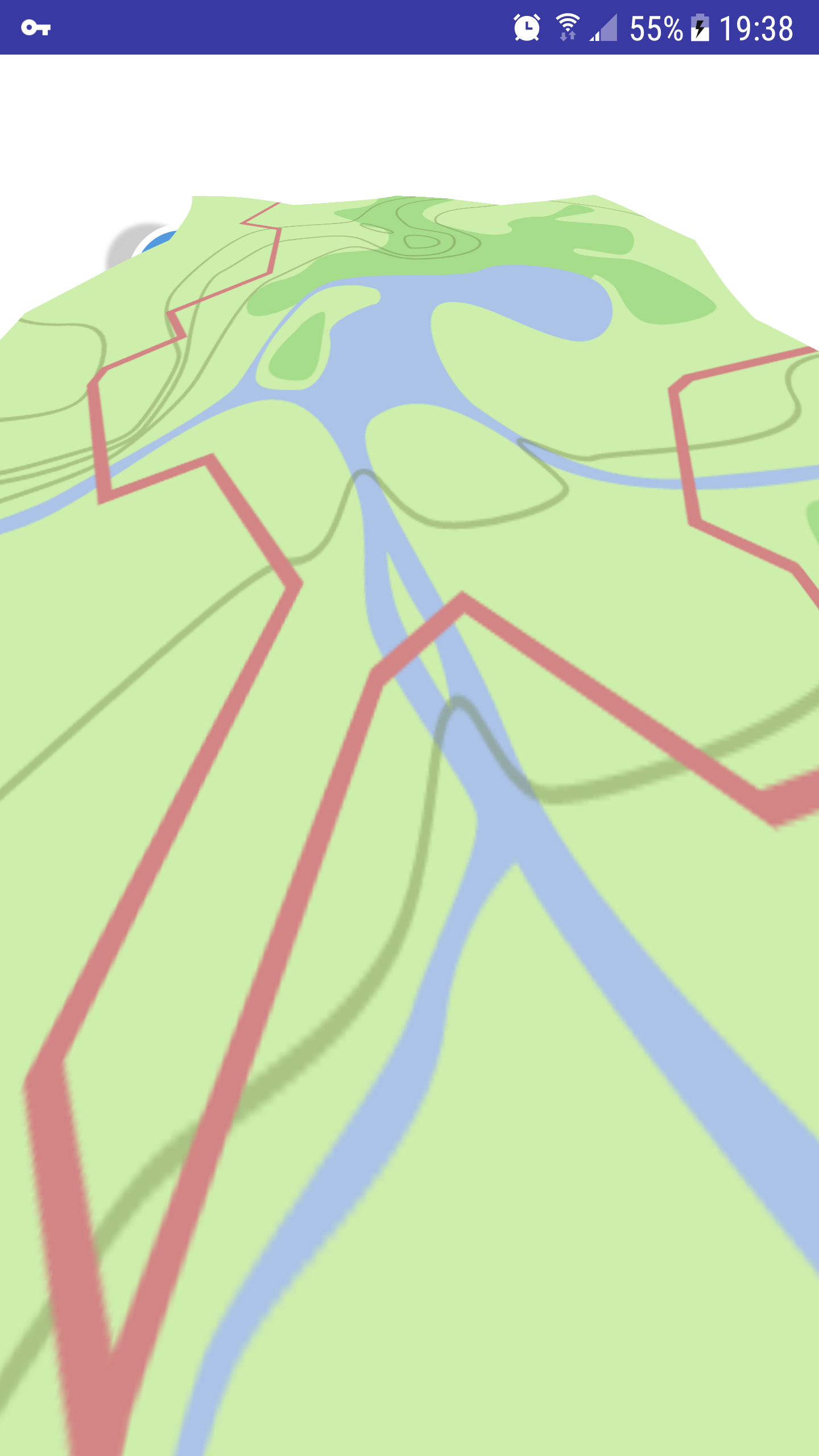
Just so you know, building from 6708d45, the map disappears on the second screen, after the rotation animation finishes:
 smichel17
on 16 Mar 2020
smichel17
on 16 Mar 2020
Hm thanks for testing it! Is this your phone, or an emulator? Which API version? I tested it both on my phone and on an emulator (API 21, 28) and there were no problems.
westnordost
on 16 Mar 2020
Maybe since you can reproduce it and you have a dev environment, you can try to find more details to the problem?
The animation happens at TutorialFragment.kt line 78-97. What if the map is rotated less? What happens if it is scaled less? Perhaps the problem is that the imageview is now considered to be "behind" the camera? If this would be the problem, perhaps also translating Z would solve it.
westnordost
on 16 Mar 2020
It's on my Samsung G920A (galaxy S6, there are a couple versions of it), Android 7.0 (api 24 -- I have to look up the conversation every time). I was just testing it quickly, I can look into it later today when I finish work.
smichel17
on 16 Mar 2020
It's a result of line 87; when I comment it out, the map does not disappear.
// .scaleX(mapScale).scaleY(mapScale)
My hunch is that your hunch about "behind" the camera is correct. Playing around more, will edit.
edit: When mapScale = 1.87f, the map does not disappear; when mapScale = 1.88f it does.
edit2: Not going any more precise than that.
smichel17
on 16 Mar 2020
I continue to find it likely that the map has moved above/behind the camera. When mapScale = 1.87f, it looks like this:
I can fix it trivially on my device by reducing mapScale, but if that makes it look wrong on other devices, we have a problem.
smichel17
on 16 Mar 2020
What if you set translationZ to something negative?
westnordost
on 17 Mar 2020
No visible effect, tested at -5f, -50f, and -500f.
Aside, it takes an annoyingly long time to install on my device for some reason. The build is done in a second and then I have to wait almost 15 seconds on the install task :neutral_face:
smichel17
on 17 Mar 2020
I tried setting mapScale = 1.87f (so the map stays visible) and experimenting with translationZ.
Negative values appear to have no effect, regardless of their magnitude.
Large positive values — say, translationZ(500f) — look like this:
 smichel17
on 17 Mar 2020
smichel17
on 17 Mar 2020
Okay, I think this is actually how the tilt looks on any device, but it is not visible because it is occluded by the white background of the text area.
westnordost
on 17 Mar 2020
Tested, translationY is the important one to trigger the bug; translationX does not matter.
smichel17
on 17 Mar 2020
Sorry, misspoke, I meant scaleY triggers the bug and scaleX doesn't matter.
smichel17
on 17 Mar 2020
So I wonder if the scaleY+scaleX is exchanged with instead changing the view width and height (LayoutParams), if this would solve the problem.
westnordost
on 17 Mar 2020
This should do that
        val animator = ValueAnimator.ofInt(200,500)
            animator.addUpdateListener { animator ->
                mapImageView.updateLayoutParams {
                    width = animator.animatedValue as Int
                    height = animator.animatedValue as Int
                }
            }
        animator.duration = 800
        animator.interpolator = AccelerateDecelerateInterpolator()
        animator.start()
But I can't test it of course, because I can't reproduce the problem in the first place
westnordost
on 17 Mar 2020
Sorry, needed to step away from the computer to help with covid19 precautions for my grandma.
To get this to compile & run without crashing, I needed to do this:
        val animator = ValueAnimator.ofInt(200,500)
            animator.addUpdateListener {
                val params = mapImageView.layoutParams
                params.width = it.animatedValue as Int;
                params.height = it.animatedValue as Int;
                mapImageView.layoutParams = params
            }
        animator.duration = 800
        animator.interpolator = AccelerateDecelerateInterpolator()
        animator.start()
It does not disappear, but also does not have the desired visual effect. It shrinks the map very small, then expands it a little. Using ValueAnimator.ofInt(800, 750) gets it closer to right, but then we're doing very little. Honestly, it doesn't make that much of a difference if I just keep the original code and omit the scaleX and scaleY entirely.
smichel17
on 17 Mar 2020
This is where it ends if I just comment out line 87. Leaving this image full size so it's easier to see the clipping against the left side of the screen and position of the pins.
smichel17
on 17 Mar 2020
Yes it looks nice as well, but I find the effect of the map icon changing seemingly to a map view much more interesting than the map icon simply tilting a bit.
There is a bug in the code I posted here, it's in pixels, not in DP.
westnordost
on 17 Mar 2020
Okay, I tested it with the corrected version, it works, but this has other problems: Since the actual size of the view changes, the views that are aligned onto it move out of the screen (GPS button, checkmark). I guess this is not worth the extra effort. I will remove the scale as you suggested.
westnordost
on 17 Mar 2020
What about the original code with only a small amount of scaling? ~1.5 or so. That would not disappear and would keep some amount of the original effect.
smichel17
on 17 Mar 2020
Yes, that's what I meant
westnordost
on 17 Mar 2020
Related issues
 ecksun
·
3Comments
ecksun
·
3Comments
 tordans
·
4Comments
tordans
·
4Comments
 JulienPalard
·
3Comments
JulienPalard
·
3Comments
 nmxcgeo
·
3Comments
nmxcgeo
·
3Comments
 lost-geographer
·
3Comments
lost-geographer
·
3Comments
Most helpful comment
My idea would be to use the same mechanic here for things that need to be said at the beginning, such as:
etc.