Storybook: When splitting component's stories in multiple files, control args are not autogenerated
Describe the bug
When splitting the component's stories based on: https://github.com/storybookjs/storybook/blob/next/MIGRATION.md#deprecated-support-for-duplicate-kinds
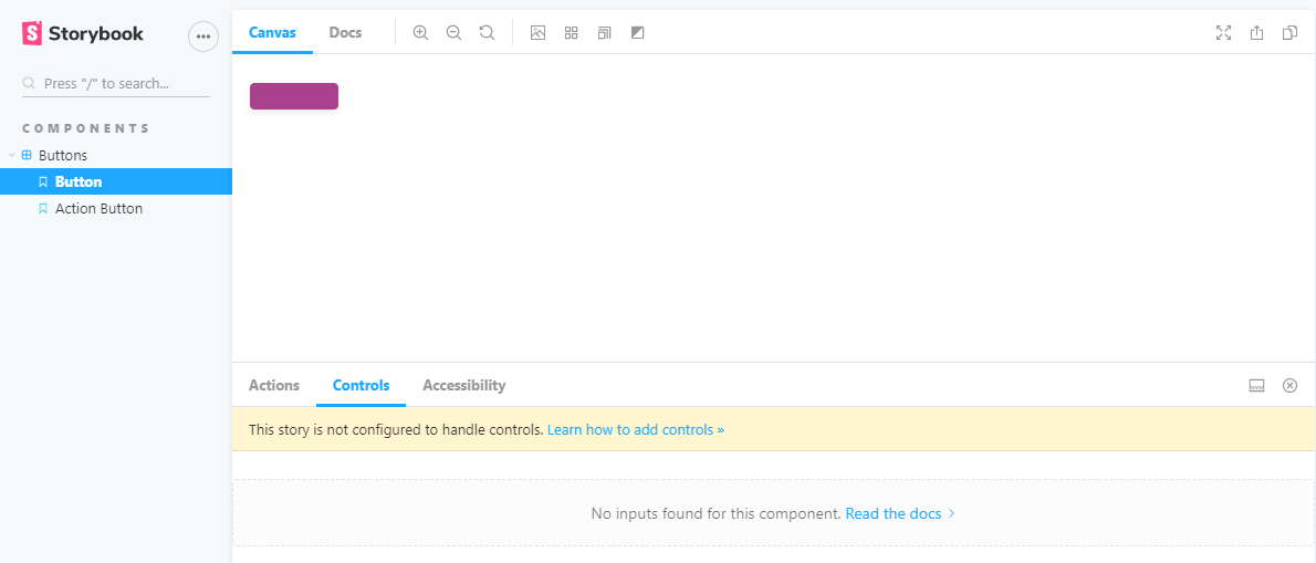
The args are not auto generated in the controls
Expected behavior
I would expect that the controls in the splitted stories are autogenerated
Screenshots
Code snippets
Button.stories.js
import React from "react";
import { Button } from "../src/";
import mdx from "../docs/Button.mdx";
import {
    PencilIcon,
    TrashcanIcon,
    DownloadIcon,
    ArrowIcon,
} from "../../icons/src";

const iconMap = { PencilIcon, TrashcanIcon, DownloadIcon, ArrowIcon };

export const button = (args) => {
    const icon = iconMap[args.icon];
    const argsWithIcon = { ...args, icon };
    return <Button {...argsWithIcon} />;
};

button.parameters = {
    docs: {
        page: mdx,
    },
};
Button.js
import React from "react";
import { string, node, bool, func, oneOf, object } from "prop-types";

import classNames from "classnames";

const Button = ({
    attributes = {},
    children,
    className = null,
    href = null,
    icon = null,
    id = null,
    isDisabled = false,
    isLink = false,
    name = null,
    onClick,
    size = null,
    target = null,
    text = null,
    type = "button",
    variant = "primary",
}) => {
    const buttonSize = size ? `Trinity-Button--${size}` : null;

    const classes = classNames(
        "Trinity-Button",
        `Trinity-Button--${variant}`,
        buttonSize,
        { "Trinity-Button--is-disabled": isDisabled },
        className
    );

    const Icon = icon;

    const buttonIcon = () =>
        icon && (
            <span className="Trinity-Button__icon">
                <Icon
                    width={size !== "small" ? "24" : "16"}
                    height={size !== "small" ? "24" : "16"}
                />
            </span>
        );

    if (isLink)
        return (
            <a
                aria-disabled={isDisabled}
                className={classes}
                disabled={isDisabled}
                href={href}
                id={id}
                tabIndex={0}
                target={target}
            >
                {buttonIcon()}
                {text || children}
            </a>
        );

    if (isLink)
        return (
            <a
                aria-disabled={isDisabled}
                className={classes}
                disabled={isDisabled}
                href={href}
                id={id}
                tabIndex={0}
                target={target}
            >
                {icon && (
                    <span className="Trinity-Button__icon">{buttonIcon}</span>
                )}
                {text || children}
            </a>
        );

    return (
        <button
            type={type}
            name={name}
            id={id}
            disabled={isDisabled}
            aria-disabled={isDisabled}
            className={classes}
            tabIndex={0}
            onClick={onClick}
            {...attributes}
        >
            {buttonIcon()}
            {text || children}
        </button>
    );
};

Button.propTypes = {
    attributes: object,
    children: node,
    className: string,
    href: (props, propName) =>
        props.isLink
            ? new Error(`${propName} is required if Button is used as a href`)
            : null,
    icon: func,
    id: string,
    isDisabled: bool,
    isLink: bool,
    name: string,
    onClick: func.isRequired,
    size: oneOf(["small"]),
    target: string,
    text: (props, propName) => {
        if (!props.children && !props.text) {
            return new Error(`${propName} is required if not passing children`);
        }
        if (props.children && props.text) {
            return new Error(
                `${propName} can not be combined with children, either specify ${propName} or pass children, but not both`
            );
        }
        return null;
    },
    type: oneOf(["button", "submit", "reset"]),
    variant: oneOf(["primary", "secondary"]),
};

export default Button;
ActionButton.stories.js
import React from "react";
import { ActionButton } from "../src/";
import mdx from "../docs/ActionButton.mdx";

import {
    InfoCircleIcon,
    PdfIcon,
    PlusCircleIcon,
    TrashcanIcon,
} from "../../icons/src/index";

const iconMap = { InfoCircleIcon, PdfIcon, PlusCircleIcon, TrashcanIcon };

export const actionButton = (args) => {
    const icon = iconMap[args.icon];
    const argsWithIcon = { ...args, icon };
    return <ActionButton {...argsWithIcon} />;
};

actionButton.parameters = {
    docs: {
        page: mdx,
    },
};
index.stories.js
export default { title: "components/Buttons" };

export * from "./Button.stories";
export * from "./ActionButton.stories";
 inginging
All 7 comments
argTypes are automatically generated based on the default.component property. Since index.stories.js doesn't provide a default.component property, they are not auto-generated. Also, since you have two different components, you're probably better off having two different default exports.
If that doesn't work for you, you can always go manual: https://github.com/storybookjs/storybook/blob/next/addons/controls/README.md#my-controls-arent-being-auto-generated-what-should-i-do
 shilman
on 8 Sep 2020
shilman
on 8 Sep 2020
Thanks @shilman for the reply. The reason I do this is that I want to have ActionButton and Button grouped under the folder"Buttons". But when I give them both the same title in the export default, I get the deprication warning about duplicated titles. So that's why I chose for the splitting option. Any advice on the best way to do this?
inginging
on 10 Sep 2020
I'm hitting this as well and the reasoning is the same as @inginging described.
Were we able to assign the "component" parameter to the named export, it would solve this.
 kubijo
on 25 Sep 2020
kubijo
on 25 Sep 2020
@kubijo that's not a bad workaround, although it doesn't match our intended convention of "one file per component". @tmeasday @ndelangen WDYT?
shilman
on 25 Sep 2020
I'm not really sure what all that rule means in practice, but it seems that it possibly touches on my pet peeve with having to have an extra level in the menu if can't share the default export with other stories. Even though the component is just a single parametric story...
kubijo
on 25 Sep 2020
@kubijo we might make the navigation more configurable in the future https://github.com/storybookjs/storybook/issues/8255
cc @ghengeveld
shilman
on 25 Sep 2020
We're moving towards a model where components get their own pages. I'm prioritizing #8255 as a way to help de-clutter the sidebar for components with single stories.
We might reconsider this after everything has had a chance to settle, but at the moment this introduces complexity that we're not comfortable with. Closing this for now.
shilman
on 1 Oct 2020
Related issues
 dnlsandiego
·
3Comments
dnlsandiego
·
3Comments
 tirli
·
3Comments
tirli
·
3Comments
 Jonovono
·
3Comments
Jonovono
·
3Comments
 wahengchang
·
3Comments
shilman
·
3Comments
wahengchang
·
3Comments
shilman
·
3Comments
Most helpful comment
@kubijo we might make the navigation more configurable in the future https://github.com/storybookjs/storybook/issues/8255
cc @ghengeveld