Describe the bug
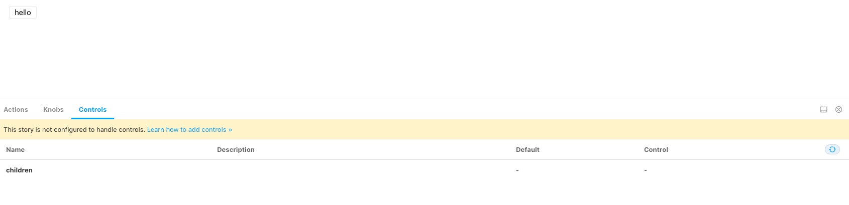
I followed the tutorial that is being described in this article. Controls tab is being displayed but there is a message saying that This story is not configured to handle controls. Learn how to add controls » and controls can't be used.
To Reproduce
Steps to reproduce the behavior:
- Create a story and paste the following code (same code provided in the tutorial)
import React from 'react'
import { Button } from '@storybook/react/demo';
export default { title: 'Button/Controls', component: Button };
export const Basic = (args: any) => <Button {...args} />;
Basic.args = { children: 'hello' };
Expected behavior
Able to edit controls
Screenshots

Additional context
"@storybook/addon-actions": "^6.0.13",
    "@storybook/addon-controls": "^6.0.13",
    "@storybook/addon-knobs": "^6.0.13",
    "@storybook/addon-links": "^6.0.13",
    "@storybook/addons": "^6.0.13",
    "@storybook/preset-create-react-app": "^3.1.4",
    "@storybook/react": "^6.0.13",
 Alfrex92
All 17 comments
Hey @Alfrex92! Indeed this doesn't look like the expected behaviour, thanks for opening this issue!
It seems like there was a regression in the automatic detection for react components.
For now, you could annotate your properties manually like this:
import React from 'react'
import { Meta, Story } from '@storybook/react'
import { Button } from '@storybook/react/demo'
export default {
title: 'Button/Controls',
component: Button,
argTypes: {
children: {
control: 'text',
},
},
} as Meta
export const Basic: Story<{ children: React.ReactNode }> = args => (
<Button {...args} />
)
Basic.args = { children: 'hello' }
As soon as the issue is fixed then you could just remove argTypes entirely (if you want default automatic detection rather than specific overrides).
p.s. I see that you're using typescript, so I added an example of how to use the new Storybook types as well :)
 yannbf
on 20 Aug 2020
yannbf
on 20 Aug 2020
Thanks for your reply and also for adding an example using Typescript.
Unfortunately, the solution didn't work 😢. I'm not seeing the message anymore but I can't edit controls.
Alfrex92
on 21 Aug 2020
Hey @yannbf, thanks for providing a snippet to play with!
I think I am encountering the same issue (with all 6.0.x versions of Storybook. Here is the code of a story written from your comment above:
import { Meta, Story } from '@storybook/react';
import React from 'react';
import { SearchInput } from '../../src/SearchInput';
export default {
title: 'SearchInput',
component: SearchInput,
argTypes: { value: { control: 'text' } },
} as Meta;
export const searchInputDemo: Story<{ value: string }> = (args) => (
<SearchInput {...args} />
);
searchInputDemo.args = {
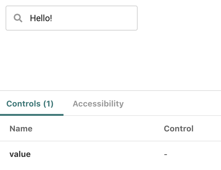
value: 'Hello!',
};
I do not get that warning, but the value argument gets no control:
However, we have multiple tsconfig.json files and I am wondering if that might be why Storybook is unable to generate the controls. Here is a very simplified tree structure of our (private, unfortunately) repo:
├─ src
| ├─ ...
| ├─ SearchInput.tsx
| └─ ...
├─ storybook
| ├─ stories
| | ├─ ...
| | ├─ SearchInput.story.tsx
| | └─ ...
| └─ tsconfig.json
└─ tsconfig.json
storybook/tsconfig.json contains:
{
"compilerOptions": {
"rootDir": "../",
"outDir": "../storybook_dist"
},
"extends": "../tsconfig.json"
}
That's because we do not include stories in the JS bundle of the library itself.
Does this seem unusual to you, and do you think the extra tsconfig.json could explain the lack of controls?
 astorije
on 21 Aug 2020
astorije
on 21 Aug 2020
@astorije do you have a repro?
 shilman
on 21 Aug 2020
shilman
on 21 Aug 2020
After the latest updates in the SB 6 the Controls have disappeared from the ArgsTable completely for me 🤔 They are there in version 6.0.0, but gone after 6.0.13
 lsbet
on 21 Aug 2020
lsbet
on 21 Aug 2020
@lsbet can you figure out specifically in which version they went away?
shilman
on 21 Aug 2020
Hey @shilman
We have the same issue with controls. After updating to the current version, Props and Controls disappeared. We had the same issue a week ago https://github.com/storybookjs/storybook/issues/11870
import { Meta, Story, Canvas, Props } from '@storybook/addon-docs/blocks'
import { action } from '@storybook/addon-actions'
import Ui from '@/ui'
import Tooltip from '.'
<Meta
title="Tooltip"
component={Tooltip}
/>
# Tooltip
The Tooltip circle for each node.
<Canvas>
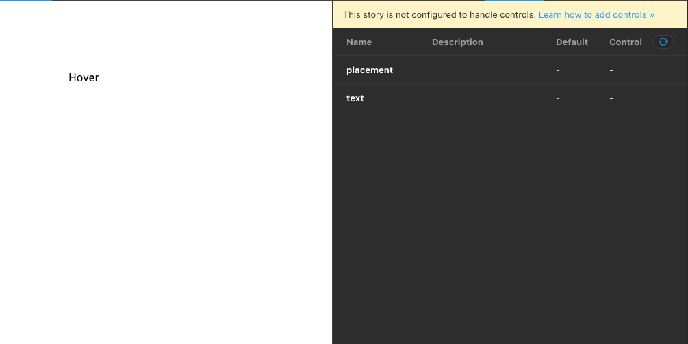
<Story name="Default" args={{ placement: 'bottom', text: 'I\'m tooltip 😇' }}>
{args => (
<Ui margin={[100, 0, 0, 100]}>
<Tooltip {...args}>
<Ui
position="relative"
fontSize={Ui.Font.Size.Normal}
>Hover</Ui>
</Tooltip>
</Ui>
)}
</Story>
</Canvas>
# Props
<Props of={Tooltip} />

 gcofficial
on 23 Aug 2020
gcofficial
on 23 Aug 2020
Reverting back to 6.0.0 for playbook-react, addon-controls and addon-docs fixed the issue for me!
"@storybook/addon-controls": "^6.0.0",
"@storybook/addon-docs": "^6.0.0",
"@storybook/addon-info": "^5.3.19",
"@storybook/addon-links": "^6.0.10",
"@storybook/addons": "^6.0.10",
"@storybook/react": "^6.0.0",
This currently works.
lsbet
on 24 Aug 2020
@astorije do you have a repro?
Thanks for replying! I was playing with this just now, and somehow got it to work by replacing:
argTypes: {
value: { control: 'text' },
},
with:
argTypes: {
value: { control: { type: 'text' } },
},
Even though the doc doesn't say so.
🤯
astorije
on 25 Aug 2020
@astorije i've been working on the documentation. If you can supply a repo i'm more than glad to take a look at it. And if need be adjust the code snippet.
Feel free to provide feedback
 jonniebigodes
on 25 Aug 2020
jonniebigodes
on 25 Aug 2020
Looks like a bug in Storybook not in the documentation. Looking at it.
shilman
on 25 Aug 2020
Jiminy cricket!! I just released https://github.com/storybookjs/storybook/releases/tag/v6.0.18 containing PR #12230 that references this issue. Upgrade today to try it out!
Closing this issue. Please re-open if you think there's still more to do.
shilman
on 25 Aug 2020
@shilman, thanks a lot! It does seem to work much better, this is awesome!!
Just one clarification though to make sure I'm not deeply misguided as to how Arguments/Controls are supposed to work: are the controls supposed to be inferable from the available TS type information?
For example, adjusting my snippet above:
import { Meta, Story } from '@storybook/react';
import React from 'react';
import { SearchInput, SearchInputProps } from '../../src/SearchInput';
// Assuming:
// interface SearchInputProps {
// disabled?: boolean;
// value?: string;
// }
export default {
title: 'SearchInput',
component: SearchInput,
} as Meta;
export const searchInputDemo: Story<SearchInputProps> = (args) => (
<SearchInput {...args} />
);
Would Storybook be able to infer that disabled and value are to be available as controls, without having to specify:
searchInputDemo.args = {
disabled: false, // Sidenote: `disabled: undefined` gives us "Cannot read property 'defaultValue' of undefined" but probably worth a separate issue!
value: '',
};
?
Reading the doc on addon-controls, it seems like args are opt-in, but other places in the doc lead me to believe they should be auto-inferred (FYI we are not using the docs addon nor do we have a direct dependency on react-docgen-typescript). Thanks in advance and apologies for hijacking the thread, I wasn't sure if this was relevant as a follow-up here!
And thanks again for all of this!
astorije
on 26 Aug 2020
@astorije For historical reasons, the docs addon contains the code that does the auto-inference. So in 6.0 you'll need to add that to get auto-generated controls. You can disable the docs tab if you don't want it to be part of your UI.
You can also specify argTypes by hand: https://github.com/storybookjs/storybook/blob/next/addons/controls/README.md#my-controls-arent-being-auto-generated-what-should-i-do
It's not required to specify .args--you typically use those to specify the initial value of the args in the stories, since each story will have different settings.
shilman
on 26 Aug 2020
Thank you @shilman, excellent!
astorije
on 26 Aug 2020
I am currently working with Gatsby + Storybook + Typescript and storybook is not auto-detecting controls for any of the components. eg-
import React from "react"
import { Story, Meta } from "@storybook/react"
// default import
import  StyledButton, {StyledButtonProps } from "./StyledButton.styles"

export default {
  title: "Components/StyledButton",
  component: StyledButton,
} as Meta

const Template: Story<StyledButtonProps> = args => <StyledButton {...args} />

// controls are not detected
export const Basic= Template.bind({})
But, everything starts working when I make the component into a named export, instead of a default export.
import React from "react"
import { Story, Meta } from "@storybook/react"
// named import
import {StyledButton, StyledButtonProps } from "./StyledButton.styles"

export default {
  title: "Components/StyledButton",
  component: StyledButton,
} as Meta

const Template: Story<StyledButtonProps> = args => <StyledButton {...args} />

// controls are auto-detected
export const Basic= Template.bind({})
 mohit242
on 1 Oct 2020
mohit242
on 1 Oct 2020
For me the problem is solved when I give my component a named export:
As the docs of react-docgen-typescript mention:
Warning: only named exports are supported. If your project uses default exports, you still need to include named exports for react-docgen-typescript.
export interface IconButtonProps {
  onClick?: () => void;
  type?: 'button' | 'submit' | 'reset';
  dataTestId?: string;
  disabled?: boolean;
  size?: 'small' | 'normal' | 'large' | 'compact';
  variant?: 'default' | 'borderless' | 'primary';
  border?: 'square' | 'rounded';
  children: {
    icon?: SVGElement;
  };
}

export const IconButtonComp: FC<IconButtonProps> = ({
  children,
  type = 'button',
  onClick,
  dataTestId = 'button',
  variant = 'default',
  border = 'square',
  disabled = false,
  size = 'normal',
}) => (
  <Button
    onClick={onClick}
    variant={variant}
    border={border}
    size={size}
    type={type}
    disabled={disabled}
    data-testid={dataTestId}
  >
    {children}
  </Button>
);
So add a named export and you are good to go 👍
 GuidovdRiet
on 5 Nov 2020
GuidovdRiet
on 5 Nov 2020
Related issues
 dnlsandiego
·
3Comments
dnlsandiego
·
3Comments
 zvictor
·
3Comments
zvictor
·
3Comments
 MrOrz
·
3Comments
MrOrz
·
3Comments
 oriSomething
·
3Comments
oriSomething
·
3Comments
 levithomason
·
3Comments
levithomason
·
3Comments
Most helpful comment
I am currently working with Gatsby + Storybook + Typescript and storybook is not auto-detecting controls for any of the components. eg-
But, everything starts working when I make the component into a named export, instead of a default export.