Storybook: addon-docs: a way to override width of name column in props table
30% for the name of the prop, especially when addon-controls is enabled is a bit too much:

20% would have been perfect fit. Is there a way to override this somehow?
 jayarjo
All 10 comments
@domyen can you take a look at this one? i think you might've modified this in the latest round of styling updates
 shilman
on 30 Jun 2020
shilman
on 30 Jun 2020
And I think Control column requires some min-width in general or it might end up with something like this:

jayarjo
on 1 Jul 2020
@shilman got it, will take a look later this week.
Re: column width constraints. This speaks to a larger issue. One of the columns will always get squished when the table is narrow. For instance, in the addon panel. I wonder if we need to hide columns altogether in this case. 🤔
 domyen
on 1 Jul 2020
domyen
on 1 Jul 2020
So there's another row that is not seen in this screenshot that contained an action with very long type and that what was stretching that column. Maybe it makes sense to put word-break rule on those columns too.
jayarjo
on 1 Jul 2020
Hi everyone! Seems like there hasn't been much going on in this issue lately. If there are still questions, comments, or bugs, please feel free to continue the discussion. Unfortunately, we don't have time to get to every issue. We are always open to contributions so please send us a pull request if you would like to help. Inactive issues will be closed after 30 days. Thanks!
![stale[bot] picture](https://avatars3.githubusercontent.com/in/1724?v=4&s=40) stale[bot]
on 25 Jul 2020
stale[bot]
on 25 Jul 2020
Maybe simply provide a way to add custom styles to components or the preview/manager pages in general. That's what I personally ended up with, but in somewhat hacky way.
jayarjo
on 25 Jul 2020
I have a related use case where I'm setting a long url as a default property for an avatar component
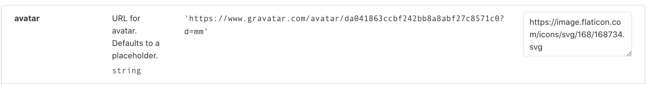
The worst part is that it doesn't shrink and creates a horizontal scrollbar when I have dev tools open.
If I add word-break: break-all to the cell through the dev tools it looks fine.

 cfhull
on 4 Aug 2020
cfhull
on 4 Aug 2020
Addressed these issues here in #11805.
If you want to customize the styles further, target these classes:
.docblock-argstable.docblock-argstable-head.docblock-argstable-body
e.g., .docblock-argstable-head th:first-of-type { width: 20% }. Make sure that your selector's specificity is greater than our default styling or use !important.
domyen
on 5 Aug 2020
Whoopee!! I just released https://github.com/storybookjs/storybook/releases/tag/v6.0.0-rc.27 containing PR #11805 that references this issue. Upgrade today to try it out!
You can find this prerelease on the @next NPM tag.
Closing this issue. Please re-open if you think there's still more to do.
shilman
on 5 Aug 2020
Great Caesar's ghost!! I just released https://github.com/storybookjs/storybook/releases/tag/v6.0.12 containing PR #11818 that references this issue. Upgrade today to try it out!
shilman
on 17 Aug 2020
Related issues
 hckhanh
·
69Comments
hckhanh
·
69Comments
 p3k
·
61Comments
p3k
·
61Comments
 EdenTurgeman
·
81Comments
EdenTurgeman
·
81Comments
 bpeab
·
70Comments
bpeab
·
70Comments
 tycho01
·
76Comments
tycho01
·
76Comments