Storybook: Prop groups for addon-controls panels
Similar to addon-knobs it would be fantastic to be able to split props up into different tabs, this comes in very useful for components that use sub components, ie: Accordion and AccordionItem.
Would a similar approach to addon-knobs of assigning a groupId would work?
 sami616
All 17 comments
I think you can do this already with an undocumented API. I'd like to think it through and make sure it's a coherent design before documenting it and committing to support it though.
Right now there are so many different possible groupings:
- by component (via tabs, but only the first tab gets controls currently)
- by interface for typescript inheritance in #9110 (not yet merged)
- by category (e.g. inputs/slots/events/etc. in various frameworks, "just props" in react)
- by user grouping potentially according to this issue
Also since the same components are shared between addon-controls and addon-docs props table we'll need to think about both use cases and make sure they don't sabotage each other.
This might end up being more of a design issue than a technical one @domyen @tmeasday. I think we're in a pretty good place technically to have the data we need to do something interesting here, both automatically and also user controlled.
 shilman
on 29 May 2020
shilman
on 29 May 2020
Oh okay I tried passing ‘groupId’ as a property in ‘argTypes’ but nada!
sami616
on 29 May 2020
Yeah that’s not the undocumented API 😈
shilman
on 29 May 2020
Will do a pass at Storybook design stuff this week. Will try to fit the groupings/tabs in depending on scope.
 domyen
on 30 May 2020
domyen
on 30 May 2020
Thank you @domyen !!!!
sami616
on 30 May 2020
Hi everyone! Seems like there hasn't been much going on in this issue lately. If there are still questions, comments, or bugs, please feel free to continue the discussion. Unfortunately, we don't have time to get to every issue. We are always open to contributions so please send us a pull request if you would like to help. Inactive issues will be closed after 30 days. Thanks!
![stale[bot] picture](https://avatars3.githubusercontent.com/in/1724?v=4&s=40) stale[bot]
on 20 Jun 2020
stale[bot]
on 20 Jun 2020
Working on this issue here https://github.com/storybookjs/storybook/pull/11216
domyen
on 20 Jun 2020
Hi everyone! Seems like there hasn't been much going on in this issue lately. If there are still questions, comments, or bugs, please feel free to continue the discussion. Unfortunately, we don't have time to get to every issue. We are always open to contributions so please send us a pull request if you would like to help. Inactive issues will be closed after 30 days. Thanks!
stale[bot]
on 11 Jul 2020
Just wondering if there is any documentation kicking around for how to handle subcomponent controls in SB6? @shilman mentioned some kind of "undocumented API" for this.
sami616
on 13 Jul 2020
Did I? At one point I'd implemented something for that, but I removed it for simplicity. Right now you can either get autogenerated controls for the top-level component (in frameworks that support it) and/or you can manually define args/controls and how those values get translated into subcomponent instances. But there's no explicit support for subcomponent controls.
Related: https://github.com/storybookjs/storybook/issues/11525
shilman
on 13 Jul 2020
Okay, good to know. Is it worth me reopening this issue as a feature request? 🤔
sami616
on 13 Jul 2020
Sure, that would be awesome. The more you can specify the desired behavior, the better. I can't actually think of a well-defined version of the feature, which is why I removed what I'd implemented.
shilman
on 13 Jul 2020
Hi everyone! Seems like there hasn't been much going on in this issue lately. If there are still questions, comments, or bugs, please feel free to continue the discussion. Unfortunately, we don't have time to get to every issue. We are always open to contributions so please send us a pull request if you would like to help. Inactive issues will be closed after 30 days. Thanks!
stale[bot]
on 8 Aug 2020
Hi everyone! Seems like there hasn't been much going on in this issue lately. If there are still questions, comments, or bugs, please feel free to continue the discussion. Unfortunately, we don't have time to get to every issue. We are always open to contributions so please send us a pull request if you would like to help. Inactive issues will be closed after 30 days. Thanks!
stale[bot]
on 31 Aug 2020
My team ran into this as well when trying to move from addon-knobs to addon-controls.
Some thoughts:
addon-knobsare much more freeform, it's all on the developer to make the decision about what is a knob and what is grouped together.addon-controlsfeel linked directly to the component because theargsare generated from the components definition that is set in the story config. It can be customized, but that ends up being more of secondary addition/action.
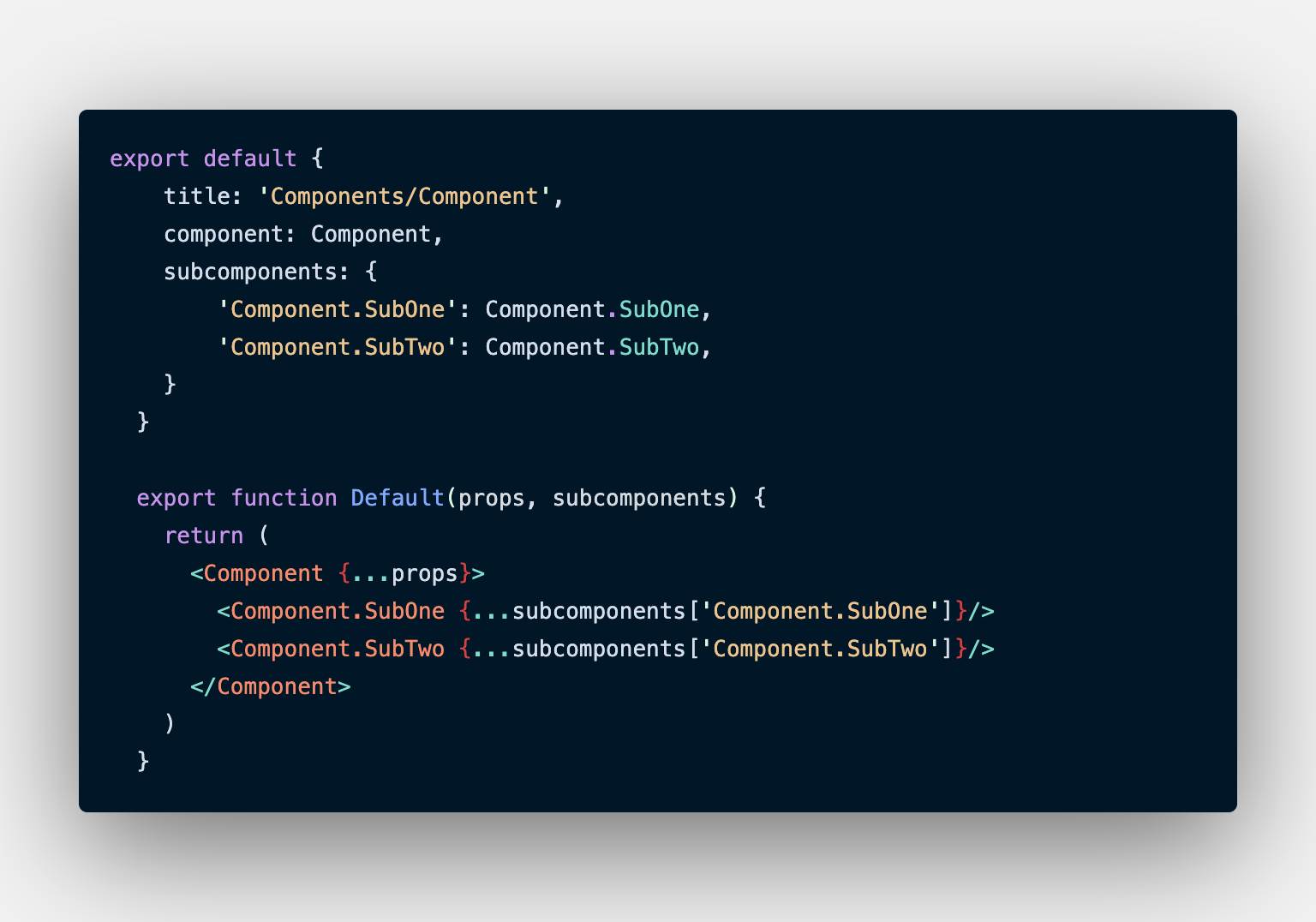
If addon-controls are more about being linked to a component then the act of defining additional panels/groups should be linked to them as well. What if it's based on subcomponents? This is already a defined with addon-docs which will give you a tab panel for each subcomponent in the documentation.
Here is a rough concept of how this would play out with a List component that ends up having two other components that can be composed with it:
export default {
  title: 'List',
  component: List,
  subcomponents: [ListItem, ListLink],
};

// Custom args as consts so they can be more descriptive, re-used, and differentiate themselves from normal args
const ITEM_TYPE = 'Item Type'

const ITEM_LABEL = 'Item Label (children)'
const ITEM_ICON = 'Item Icon (children)'

// Example story with a 3rd parameter that is an array of subArgs which can be destructured
// listItemArgs would end up having all the defined props of subcomponents[0] aka ListItem plus anything defined in Example.subArgs[0]
// listLinkArgs would end up having all the defined props of subcomponents[1] aka ListLink plus anything defined in Example.subArgs[1]
export const Example = (args, context, [ listItemArgs, listLinkArgs ]) => (
  <List {...args}>
    { args[ITEM_TYPE] === 'link' ? (
      <ListItem { ...listItemArgs }>
        { listItemArgs[ITEM_ICON] && (
          <Icon name={listItemArgs[ITEM_ICON]} />
        ) }
        { listItemArgs[ITEM_LABEL] }
      </ListItem>
    ) : (
      <ListLink { ...listLinkArgs }>
        { listLinkArgs[ITEM_ICON] && (
          <Icon name={listLinkArgs[ITEM_ICON]} />
        ) }
        { listLinkArgs[ITEM_LABEL] }
      </ListLink>
    ) }
  </List>
)

Example.args = {
  [ITEM_TYPE]: 'normal',
}

Example.argTypes = {
  [ITEM_TYPE]: {
    control: {
      type: 'select',
      options: [null, 'normal', 'link'],
    },
  },
}

// The subArgs would end up modeling themselves after args but instead be an array that matches up to the subcomponents passed.
// So subArgs[0] is describing subcomponents[0], subArgs[1] is describing subcomponents[1], etc.
Example.subArgs = [
  // ListItem
  {
    [ITEM_LABEL]: 'Item',
    [ITEM_ICON]: null,
  },
  //ListLink
  {
    [ITEM_LABEL]: 'Item',
    [ITEM_ICON]: null,
  },
]

// Just like args have argTypes, subArgs should have subArgTypes with the similar array pattern
Example.subArgTypes = [
  // ListItem
  {
    [ITEM_LABEL]: {
      control: {
        type: 'text',
      },
    },
    [ITEM_ICON]: {
      control: {
        type: 'select',
        options: [null, 'external', 'home', 'settings'],
      },
    },
  },
  // ListLink
  {
    [ITEM_LABEL]: {
      control: {
        type: 'text',
      },
    },
    [ITEM_ICON]: {
      control: {
        type: 'select',
        options: [null, 'external', 'home', 'settings'],
      },
    },
  },
]
 philipbordallo
on 26 Sep 2020
philipbordallo
on 26 Sep 2020
Great to see some activity again here. This is still the one feature I feel is missing with controls. I suggested an api like this a while ago, not sure how plausible it is but I quite like it's simplicity.
sami616
on 27 Sep 2020
@sami616 There is an alternative proposal https://github.com/storybookjs/storybook/issues/12871
 monolithed
on 15 Nov 2020
monolithed
on 15 Nov 2020
Related issues
 zvictor
·
3Comments
zvictor
·
3Comments
 sakulstra
·
3Comments
sakulstra
·
3Comments
 xogeny
·
3Comments
xogeny
·
3Comments
 Jonovono
·
3Comments
Jonovono
·
3Comments
 alexanbj
·
3Comments
alexanbj
·
3Comments
Most helpful comment
Great to see some activity again here. This is still the one feature I feel is missing with controls. I suggested an api like this a while ago, not sure how plausible it is but I quite like it's simplicity.