Storybook: Addon-docs: Parameter to not print the PropsTable next to the primary story
Is your feature request related to a problem? Describe the solution you'd like
I want to prevent the PropsTable to be displayed by default next to the primary story and instead, move it to a panel if possible (can Storybook v6 support that kind of move?)
Describe alternatives you've considered
I've checked the sourcecode and it seems that no matter what, StoryTable will include a TabbedArgsTable or ArgsTable (at least what I saw inside Props.tsx)
Are you able to assist bring the feature to reality?
I may need some guidance to implement the panel from the existing props. But yeah, I'm willing to put some effort to make this a reality.
 matheo
All 14 comments
Please use the following recipe:
https://github.com/storybookjs/storybook/blob/next/addons/docs/docs/docspage.md#remixing-docspage-using-doc-blocks
We'll provide more configurability for the props table in 6.1
 shilman
on 12 May 2020
shilman
on 12 May 2020
@shilman great thanks!
I will customize the DocsPage with that recipe
but talking about moving the <Props /> to a panel,
is it possible right now? or there will be needed some core support to allow it?
TIA
matheo
on 13 May 2020
@shilman this code was a great help
https://raw.githubusercontent.com/storybookjs/storybook/ad3af10f05f275ed31cf7722f4cb0c86d8c6ac70/examples/official-storybook/stories/addon-docs/addon-docs.stories.mdx
As I'm using Angular, the React recipe was a bit complicated to run
I preferred to use an MDX as default page like this:
import { Description, Props, Source, Story, Subtitle, Title } from '@storybook/addon-docs/blocks';

<Title />
<Subtitle />
<Description />

<Story id="." />

<Source id="." />

<Props of="." />
and I'm loving how it works per-story basis.
Now I'm getting familiar with the other blocks to understand their power!
After this I will dig into the panels.
Thank you very much!
matheo
on 13 May 2020
PS. Digging and playing with the Props block, it seems to rely on DocsContext, but I'm not sure if it can be provided from an Addon to render that block inside a Panel. Is that possible?
My current panel looks like this:
  addons.addPanel('my/docs/props', {
    title: 'Props',
    render: ({ active, key }) => {
      return active && api.getCurrentStoryData() ? (
        <AddonPanel key={key} api={api}>
          <Props story={api.getCurrentStoryData().id} />
        </AddonPanel>
      ) : null;
    }
  })
but it fails trying to extract the subcomponents from the context.parameters
Cannot read property 'subcomponents' of undefined
because of
Props.tsx
  const context = useContext(DocsContext);
  const {
    parameters: { subcomponents },
  } = context;
matheo
on 13 May 2020
Yeah. We’ll provide an addon for that in 6.1. In the meantime you might be able create your own DocsContext if you want to hack it yourself. I don’t have time to look into it yet
shilman
on 13 May 2020
@shilman I'm not a react expect, can you share with me two lines to create that context from the story data (inside the addon?) to be detected by Props correctly. I've tried some stuff but I definitely need to read React docs to get a better idea.
matheo
on 13 May 2020
shilman
on 13 May 2020
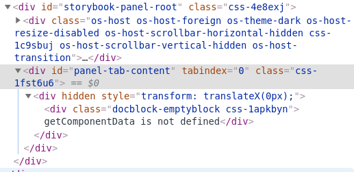
@shilman I managed to run most of it but now, for some reason, I'm getting this error inside Props:
getComponentData is not defined
it comes from addons/docs/src/frameworks/angular/compodoc.ts(extractArgTypes) not working properly :( I have no idea of which binding is going wrong or what's happening... it's so close to run!
and the current code looks like:
  addons.addPanel('my/docs/props', {
    title: 'Props',
    render: ({ active, key }) => {
      const story = api.getCurrentStoryData();
      return active && story ? (
        <DocsContext.Provider key={key} value={story}>
          <AddonPanel>
            <Props of="." />
          </AddonPanel>
        </DocsContext.Provider>
      ) : null;
    }
  })
Thanks for your time!
matheo
on 13 May 2020
It worked after manually setting some addon-docs/angular stuff!
for the record, the final code that I've added to the .storybook/manager.js file looks like this:
import React from 'react';
import { addons } from '@storybook/addons';
import { extractArgTypes, extractComponentDescription, setCompodocJson } from '@storybook/addon-docs/angular';
import { DocsContext, Props } from '@storybook/addon-docs/blocks';
import { combineParameters } from '@storybook/client-api';
import { AddonPanel } from '@storybook/components';

import docJson from './documentation.json';
setCompodocJson(docJson);

addons.register('my/addon', api => {

  addons.addPanel('my/docs/props', {
    title: 'Props',
    render: ({ active, key }) => {
      const story = api.getCurrentStoryData();
      const context = combineParameters(story || {}, {
        parameters: {
          docs: {
            extractArgTypes,
            extractComponentDescription,
          },
        },
      });

      return active && story ? (
        <DocsContext.Provider key={key} value={context}>
          <AddonPanel active={active}>
            <Props of="." />
          </AddonPanel>
        </DocsContext.Provider>
      ) : null;
    }
  })
});
Now I have those props outside the docs, next to the Story of the component :)

This worked with Storybook v6.0.0-beta8
Looking forward for some options in v6.1,
I will try to provide feedback on PRs around it :)
Thanks again @shilman!
matheo
on 13 May 2020
Awesome that it works @matheo! Great job!!!
shilman
on 13 May 2020
It worked after manually setting some addon-docs/angular stuff!
for the record, the final code looks like this:import React from 'react'; import { addons } from '@storybook/addons'; import { extractArgTypes, extractComponentDescription, setCompodocJson } from '@storybook/addon-docs/angular'; import { DocsContext, Props } from '@storybook/addon-docs/blocks'; import { combineParameters } from '@storybook/client-api'; import { AddonPanel } from '@storybook/components'; import docJson from './documentation.json'; setCompodocJson(docJson); addons.register('my/addon', api => { addons.addPanel('my/docs/props', { title: 'Props', render: ({ active, key }) => { const story = api.getCurrentStoryData(); const context = combineParameters(story || {}, { parameters: { docs: { extractArgTypes, extractComponentDescription, }, }, }); return active && story ? ( <DocsContext.Provider key={key} value={context}> <AddonPanel active={active}> <Props of="." /> </AddonPanel> </DocsContext.Provider> ) : null; } }) });Now I have those props outside the docs, next to the Story of the component :)
Looking forward for some options in 6.1,
I will try to provide feedback on PRs around it :)Thanks again @shilman!
Hey @matheo, I'm trying to get the same result you got, which is amazing by the way! I'm also on angular.
I've been scratching my head for a week now to get all the addons working.
At the moment, I have the setCompodocJson(docJson) in config.js.
I tried to copy your final code in there too but it does not work. I get an Error:
ERROR in ./libs/shared-ui/.storybook/config.js 54:31
Module parse failed: Unexpected token (54:31)
File was processed with these loaders:
./node_modules/babel-loader/lib/index.js
You may need an additional loader to handle the result of these loaders.
Could you tell me in which file you put that code?
 OlivierSte
on 26 May 2020
OlivierSte
on 26 May 2020
@OlivierSte uh, I missed the big detail.
I've put this inside the manager.js file, where the addons are supposed to be configured.
I will edit the original code with that comment
because the trick was to add compodoc to the manager too,
the main.js config is mean to set the story preview, but that doesn't affect Storybook's manager.
This ran with Storybook v6.0.0-beta8 tho
matheo
on 26 May 2020
Added a first-class implementation in #10834
Still working on angular support @matheo but should be dropping next week
shilman
on 26 May 2020
Good golly!! I just released https://github.com/storybookjs/storybook/releases/tag/v6.0.0-beta.15 containing PR #10834 that references this issue. Upgrade today to try it out!
You can find this prerelease on the @next NPM tag.
shilman
on 27 May 2020
Related issues
 ZigGreen
·
3Comments
ZigGreen
·
3Comments
 purplecones
·
3Comments
purplecones
·
3Comments
 miljan-aleksic
·
3Comments
miljan-aleksic
·
3Comments
 levithomason
·
3Comments
levithomason
·
3Comments
 tirli
·
3Comments
tirli
·
3Comments
Most helpful comment
Added a first-class implementation in #10834
Still working on angular support @matheo but should be dropping next week