Storybook: @emotion/react ThemeProvider does not work with @emotion/styled
Describe the bug
I use @emotion/react ThemeProvier to access the theme prop when styling a component. When I open my app with "npm start" everything works smoothly. With "npm run storybook", however, the theme object for my styled emotion components is empty.
To Reproduce
Steps to reproduce the behavior:
- npx create-react-app my-app
- npx -p @storybook/cli sb init
- npm install @emotion/[email protected] @emotion/[email protected]
- Creat Theme and Button component with logs for the theme prop
- Creat Button.stories.js
- Add Theme and Button component to App.js
- Add Theme component (with addDecorator) as decorator to .storybook/preview.js
- Run "npm start" and "npm run storybook"
Expected behavior
The pre-defined theme object is displayed in the console, so that you can access it when styling.
Screenshots

Code snippets
GitHub repo: https://github.com/fabian-hiller/a7hs5hsk2
System:
Environment Info:
System:
OS: macOS 10.15.3
CPU: (16) x64 Intel(R) Core(TM) i9-9880H CPU @ 2.30GHz
Binaries:
Node: 12.13.1 - /usr/local/bin/node
npm: 6.14.4 - ~/.npm-global/bin/npm
Browsers:
Chrome: 80.0.3987.149
Firefox: 74.0
Safari: 13.0.5
npmPackages:
@storybook/addon-actions: ^5.3.17 => 5.3.17
@storybook/addon-links: ^5.3.17 => 5.3.17
@storybook/addons: ^5.3.17 => 5.3.17
@storybook/preset-create-react-app: ^2.1.1 => 2.1.1
@storybook/react: ^5.3.17 => 5.3.17
 fabian-hiller
All 24 comments
We are also using emotion 10.0.x in Storybook. I'm guessing the two are not playing nicely together. cc @ndelangen
 shilman
on 28 Mar 2020
shilman
on 28 Mar 2020
Hello @shilman , thank you very much for the fast processing. I am currently in the process of moving our design system to Storybook. Due to this problem, a part of our frontend development is currently at a standstill. If it helps you, I will support you in solving this problem.
fabian-hiller
on 28 Mar 2020
Is there any news yet? @shamin @ndelangen
fabian-hiller
on 31 Mar 2020
I don't know what's happening here. Hopefully @ndelangen does.
shilman
on 1 Apr 2020
Are you wrapping your stories with a decorator providing the theme context?
 ndelangen
on 2 Apr 2020
ndelangen
on 2 Apr 2020
Are you wrapping your stories with a decorator providing the theme context?
Yes. As described in step 7 (steps to reproduce), I have done that. Because the useTheme hook works, as you can see in the photo, the theme context is available.
I created a repository where you can look at the code or clone it for testing.
https://github.com/fabian-hiller/a7hs5hsk2
fabian-hiller
on 2 Apr 2020
Might be related to https://github.com/storybookjs/storybook/issues/10296
It seems that context provider doesn't work on the top level in stories.
 tajo
on 2 Apr 2020
tajo
on 2 Apr 2020
It seems that context provider doesn't work on the top level in stories.
In my case it just does not work with the styled components. In the other cases, as you can see in the screenshot, the context works.
But maybe the reason for the problem is the same for both of us.
fabian-hiller
on 2 Apr 2020
I spoke to one of the emotion maintainers yesterday, and this is essentially due to both storybook & your app/component using emotion & theming.
Emotion theming solution uses React context, meaning is somewhat global.
The proper solution is to not use emotion context but our own.
Here's the suggested solution from https://github.com/Andarist:
styled.div(props => ({
  const theme = useMyTheme();
  return {
    color: theme.color,
  };
})}
I'm not mentioning this because I think YOU should do this, but actually, this is something Storybook should do, so we would never conflict with someone using emotion.
We think emotion is the best, and we certainly don't want to stand in the way of anyone using it + storybook.
@fabian-hiller I have some pretty strong ideas on how to make this work from storybook, would you be interested in working with me to solve this in storybook?
ndelangen
on 3 Apr 2020
@fabian-hiller I have some pretty strong ideas on how to make this work from storybook, would you be interested in working with me to solve this in storybook?
Yeah, I'd be honored. How much effort do you estimate?
fabian-hiller
on 3 Apr 2020
We need
- to expose a custom context for theming that derives the theme from the manager-context state
- replace the ThemeProvider from emotion with this custom ContextProvider
- change @storybook/theming so
styled&useThemeauto-inject them theme into any functions
part 3 is going to be the most challenging, particularly to make all the typings correct.
If you'd want to tackle this together in a pair programming session, let's schedule something:
https://calendly.com/ndelangen/storybook
ndelangen
on 3 Apr 2020
If you'd want to tackle this together in a pair programming session, let's schedule something:
https://calendly.com/ndelangen/storybook
All right. See you later.
fabian-hiller
on 3 Apr 2020
Woohoo! It's great to see this being worked on. We face the same issue at sumup-oss/circuit-ui when trying to upgrade to Emotion 11. If there's anything that I can do to help here, please let me know.
 connor-baer
on 10 Apr 2020
connor-baer
on 10 Apr 2020
Thanks for your message @connor-baer.
If there's anything that I can do to help here, please let me know.
Could you find a solution? Where can I find the code for it in your repository?
fabian-hiller
on 10 Apr 2020
@fabian-hiller I searched the Emotion and Storybook issues extensively and there doesn't seem to be a solution that can be implemented on the user's side.
I came across the same suggestion that @ndelangen relayed from @Andarist: frameworks should implement and use their own theme context. The steps that @ndelangen outlined are much more straightforward than what I had in mind. Did you two already get started on those?
I looked a bit into @storybook/theming and how we could auto-inject the custom theme context into styled & useTheme (step 3). Looks like we need to create our own styled instance from @emotion/styled-base, something like this (pseudo code):
import React from 'react';
import emotionStyled from '@emotion/styled-base'

const useTheme = () => React.useContext(StorybookThemeContext);

const styled = (...args) => {
  const Styled = emotionStyled(...args);
  const theme = useTheme();
  return React.forwardRef((props) => <Styled theme={theme} {...props} />;
}
Then we just need to apply the same magic that @emotion/styled does to make the styled.<tag> syntax work.
connor-baer
on 11 Apr 2020
@connor-baer I had an approach similar to yours, but I haven't been able to make it work yet. I will test your code the days and if it works, I can create a PR.
fabian-hiller
on 11 Apr 2020
Doing something like this as a workaround would be a bad idea?
import styled from "@emotion/styled";
import { theme } from "custom-theme";

export const Button = styled.button`
  background-color: ${theme.colors.green};
`;
Another thing that seems to work is keep using ThemeProvider from emotion-theming until this is fixed for @emotion/react
import { ThemeProvider } from "emotion-theming";
import { theme } from "custom-theme";

const ThemeDecorator = (storyFn) => (
  <ThemeProvider theme={theme}>{storyFn()}</ThemeProvider>
);

addDecorator(ThemeDecorator);
 lucascurti
on 14 Apr 2020
lucascurti
on 14 Apr 2020
Doing something like this as a workaround would be a bad idea?
This would require updating every component inside Storybook or your own codebase which would be a _huge_ amount of work. It also makes it impossible to dynamically update the theme, e.g. from light to dark.
Another thing that seems to work is keep using
ThemeProviderfromemotion-theminguntil this is fixed for@emotion/react
I assume you're talking about using Emotion 11 in the component library? Does emotion-theming work with Emotion 11? I figured it wouldn't since @emotion/styled imports the theme context from @emotion/react, doesn't it?
connor-baer
on 14 Apr 2020
Good point.
Yes. I'm using Emotion 11 and seems that using ThemeProvider from emotion-theming works. This is how I ended up doing it.
lucascurti
on 14 Apr 2020
Interesting, I'll give that a shot. Thanks for the tip!
connor-baer
on 14 Apr 2020
Given that the above PR is not yet merged, I think this issue should be re-opened.
 grncdr
on 26 Aug 2020
grncdr
on 26 Aug 2020
Hi everyone! Seems like there hasn't been much going on in this issue lately. If there are still questions, comments, or bugs, please feel free to continue the discussion. Unfortunately, we don't have time to get to every issue. We are always open to contributions so please send us a pull request if you would like to help. Inactive issues will be closed after 30 days. Thanks!
![stale[bot] picture](https://avatars3.githubusercontent.com/in/1724?v=4&s=40) stale[bot]
on 20 Sep 2020
stale[bot]
on 20 Sep 2020
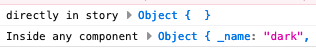
Just want to mention this is still an issue. The theme works in components, but not directly in the story. We are using MDX for documentation, if that makes any difference.
The following code shows everything you need to know:
import { useContext } from 'react';
import { ThemeContext } from '@emotion/core';

<Preview>
  <Story name="Storyname">
    {() => {
      console.log('directly in story', useContext(ThemeContext));
      const Test = () => {
        console.log('Inside any component', useContext(ThemeContext));
        return null;
      };
      return <Test />;
    }}
  </Story>
</Preview>
Then the logs look like this:
 RuudBurger
on 26 Oct 2020
RuudBurger
on 26 Oct 2020
After some research, I find a temporary solution used by chackra-ui here! How emotion doesn't have breaking changes, this works fine.
I think storybook need to update to emotion 11 internally.
 mverissimo
on 16 Nov 2020
mverissimo
on 16 Nov 2020
Related issues
 maraisr
·
119Comments
maraisr
·
119Comments
 firaskrichi
·
61Comments
firaskrichi
·
61Comments
 moimikey
·
67Comments
moimikey
·
67Comments
 ChucKN0risK
·
74Comments
ChucKN0risK
·
74Comments
 p3k
·
61Comments
p3k
·
61Comments
Most helpful comment
After some research, I find a temporary solution used by chackra-ui here! How emotion doesn't have breaking changes, this works fine.
I think storybook need to update to emotion 11 internally.