Storybook: Props table issue from styled component interface in addon-blocks
There is issue in generating props table from typescript interface in styled component. There are all the HTML properties in props table.
Button.tsx
import styled from 'styled-components';

interface IButton{
    isUpperCase: boolean;
}
const Button = styled.button<IButton>`
    ${props => props.isUpperCase && 'text-transform: upperase;'}
`;
export default Button;
Button.stories.mdx
import { Meta, Preview, Story, Props } from '@storybook/addon-docs/blocks';
import Button from './Button';

<Meta title="Button" />

<Preview>
  <Story name="Button">
    <Button>Press me</Button>
  </Story>
</Preview>

<Props of={Button} />
.stortbook/main.js
const path = require('path');

module.exports = {
  stories: ['../src/**/*.stories.mdx'],
  addons: [
    {
      name: '@storybook/preset-create-react-app',
      options: {
        tsDocgenLoaderOptions: {
          tsconfigPath: path.resolve(__dirname, '../tsconfig.json')
        }
      }
    },
    '@storybook/addon-actions',
    '@storybook/addon-links',
    {
      name: '@storybook/addon-docs',
      options: {
        configureJSX: true,
      },
    }
  ]
};
The prop table is generated like below:

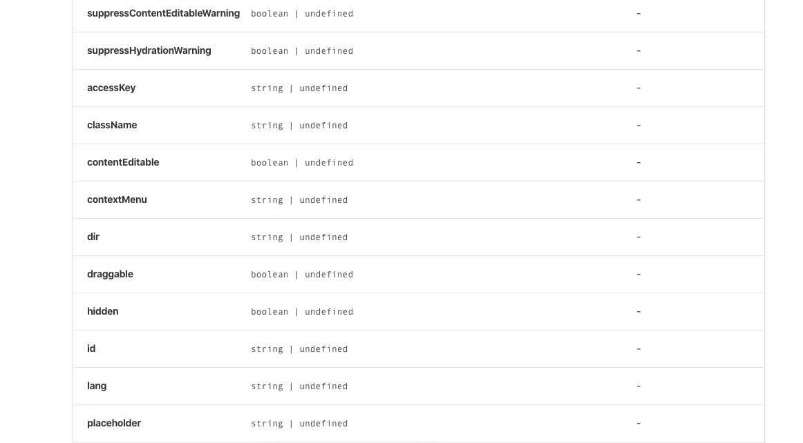
Here the desired behavior is to get only isUpperCase in props table.
Storybook version: 5.3.12
Styled components version: 4.4.0
 suraj-eai
All 12 comments
Hi everyone! Seems like there hasn't been much going on in this issue lately. If there are still questions, comments, or bugs, please feel free to continue the discussion. Unfortunately, we don't have time to get to every issue. We are always open to contributions so please send us a pull request if you would like to help. Inactive issues will be closed after 30 days. Thanks!
![stale[bot] picture](https://avatars3.githubusercontent.com/in/1724?v=4&s=40) stale[bot]
on 29 Feb 2020
stale[bot]
on 29 Feb 2020
@suraj-eai Did you come up with a workaround for this?
 douglaseggleton
on 20 Mar 2020
douglaseggleton
on 20 Mar 2020
+1 from me on this
i have a workaround to this specific issue, which is to create a simple React functional component that wraps the styled component specifically only for use with the Props table.
my base component button.tsx file has the following code at the end:
export const DocsButton: React.FC<Props> = props => <Button {...props} />;
DocsButton.defaultProps = Button.defaultProps;

export default Button;
my button.stories.mdx file has the following code:
import { Meta, Story, Preview, Props } from '@storybook/addon-docs/blocks';
import Button, { DocsButton } from '.';

<Meta title="Button" component={Button} />

Documentation and examples here

<Props of={DocsButton} />
this is obviously slightly less than ideal (as the DocsButton component is effectively junk code) but does resolve the issue. fortunately my build tooling throws this component away, so it's not littering the build.
 stevesims
on 2 Apr 2020
stevesims
on 2 Apr 2020
@suraj-eai Did you come up with a workaround for this?
Sorry, not yet.
suraj-eai
on 2 Apr 2020
@stevesims we're updating the docgen recommendations for typescript in 6.0:
https://github.com/storybookjs/storybook/blob/next/MIGRATION.md#react-prop-tables-with-typescript
the new setup has its own issues, but i expect will resolve the one you're seeing above
 shilman
on 2 Apr 2020
shilman
on 2 Apr 2020
https://github.com/storybookjs/storybook/blob/next/MIGRATION.md#react-prop-tables-with-typescript
Thanks @shilman
suraj-eai
on 3 Apr 2020
Hi everyone! Seems like there hasn't been much going on in this issue lately. If there are still questions, comments, or bugs, please feel free to continue the discussion. Unfortunately, we don't have time to get to every issue. We are always open to contributions so please send us a pull request if you would like to help. Inactive issues will be closed after 30 days. Thanks!
stale[bot]
on 25 Apr 2020
We've just released zero-config typescript support in 6.0-beta. Please upgrade and test it!
Thanks for your help and support getting this stable for release!
shilman
on 21 May 2020
@shilman The props table issue with styled component seemed to be fixed in beta release. I tested with storybook version v6.0.0-beta.16.
main.js
module.exports = {
  stories: ['../src/**/*.stories.mdx'],
  addons: [
    {
      name: '@storybook/preset-create-react-app'
    },
    '@storybook/addon-actions',
    '@storybook/addon-links',
    {
      name: '@storybook/addon-docs',
      options: {
        configureJSX: true
      }
    }
  ]
};
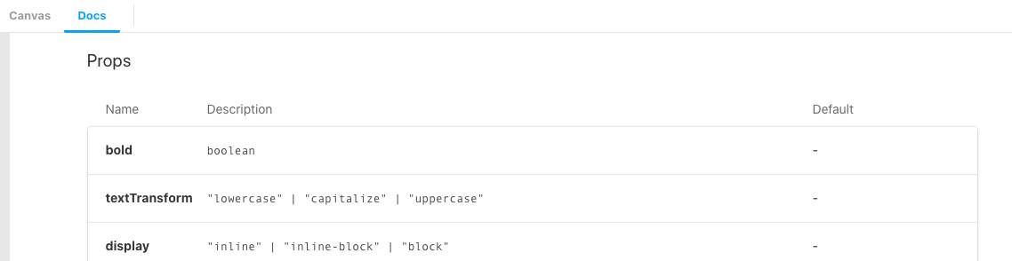
Styled component:
import styled from 'styled-components';

interface IStyledProps {
  bold?: boolean;
  textTransform?: 'lowercase' | 'capitalize' | 'uppercase';
  display?: 'inline' | 'inline-block' | 'block';
}

const Typography = styled.p<IStyledProps>`
  ${props => props.bold && `font-weight: ${props.theme.weight.bold};`}
  ${props => props.textTransform && `text-transform: ${props.textTransform};`}
  ${props => props.display && `display: ${props.display};`}
`;
Generates the prop table below:
Thank you for the hard work.
 kcsuraj
on 28 May 2020
kcsuraj
on 28 May 2020
Hi everyone! Seems like there hasn't been much going on in this issue lately. If there are still questions, comments, or bugs, please feel free to continue the discussion. Unfortunately, we don't have time to get to every issue. We are always open to contributions so please send us a pull request if you would like to help. Inactive issues will be closed after 30 days. Thanks!
stale[bot]
on 20 Jun 2020
Hey there, it's me again! I am going close this issue to help our maintainers focus on the current development roadmap instead. If the issue mentioned is still a concern, please open a new ticket and mention this old one. Cheers and thanks for using Storybook!
stale[bot]
on 20 Jul 2020
EDIT: updated reproduction code
@shilman @kcsuraj I see this issue is closed but I encountered the same/very similar issue with the latest rc.13 version. I have styled-component added to Storybook but the props table is not showing any custom props defined on the component. Any idea or advice what I'm doing wrong?
import styled from 'styled-components';

export const TextSizes = {
  lg: 'lg',
  md: 'md',
  sm: 'sm',
} as const;

export const TextTypes = {
  primary: 'primary',
  secondary: 'secondary',
  emphasis: 'emphasis',
  context: 'context',
  monospace: 'monospace',
} as const;

export type Sizes = typeof TextSizes[keyof typeof TextSizes];
export type Types = typeof TextTypes[keyof typeof TextTypes];

export interface TextComponentProps {
  size?: Sizes;
  type?: Types;
  [key: string]: unknown; // <-- this seems to be the issue, when I remove this line props are shown normally
}

const Text = styled.span<TextComponentProps>`
  /* implementation */
`;

Text.defaultProps = {
  size: TextSizes.lg,
  type: TextTypes.primary,
};

export default Text;
import Text from './Text';

export default {
  title: 'Components/typography/Text',
  component: Text,
};


export const largeText = () => <Text size="lg">{lipsum}</Text>;
 ajkl2533
on 21 Jul 2020
ajkl2533
on 21 Jul 2020
Related issues
 oriSomething
·
3Comments
oriSomething
·
3Comments
 rpersaud
·
3Comments
rpersaud
·
3Comments
 tomitrescak
·
3Comments
tomitrescak
·
3Comments
 wahengchang
·
3Comments
wahengchang
·
3Comments
 sakulstra
·
3Comments
sakulstra
·
3Comments