Storybook: React Context not working with ThemeProvider of styled-components
Describe the bug
I’m trying to consume the theme inside my styled-components when developing then through Storybook, but theme prop come as empty object. It is worth mentioning that the theme works as expected on app, but not in the Storybook.
Maybe there is something to React Context? I tried https://github.com/storybookjs/storybook/issues/8426#issuecomment-542240804 and read all of https://github.com/storybookjs/storybook/issues/8531
To Reproduce
Steps to reproduce the behavior:
- Create a Theme object with color definitions
- Create a decorator with
ThemeProviderof styled-components and use it insideconfig.jsx
_(using the workaround mentioned by @shilman in #8426)_
const Theme = StoryFn => (
  <ThemeProvider theme={theme}>
    <StoryFn />
  </ThemeProvider>
);

addDecorator(Theme);
- Write a component that uses the
themeobject
Button.tsx
import React from 'react';
import { Text } from 'react-native';
import styled from 'styled-components/native';

const PRIMARY = 'primary';
const INVERSE = 'inverse';
const ELEVATED = 'elevated';
const OUTLINE = 'outline';

const ButtonWrapper = styled.View`
  margin: 0 7%;
`;
const Touchable = styled.TouchableOpacity<{ type: ButtonType }>`
  background-color: ${p => {
    console.log(p.theme);
    return p.theme.primary;
  }};
`;

type ButtonType = typeof PRIMARY | typeof INVERSE | typeof ELEVATED | typeof OUTLINE;
interface ButtonProps {
  text: string;
  type: ButtonType;
}

const Button: React.FC<ButtonProps> = ({ text, type }) => {
  return (
    <ButtonWrapper>
      <Touchable type={type}>
        <Text>{text}</Text>
      </Touchable>
    </ButtonWrapper>
  );
};

export default Button;
- Write a story for the component (I’m using the
addon-docs)
examples/Text.jsx
import React from 'react';

import Button from '../../../../src/modules/core/Button';

export default function Text() {
  return <Button text="Press me" type="primary" />;
}
Button.stories.js
export default {
  title: 'Components|Button',
  includeStories: []
};

export { default as text } from './examples/Text';
Button.stories.mdx
import { Meta, Props, Story, Preview } from '@storybook/addon-docs/blocks';
import * as Stories from './Button.stories.js';

<Meta title="Components|Button" />

# Button

A basic button component.

### text

The text that will be shown by the button

<Preview withSource="none">
  <Story name="text">
    <Stories.text />
  </Story>
</Preview>
Expected behavior
The button should consume theme object and have p.theme.primary color.
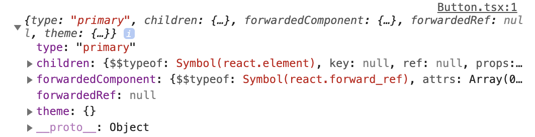
Screenshots
The console.log resulting
System:
Environment Info:

  System:
    OS: macOS 10.15.2
    CPU: (4) x64 Intel(R) Core(TM) i5-7360U CPU @ 2.30GHz
  Binaries:
    Node: 13.5.0 - /usr/local/bin/node
    Yarn: 1.21.1 - /usr/local/bin/yarn
    npm: 6.13.4 - /usr/local/bin/npm
  Browsers:
    Chrome: 79.0.3945.88
    Safari: 13.0.4
  npmPackages:
    "@storybook/addon-docs": "5.3.0-rc.7",
    "@storybook/addon-options": "5.3.0-rc.7",
    "@storybook/addons": "5.3.0-rc.7",
    "@storybook/cli": "5.3.0-rc.7",
    "@storybook/preset-create-react-app": "^1.5.0",
    "@storybook/react": "5.3.0-rc.7",
    "@storybook/theming": "5.3.0-rc.7",
    "react": "^16.9.0",
    "react-dom": "^16.9.0",
    "react-native-web": "0.11.7",
    "styled-components": "^4.4.1"
Additional context
I’m working on a monorepo with react-native-web. I tried almost everything, such as:
- evoke
storyFnas a function instead of using it as a component - move the decorator next to story definition
- read this gist
 renanmav
All 4 comments
@renanmav Can you share a reproduction repo?
 shilman
on 3 Jan 2020
shilman
on 3 Jan 2020
Sure thing @shilman
Here it is https://github.com/renanmav/theme-context-storybook-repro
I provided some additional context on README.md
renanmav
on 3 Jan 2020
@renanmav
You are using ThemeContext from styled-components module in Storybook config, and ThemeContext from styled-components/native module in components source code.
import { ThemeContext } from 'styled-components'
import * as Native from 'styled-components/native'

console.log(ThemeContext === Native.ThemeContext) // false
```diff
-import { ThemeProvider } from 'styled-components';
+import { ThemeProvider } from 'styled-components/native';
````
 pocka
on 5 Jan 2020
pocka
on 5 Jan 2020
It worked, thank you so much @pocka
renanmav
on 5 Jan 2020
Related issues
 oriSomething
·
3Comments
oriSomething
·
3Comments
 alexanbj
·
3Comments
alexanbj
·
3Comments
 rpersaud
·
3Comments
shilman
·
3Comments
rpersaud
·
3Comments
shilman
·
3Comments
 dnlsandiego
·
3Comments
dnlsandiego
·
3Comments
Most helpful comment
@renanmav
You are using
ThemeContextfromstyled-componentsmodule in Storybook config, andThemeContextfromstyled-components/nativemodule in components source code.```diff
-import { ThemeProvider } from 'styled-components';
+import { ThemeProvider } from 'styled-components/native';
````
https://codesandbox.io/s/nervous-thunder-35ft4