Storybook: propTypes not informing description
Describe the bug
Probably not a bug, but I can't figure out docspage esp in regards to slot proptypes informing description and
To Reproduce
/**
 * some cool docs
 */

export const Button = (props) => {
  return <Cb {...props} />
}
Button.propTypes = {
  actionType: PropTypes.oneOf(['positive', 'negative', 'neutral', 'error', 'warning']),
};
Expected behavior
Something like this

Actual

 dvnrsn
All 14 comments
If you're using CRA, you should use the preset https://github.com/storybookjs/presets/tree/master/packages/preset-create-react-app
However, there is a known bug when using it with versions > 5.3.0-beta.15 that's in progress now: https://github.com/storybookjs/presets/issues/71
 shilman
on 11 Dec 2019
shilman
on 11 Dec 2019
For what it's worth, I'm seeing more or less the same issue with my component and I'm definitely not using CRA, so unsure if that bug would affect my use-case.
This is what I end up with:

const Button = (props) => {
// Component stuff here.
};

Button.propTypes = {
  /**
   * Whether or not to center the button.
   */
  centerAlign: PropTypes.bool,
  /**
   * The color theme to apply to the button.
   */
  color: PropTypes.oneOf([...buttonColors, ...brandColors]),
  /**
   * Classes to apply to the column element to adjust it's responsive width.
   */
  columnClasses: PropTypes.string,
  /**
   * The classes to apply to the outer grid element.
   */
  gridClass: PropTypes.string,
  /**
   * The text the button should display.
   */
  text: PropTypes.string,
  /**
   * The URL the button should link to.
   */
  url: PropTypes.string,
  /**
   * Whether or not the button's link should open in a new tab.
   */
  urlOpenNewTab: PropTypes.bool,
  /**
   * The button variant to use.
   */
  variant: PropTypes.oneOf(variants),
};

Button.defaultProps = {
  centerAlign: true,
  color: 'upgrade',
  columnClasses: '',
  gridClass: '',
  text: '',
  url: '',
  urlOpenNewTab: false,
  variant: 'solid',
};
I did at least get one step closer than the original author by setting Button.defaultProps to get the defaults column working, but the descriptions are a no-go both in textual description and for showing the actual types.
 ryanboswell
on 17 Dec 2019
ryanboswell
on 17 Dec 2019
@ryanboswell can you use --debug-webpack in your project to verify that the babel-plugin-react-docgen is running on your components?
shilman
on 18 Dec 2019
I'm experiencing the same issue as @ryanboswell and when I use --debug-webpack I see that docgen should be running on all my .jsx components.
 robborrego
on 18 Dec 2019
robborrego
on 18 Dec 2019
Took me a bit, but I did eventually figure out how to get react-docgen running on the project by adding it to our custom babelrc file.
ryanboswell
on 4 Jan 2020
I am not using CRA. Curious what exactly you changed @ryanboswell. Was it something like:
{
  "plugins": ["react-docgen"]
}
@dvnrsn Yeah, that was the trick. For us, we have a bunch of different environment specific config in .babelrc, so it took some trial an error to get it into the right one for Storybook (and avoid having it in prod config).
If anyone else has the same question, it's the development config env as far as babel is concerned when you're running from npm run storybook.
ryanboswell
on 11 Jan 2020
Hi everyone! Seems like there hasn't been much going on in this issue lately. If there are still questions, comments, or bugs, please feel free to continue the discussion. Unfortunately, we don't have time to get to every issue. We are always open to contributions so please send us a pull request if you would like to help. Inactive issues will be closed after 30 days. Thanks!
![stale[bot] picture](https://avatars3.githubusercontent.com/in/1724?v=4&s=40) stale[bot]
on 1 Feb 2020
stale[bot]
on 1 Feb 2020
Alright, now I'm able to invest more fully in this. There seem to have been a few significant updates to storybook so I've updated and moved to main.js config. Here are the steps I've taken to get addon-docs working:
yarn add -D @storybook/addon-docs
yarn add -D react react-is babel-loader
````
Add the following to main.js
module.exports = {
stories: ['../src/*/.stories.js'],
addons: ['@storybook/addon-actions', '@storybook/addon-links', '@storybook/addon-docs'],
```
After completion, I get the docs tab, but only the component title and the exported component is showing.
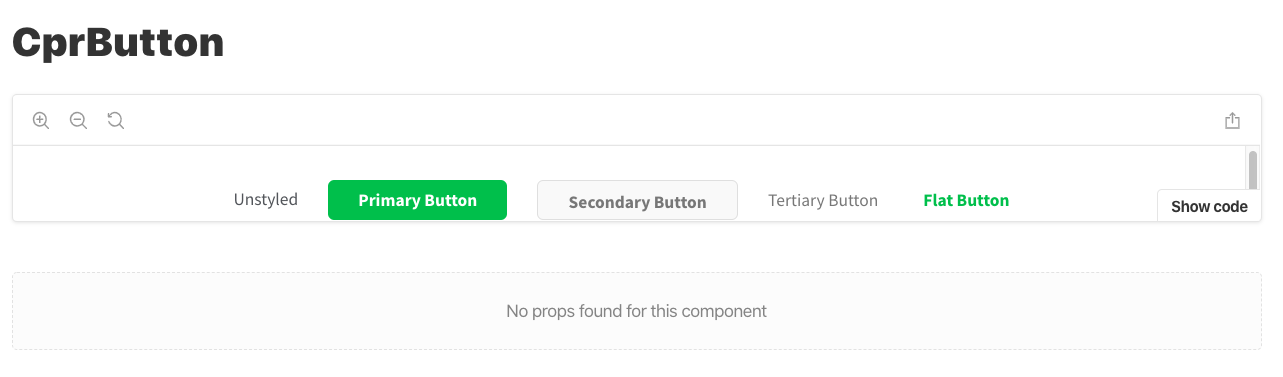
Now, none of my slots are filling...
dvnrsn
on 3 Feb 2020
Installing babel-plugin-react-docgen and including in .babelrc seems to have solved for me. Submitted PR for docs
dvnrsn
on 3 Feb 2020
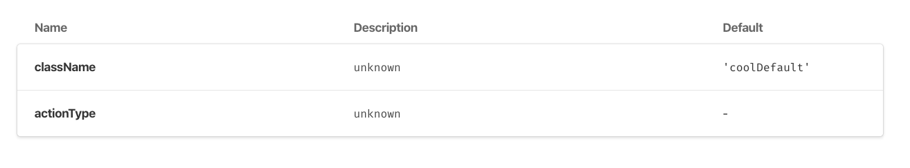
Just realized I'm back at square 0. Unable to get the Description to populate...weird because the react-docgen does get everything else to work..
Button.propTypes = {actionType: PropTypes.oneOf(['a', 'b'])}
Button.defaultProps = {
  className: 'coolDefault',
}
dvnrsn
on 4 Feb 2020
Well, this is awkward. It turns out it was failing because there was a misalignment between Component.proptypes and Component.defaultProps. I had one attribute in the former and another in the latter. Why this mattered, I'm not sure, but it works if I have matching properties.
dvnrsn
on 4 Feb 2020
@dvnrsn Pretty interesting. There are a million "props table" issues and we'll be doing a major cleanup as part of 6.0. Knowing about little gotcha's like this is incredibly helpful. Thanks a bunch!! 💯
shilman
on 4 Feb 2020
Was revisiting this problem with storybook v6 and here are the docs that helped me get up and going again https://github.com/storybookjs/babel-plugin-react-docgen
dvnrsn
on 20 Oct 2020
Related issues
 sakulstra
·
3Comments
sakulstra
·
3Comments
 alexanbj
·
3Comments
shilman
·
3Comments
alexanbj
·
3Comments
shilman
·
3Comments
 miljan-aleksic
·
3Comments
miljan-aleksic
·
3Comments
 Jonovono
·
3Comments
Jonovono
·
3Comments
Most helpful comment
Took me a bit, but I did eventually figure out how to get
react-docgenrunning on the project by adding it to our custombabelrcfile.