Storybook: Cannot read property 'fonts' of undefined - using ColorPalette in addon-docs
Describe the bug
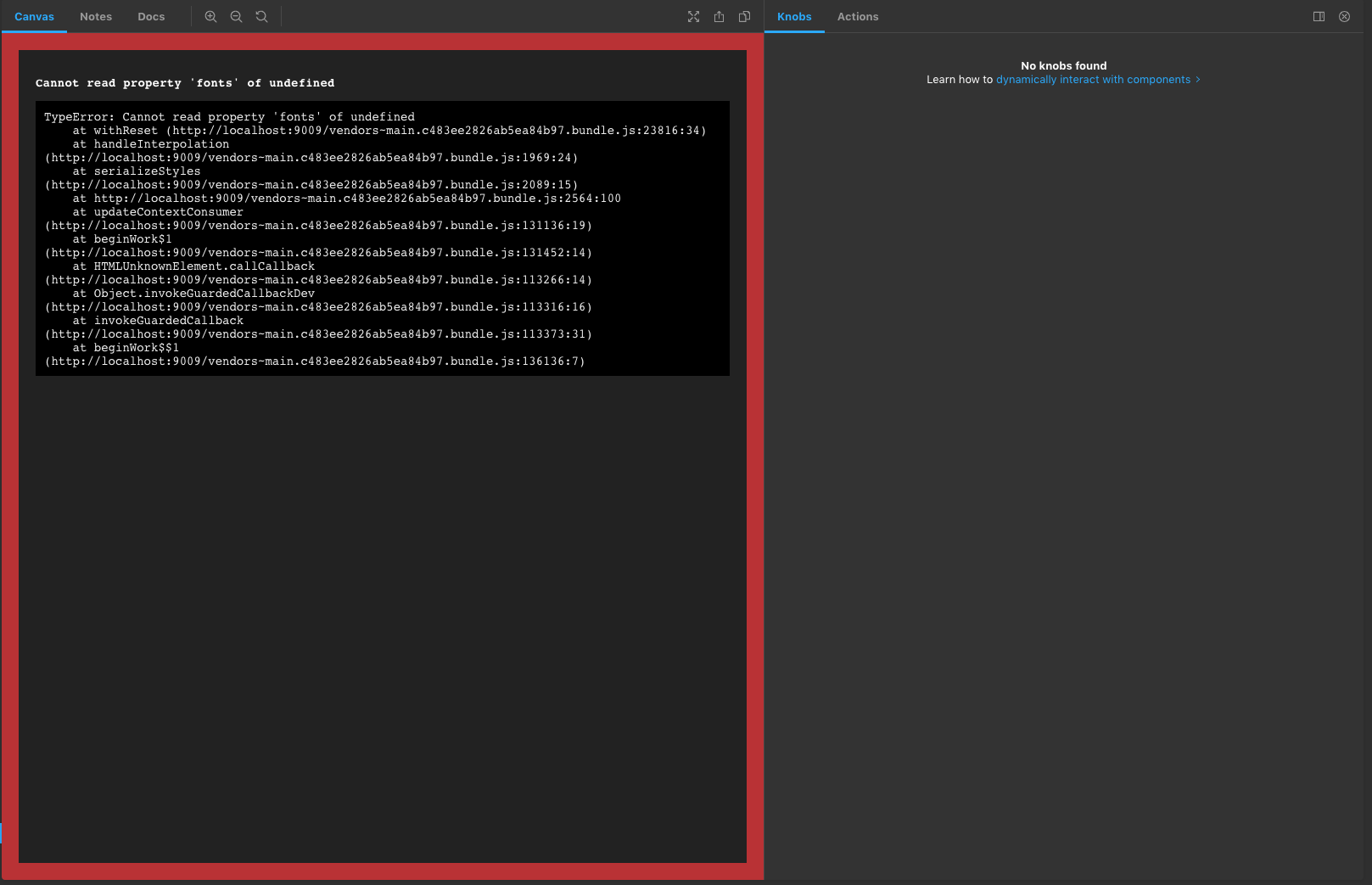
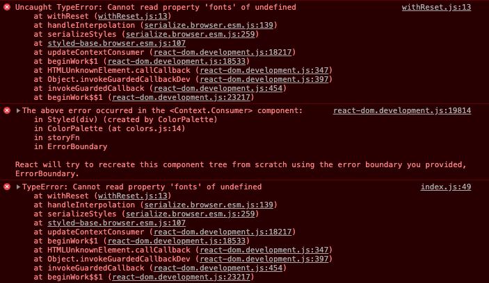
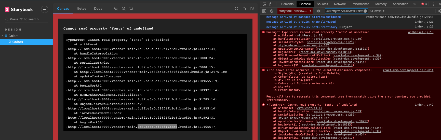
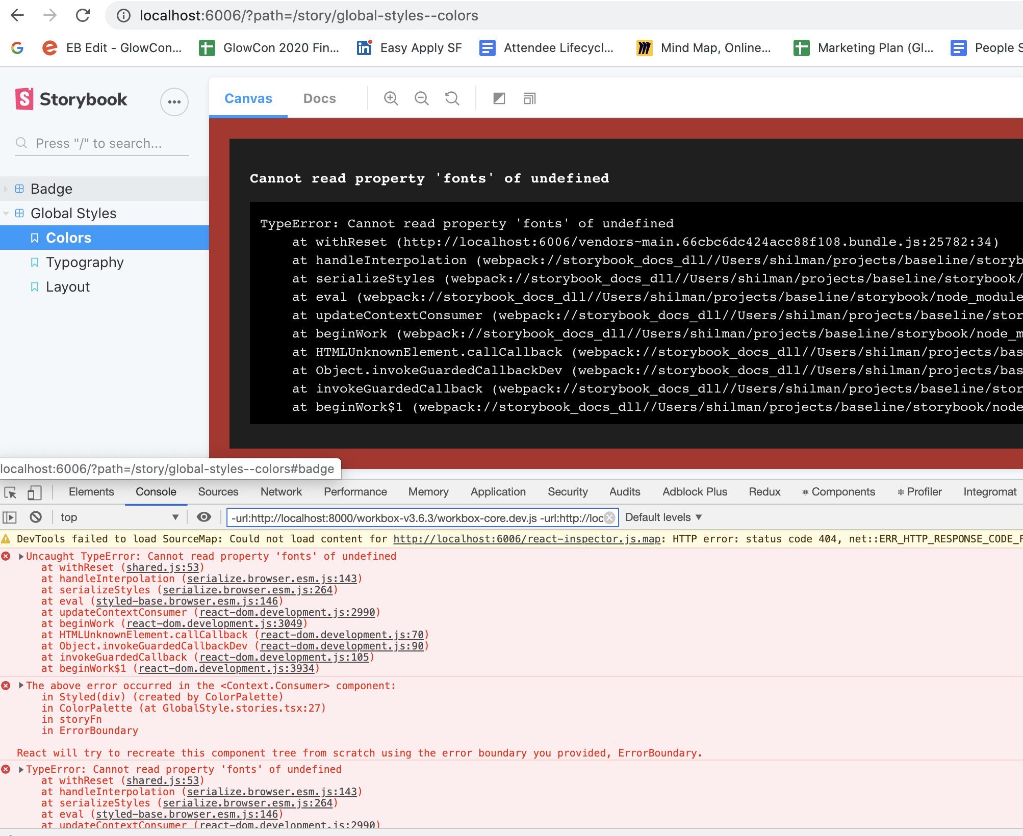
I am attempting to use ColorPalette and ColorItem from addon-docs but I keep getting this error. The error is only visible in the Canvas tab. The story renders fine in the Docs tab.
To Reproduce
Go to story using ColorPalette
Go to Canvas tab
See error
Expected behavior
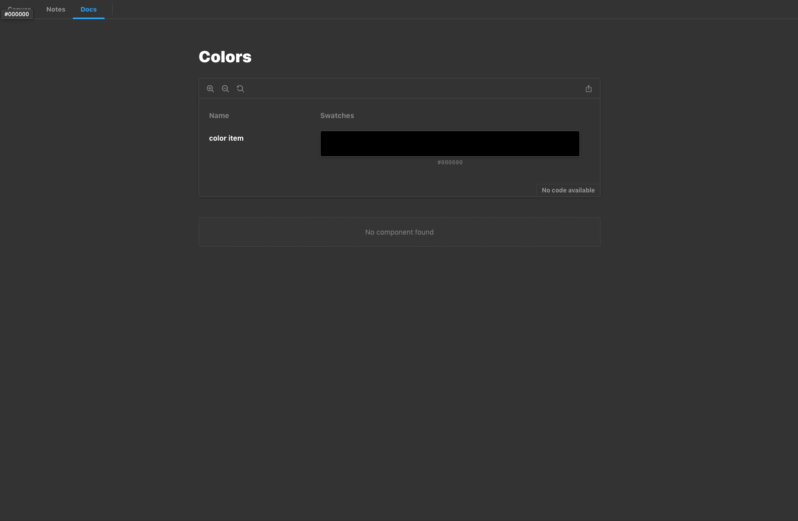
ColorPalette and ColorItem to render also render properly in Canvas tab.
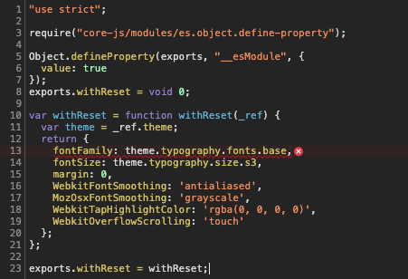
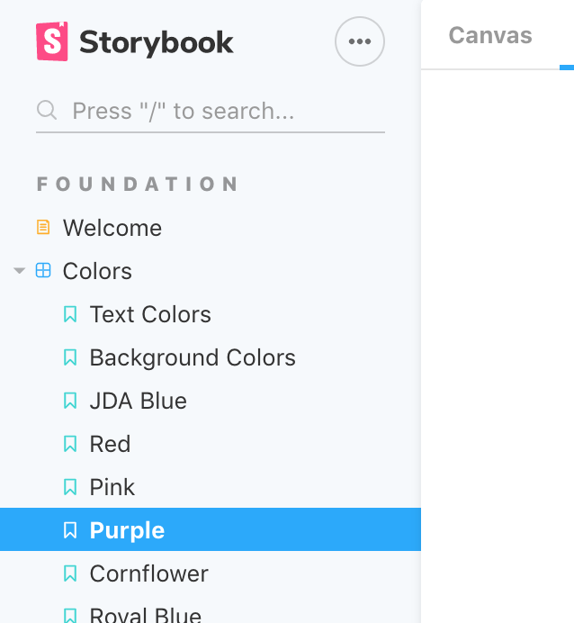
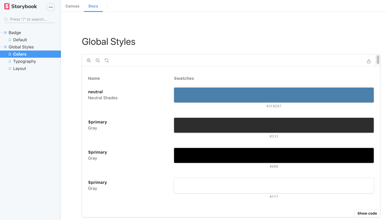
Screenshots
Canvas tab
Docs tab
Console error
Code snippets
`import React from 'react';
import { storiesOf } from '@storybook/react';
import { ColorItem, ColorPalette } from '@storybook/addon-docs/blocks';
import { themes } from '@storybook/theming';
storiesOf('Colors', module)
.addParameters({
options: {
theme: themes.dark,
},
})
.add('Colors', () => {
return (
);
});
`
System:
Browsers:
Chrome: 78.0.3904.97
Firefox: 66.0.5
Safari: 12.1.1
npmPackages:
@storybook/addon-actions: ^5.2.5 => 5.2.5
@storybook/addon-docs: ^5.2.5 => 5.2.5
@storybook/addon-info: ^5.2.5 => 5.2.5
@storybook/addon-knobs: ^5.2.5 => 5.2.5
@storybook/addon-links: ^5.2.5 => 5.2.5
@storybook/addon-notes: ^5.2.5 => 5.2.5
@storybook/addon-options: ^5.2.5 => 5.2.5
@storybook/react: ^5.2.5 => 5.2.5
@storybook/theming: ^5.2.5 => 5.2.5
Additional context
Running through solutions to similar issues. I checked the following:
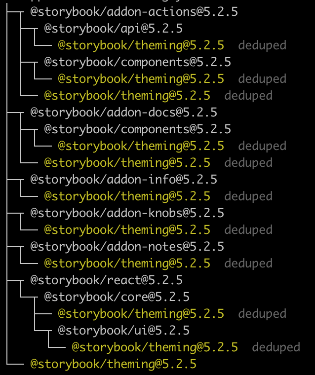
Output of npm ls emotion-theming
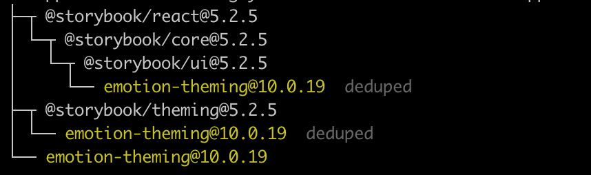
Output of npm ls @storybook/theming
Current dependencies:
"devDependencies": {
"@babel/core": "^7.4.3",
"@babel/polyfill": "^7.6.0",
"@sambego/storybook-state": "^1.3.4",
"@sentry/webpack-plugin": "^1.6.2",
"@storybook/addon-actions": "^5.2.5",
"@storybook/addon-docs": "^5.2.5",
"@storybook/addon-info": "^5.2.5",
"@storybook/addon-knobs": "^5.2.5",
"@storybook/addon-links": "^5.2.5",
"@storybook/addon-notes": "^5.2.5",
"@storybook/addon-options": "^5.2.5",
"@storybook/react": "^5.2.5",
"@storybook/theming": "^5.2.5"
},
"dependencies": {
"@emotion/core": "^10.0.22",
"@emotion/styled": "^10.0.23"
}
I've also removed node_modules, yarn.lock, and yarn installed but error still occurs
 groces
All 11 comments
It's possible that the problem is that these doc blocks are not meant to go into your stories directly. They are meant to be used in the docs addon in your MDX documentation. They require a context that's set up in docs.
Can you try that instead?
 shilman
on 8 Nov 2019
shilman
on 8 Nov 2019
@shilman I seem to still be getting that error after I converted my story to mdx.
Colors.stories.mdx
import { action } from '@storybook/addon-actions';
import { Story, Meta } from '@storybook/addon-docs/blocks';

import Colors from '../colors/Colors';

<Meta title='Design|Colors' component={Colors} />

# Colors

<Story name="Colors">
    <Colors />
</Story>
Colors.jsx
import React, { Component } from 'react';
import { ColorPalette, ColorItem } from '@storybook/addon-docs/blocks';

class Colors extends Component {
  render() {
    return (
      <div>
        <ColorPalette>
          <ColorItem title="color item" colors={['#000000']} />
        </ColorPalette>
      </div>
    );
  }
}

export default Colors;
groces
on 12 Nov 2019
Right, it's still inside a story. It's meant to be used in docs OUTSIDE of stories... 😬
shilman
on 13 Nov 2019
SMH I see now haha. Thanks for the help!
groces
on 13 Nov 2019
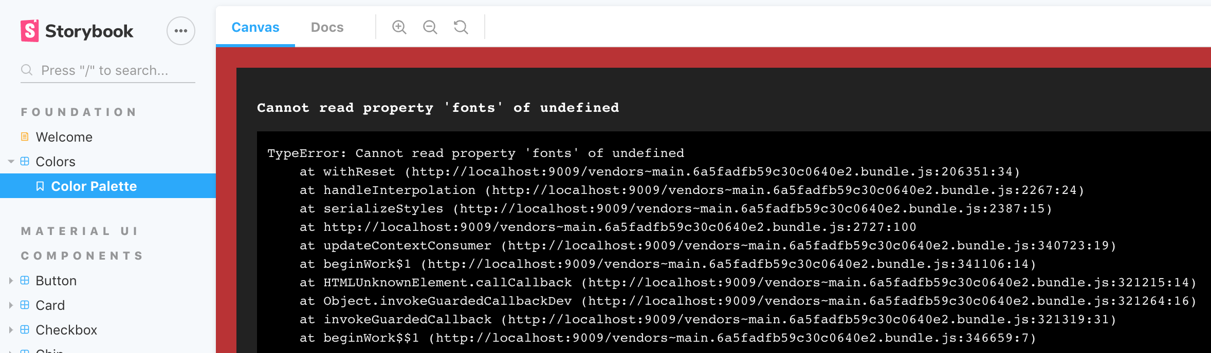
@shilman I'm actually seeing this same behavior but my ColorPalette and ColorItems are within an mdx file. I'm seeing the same exact errors mentioned by @groces

And what I have in my palette.stories.mdx file:
import { LightTheme, Palette } from "..";
import { Meta, Story, Props, ColorPalette, ColorItem } from "@storybook/addon-docs/blocks";

<Meta title="Foundation|Colors"/>

# LUI Colors

## Color Palette
<Story name='Color Palette'>
  <ColorPalette>
    <ColorItem
      title="Palette.colors.red"

      colors={[
        Palette.colors.red[50],
        Palette.colors.red[100],
        Palette.colors.red[200],
        Palette.colors.red[300],
        Palette.colors.red[400],
        Palette.colors.red[500],
        Palette.colors.red[600],
        Palette.colors.red[700],
        Palette.colors.red[800],
        Palette.colors.red[900],
        Palette.colors.red.A100,
        Palette.colors.red.A200,
        Palette.colors.red.A400,
        Palette.colors.red.A700
      ]}
    />
  </ColorPalette>
</Story>
 justin-peterson-jdas
on 1 Feb 2020
justin-peterson-jdas
on 1 Feb 2020
@justin-peterson-jdas like i said above, it's meant to be used outside of stories. your example is inside a <Story>...</Story>
shilman
on 1 Feb 2020
@shilman apologies! I read the answer a different way. Thank you sir. So is it not possible to have
justin-peterson-jdas
on 3 Feb 2020
These are documentation-only components for now. They could be adapted to be used in stories, by providing providing an emotion theme in a decorator. But that's an advanced usage, and not the intended use. More docs forthcoming!
shilman
on 4 Feb 2020
@shilman
On our storybook/gatsby 6, the odd thing is that it works during the build but not during dev:
Working Prod
Buggy Dev
We have a GlobalStyle component I want to document using color swatches etc. It seemed natural to me that I'd have a GlobalStyle.stories.tsx, where I could export const colors
GlobalStyle is the shared component that allows us to drop our ui styles into both our storybook and our app. In the case of the storybook, the thought was that we'd document it with stories. We have no special need for MDX features.. Just want to write some TSX stories that demonstrate the global styles of our design system.
What's odd to me is that the build works by the dev server does not
 bsgreenb
on 10 May 2020
bsgreenb
on 10 May 2020
@bsgreenb are you using them inside stories? or inside the docs tab? if the former, it's a bug that it even works in the build.
shilman
on 11 May 2020
@shilman Got it working on dev with mdx (not inside story). Yeah, it worked in the build inside a story
bsgreenb
on 11 May 2020
Related issues
shilman
·
3Comments
 tomitrescak
·
3Comments
tomitrescak
·
3Comments
 tlrobinson
·
3Comments
tlrobinson
·
3Comments
 MrOrz
·
3Comments
shilman
·
3Comments
MrOrz
·
3Comments
shilman
·
3Comments