Is your feature request related to a problem? Please describe.
Our component library inherits it's styling from a class that is applied to the root tag.
Example:
<html class="dark">
some stories
</html>
And similar for light.
So I can get so far by including this html in the preview-head.html and then importing in our stylesheet.
In parallel I have also developed a storybook theme that is defined in config.js that looks like our dark theme.
But now I need to be able to toggle the Storybook theme, in sync with switching the class name on the html tag in the preview-head.html
Describe the solution you'd like
It would be great if there was a storybook level theme toggle, then when toggled would each story know the current theme value.
Describe alternatives you've considered
Thinking of a add-on that shows a UI that when toggled goes and modifies the markup in the preview-head.html
Are you able to assist bring the feature to reality?
yes
 rezaabedian
All 20 comments
Have you taken a look at this? https://github.com/leoyli/addon-contexts
cc @leoyli
 shilman
on 4 Apr 2019
shilman
on 4 Apr 2019
Would like to know more about your framework of use. I'm currently pushing my addon out of React to Vue. So if you are in other framework, it may not be so useful at the moment. But I guess we can work together, or at least I can investigate or prioritize something for you. 💪
 leoyli
on 4 Apr 2019
leoyli
on 4 Apr 2019
I was wondering why using context.theme wasn't the default in addon-backgrounds...
 kevinSuttle
on 4 Apr 2019
kevinSuttle
on 4 Apr 2019
@kevinSuttle That would be a nice feature for addon-backgrounds 👍
shilman
on 5 Apr 2019
@kevinSuttle, @shilman: where this context.theme came from?! Is the storybook theming or the application theming?! I think the later is a bit harder for addon-backgrounds to get processed automatically...?! In our use case, we have theming object came from material-UI and we just have a simple file to glue the theming definition with addon-backgrounds to remain 1 source of the truth. So I don't see there are something to do on addon-backgrounds though.
leoyli
on 5 Apr 2019
@leoyli we are using Angular and React. I'll investigate addon-contexts but I'm guessing that because our theme is being driven by a global scss and not state, context or props, the model in addon-contexts isn't just going to do it place.
rezaabedian
on 5 Apr 2019
@rezaabedian, Angular is not supported in the addon yet (will do this). But I believe you can still use this addon for React. If you just want to dynamically inject className, you can specify like this using this addon:
  {
    icon: 'box',
    title: 'CSS Themes',
    components: ['div'],
    params: [
      { name: 'Dark', props: { className: 'dark' } },
      { name: 'Light', props: { className: 'light' } }],
  }
The above configuration can be used globally or locally with this addon. Basically this injects a div wrapping your component.
Think this addon is just like an agent who knows how to communicate between Storybook manager and your component preview.
leoyli
on 5 Apr 2019
+1 to being able to toggle between various Storybook themes. Our UI suite has to accommodate light and dark versions of our components and so far I’ve built a Grommet (styled-components) level toggle as a global decorator but it would be splendid if a similar toggle existed on a higher level that switched the entire Storybook UI theme and simply notified my decorator component in some way so that I could load my component library specific theme for the same color space (light or dark).
 dallas
on 7 Apr 2019
dallas
on 7 Apr 2019
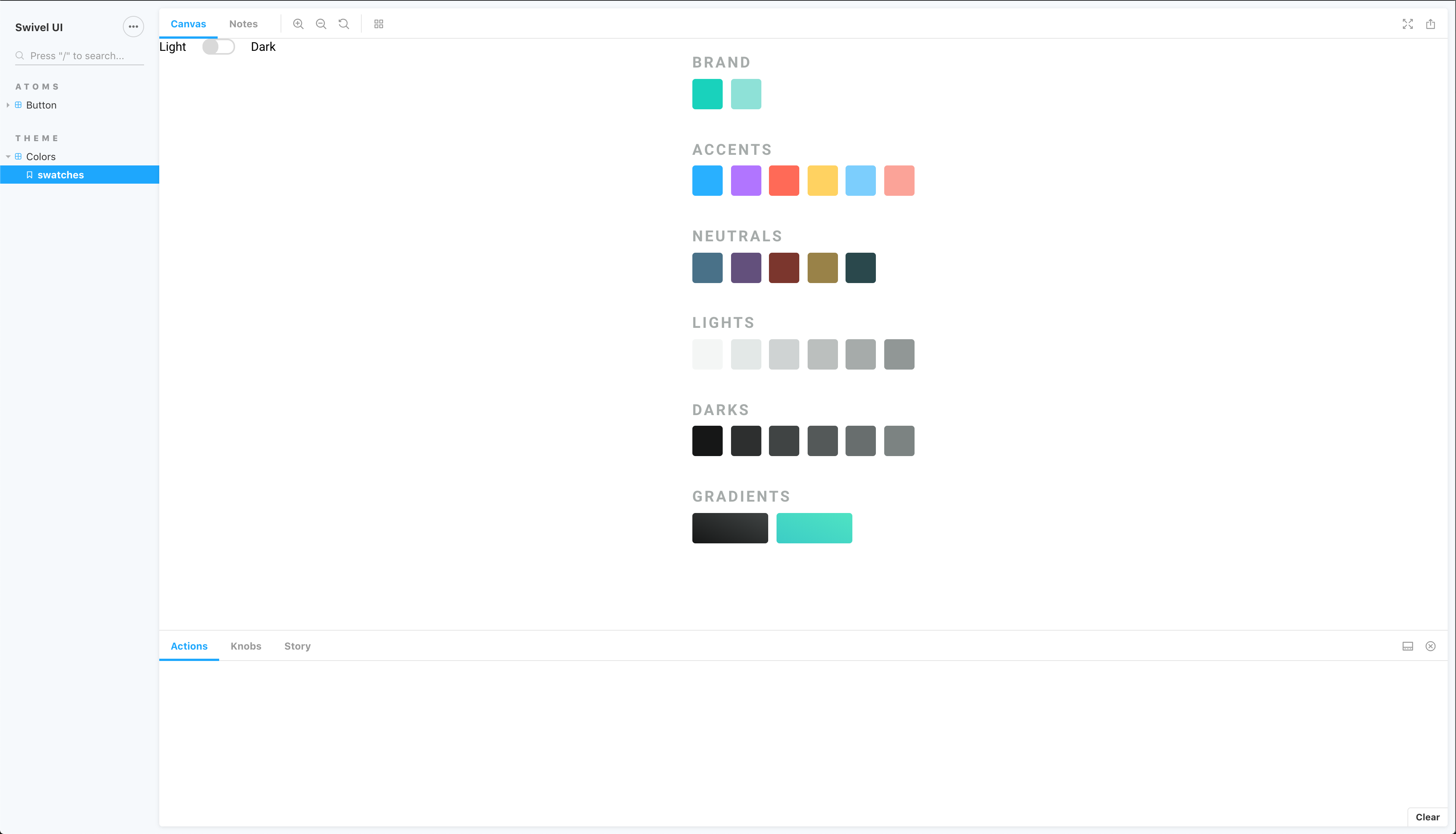
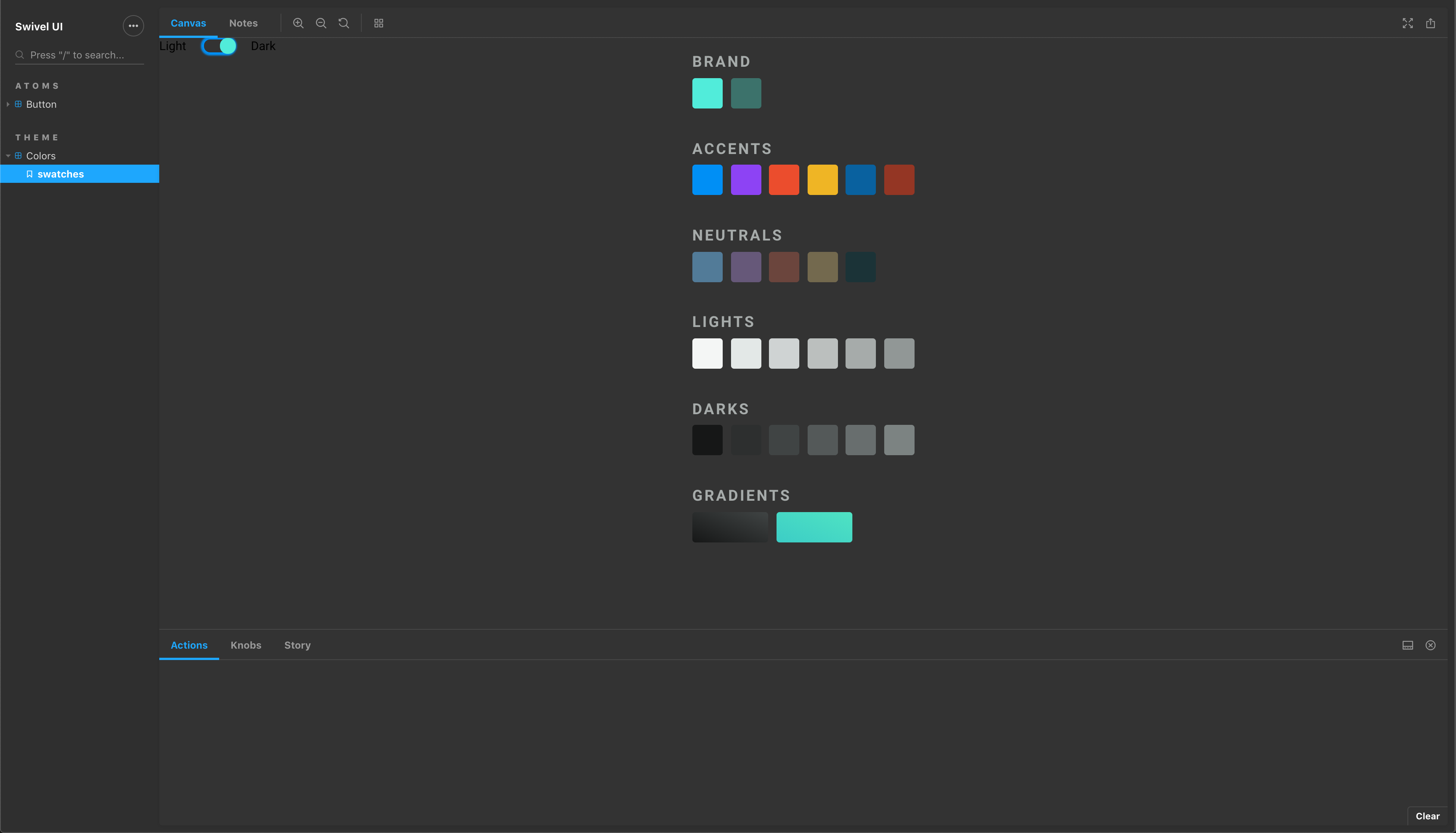
Something that would let me toggle between light and dark like this:
dallas
on 7 Apr 2019
@dallas, as mentioned in this thread, please take a look on addon-contexts, this allows you to wrap your stories globally or locally with the ability to control the injected component props from storybook toolbar.
leoyli
on 7 Apr 2019
Hi, @leoyli, thanks for re-sharing that. I’ve taken a look at the addon-contexts add-on, and I’ve found it quite useful already for simplifying my theme wrapper & toggling between my own defined “light” and “dark” themes for our UI library (built on Grommet), but I’m afraid I still don’t understand how it can be used to toggle the UI theme of Storybook itself. Could you provide some guidance or an example for this?
dallas
on 8 Apr 2019
That's great @leoyli. Thanks!
kevinSuttle
on 8 Apr 2019
@dallas, Oh my bad, it's actually more than just the story preview but the theme of the manager app too... then addon-contexts can not do such thing although may have a workaround on top of it.
In addon-contexts v1.1.0, internally, after user change the addon state from toolbar menu, the addon fires an event called addon-contexts/UPDATE_PREVIEW with the information about the current user selected contexts. If you wish to use this addon to manage your story contexts while also want the manager app to get reacted, you can subscribe this event and change the app theme accordingly (some overhead on how SB works internally, though).
leoyli
on 9 Apr 2019
Okay, cool. Thanks for the info, @leoyli!
dallas
on 9 Apr 2019
Hi everyone! Seems like there hasn't been much going on in this issue lately. If there are still questions, comments, or bugs, please feel free to continue the discussion. Unfortunately, we don't have time to get to every issue. We are always open to contributions so please send us a pull request if you would like to help. Inactive issues will be closed after 30 days. Thanks!
![stale[bot] picture](https://avatars3.githubusercontent.com/in/1724?v=4&s=40) stale[bot]
on 30 Apr 2019
stale[bot]
on 30 Apr 2019
Have you taken a look at this one? https://github.com/hipstersmoothie/storybook-dark-mode
shilman
on 1 May 2019
That looks like exactly what I want, @shilman! Thank you so much for sharing it!
dallas
on 2 May 2019
Hi everyone! Seems like there hasn't been much going on in this issue lately. If there are still questions, comments, or bugs, please feel free to continue the discussion. Unfortunately, we don't have time to get to every issue. We are always open to contributions so please send us a pull request if you would like to help. Inactive issues will be closed after 30 days. Thanks!
stale[bot]
on 23 May 2019
Hey there, it's me again! I am going close this issue to help our maintainers focus on the current development roadmap instead. If the issue mentioned is still a concern, please open a new ticket and mention this old one. Cheers and thanks for using Storybook!
stale[bot]
on 22 Jun 2019
Angular is not supported in the addon yet (will do this)
@leoyli - any rough ETA on Angular support for the contexts addon?
 dfagan2
on 6 Jan 2020
dfagan2
on 6 Jan 2020
Related issues
 purplecones
·
3Comments
purplecones
·
3Comments
 xogeny
·
3Comments
xogeny
·
3Comments
 arunoda
·
3Comments
arunoda
·
3Comments
 MrOrz
·
3Comments
MrOrz
·
3Comments
 alexanbj
·
3Comments
alexanbj
·
3Comments