Storybook: withInfo show functions
withInfo source: true is great but it lacks the ability to show more complex source
Currently when doing something like this
<button onClick={(event) => handleClick(event)}>Click Me </button>
withInfo source shows
<button onClick={onClick}>Click Me </button>
ideally it would show the source as it appears in the story source code
<button onClick={(event) => handleClick(event)}>Click Me </button>
I will occasionally use react-markdown, create a readme.md file and render that in a story but it would be way better if source showed all the things that make up the source, not just the component definition.

 PaulieScanlon
All 13 comments
Hey, this is a reasonable request and a limitation of the info addon. I'm working on a replacement now that will be cross-view layer and support a bunch of new documentation features, so I'll try to make this request a part of that. No ETA yet for this specific feature but I hope to release the first version of the replacement in 5.1.
 shilman
on 22 Mar 2019
shilman
on 22 Mar 2019
@shilman that's great to hear man, thanks!!! i did actually try to clone the Storybook repo and investigate myself but i fear i'm not the man for the job... as you can see i only make buttons :-)
PaulieScanlon
on 22 Mar 2019
Hi everyone! Seems like there hasn't been much going on in this issue lately. If there are still questions, comments, or bugs, please feel free to continue the discussion. Unfortunately, we don't have time to get to every issue. We are always open to contributions so please send us a pull request if you would like to help. Inactive issues will be closed after 30 days. Thanks!
![stale[bot] picture](https://avatars3.githubusercontent.com/in/1724?v=4&s=40) stale[bot]
on 12 Apr 2019
stale[bot]
on 12 Apr 2019
Hey man! How’s it going? Have you had a chance to investigate this any further? I’d love to see a fix for this... cheers!
PaulieScanlon
on 24 Apr 2019
@PaulieScanlon
Some progress: https://medium.com/storybookjs/storybook-docs-sneak-peak-5be78445094a
Current release schedule: https://gist.github.com/shilman/1428d44b2b53644e7b952ac441d2e954
We'll get there 😉
shilman
on 24 Apr 2019
@shilman this is awesome... it’s gonna blow the design team’s mind! I can’t wait for tomorrow! Thanks man... and team!
PaulieScanlon
on 25 Apr 2019
Hi everyone! Seems like there hasn't been much going on in this issue lately. If there are still questions, comments, or bugs, please feel free to continue the discussion. Unfortunately, we don't have time to get to every issue. We are always open to contributions so please send us a pull request if you would like to help. Inactive issues will be closed after 30 days. Thanks!
stale[bot]
on 16 May 2019
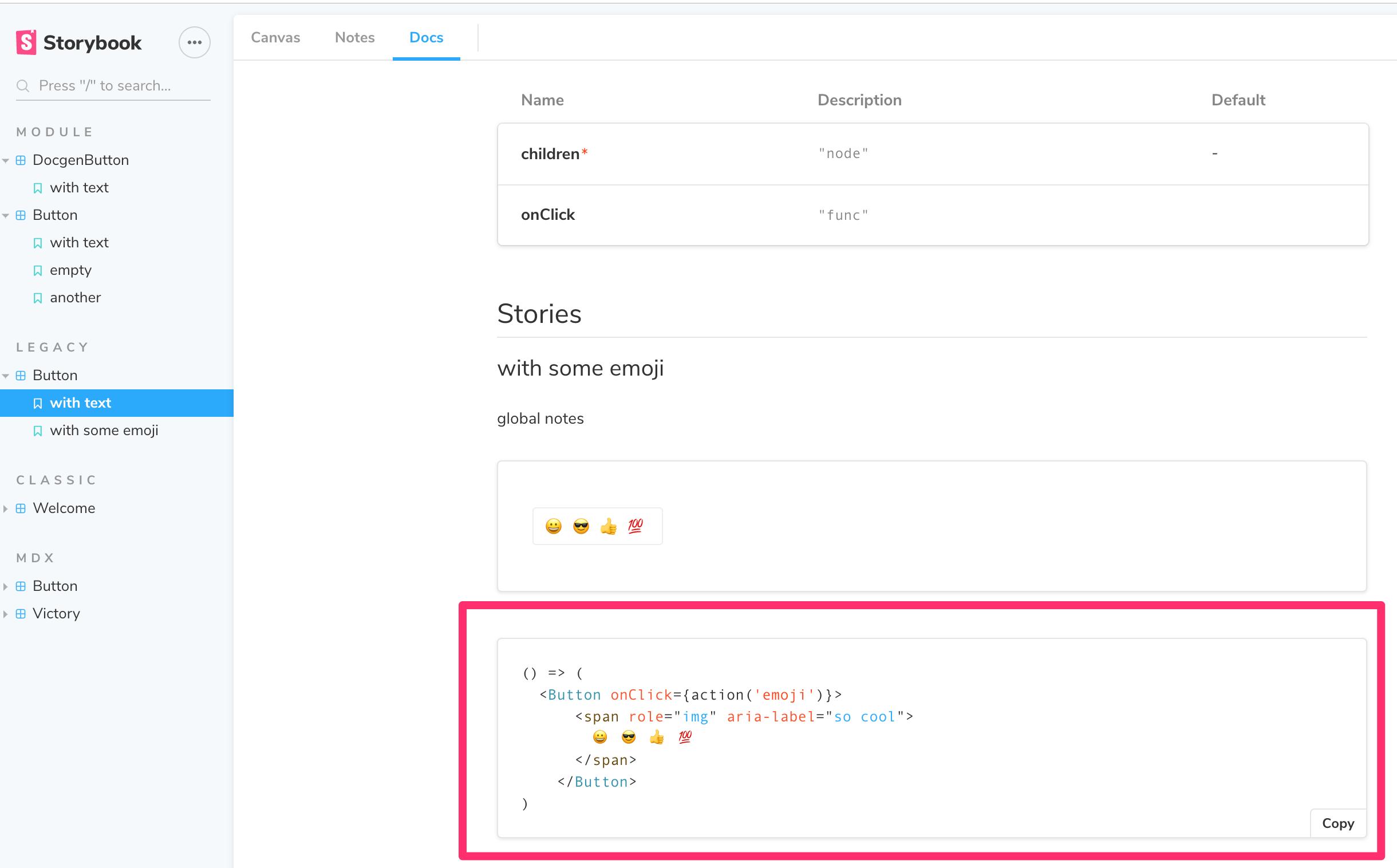
@PaulieScanlon This is working well in docs now:
shilman
on 16 May 2019
@shilman This looks great! what version of Storybook was this released in i'm still on 5.0.6
--update-- i updated to latest but still see the same thing... wondering if this is do with with either react-docgen-typescript-loader or i'm using a global withInfo decorator... any ideas?
PaulieScanlon
on 24 May 2019
@PaulieScanlon 5.2.0-alpha.x. https://docs.google.com/document/d/1un6YX7xDKEKl5-MVb-egnOYN8dynb5Hf7mq0hipk8JE/edit?usp=sharing
shilman
on 25 May 2019
@shillman 🤦♂️ Of course! Thanks man!
PaulieScanlon
on 25 May 2019
Hi everyone! Seems like there hasn't been much going on in this issue lately. If there are still questions, comments, or bugs, please feel free to continue the discussion. Unfortunately, we don't have time to get to every issue. We are always open to contributions so please send us a pull request if you would like to help. Inactive issues will be closed after 30 days. Thanks!
stale[bot]
on 15 Jun 2019
Hey there, it's me again! I am going close this issue to help our maintainers focus on the current development roadmap instead. If the issue mentioned is still a concern, please open a new ticket and mention this old one. Cheers and thanks for using Storybook!
stale[bot]
on 15 Jul 2019
Related issues
 sakulstra
·
3Comments
sakulstra
·
3Comments
 ZigGreen
·
3Comments
ZigGreen
·
3Comments
 levithomason
·
3Comments
levithomason
·
3Comments
 xogeny
·
3Comments
xogeny
·
3Comments
 tirli
·
3Comments
tirli
·
3Comments
Most helpful comment
Hey, this is a reasonable request and a limitation of the info addon. I'm working on a replacement now that will be cross-view layer and support a bunch of new documentation features, so I'll try to make this request a part of that. No ETA yet for this specific feature but I hope to release the first version of the replacement in 5.1.