Storybook: Make grid cell size customizeable
Right now it's hardcoded to be 10px. Our designer uses 8px grid, so I'd like to have it in storybook as well
 Hypnosphi
👍22
All 2 comments
@Hypnosphi I had the same issue. In my case I need a 12px grid.
To work around I did this:
- Add Storybook Background Addon
- Use custom SVG (You can take this, modify and encode it https://codepen.io/pigabo/pen/eAiLF) or just copy and modify the one from
node_modules/@storybook/ui/src/components/preview/background.js
// config.js
import { addParameters } from "@storybook/react" // <- or your storybook framework

addParameters({
  backgrounds: [
    {
      name: "grid",
      value: `url("data:image/svg+xml,%3Csvg  xmlns='http://www.w3.org/2000/svg'%3E%3Cdefs%3E%3Cpattern id='smallGrid' width='12' height='12' patternUnits='userSpaceOnUse'%3E%3Cpath d='M 12 0 L 0 0 0 12' fill='none' stroke='gray' stroke-width='0.5'/%3E%3C/pattern%3E%3Cpattern id='grid' width='144' height='144' patternUnits='userSpaceOnUse'%3E%3Crect width='144' height='144' fill='url(%23smallGrid)'/%3E%3Cpath d='M 144 0 L 0 0 0 144' fill='none' stroke='gray' stroke-width='1'/%3E%3C/pattern%3E%3C/defs%3E%3Crect width='144%25' height='144%25' fill='url(%23grid)' /%3E%3C/svg%3E")`,
      default: true,
    },
  ],
})
Additionally there was a 8px margin in the preview area. Just add a preview-head.html and set whatever you need in a style tag.
Result:
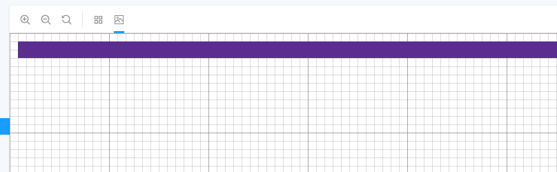
It's ugly but it works.
 saviomuc
on 22 Mar 2019
saviomuc
on 22 Mar 2019
👍3
Boo-yah!! I just released https://github.com/storybooks/storybook/releases/tag/v5.1.0-alpha.14 containing PR #6252 that references this issue. Upgrade today to try it out!
Because it's a pre-release you can find it on the @next NPM tag.
Closing this issue. Please re-open if you think there's still more to do.
 shilman
on 25 Mar 2019
shilman
on 25 Mar 2019
👍1
Was this page helpful?
0 / 5 - 0 ratings
Related issues
 maraisr
·
119Comments
maraisr
·
119Comments
 bpeab
·
70Comments
bpeab
·
70Comments
 Olian04
·
78Comments
Olian04
·
78Comments
 ChucKN0risK
·
74Comments
ChucKN0risK
·
74Comments
 ilyaulyanov
·
100Comments
ilyaulyanov
·
100Comments
Most helpful comment
@Hypnosphi I had the same issue. In my case I need a 12px grid.
To work around I did this:
node_modules/@storybook/ui/src/components/preview/background.jsAdditionally there was a 8px margin in the preview area. Just add a
preview-head.htmland set whatever you need in astyletag.Result:
It's ugly but it works.