Storybook: Failed prop type: Invalid prop `type` of type `object` supplied to `PropTable`, expected'` `function`
Describe the bug
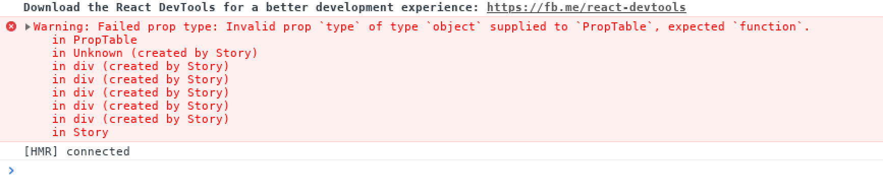
Proptypes didn't show up with styled-component. Instead I got error
Failed prop type: Invalid proptypeof typeobjectsupplied toPropTable, expected' function
To Reproduce
npm run storybook
Expected behavior
Proptypes should show up with all default values
Screenshots

Code snippets
Config.js
import React from 'react';
import { configure, addDecorator } from '@storybook/react';
import { ThemeProvider } from 'styled-components';
import { withInfo } from '@storybook/addon-info';
import theme from '../src/theme';
import GlobalStyle from '../src/globalStyle';
import '../src/font.css';

function requireAll(requireContext) {
  return requireContext.keys().map(requireContext);
}


function loadStories() {
  requireAll(require.context("../src/components", true, /.story\.js?$/));
}

const CenterDecorator = (storyFn) => (
  <ThemeProvider theme={theme}>
    <div style={{padding:'1em'}}>
      { storyFn() }
      <GlobalStyle />
    </div>
  </ThemeProvider>
);

addDecorator(CenterDecorator);
addDecorator(withInfo);

configure(loadStories, module);
Button.js
import React from 'react';
import styled, { css } from 'styled-components';
import PropTypes from 'prop-types';
import { Link } from 'react-router-dom';
import { getColor } from '@theme';

const Button = ({
  className,
  label,
  icon,
  onClick,
  disabled,
  href,
  loading,
  primary,
  iconOnRight,
  ...otherProps
}) => {
  const Wrapper = (href) ? Link : styled.button``;

  return (
    <Wrapper
      className={className}
      disabled={disabled || loading}
      to={href}
      onClick={onClick}
      {...otherProps}
    >
      <div className="button__content">
        <span className="button__label">{label}</span>
      </div>
    </Wrapper>
  );
};

Button.propTypes = {
  className: PropTypes.string.isRequired,
  onClick: PropTypes.func,
  label: PropTypes.string,
  icon: PropTypes.element,
  primary: PropTypes.bool,
  disabled: PropTypes.bool,
  href: PropTypes.string,
  loading: PropTypes.bool,
  iconOnRight: PropTypes.bool,
};

Button.defaultProps = {
  label: '',
  icon: null,
  primary: false,
  disabled: false,
  href: '',
  onClick: () => {},
  loading: false,
  iconOnRight: false,
};

const getPrimaryStyles = ({ primary, disabled }) => (
  primary
    && css`
      background-color: ${getColor('ACTIVE')};
      color: ${getColor('WHITE')};
      border: none;

      &:hover {
        background-color: ${!disabled ? getColor('ACTIVE_HOVER') : ''};
      }
    `
);

const getDefaultHoverStyles = ({ primary, disabled }) => (
  (!primary && !disabled)
    && css`
      &:hover {
        border-color: ${getColor('ACTIVE')};
        color: ${getColor('ACTIVE')};
      }
    `
);

const getDisabledStyles = ({ disabled }) => (
  disabled
    && css`
      opacity: 0.5;
      cursor: auto;
    `
);

export default styled(Button)`
  position: relative;
  display: flex;
  align-items: center;
  justify-content: center;
  font-family: Muli;
  padding: 0 .75rem;
  height: 41px;
  border-radius: 2px;
  width: ${({ width }) => (width ? `${width}px` : '')};
  text-decoration: none;
  cursor: pointer;
  background-color: ${getColor('WHITE')};
  border: ${({ theme }) => theme.border.normal(theme.palette.LIGHTGREY1)};
  background-color: ${getColor('WHITE')};
  color: ${getColor('DARKGREY1')};
  ${getDefaultHoverStyles}
  ${getPrimaryStyles}
  ${getDisabledStyles}

  .button__content {
    visibility: ${({ loading }) => (loading ? 'hidden' : 'initial')};
    display: flex;
  }

  .button__label {
    line-height: 18px;
  }

  .button__icon {
    margin-right: .3em;
  }

  .button__icon svg {
    height: 18px;
    width: 18px;
  }

  .button__spinner {
    position: absolute;
  }
`;
Button.story.js
import React from 'react';
import { storiesOf } from '@storybook/react';
import Star from '@material-ui/icons/Star';

import Button from './Button';

storiesOf('Button', module)
  .add('just label',() => (
    <div>
      <Button label="Button" /><br />
      <Button primary label="Primary" /><br />
      <Button disabled label="Disabled" />
    </div>
  ), { info: { inline: true, header: true } })
System:
- OS: [MacOS]
- Device: [Macbook Pro 2018]
- Browser: [chrome]
- Framework: [ react]
- Version: [4.0.7]
 jitenderchand1
All 3 comments
Mate, you don't need to export component with styled wrapper, it's not good practise
storybook/react watching exactly on React Components wrapper and with your example, has no access for defaultProps and propTypes. As you can see, you provide Styled(Button) component for storybook in addon info
Styled-components provide access for props by innerProps attribute, but I don't think if contributors will add checking for this field, they won't struggle with new React changes and sudden conflicts about it
So, I will recommend you redetermine your approach for using styled-components and use it for inner component styling
By the way, there are some library for theme providing you probably could use for your solutions
https://github.com/echoulen/storybook-addon-styled-component-theme
 darotar
on 20 Nov 2018
darotar
on 20 Nov 2018
@darotar Thanks that was really helpful. I used this one which has better support for styled-component.
jitenderchand1
on 21 Nov 2018
Mate, you don't need to export component with styled wrapper, it's not good practise
@darotar could you please describe the cons of this approach?
So, for example, we have a Button.js file, that represents a simple html button wrapped with styled and several conditional css-attributes.
Then we export it and reuse somewhere else.
import { StyledButton } from 'app/components';

const DualButton = props => (
  <>
    <StyledButton variant="success" label="BUY" />
    <StyledButton variant="error" outlined label="cancel" />
  </>
)
 Carduelis
on 29 Nov 2018
Carduelis
on 29 Nov 2018
Related issues
 arunoda
·
3Comments
arunoda
·
3Comments
 miljan-aleksic
·
3Comments
miljan-aleksic
·
3Comments
 tirli
·
3Comments
tirli
·
3Comments
 dnlsandiego
·
3Comments
dnlsandiego
·
3Comments
 oriSomething
·
3Comments
oriSomething
·
3Comments
Most helpful comment
@darotar could you please describe the cons of this approach?
So, for example, we have a Button.js file, that represents a simple html button wrapped with
styledand several conditional css-attributes.Then we export it and reuse somewhere else.