Storybook: Question: propTypes for redux-connected components?
Issue details
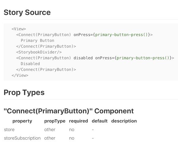
I'm creating components that must use react-redux's connect to grab some global application state. These components also have configurable properties. I'd like to be able to view the components' propTypes in their storybooks, _but_ I only see the connect-ed HOC's props (see screenshot below). Any thoughts on how to show the base component's propTypes?
Steps to reproduce
_.storybook/config.js_:
import React from "react";
import { Provider } from "react-redux";
import { configure, addDecorator } from "@storybook/react";

import configureStore from "./store/configureStore";

const context = require.context("../stories/", true, /\.js$/);
const store = configureStore();

addDecorator((render) =>
  <Provider store={store}>
    {render()}
  </Provider>
);

// ...
configure(() => context.keys().forEach(context), module);
_stories/button.js_:
import React from "react";
import { action } from "@storybook/addon-actions";
import { storiesOf } from "@storybook/react";
import { withInfo } from "@storybook/addon-info";

import PrimaryButton from "../components/primary-button";

storiesOf("Button", module)
  .add(
    "Primary Button",
    withInfo(PrimaryButton.WrappedComponent.__docgenInfo.description)(
      () => (
        <div>
          <PrimaryButton onPress={action("primary-button-press")}>
            Primary Button
          </PrimaryButton>
          <StorybookDivider />
          <PrimaryButton
            disabled
            onPress={action("primary-button-press")}
          >
            Disabled
          </PrimaryButton>
        </div>
      )
    )
  );
_components/primary-button.js_:
import React from "react";
import PropTypes from "prop-types";
import { connect } from "react-redux";
// ...

const PrimaryButton = ({ disabled, onPress }) => (
  <button
    className="primary-button"
    disabled={disabled}
    onClick={onPress}
  >
    {children}
  </button>
);

PrimaryButton.defaultProps = {
  disabled: false,
  onPress: undefined
};

PrimaryButton.propTypes = {
  children: PropTypes.string.isRequired,
  disabled: PropTypes.bool,
  onPress: PropTypes.func
};

export default connect(selector)(PrimaryButton);
I can create a starter project for a full setup if needed.
Please specify which version of Storybook and optionally any affected addons that you're running
@storybook/[email protected]@storybook/[email protected]@storybook/[email protected]
Affected platforms
@storybook/[email protected]?
Screenshots / Screencast / Code Snippets (Optional)
 swashcap
All 9 comments
Do the connect in a different export and just export your component as a pure component
 eddiemonge
on 19 Dec 2017
eddiemonge
on 19 Dec 2017
@eddiemonge That approach doesn’t scale for me, unfortunately: I have several dozen components, each requiring unique slices/pieces of the state tree.
swashcap
on 19 Dec 2017
My app is using hundreds. They are divided into components and containers. The component only takes props and has stories that show it in different states. The other export is a container that is purely responsible for maintaining state from redux. Your code would look like this:
import React from "react";
import PropTypes from "prop-types";
import { connect } from "react-redux";
// ...

export const PrimaryButton = ({ disabled, onPress }) => (
  <button
    className="primary-button"
    disabled={disabled}
    onClick={onPress}
  >
    {children}
  </button>
);

export default connect(selector)(PrimaryButton);
Then in your story:
import React from "react";
import { action } from "@storybook/addon-actions";
import { storiesOf } from "@storybook/react";
import { withInfo } from "@storybook/addon-info";

import {PrimaryButton} from "../components/primary-button";

storiesOf("Button", module)
  .add(
    "Primary Button",
    withInfo(PrimaryButton.WrappedComponent.__docgenInfo.description)(
      () => (
          <PrimaryButton onPress={action("primary-button-press")}>
            Primary Button
          </PrimaryButton>
     )
)
  .add(
    "Primary Button (disabled)",
    withInfo(PrimaryButton.WrappedComponent.__docgenInfo.description)(
      () => (
          <PrimaryButton
            disabled
            onPress={action("primary-button-press")}
          >
            Disabled
          </PrimaryButton>
      )
    )
  );
Your stories should show the components, not the containers
eddiemonge
on 20 Dec 2017
I created a demo project to show what's happening: https://github.com/swashcap/react-storybook-connect-example. The sample button component has a few necessary properties that gathers from the redux store. In practice this may be _way more_ properties. It doesn’t scale well to duplicate these properties explicitly in a non-connect-ed component.
How does adding some react-redux smarts to the addon-info extension sound? It could detect whether a component is connect-ed and emit the right propTypes table.
swashcap
on 21 Dec 2017
Hi everyone! Seems like there hasn't been much going on in this issue lately. If there are still questions, comments, or bugs, please feel free to continue the discussion. Unfortunately, we don't have time to get to every issue. We are always open to contributions so please send us a pull request if you would like to help. Inactive issues will be closed after 60 days. Thanks!
![stale[bot] picture](https://avatars3.githubusercontent.com/in/1724?v=4&s=40) stale[bot]
on 4 Feb 2018
stale[bot]
on 4 Feb 2018
It doesn’t scale well to duplicate these properties explicitly in a non-connect-ed component.
What do you mean by duplicating? If your can pass this props from mapStateToProps, that means that you can pass them explicitly in a story, doesn't it?
So I'd also recommend to add stories for presentational components in the first place. If you really need to use your container components in stories, you can do something like this:
const ConnectedPrimaryButton = connect(selector)(PrimaryButton);
ConnectedPrimaryButton.propTypes = PrimaryButton.propTypes;
export default ConnectedPrimaryButton;
 Hypnosphi
on 4 Feb 2018
Hypnosphi
on 4 Feb 2018
It doesn’t scale well to duplicate these properties explicitly in a non-connect-ed component.
What do you mean by duplicating? If your can pass this props from mapStateToProps, that means that you can pass them explicitly in a story, doesn't it?
It's been a while, but I think what I meant was:
import React from 'react'
import { Text, TouchableOpacity } from 'react-native'
import PropTypes from 'prop-types'

const MyButton = ({
  __backgroundColor,
  __borderColor,
  __borderRadius,
  __color,
  __disabledBackgroundColor,
  __disabledBorderColor,
  __disabledColor,
  __fontFamily,
  __fontSize,
  __fontWeight,
  __lineHeight,
  __onLongPress,
  __onPress,
  __onPressIn,
  __onPressOut,
  children,
  disabled,
  onPress,
  testID
}) => {
  return (
    <TouchableOpacity
      disabled={disabled}
      style={{
        backgroundColor: disabled ? __disabledBackgroundColor : __backgroundColor,
        borderColor: disabled ? __disabledBorderColor : __borderColor,
        borderRadius: __borderRadius,
        borderWidth: 1
      }}
      onLongPress={__onLongPress}
      onPress={(event) => {
        __onPress(event)
        onPress(event)
      }}
      onPressIn={__onPressIn}
      onPresOut={__onPressOut}
      testID={testID}
    >
      <Text
        style={{
          color: disabled ? __disabledColor : __color,
          fontFamily: __fontFamily,
          fontSize: __fontSize,
          fontWeight: __fontWeight,
          lineHeight: __lineHeight
        }}
      >
        {children}
      </Text>
    </TouchableOpacity>
  )
}

MyButton.propTypes = {
  // ...
}

export default MyButton
All of the __-prefixed properties come from the redux store. Writing a story by pulling the MyButton.WrappedComponent becomes tedious:
import React from 'react'
import { View } from 'react-native'
import { storiesOf } from '@storybook/react'
import { withInfo } from '@storybook/addon-info'

import MyButton from '../components/MyButton.js'

storiesOf('Buttons', module).add(
  'My Button',
  withInfo(MyButton.WrappedComponent.__docgenInfo.description)(() => (
    <View>
      <MyButton.WrappedComponent
        __backgroundColor='lightcyan'
        __borderColor='cyan'
        __borderRadius={2}
        __color='midnightblue'
        __disabledBackgroundColor='gainsboro'
        __disabledBorderColor='silver'
        __disabledColor='dimgray'
        __fontFamily='System'
        __fontSize={18}
        __fontWeight='700'
        __lineHeight={22}
        __onLongPress={console.log}
        __onPress={console.log}
        __onPressIn={console.log}
        __onPressOut={console.log}
        onPress={console.log}
        testID='my-button'
      >
        My Button
      </MyButton.WrappedComponent>
      <MyButton.WrappedComponent
        __backgroundColor='lightcyan'
        __borderColor='cyan'
        __borderRadius={2}
        __color='midnightblue'
        __disabledBackgroundColor='gainsboro'
        __disabledBorderColor='silver'
        __disabledColor='dimgray'
        __fontFamily='System'
        __fontSize={18}
        __fontWeight='700'
        __lineHeight={22}
        __onLongPress={console.log}
        __onPress={console.log}
        __onPressIn={console.log}
        __onPressOut={console.log}
        disabled
        onPress={console.log}
        testID='my-button'
      >
        Disabled
      </MyButton.WrappedComponent>
    </View>
  ))
)
That's a lot of props! Adding .propTypes to the connect-ed component seems like a potentially harmful runtime modification: a connected component is assigned .propTypes by react-redux.
I’ve started using React Styleguidist, which supports react-redux fairly well.
swashcap
on 4 Feb 2018
Hi everyone! Seems like there hasn't been much going on in this issue lately. If there are still questions, comments, or bugs, please feel free to continue the discussion. Unfortunately, we don't have time to get to every issue. We are always open to contributions so please send us a pull request if you would like to help. Inactive issues will be closed after 60 days. Thanks!
stale[bot]
on 21 Mar 2018
@swashcap nooo! I was so happy someone else said what I've been thinking the entire time I've been working with redux, and you disappear a month later?
I am exceedingly sad.
(I got here in a different way though - I'm looking to split propTypes out into ones the user must provide, and ones the component gets from the store, and enforce that with linting. Unrelated, but context is always helpful).
 Asday
on 15 May 2019
Asday
on 15 May 2019
Related issues
 maraisr
·
119Comments
maraisr
·
119Comments
 dmmarmol
·
57Comments
dmmarmol
·
57Comments
 firaskrichi
·
61Comments
firaskrichi
·
61Comments
 ChucKN0risK
·
74Comments
ChucKN0risK
·
74Comments
 hckhanh
·
69Comments
hckhanh
·
69Comments
Most helpful comment
My app is using hundreds. They are divided into components and containers. The component only takes props and has stories that show it in different states. The other export is a container that is purely responsible for maintaining state from redux. Your code would look like this:
Then in your story:
Your stories should show the components, not the containers