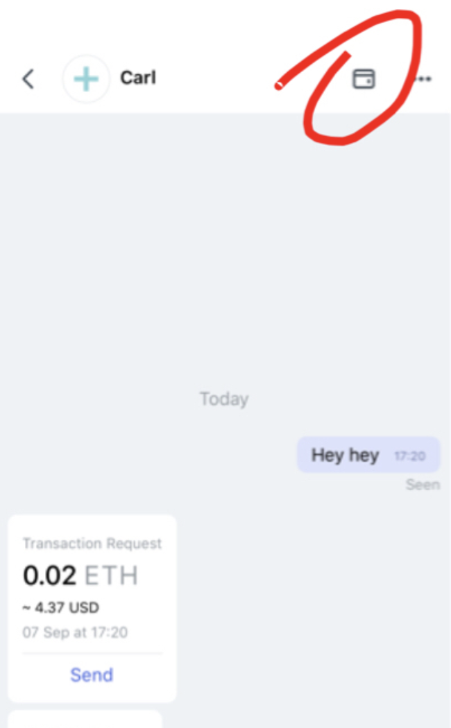
Status-react: Wallet icon in chats and dapps is hard to grasp for many users
Description
Type: Bug
Summary: The wallet modal was introduced in https://github.com/status-im/status-react/pull/5256 as a quick way to check owns assets and token history. Despite being a nice feature, it confuses many users (including Nabil).

Here are what people are struggling with:
- What does the icon mean?
- In 1-1 chat the wallet icon is close to an avatar of other user and many users confuse it with other person's wallet. It also happened in the recent UXR session in Berlin, the person was convinced that he's seeing wallet of his friend.
- In general, why "Wallet" icon is shown in a chat or dapp. What should I suppose to do with it?
I suggest to rethink having this icon there. Since the app already demands lot of attention from a new user (new concepts, etc.), I would not add another thing he/she needs to wonder about. In other words, I think we should optimize for really simple interface to reduce cognitive load.
Additional Information
- Status version: 0.9.27
- Operating System: Android, iOS
All 12 comments
@errorists @hesterbruikman do you think that we are still able to fix it and keep the wallet modal feature? Or it's better to get rid of it at all in your opinion?
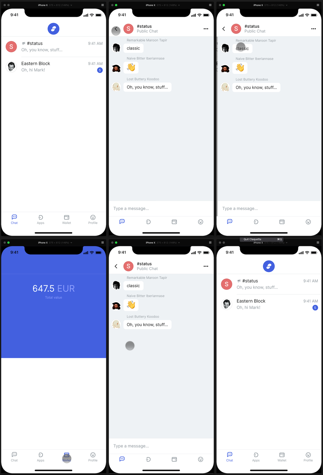
We should totally get rid of it. If viewing wallet is of that importance in the context of chat we could move it to the overflow ••• menu under a more descriptive 'View your wallet' button. But that also feels like a stopgap solution. The problem is that inside chat and dapps we lose tab navigation, and this is something I'd like to address in nearby future by either making the tab bar permanent or otherwise accessible.
@errorists yup. I also feel like having "..." under menu is not the right path.
@hesterbruikman any thoughts on information architecture?
I'm currently exploring ways to have the tab bar permanent so there's no need for the shortcut at all

In short: tab bar permanent long term. @errorists overflow menu option short term.
This resolves the issue of people perceiving it as it being a view of their contact's wallet. Not sure about the labeling 'View your wallet' or 'View your balance'.
I really like the pernament tab idea with saved state for each tab. E.g. I can quickly switch to wallet and then go back to my chat.
@errorists is there an issue for pernament tabs? Can we link this issue there?
@lukaszfryc not yet, give me some time to figure out all the kinks, literally just started working on it yesterday :)
Thanks @errorists. Would you be up for designing a few navigation solutions? @andrei has also looked at this in the past. This is a very structural issue that we need to test so we don't run into redesigning again a few months from now. We also have what @chad lovingly calls the 'junk drawer' aka Profile that needs to be included in this.
Hey @hesterbruikman I don't think you intended to mention me. I don't think I have anything to do with this issue.
Sorry about that! Wrong mention:)
This issue has been automatically marked as stale because it has not had recent activity. It will be closed if no further activity occurs. Thank you for your contributions.
This issue has been automatically closed. Please re-open if this issue is important to you.
Most helpful comment
Hey @hesterbruikman I don't think you intended to mention me. I don't think I have anything to do with this issue.
Sorry about that! Wrong mention:)