Spyder: Improvements to the Help panel
Problem Description
- [x] Change
Notesections colors on the dark them - [x] Change default snippets colors on the dark theme (from
MonokaitoSpyder Dark) - [x] Add loading page
- [x] Unify
hover and clickvsCtrl + Iresults (for example withspyder/spyder/app/restart.pydoingCtrl+Iwhen the cursor is just before a parenthesis) - [x] Change table style
 dalthviz
All 5 comments
@dalthviz, as part of this effort, please also change the style of "Note" sections (which is the same of "See also" ones, I think):
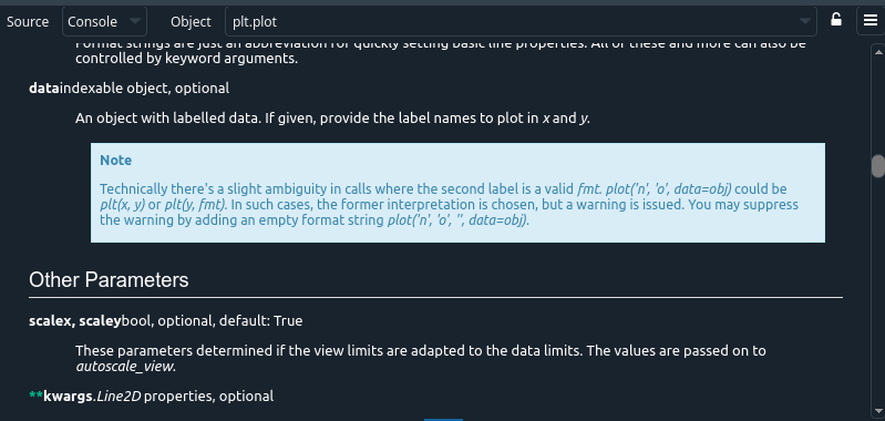
This is the docstring of plt.plot.
 ccordoba12
on 8 Jan 2020
ccordoba12
on 8 Jan 2020
@dalthviz, please also take a look at this other bug. If you press Ctrl+I next to this function:
you'll get as a result in the Help pane:

However, when you hover on the function and make a click on that hover, you'll get:

As you can see, the second result is the right one because it includes the header and the function signature, whereas the first one is missing those elements.
ccordoba12
on 8 Jan 2020
@dalthviz, let's take this opportunity to also improve the style of tables in both the dark and light themes:

These are my suggestions:
- Add a line to bottom border of the table.
- Please align the the table headers (i.e.
characteranddescriptionin the screenshot above) to the left. - Please reduce the top and bottom padding around text in each cell by two or three pixels (please post screenshots here to see how it looks with different paddings).
ccordoba12
on 13 Jan 2020
@ccordoba12 a preview of the tables with the changes suggested above:


dalthviz
on 13 Jan 2020
Things look much better now, thanks @dalthviz! But please reduce the top/bottom padding in each cell a bit more.
ccordoba12
on 13 Jan 2020
Related issues
 spyder-bot
·
3Comments
spyder-bot
·
3Comments
 hgijeon
·
3Comments
hgijeon
·
3Comments
 goanpeca
·
3Comments
goanpeca
·
3Comments
 impact27
·
3Comments
impact27
·
3Comments
 SapnaSM
·
3Comments
SapnaSM
·
3Comments
Most helpful comment
@dalthviz, please also take a look at this other bug. If you press
Ctrl+Inext to this function:https://github.com/spyder-ide/spyder/blob/62de40c4005c9ca30be5c83bdbd6f366a3fccd42/spyder/app/restart.py#L62-L71
you'll get as a result in the Help pane:
However, when you hover on the function and make a click on that hover, you'll get:
As you can see, the second result is the right one because it includes the header and the function signature, whereas the first one is missing those elements.