Spyder: Replace Spyder logotype in splash screen
Issue Report Checklist
- [x] Searched the issues page for similar reports
- [x] Read the relevant sections of the Spyder Troubleshooting Guide and followed its advice
- [x] Reproduced the issue after updating with
conda update spyder(orpip, if not using Anaconda) - [x] Completed the Problem Description, Steps to Reproduce and Version sections below
Task Description
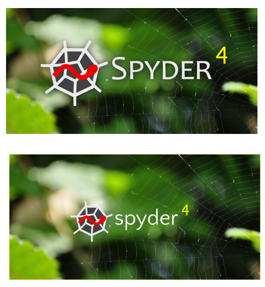
Currently, the Spyder logotype used in the splash screen is all lowercase, like this:

For consistency, it should match the Title Case, small caps version from the docs banner, readme banners, Spyder homepage, etc:
EDIT: Realized I copied the wrong image

Also, as part of this we might want to either tweak the background's position to improve contrast (avoid light on light). but the current dark BG logo is probably still fine and I think looks a little better her anyway, IMO. The best way to do that, if you have the margin, is just to bump the BG image up by a little so the dark parts cover the white web strands from the logo.
 CAM-Gerlach
All 22 comments
@dalthviz, please work on this one.
 ccordoba12
on 25 May 2018
ccordoba12
on 25 May 2018
You can get high-resolution PNGs of both the light and the dark versions of the logo + logotype in the relevant directory on our Google Drive. I'd use SVGs, but I've been getting very inconsistent output between Illustrator, Inkscape and various display programs. This would be really nice to have for Beta 1 since it would mark a clear visual distinction between the two versions, since we aren't changing the splash screen BG (at least for now).
CAM-Gerlach
on 2 Jun 2018
@CAM-Gerlach, given the comments in PR #8028, I'm going to close this one because we don't have time to implement it for Spyder 4.
What we really need to do is to create a new icon and use it in the splash screen. But that's work for Spyder 5 at this point.
ccordoba12
on 9 Oct 2018
TL;DR: I agree with @bcolsen's comments, and that we shouldn't make any substantial changes until we hire a designer well in the future. However, the point of this issue was just to change the font case of the Spyder logotype to match everywhere else its used and look much better, whereas all of that was directed at other changes either unrelated to or specifically recommended against by this issue. Therefore, @dalthviz or I should submit a PR with just the simple change to the Spyder logotype (Title Case/Small Caps) that this issue requests as he already included there, as its a strict minimal-effort improvement in look and consistency.
--
The core problem with that PR was that it changed to the logo and the text to the version adapted for light backgrounds, when there was nothing wrong with the original there and no reason to change the text color to white. All that needed to be done here, as stated above in the OP and even the title, was to change the text to Title Case and small caps, so its consistent with everywhere else. I did say
Also, as part of this we might want to tweak the background's position to improve contrast (avoid light on light)
But then explicitly clarified
but the current dark BG logo is probably still fine and I think looks a little better her anyway, IMO.
Simply changing the font case as @dalthviz already did (which is exactly what this issue is about) is a strict improvement in both look and consistency on the previous for relatively little effort, as @bcolsen 's (valid) comments 2 and 3 only apply to changes this PR explicitly said to not do (changing the logo and text color), and comment 1 is an issue either way and not affected by the changes, so it shouldn't be a reason not to merge a PR with just a change to the font.
If we are going to make more substantial changes (which indeed should wait for at least Spyder 5), I agree we should hire a designer. However, while I am far from one to talk down the importance of good design in general (after all, I was raised by a graphic designer (my mom) who constantly instilled in me a strong sense of the importance thereof), I'm of the belief that at least for now, we should concentrate our very limited resources that we've been entrusted with by our users on fixing bugs, adding features and developing plugins that our users actually want and need, rather than paying >= hundreds of $ to a professional designer for a prettier logo and splash screen, at least until we get closer to the level of Jupyter in terms of wads of cash to burn.
Therefore, given this won't otherwise be touched anytime soon, @dalthviz or I should simply make the actual change requested in this issue (that he already made, among others), i.e. making the font case consistent with everywhere else the logotype is used, and then be done with it if and until we hire a designer sometime well in the future.
CAM-Gerlach
on 9 Oct 2018
@ccordoba12 my intervention in PR #8028 was not to suggest closing the PR, but to avoid that we waste time trying to correct small details about "flaws" in the design of our current logo. Also, note that I made my comment thinking the logo and banner were currently being worked on by a professional designer for the release of Spyder 4, as it was discussed previously in Gitter.
That being said, I agree with @CAM-Gerlach that @dalthviz could simply revert back using the standard dark background color logo and make the text white in his PR and that's it. I think the PR could be merged like that, without further modifications.
 jnsebgosselin
on 9 Oct 2018
jnsebgosselin
on 9 Oct 2018
I should submit a PR with just the simple change to the Spyder logotype (Title Case/Small Caps) that this issue requests as he already included there, as its a strict minimal-effort improvement in look and consistency.
Ok, I agree only with this.
ccordoba12
on 9 Oct 2018
@CAM-Gerlach, please take care of it.
ccordoba12
on 9 Oct 2018
I know I said not to waste time on this, but this was before I knew that the splash was not going to be reworked in Spyder4.
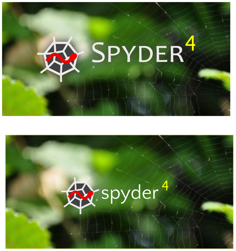
So, here is what I'm proposing to fix this Issue and also to improve the contrast between the logo/text and background.
- Make the logo and text larger
- Change the font from Quattrocento Sans to Candara, because the former doesn't support small caps and Candara is the font used in the banner and other Spyder logo.
- Add a subtle shadow to improve contrast
jnsebgosselin
on 12 Oct 2018
Ok, here is a version with a smaller logo and more subtle shadow. I think it looks better.

jnsebgosselin
on 12 Oct 2018
@jnsebgosselin Great work! The subtle drop shadow fixes the contrast issue with the highlights without any position tweaks, and overall its a much better solution.
Do you think you could move the 4 down a little so it isn't quite such an extreme supercript (perhaps so the horizontal bar of the 4 is even with the letter height of the small caps)? Especially due to the small caps, it looks rather disconnected from the Spyder text.
Also, you could consider keeping the logo the same (or perhaps even a tad smaller, but increasing the font size of the Spyder logotype just a bit, so the latter doesn't dominate the former and is closer to the ratio in the other sources.
Thanks!
CAM-Gerlach
on 12 Oct 2018
I really like these improvements @jnsebgosselin!
ccordoba12
on 12 Oct 2018
Here is a version with the banner size and position, with the _4_ down a little as suggested by @CAM-Gerlach .
jnsebgosselin
on 15 Oct 2018
Hey @CAM-Gerlach. I think you would be better than me to handle this. Would you like to take it from there? I do not enjoy that much doing this and prefer fixing things hehe
jnsebgosselin
on 15 Oct 2018
@jnsebgosselin Sure, just send me the file. There really shouldn't be much more to do then fixing the vertical alignment of the Spyder name (so its centered with the logo again), maybe dropping the "4" a tad more and submitting a PR with the final design, and I don't want to drag this out as @ccordoba12 cautioned against.
CAM-Gerlach
on 15 Oct 2018
@CAM-Gerlach ok thank you very much.
jnsebgosselin
on 15 Oct 2018
Thanks @CAM-Gerlach for finishing @jnsebgosselin's work!
ccordoba12
on 15 Oct 2018
@ccordoba12 I haven't done anything yet, as I'm still waiting on the file. He did 99% percent of it anyway; 90% of what I do will probably just be getting the SVG to open, render and output properly.
CAM-Gerlach
on 15 Oct 2018
Sorry for the delay. I need to cleanup a little bit my file and I'll send it to you @CAM-Gerlach .
jnsebgosselin
on 16 Oct 2018
@jnsebgosselin Thanks!
CAM-Gerlach
on 17 Oct 2018
@jnsebgosselin Did you send me the files? Or are they on our Spyder Google Drive?
CAM-Gerlach
on 29 Nov 2018
On the Drive.
jnsebgosselin
on 29 Nov 2018
Thanks! I'll take care of it when final exams and projects are done next week.
CAM-Gerlach
on 29 Nov 2018
Related issues
 SapnaSM
·
3Comments
SapnaSM
·
3Comments
 gabrielclow
·
3Comments
gabrielclow
·
3Comments
 goanpeca
·
3Comments
goanpeca
·
3Comments
 danieltomasz
·
3Comments
danieltomasz
·
3Comments
 spyder-bot
·
3Comments
spyder-bot
·
3Comments
Most helpful comment
Ok, here is a version with a smaller logo and more subtle shadow. I think it looks better.