This issue is related to the work initiated in PR #6352. The goal is to document modification done to the logo in order to improve it visually and to make it more friendly for light background. Below are a list of ideas on which I would like us to work on in order to improve the logo.
- Improve the snake
- Make the web symetrical
- Make the logo looks better on the light background
- Try to enclose the logo in a circle.
- Make the current red snake into an S (similar to the Scipy symbol)
 jnsebgosselin
All 45 comments
As a starter, I've done some work to make the web symmetrical.
jnsebgosselin
on 25 Feb 2018
Some attempt at enclosing the logo...

And below is how it looks in the banner with light or dark background.

jnsebgosselin
on 25 Feb 2018
I really like how the webs go out to the edges. It gives great contrast to the webs
I thought I would give it a shot. I wanted to preserve the icon shape and curve the webs to make them flow. The snake isn't working for me. Maybe I'm to used to the simple snake :-)

 bcolsen
on 25 Feb 2018
bcolsen
on 25 Feb 2018
@bcolsen Nice work! I like the web. Could you make an alternate version with the same dark grey everywhere and with the original snake please? Also can you try to use full white for the web instead.
I've also tried with various type of snake and it all looked strange... Also using the snake to make an "S" never gave good result for me because it felt like too easy (kitsch?). I think we need to make a snake that is similar the the actual one, but to improve it a little, like for the shape of the head for example.
Would you like to give it a shot?
jnsebgosselin
on 25 Feb 2018
@bcolsen Could you also show how it looks on a dark background please. That would be nice thank you.
jnsebgosselin
on 25 Feb 2018
@jnsebgosselin, I like a lot the squared shape you gave to the icon. What if you combine it with the S from @bcolsen and give the snake's head the shape of your third iteration from left to right (the one with several curls)?
 ccordoba12
on 25 Feb 2018
ccordoba12
on 25 Feb 2018
@ccordoba12 OK, I'll try to combine both concepts, it is a good idea. I would like to try @bcolsen 's web in a squared shape like I did. I think that would look great. I'll also iterate some more with the S shaped snake idea.
@bcolsen would you agree to share with me your design in a svg format so that I can more easily play with it? That would be awesome.
jnsebgosselin
on 25 Feb 2018

jnsebgosselin
on 25 Feb 2018
Getting closer, getting closer! This is really cool!
What I still like from @bcolsen design is that you can clearly distinguish the S and the red snake. In your design, I think only the snake is distinguishable.
Could you make the snake's head to be at the end of the S's top arm (I don't know how describe it better :-)? I mean, instead of going perpendicular to it. And the same for the snake's tail? Thanks!
I also think the S can occupy more space inside the square, like in @bcolsen's design.
ccordoba12
on 25 Feb 2018
My idea is to make a contrast with RStudio's logo (between the S and the R, I mean).
ccordoba12
on 25 Feb 2018
@ccordoba12 I understand, good idea. I'm going to try it.
jnsebgosselin
on 25 Feb 2018
Here's a link:
https://drive.google.com/file/d/1GO7F7D3SNfdo_An8ngMryPLE8PPMVLxM/view?usp=sharing
I used the lighter background in the web to increase the contrast of the snake. Something like that and a darker snake may let us avoid the outline on the snake
bcolsen
on 25 Feb 2018
Make the web symetrical
IMO, it's nice as it is. Symmetry is less, well, original.
Make the current red snake into an S (similar to the Scipy symbol)
Python's snake logo can be used to make an S too.
 homocomputeris
on 25 Feb 2018
homocomputeris
on 25 Feb 2018
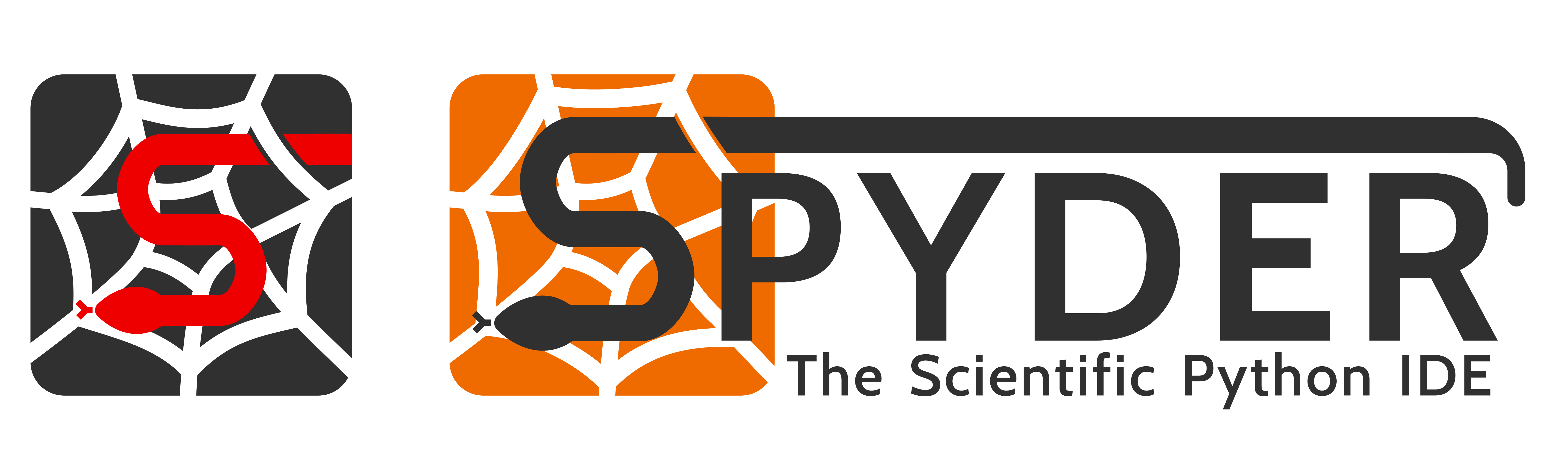
Thank you very much @bcolsen! Below are some more concepts integrating @ccordoba12 suggestions and @bcolsen web design.
jnsebgosselin
on 25 Feb 2018
IMO, it's nice as it is. Symmetry is less, well, original.
My designs are going to be symmetrical... sorry but I can't help it. It's not like its a game changer anyway...
Following @homocomputeris suggestion, here is a quick attempt to make a design that recall the snake in the Python's logo. Some work is still needed to make the S looks more like a S.
jnsebgosselin
on 25 Feb 2018
Some modified version of the designs above.
jnsebgosselin
on 26 Feb 2018
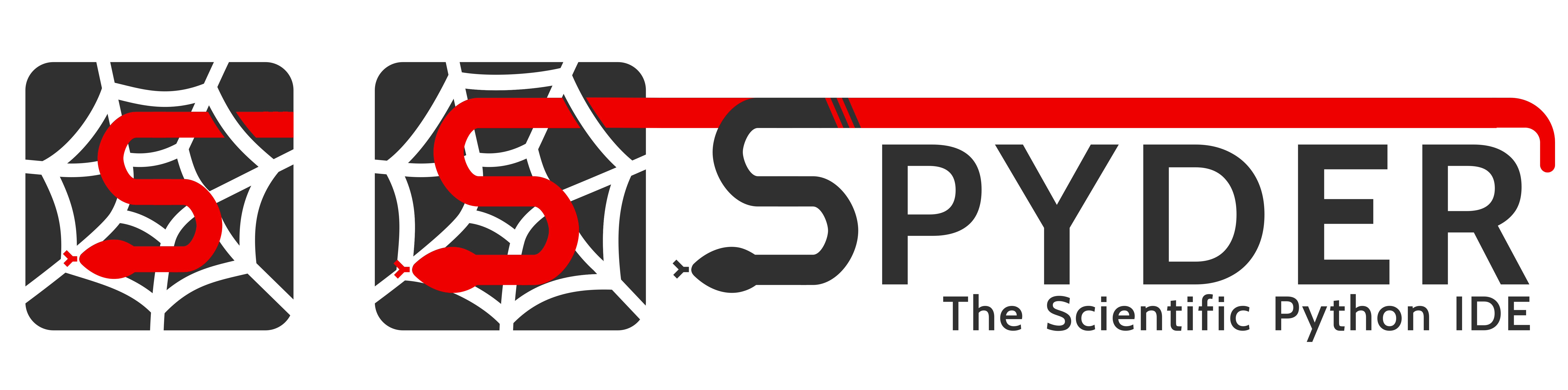
A banner for design 6 and another try :

Same as above but with the same gray as in the original logo :

jnsebgosselin
on 26 Feb 2018
Wow I really like 10. The snake is great upside down and the over line is I liked the snake going through web in 6 as well.
I like the idea of the integration of the logo with the name too, and the shortened subtitle as well. The S needs more contrast though, because on first glance I just see the "pyder"
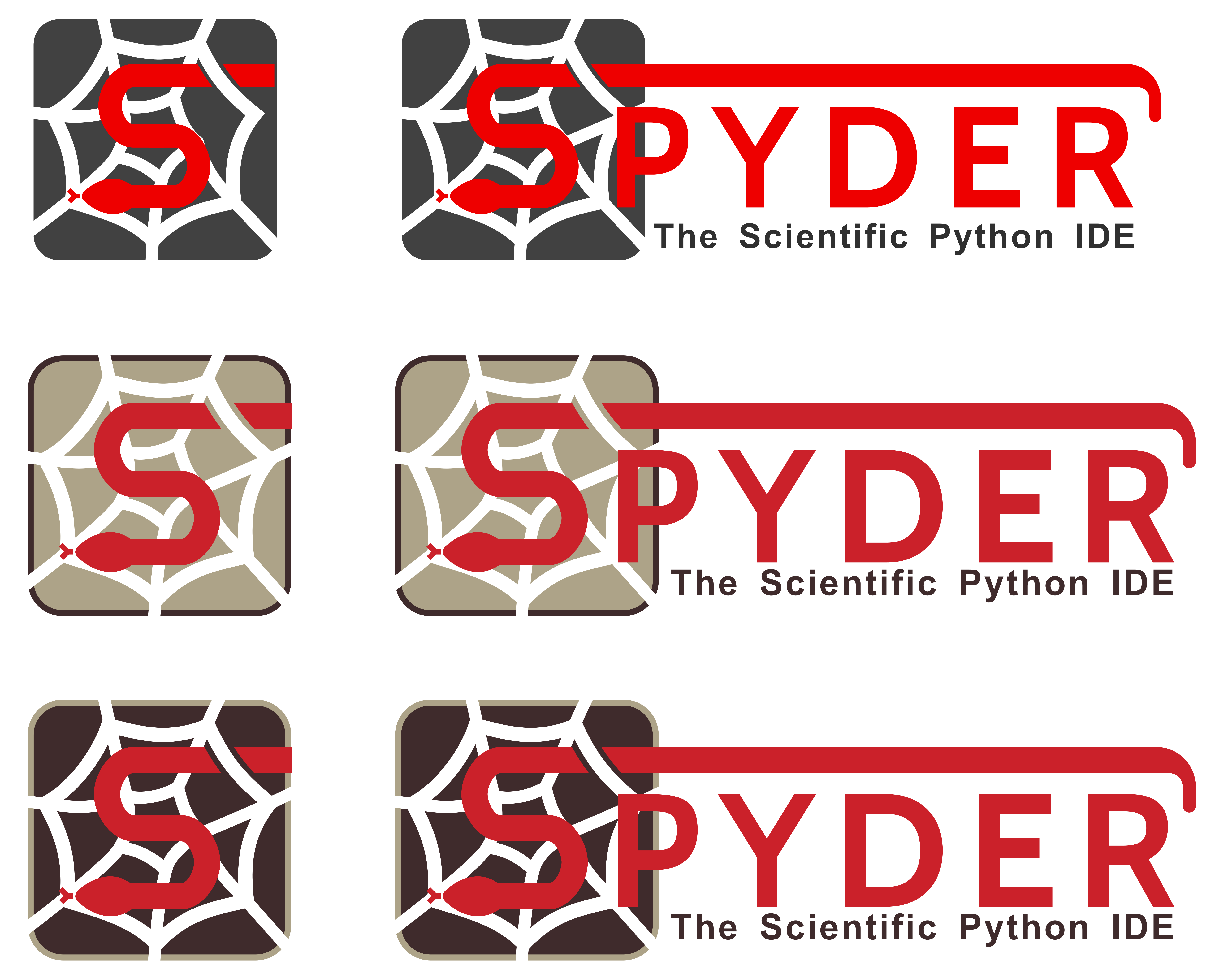
A pallet swap gives an "S" first web later thing:

Flat font to match the "S" is Cabin Bold under the Open Font License.
Without Subtitle:

That would look sweet on a skate board or even an IDE! (I guess)
bcolsen
on 26 Feb 2018
This is really starting to look cool. Keep it up!
 jitseniesen
on 26 Feb 2018
jitseniesen
on 26 Feb 2018
Nice observations @bcolsen! I want a sticker to put on the back of my Alienware lol
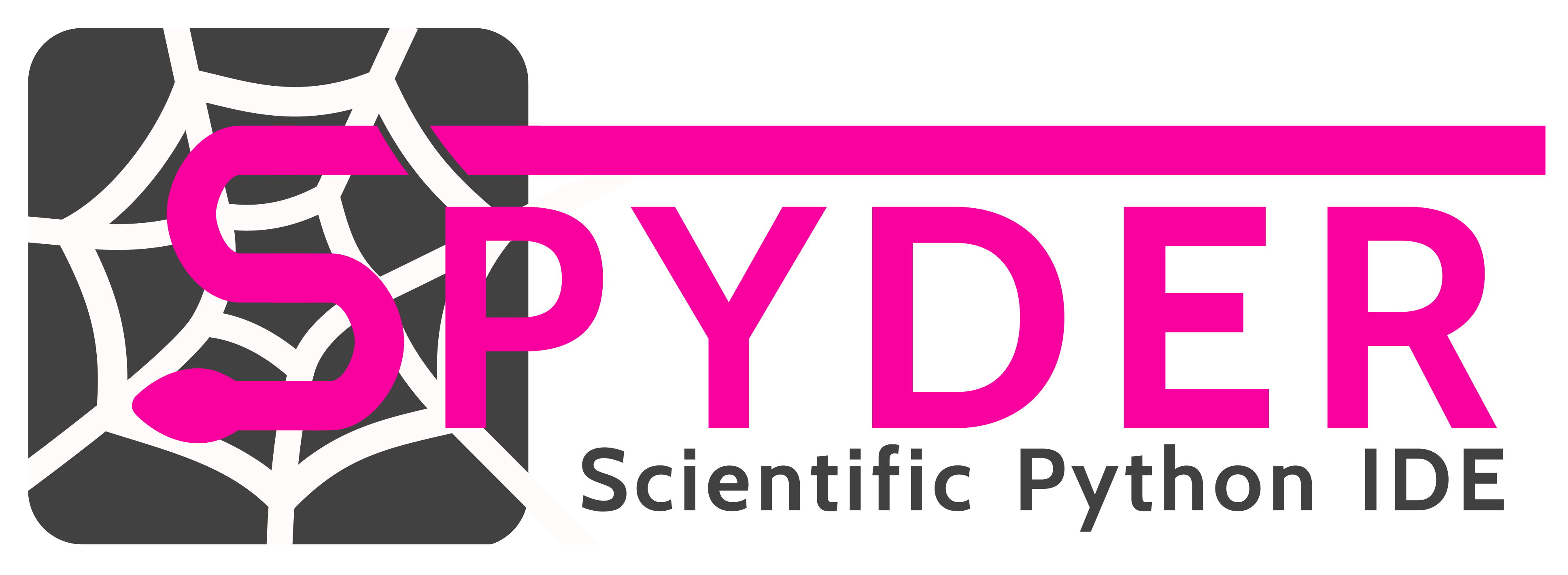
Here is a small twist to what you've done if we want to keep a white background so that it is easier to integrate as a banner on the website or on the readme.
jnsebgosselin
on 26 Feb 2018
I really do like the white web the best.
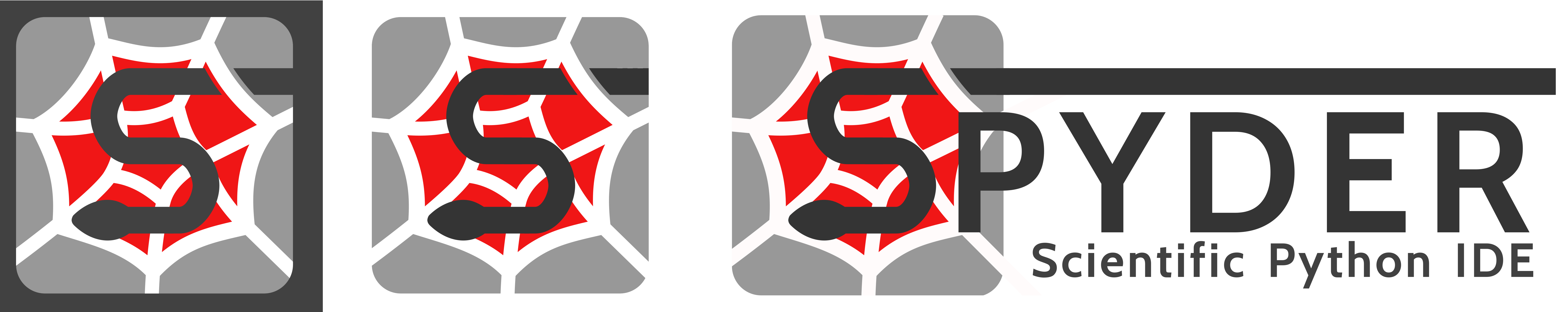
To increase the "S" contrast I tried to in crease the size a bit. Small one on the left bigger on right:

The "s" a bit more visible when it's bigger.
I don't know what font you're using now, but I think I like the "R" in cabin a bit more
bcolsen
on 27 Feb 2018
I like the general ideas but, the red is a really bad color, maybe we can change it :-) ?
 goanpeca
on 27 Feb 2018
goanpeca
on 27 Feb 2018
There are a lot more green snakes than red snakes :-)
People can see green better too.
bcolsen
on 27 Feb 2018
Yeah, we had thought about using green as well, could we see some options :-) ?
Do not feel tied to it
- Anaconda:
#48ae35 - Github:
#3dcc5d - Google Chrome:
#27a163 - Slack 1:
#4caf89 - Slack 2:
#1e7d66 - Slack 3:
#889e3e - Whatsapp:
#4dc35c
goanpeca
on 27 Feb 2018
@goanpeca What about yellow? Yellow would look great also no?
jnsebgosselin
on 27 Feb 2018
@jnsebgosselin sure, lets just get away from the red once and for all please, its like the worst color ever!
goanpeca
on 27 Feb 2018
ooh yeah...burnt yellow and grey..my favorite color combo
A (I think this is the most clear title..easy to see spyder right away):
with yellow text:
B:
Skateboard:
bcolsen
on 27 Feb 2018
As an 48px icon:

bcolsen
on 27 Feb 2018
I really really like the colors, but it doesn't feel like Spyder to me. I'm not against it, but I'm not sure it is a good idea to use another color than red for the snake. The red snake kind of grow on me over the years using Spyder... I'll look at it again in a couple of days. Maybe I'll have another perspective.
The logo alone with the red snake doesn't look so bad. Maybe we can rework the banner so that there is less red?
jnsebgosselin
on 27 Feb 2018
Gotta love the colors :D Thanks everyone for the great collaboration/interaction we're having on this one. This is fun.
@bcolsen The Cabin font was not installed in my Inkscape. I installed it and I'm using it now.
jnsebgosselin
on 27 Feb 2018
Gotta love the colors :D
Yeah I think things are working out well!
The red snake has strong branding. Here's one with a darker red. It's a little easier on the eyes than the original red(seen on the left icon).

could go more orange:
something a little different:
bcolsen
on 27 Feb 2018
Here is a link to the big S
https://drive.google.com/open?id=1szVQf1Pd5rjTlrySc_bAdeC9OWdsDhs9
bcolsen
on 27 Feb 2018
The red snake has strong branding. Here's one with a darker red. It's a little easier on the eyes than the original red(seen on the left icon).
I agree with you. That is why I'm hesitant to completely drop the red...
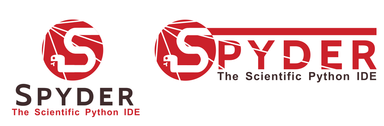
I like the red design you've made. It looks good and you are right it is a lot easier on the eye. Following your idea, here is another 3-colors design I've made with a different red. I've also enlarged the S like you suggested.
jnsebgosselin
on 28 Feb 2018
The tan in the middle one gives good contrast with the red.
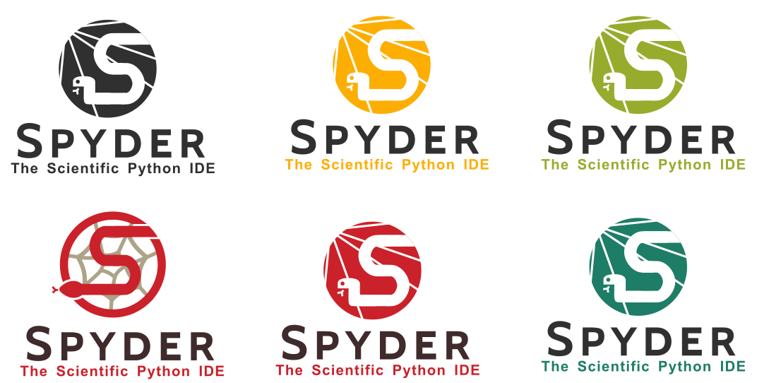
I tried it with a solid red back with a dark snake for fun, but it was too much red, but just in the middle works:
Also, are we confident enough in our IDE for this one:
That's light red BTW ;-)
bcolsen
on 28 Feb 2018
I showed our concepts to some of my colleges, one of which is very good with graphic art. Overalls, the feedback was not as good as I would have wished.... Basically they said it was "interesting..." (not good hehe), but that the contrast with the S and the web was generally bad, that the "P" overlapping the logo is generally a bad thing, and that the overall design did not felt very modern... and well, in retrospect, I kind of agree with them ...
So I went back to the drawing board, trying out something completely different. I used the snake from the Python logo and tried something different for the web.
jnsebgosselin
on 28 Feb 2018
Same idea, better web.
jnsebgosselin
on 28 Feb 2018
Thanks guys for working on this :-)
I think we should move away from the Python wording, since the idea is to support more languages, and saying it is written in python is also a secondary thing.... so we should start embracing
Spyder - The Scientific Development Environment or something like that...
goanpeca
on 28 Feb 2018
@goanpeca ok... well this goes for the snake in the logo too. There is not really any reason to keep a snake in there if we want to move away from the fact that Spyder is an IDE mainly for Python. Also, the name Spyder, as an acronym, becomes a little bit less interesting, so is a change in the name also conceivable?
Until these questions are clarified, I think it is a waste of time to work on a new logo and banner.
jnsebgosselin
on 28 Feb 2018
I think we should move away from the Python wording, since the idea is to support more languages, and saying it is written in python is also a secondary thing
Given our very limited resources, I really think we should only focus in Python. Only Jupyter has enough resources to support more than Python. And out of Julia, R and C++, the support is very limited.
ccordoba12
on 28 Feb 2018
ok... well this goes for the snake in the logo too.
I think the snake is fine... cause it is built with python and the web of plugins and modules still applies, I meant specifically The Python Scientific IDE wording.
goanpeca
on 28 Feb 2018
Also @jnsebgosselin @bcolsen I really appreciate all the work you are putting on this, and I agree this is fun, but the truth is we are not graphic designers and anything we come up will probably have issues or be suboptimal, but the idea we are aiming at is pretty clear, we want a web, we want a snakey S, we want to explore new colors.
We really need to take it from here to a professional designer.
If you know someone I am all ears to arrange for paying the costs.
goanpeca
on 28 Feb 2018
@goanpeca yep I agree with you. We've laid some interesting ideas so we can take it to another level. I don't know any professional designer unfortunately. If you don't mind, I'll let you handle this one from then so that I can focus on other things.
jnsebgosselin
on 28 Feb 2018
@goanpeca
This guy http://sebastienthibault.com/ is very good. He is from my hometown.
Keep us posted please! I think this is a very serious matter and I would like very much to see progress on this soon. Thanks.
jnsebgosselin
on 1 Mar 2018
I think this can be closed, since a decision has been made on this.
jnsebgosselin
on 16 Jun 2018
@isabela-pf this is the thread for the discussion of the actual logo of Spyder so you can take a look at some ideas we had at first.
 juanis2112
on 3 Jul 2020
juanis2112
on 3 Jul 2020
Related issues
 gabrielclow
·
3Comments
gabrielclow
·
3Comments
 impact27
·
3Comments
impact27
·
3Comments
 marianux
·
3Comments
marianux
·
3Comments
 neilsf1975
·
3Comments
neilsf1975
·
3Comments
 SapnaSM
·
3Comments
SapnaSM
·
3Comments
Most helpful comment
Wow I really like 10. The snake is great upside down and the over line is I liked the snake going through web in 6 as well.
I like the idea of the integration of the logo with the name too, and the shortened subtitle as well. The S needs more contrast though, because on first glance I just see the "pyder"
A pallet swap gives an "S" first web later thing:
Flat font to match the "S" is Cabin Bold under the Open Font License.
Without Subtitle:
That would look sweet on a skate board or even an IDE! (I guess)