Sprints: Change browser icons to browser text labels in new compat table
From Bug https://bugzilla.mozilla.org/show_bug.cgi?id=1438889
What feature should be changed? Please provide the URL of the feature if possible.
The browser icons in the new compat tables should be text labels with the names of browsers
What problems would this solve?
People spend less time understanding the new compat tables and have it easier to parse the given information.
Who would use this?
All readers of compat data.
What would users see?
Browser names instead of browser icons.
What would users do? What would happen as a result?
Get compat questions answered faster.
Is there anything else we should know?
https://screenshots.firefox.com/gw2sNnLNQ1NgQCrF/localhost is how it could look like and was commented with "It looks so right, that I didn't even notice. Excellent!"
See https://discourse.mozilla.org/t/beta-testing-new-compatability-tables/21269/23 a quick survey analysis.
Acceptance Criteria
- [ ] Compat tables no longer uses icons for the various browser/platforms, but instead uses text labels.
 schalkneethling
All 24 comments
The screenshot has expired, would you mind linking to a new one?
 atopal
on 31 Oct 2018
atopal
on 31 Oct 2018
Here is one of the options. I will have to do testing across browsers if this seems like the most sensible way forward.

and on tablet size screen sizes:
 schalkneethling
on 31 Oct 2018
schalkneethling
on 31 Oct 2018
Something like this might also work but, with pages like Array for example (42 properties/functions), this will not. That is, unless we are ok with horizontal scrolling:
https://codepen.io/schalkneethling/pen/PyrOvB
 schalkneethling
on 31 Oct 2018
schalkneethling
on 31 Oct 2018
My previous attempt is here btw https://github.com/mdn/kumascript/pull/616
 Elchi3
on 31 Oct 2018
Elchi3
on 31 Oct 2018
Still exploring some more options. Will update here once I have other options to present.
schalkneethling
on 31 Oct 2018
I rather like the vertical labels; I think it looks good, and works for the limited space we have. I guess we'd need to test to see if this has too many negative legibility implications.
I worry that changing the layout so the browsers are listed across the rows might jar with too many MDN users' existing muscle memory.
 chrisdavidmills
on 31 Oct 2018
chrisdavidmills
on 31 Oct 2018
Actually, I reckon the rotated labels are our best option, unless we want to rethink the table entirely. With that, I believe those are my proposals, and my vote would go for the rotated labels unless:
- It proves to be a cross-browser challenge (I do not foresee this as a problem)
- It presents a legibility problem which negatively affects the user experience.
schalkneethling
on 31 Oct 2018
Thanks Schalk, I'm a bit unsure about the rotated text, but it might be worth testing it. Alternatively, I tried here https://github.com/mdn/kumascript/pull/616#issue-169662986 to make the text smaller to fit it in, but that isn't ideal either.
Another idea that I had was to have text and icons, I think that would actually look quite nice with the text rotated. So, icon and the rotated text above, like here for Chrome:
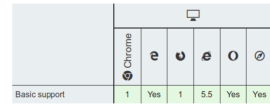
Thoughts on that?
Elchi3
on 5 Nov 2018
I like the rotated name with a leading icon.
I'd like all icons, like it is today, and then if you click or hover over the icons, the rotated names are displayed. However, for a first-time experience, icons plus names feels like the right default.
 jwhitlock
on 5 Nov 2018
jwhitlock
on 5 Nov 2018
I like the icon plus rotated label as well.
 a2sheppy
on 5 Nov 2018
a2sheppy
on 5 Nov 2018
Will you user test this? FWIW I like the vertical labels. I guess the icons are OK too, although I'm not sure grayscale icons are very useful here, where the originals are colour and the colours are so redolent of those browsers. Have you considered testing with coloured icons?
 wbamberg
on 5 Nov 2018
wbamberg
on 5 Nov 2018
Will you user test this?
The feedback from the last user surveying and user testing was that icons are not ideal, see this thread . We want to add a new survey to retest the tables, but it makes sense to do something about icons first, so we don't get the same feedback again. The new survey will be added per this bug: https://bugzilla.mozilla.org/show_bug.cgi?id=1501282 and you can have a look through the new survey here: https://www.surveygizmo.com/s3/4637778/browser-compat. I hope that this new testing will help us with making user informed decisions. Do you have other ideas how to user test this best?
Have you considered testing with coloured icons?
We haven't. Maybe we should.
For now, it seems like people are in favor of the vertical labels with the icons below. I have no strong feelings if we color the icons or not, but I guess if we do, it would make the browsers even more recognizable.
So, if I would decide here, I would say lets go with vertical labels and colored icons below and then see if it comes up again as problem in the survey and user tests that users can't identify browsers. If it doesn't come up again, then we can stick with the vertical labels/colored icons solution. If confusion does come up again, we need to rethink this again. Does this sound like a plan to you, @atopal ?
Elchi3
on 6 Nov 2018
I really like the vertical labels, I am a person with pretty much no visual memory so icons are constantly baffling to me.
 rachelandrew
on 6 Nov 2018
rachelandrew
on 6 Nov 2018
@Elchi3 I like the use of the icon and vertical label. Should we test both? Perhaps using Traffic Cop?
schalkneethling
on 6 Nov 2018
I'll defer to @atopal on that. Additional A/B testing could be useful, but also costs us more time and work I guess.
Elchi3
on 6 Nov 2018
The feedback from the last user surveying and user testing was that icons are not ideal, see this thread . We want to add a new survey to retest the tables, but it makes sense to do something about icons first, so we don't get the same feedback again. The new survey will be added per this bug: https://bugzilla.mozilla.org/show_bug.cgi?id=1501282 and you can have a look through the new survey here: https://www.surveygizmo.com/s3/4637778/browser-compat. I hope that this new testing will help us with making user informed decisions. Do you have other ideas how to user test this best?
OK, that makes sense. The only reason I asked about user testing is that otherwise it all feels subjective. I can say what I like, but so what?
For now, it seems like people are in favor of the vertical labels with the icons below. I have no strong feelings if we color the icons or not, but I guess if we do, it would make the browsers even more recognizable.
Well if I'm just being opinionated: I think colour icons are massively more useful than grayscale ones. To the extent that there's no point including grayscale icons as well as vertical labels, but there might be a point in including colour ones.
Do you have other ideas how to user test this best?
Actually this might be a thing we could test. Get three versions of a page:
- vertical labels only
- vertical labels + grayscale icon
- vertical labels + colour icon
Split the group of participants into three: each group gets one of the versions. Give each participant a job like: "which version of [Chrome|Firefox|Safari] added support for this property?" and see how long it takes them to get the answer, if they do at all.
But I don't know if it's worth it or if there are subtleties I am missing.
wbamberg
on 6 Nov 2018
Shi Li has already started working on the user testing tasks of this part, so we should include her in this, but to get us unstuck: Let's do the vertical text and colored icons as suggested by Florian. We can ask about variatons, etc as part of the test
atopal
on 6 Nov 2018
@atopal I can implement this, but I have to say I disagree. Using the vertical labels is a much better user experience.
The other option is simply too crowded, and will surely overwhelm a lot of people. Also, some of those labels are now even longer than they were when @Elchi3 proposed the previous change. For example, it is now Firefox for Android and Chrome for Android, making things even more cramped.
schalkneethling
on 7 Nov 2018
@atopal Oh, I see you changed your comment. It originally stated we should use https://github.com/mdn/kumascript/pull/616#issue-169662986 which was the option I disagreed with.
So, is the decision to go with the vertical text and coloured icons or grayscale icons as suggested by @Elchi3? I would recommend grayscale, as we can then swap out the icons that currently uses a web font, with inlined SVG. I am pretty sure we will get much smaller SVG sizes if they are grayscale and not full colour.
Even though they are inlined, it still increases the overall HTML payload coming down the wire, so we should optimise for that.
schalkneethling
on 7 Nov 2018
I am pretty sure we will get much smaller SVG sizes if they are grayscale and not full colour.
If this is true and perf would be better, please go ahead with grayscale icons and vertical text.
Elchi3
on 7 Nov 2018
Should be true, yeah. How much different depends on the given icon and
complexity.
Make sure to SVGO each of them to really maximize it. :)
On Wed, Nov 7, 2018 at 11:37 AM Florian Scholz notifications@github.com
wrote:
I am pretty sure we will get much smaller SVG sizes if they are grayscale
and not full colour.If this is true and perf would be better, please go ahead with grayscale
icons and vertical text.—
You are receiving this because you are subscribed to this thread.
Reply to this email directly, view it on GitHub
https://github.com/mdn/sprints/issues/563#issuecomment-436580520, or mute
the thread
https://github.com/notifications/unsubscribe-auth/AAED6DqXTriOXhW6CuYo4_gLcW0ay47Hks5usrfygaJpZM4YDpfe
.
 tkadlec
on 7 Nov 2018
tkadlec
on 7 Nov 2018
Hey there all,
Looked at our options with regards to the icons for this new iteration off the table. We have three options here and I would love to hear from peoples thoughts:
- Add the icon as a background image via Kuma. This means we will still have a request for each icon image, which I am trying to avoid. We can get around this by using a
data-urithough. - Add the base64 encoded
data-uris directly in the macro, and add it to each relevant table cell via an inline style. This couples it directly with the macro but, as these icons are not used elsewhere, it is probably ok. The code for the macro is also not downloaded/executed on the client, so it may lead to a bit of a performance improvement. - Add the icons as inline SVG using JS on the Kuma side. This is probably not ideal as adding SVG via JS is not trivial in terms of the amount of code required.
There may be other options I am not thinking about right now so, please feel free to suggest other options. I am leaning towards option 2, but followed by option 1 and then 3. Let me know your thoughts.
@Elchi3 @atopal @jwhitlock Thank you in advance.
schalkneethling
on 12 Nov 2018
Option 2 sounds like something we should try. Thanks for digging into this, Schalk!
Elchi3
on 13 Nov 2018
Thanks for the feedback @Elchi3 - shall proceed with option 2
schalkneethling
on 13 Nov 2018
Related issues
 mattiapontonio
·
5Comments
mattiapontonio
·
5Comments
 acolle
·
4Comments
acolle
·
4Comments
 ramiy
·
6Comments
Elchi3
·
4Comments
schalkneethling
·
5Comments
ramiy
·
6Comments
Elchi3
·
4Comments
schalkneethling
·
5Comments
Most helpful comment
Should be true, yeah. How much different depends on the given icon and
complexity.
Make sure to SVGO each of them to really maximize it. :)
On Wed, Nov 7, 2018 at 11:37 AM Florian Scholz notifications@github.com
wrote: