Spreed: Three dots item in sidebar seems always selected
Steps to reproduce
- Install Spreed master
- Open a conversation
- Take a look at the sidebar - three dots item seems to always be selected
Expected behaviour
It shouldn't look selected if it's not!
 mario
mario
All 8 comments
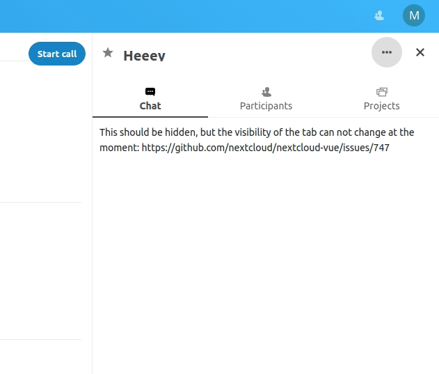
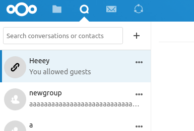
This comes from the nextcloud-vue library. @skjnldsv is there a reason why that button looks always focused?
 ma12-co
on 19 Dec 2019
ma12-co
on 19 Dec 2019
Could you provide a screenshot @mario ? :)
 skjnldsv
on 19 Dec 2019
skjnldsv
on 19 Dec 2019
👍1
ma12-co
on 19 Dec 2019
Ah yes, this was on purpose, requested by Jan when creating the new sidebar :)
skjnldsv
on 19 Dec 2019
I agree with the need of having it highlighted, as it's a very important button, this should probably happen also for the new group conversation button as well
ma12-co
on 19 Dec 2019
👀1
Ask Jan ;)
skjnldsv
on 19 Dec 2019
@jancborchardt should we go for it?
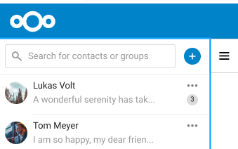
Also, should the background be primary or light primary? That's what was originally in @jenniferpiperek mokup
ma12-co
on 19 Dec 2019
@ma12-co sure, try with making the + button primary as per @jenniferpiperek’s mockup. :)
 jancborchardt
on 30 Dec 2019
jancborchardt
on 30 Dec 2019
👍1
Was this page helpful?
0 / 5 - 0 ratings
Related issues
 PVince81
·
3Comments
PVince81
·
3Comments
 cbacit
·
3Comments
cbacit
·
3Comments
 danxuliu
·
3Comments
danxuliu
·
3Comments
 nickvergessen
·
5Comments
ma12-co
·
3Comments
nickvergessen
·
5Comments
ma12-co
·
3Comments