Spreed: Fixes to favoriting conversations
Follow-up to https://github.com/nextcloud/spreed/issues/998, some details to fix:
- [x] The naming should be "Favorite conversation" and "Unfavorite conversation" to be like we call it in Files
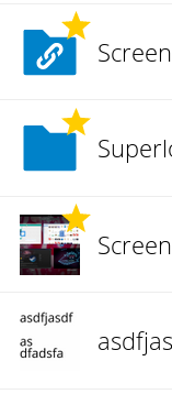
- [x] When favorited, there should be a star indicator on the top right of the icon, like we do in Files (it should show immediately when favoriting it): !
- [x] When favoriting, the conversation should directly animate to the top. Currently you need to refresh for the conversation to be shown at the top
- [x] Of course the mobile apps should reflect this as well cc @Ivansss @mario
 jancborchardt
All 10 comments
When favorited, there should be a star indicator on the top right of the icon, like we do in Files (it should show immediately when favoriting it): !
Any design hint how to accomplish this? :) Tried before without success.
When favoriting, the conversation should directly animate to the top. Currently you need to refresh for the conversation to be shown at the top
There is no need to refresh, just wait (max. 10 secs). But yeah, for a better UX this should be directly animated.
 Ivansss
on 19 Jul 2018
Ivansss
on 19 Jul 2018
I picked "pin/unpin" because that is what it does and what it's called in all other apps I checked.
Favorites suggest other things in my opinions which we dont want to have.
also I think that the yellow star is tooooo bold if you have it on the top items in the list.
I would prefer something less "in the face", like the grey star or whatever, but as per above, any designer help is appriciated.
about animating it, something for later
 nickvergessen
on 19 Jul 2018
nickvergessen
on 19 Jul 2018
There is no need to refresh, just wait (max. 10 secs)
Yeah, this is a problem. ;) Basic rule of thumb: 0.1 s or faster feels instant, around 1 s already feels slow, and 10s and the people leave the page or assume there’s a problem.
@nickvergessen
I picked "pin/unpin" because that is what it does and what it's called in all other apps I checked.
Favorites suggest other things in my opinions which we dont want to have.
Slack says "Starred" and Riot says "Favourites". And we say "Favorites" in Files, so let’s keep it consistent. What does it suggest you think is bad?
also I think that the yellow star is tooooo bold if you have it on the top items in the list.
I would prefer something less "in the face", like the grey star or whatever, but as per above, any designer help is appriciated.
Maybe it makes sense to even not have an indicator on every one of the rooms, but rather a section "Favorites" with a star icon on the left like Slack and Riot have too. Then a bit of whitespace after the favorites, and then the regular rooms. We do it similar in the Mail app with the different accounts and in the Settings with Personal/Admin. How about this:
Code to start this is:
<li class="app-navigation-caption icon-starred">Favorites</li>
And then with icon-comments and "Conversations" for the other header. Some more CSS adjustments are necessary, but this is a good start.
cc @nextcloud/designers what do you think?
about animating it, something for later
Yes, but not too much later. Slight animation is really crucial to give feedback what actually happens. That’s why it’s on the list. :)
jancborchardt
on 19 Jul 2018
What does it suggest you think is bad?
well I think with favorites something should be different, but it's not, they are just pinned, so why not call them pinned?
… headers …
looks nice and maybe we can do that once we are not using marionette.js anymore.
… animation …
Maybe adjusting the backbone model makes it jump to the top, if that is okay we can do it. any other animation: nop
nickvergessen
on 20 Jul 2018
Room list is now refreshed directly after the action, similar to a rename or type change
nickvergessen
on 20 Jul 2018
"Pin to top" and "Unpin" sound perfectly reasonable to me, and some other IM apps do it that way too.
I'd maybe even change the icon to a pin icon, and change the endpoint to be "pin" instead of "favorite", but those are details.
 mario
on 21 Jul 2018
mario
on 21 Jul 2018
@jancborchardt can you produce us a nice pin/unpin icon?
nickvergessen
on 30 Jul 2018
If I had to choose, I would also go for pin/unpin with proper pin icons.
In my opinion, it makes more clear what this feature does.
Ivansss
on 30 Jul 2018
We have to balance between what we do in Nextcloud, and what others do in other apps.
Currently there is already a metaphor we use for "pinning", and it’s called "favorites" and uses a star icon. For product consistency and – most importantly – to avoid confusion and adding more concepts, we should stick to that language and icon.
jancborchardt
on 31 Jul 2018
well its not similar to favorites on files, where you can get different activity etc.
It just pins the conversation to the top in the sidebar, but okay I will draw one myself
We have to balance between what we do in Nextcloud, and what others do in other apps.
Let me quote yourself for the reason https://github.com/nextcloud/talk-android/issues/249#issuecomment-408898976
Sorry but basically everyone in the messenger space is doing it and people are used to it.
nickvergessen
on 31 Jul 2018
Related issues
mario
·
3Comments
 pilsnerbeer
·
3Comments
pilsnerbeer
·
3Comments
 cbacit
·
3Comments
nickvergessen
·
5Comments
cbacit
·
3Comments
nickvergessen
·
5Comments
 ChristophAGietl
·
4Comments
ChristophAGietl
·
4Comments
Most helpful comment
If I had to choose, I would also go for pin/unpin with proper pin icons.
In my opinion, it makes more clear what this feature does.