Spectrum: [Mobile v1] Notifications
Splitting up #1803 into multiple sub-issues to track against
People need to be able to see their notifications and get them as push notifications in real-time.
- [x] Push notifications (#2366)
- [ ] Handle push notifications from the mobile ReactNative code
- [x] Notification view
- [x] All notification types
- [x] Infinite scrolling list (#2366)
 mxstbr
All 18 comments
@homanp moved from #1803
Ah, ok. Misunderstood then. Again I would be glad to help you out with that as well. Do you have any specific documentation on how you want to handle the notifications?
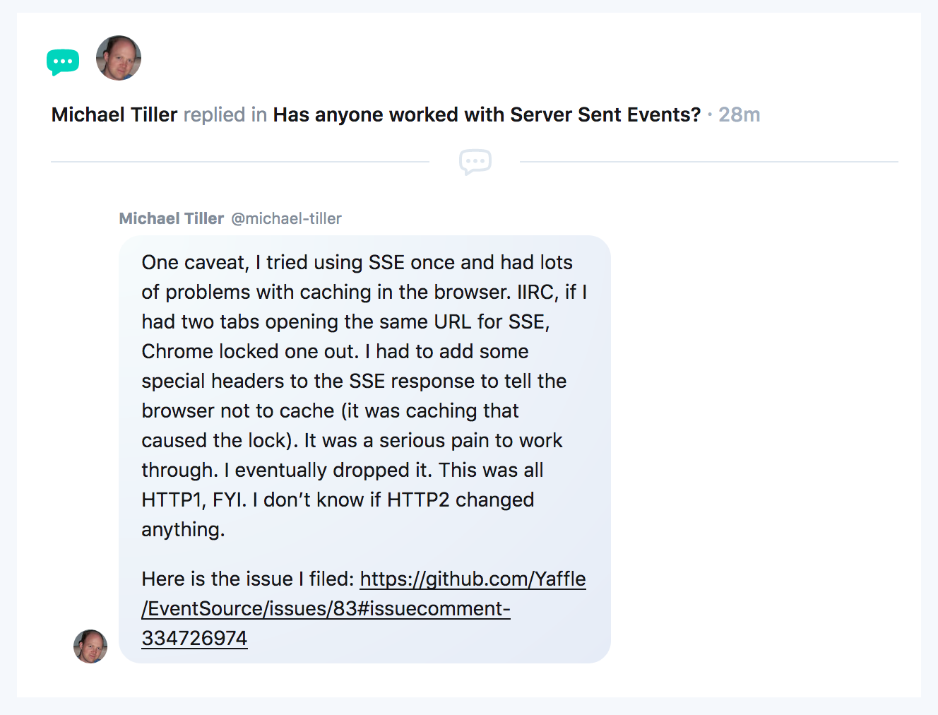
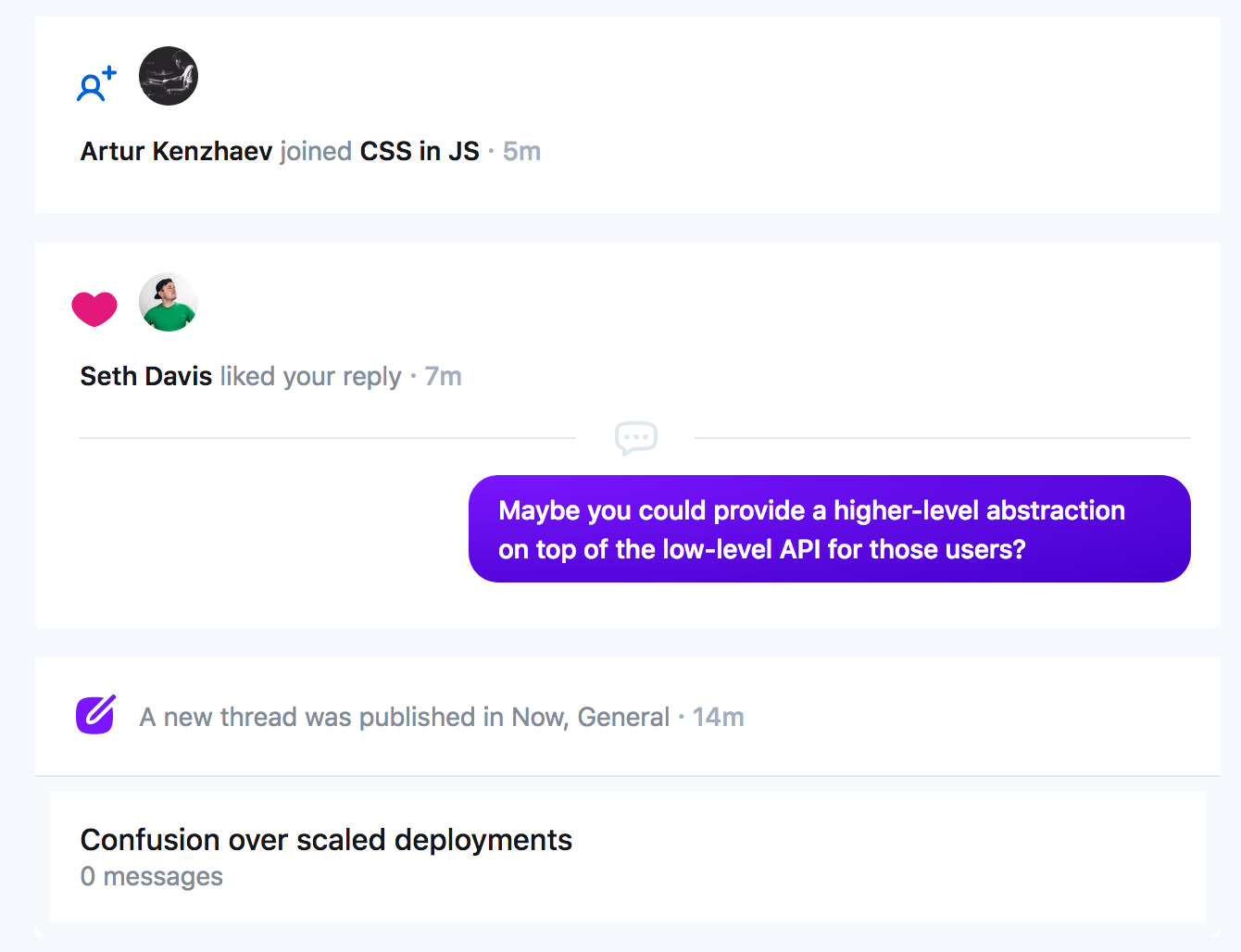
If you're talking about rendering them in the notifications tab, they should really just look like they do on the website. If you're talking about handling them while the app is open, I really don't know! Maybe it should show a dropdown with the content that can be clicked on and links to the relevant content?
Click to see screenshots of some notification types on the website
mxstbr
on 11 Apr 2018
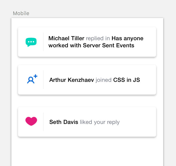
@mxstbr got it. I made a quick mock of the in-app notification. Clicking on it would navigate the user to the relevant content.
Thoughts?
 homanp
on 12 Apr 2018
homanp
on 12 Apr 2018
They should just look like they do on the web, if you copy that design you should be golden!
mxstbr
on 12 Apr 2018
@mxstbr I was referring to when a the app is open and the push notif arrives. Not the actual notification view. Do you have a design for that as well on web?
homanp
on 12 Apr 2018
Oh sorry, I misunderstood—yes, those mockups look great! 😍
mxstbr
on 12 Apr 2018
Ok, cool. I'll give a try to see how it works out. Do you guys primarily communicate on Github for this project or do you have a Slack channel or similar?
homanp
on 12 Apr 2018
A Slack channel? I hope you mean a Spectrum community :wink:, and yes we do: https://spectrum.chat/spectrum/open
mxstbr
on 12 Apr 2018
Haha, yeah sorry! Thx 😄
homanp
on 12 Apr 2018
cc @uberbryn for any design feedback on those in-app notif dropdowns :)
 brianlovin
on 12 Apr 2018
brianlovin
on 12 Apr 2018
Copy that :)
homanp
on 12 Apr 2018
Thanks for taking the time to dig into this @homanp!
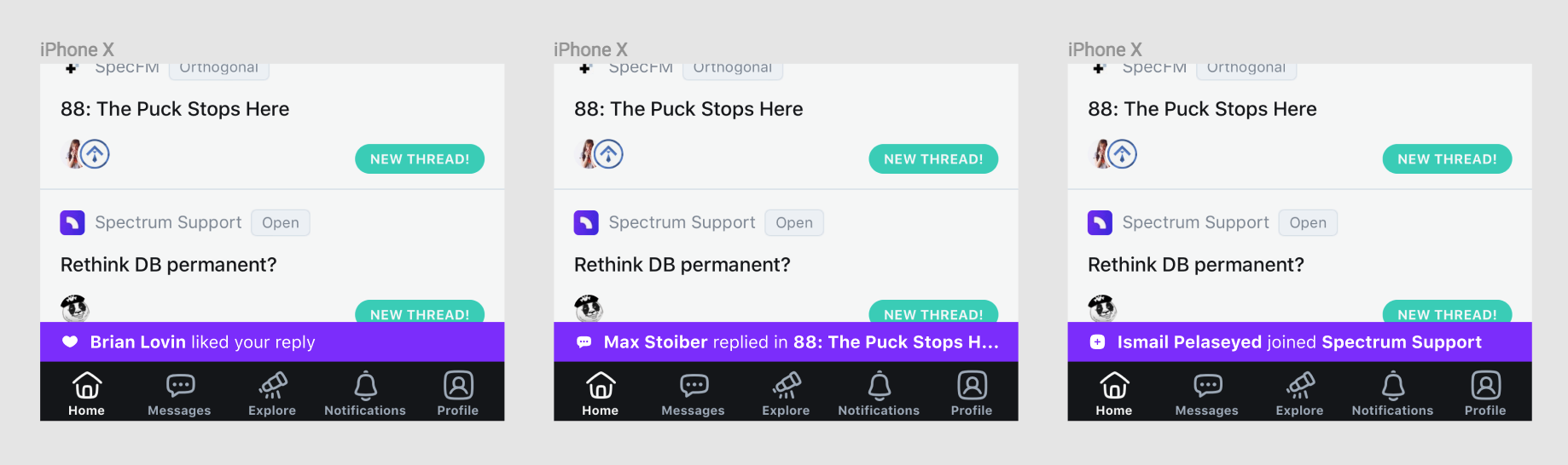
For now, I'd prefer to do a toast similar to Twitter with a spectrum purple bg, white text, and a white icon.
There are a few reasons I think this is the right approach:
- it's as close to the notifications icon as possible
- it takes up minimal space while using other functions of the app
- it's high contrast against the background, and has good color contrast (AA) with the text
The one obvious issue here is that the icons will need some adjustment to fit this context better.
Inside the Notifications view, I think we'll use the existing notifications design for now (though that could also use an update)
That said, I'd love to help you contribute more and have your stuff get approved quickly, so I'd like to give some critique of the design you proposed.
You mentioned that this was a quick mockup and I'm not sure how polished you intended to present these mockups as, so take this with a grain of salt (and that'd be helpful to note on future mockups!). IDK what your experience is like, so I hope this doesn't come off as condescending or anything.
While at the surface-level, the mockups are similar to our existing notifications, there are some key differences that would help in the future.
We use an 8pt grid almost universally (we make slight adjustments to that at small scales, so there are a few 4pt and 12pt measurements in the app). Element dimensions, padding, and margin should be defined in multiples of 8, borders are generally 2px (though we have a handful that are 1px). More often than not, we use the "Soft Grid" approach defined here: https://spec.fm/specifics/8-pt-grid
We don't use True Black or True Grays for text or anything (note text.default and text.alt would be appropriate for the text here, and bg.border or bg.wash for the vertical rule) - ours are all tinted to be slightly cooler. You can get the full list of all approved colors here: https://github.com/withspectrum/spectrum/blob/alpha/src/components/theme/index.js
Here are our default shadow dimensions (in a case like your mockup, i'd use "high"):
export const Shadow = {
  low: '0 2px 8px',
  mid: '0 4px 12px',
  high: '0 8px 16px',
};
- inside the app, we usually use these measurements in combination with one of the .dark colors or bg.reverse at 10-25% opacity depending on the use-case and color contrast (e.g. green would be higher opacity than purple to have the same perceived contrast). For marketing we get a little wilder with the colors and opacities - there are fewer rules there.
You can find those and other global defaults that we'd like to adhere to - though we don't always, when we're in a hurry - here: https://github.com/withspectrum/spectrum/blob/alpha/src/components/globals/index.js
Anyway, hopefully this is helpful. I really appreciate you contributing to the project and would love to see more of your work here in the future!
 superbryntendo
on 12 Apr 2018
superbryntendo
on 12 Apr 2018
This seems like it'd probably be a good candidate for addition to the README. Perhaps as a Figma file 🤔.
I'll see what I can come up with!
superbryntendo
on 12 Apr 2018
That would make for a great doc! docs/design/readme.md maybe?
mxstbr
on 12 Apr 2018
@uberbryn yeah a README would definitely help. So we go with Twitter-ish Toast notification bar?! If so I'll go for implementing that to begin with.
homanp
on 13 Apr 2018
Yep, that'd be great @homanp!
mxstbr
on 13 Apr 2018
Cool, going for it then 😄
homanp
on 13 Apr 2018
@mxstbr @brianlovin so I implemented everything for a device to start receiving notifs. I have some questions though:
Is the back-end for sending push notifs ready?
Are you guys saving the
ExponentPushTokensomewhere? If not this needs to be saved in order to send notifications to a specific device.Have you got any examples of the payload you will be sending as push notifs to the client?
Thanks!
homanp
on 16 Apr 2018
@homanp
- Yes, the backend is already pushing notifications out if you register with a token
- Yes, in the
expoPushSubscriptionstable! - Let me dig in, one second
mxstbr
on 16 Apr 2018
Related issues
 flaki
·
5Comments
brianlovin
·
6Comments
flaki
·
5Comments
brianlovin
·
6Comments
 davidluhr
·
3Comments
davidluhr
·
3Comments
 thundernixon
·
4Comments
thundernixon
·
4Comments
 entrptaher
·
3Comments
entrptaher
·
3Comments
Most helpful comment
Thanks for taking the time to dig into this @homanp!
For now, I'd prefer to do a toast similar to Twitter with a spectrum purple bg, white text, and a white icon.
There are a few reasons I think this is the right approach:
The one obvious issue here is that the icons will need some adjustment to fit this context better.
Inside the Notifications view, I think we'll use the existing notifications design for now (though that could also use an update)
That said, I'd love to help you contribute more and have your stuff get approved quickly, so I'd like to give some critique of the design you proposed.
You mentioned that this was a quick mockup and I'm not sure how polished you intended to present these mockups as, so take this with a grain of salt (and that'd be helpful to note on future mockups!). IDK what your experience is like, so I hope this doesn't come off as condescending or anything.
While at the surface-level, the mockups are similar to our existing notifications, there are some key differences that would help in the future.
We use an 8pt grid almost universally (we make slight adjustments to that at small scales, so there are a few 4pt and 12pt measurements in the app). Element dimensions, padding, and margin should be defined in multiples of 8, borders are generally 2px (though we have a handful that are 1px). More often than not, we use the "Soft Grid" approach defined here: https://spec.fm/specifics/8-pt-grid
We don't use True Black or True Grays for text or anything (note text.default and text.alt would be appropriate for the text here, and bg.border or bg.wash for the vertical rule) - ours are all tinted to be slightly cooler. You can get the full list of all approved colors here: https://github.com/withspectrum/spectrum/blob/alpha/src/components/theme/index.js
Here are our default shadow dimensions (in a case like your mockup, i'd use "high"):
export const Shadow = { low: '0 2px 8px', mid: '0 4px 12px', high: '0 8px 16px', };You can find those and other global defaults that we'd like to adhere to - though we don't always, when we're in a hurry - here: https://github.com/withspectrum/spectrum/blob/alpha/src/components/globals/index.js
Anyway, hopefully this is helpful. I really appreciate you contributing to the project and would love to see more of your work here in the future!