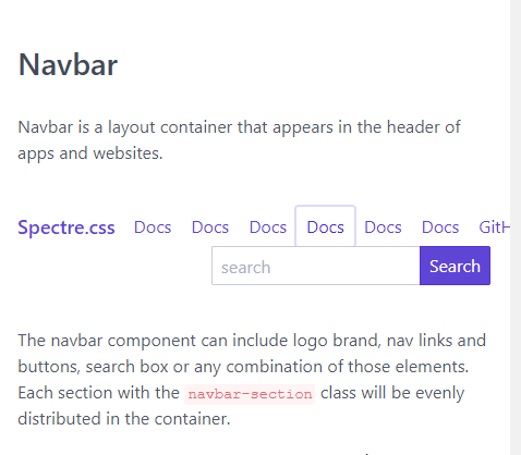
bug
 9Emi
9Emi
👍3
All 3 comments
Yes. Same problem. The navbar looks awful on small sreens.
Maybe one solution could be to split each section into rows instead of columns based on screen width. Not sure if it is a valid proposition.
 Odonno
on 15 Mar 2018
Odonno
on 15 Mar 2018
👍2
A solution could be defining a media query to set "display:block" for nav-section on small widths.
@media only screen and (max-width: 480px){
.navbar-section {
    display: block;
}}
 agausachs
on 17 Apr 2018
agausachs
on 17 Apr 2018
👍1
@agausachs
Works like a charm.
I usually just hide the navbar-section except whichever i put the site logo. with class hide-sm
Then use and alternative inline menu to display the nav links on small screens. with class show-sm
 tunjioye
on 17 Apr 2018
tunjioye
on 17 Apr 2018
👍1
Was this page helpful?
0 / 5 - 0 ratings
Related issues
 tomcam
·
3Comments
tomcam
·
3Comments
 alighasemzadeh
·
5Comments
alighasemzadeh
·
5Comments
 elias-garcia
·
4Comments
tomcam
·
4Comments
elias-garcia
·
4Comments
tomcam
·
4Comments
 kwstaskara
·
3Comments
kwstaskara
·
3Comments
Most helpful comment
Yes. Same problem. The navbar looks awful on small sreens.
Maybe one solution could be to split each section into rows instead of columns based on screen width. Not sure if it is a valid proposition.